

CSS What is the Holy Grail Layout?

In CSS, the Holy Grail layout refers to a three-column layout in which the width of the boxes on both sides is fixed and the middle box is adaptive. Among them, the middle column is placed in front of the document flow to ensure that it is rendered first; all three columns use "float:left" "Float, and match the left and right properties.
Everyone must be familiar with the two classic layouts of the front end - the Holy Grail layout and the double flying wing layout, because it can not only show that you understand the HTML structure but also can Show your mastery of DIV CSS layout.
In fact, the Holy Grail layout is actually the same thing as the double flying wing layout. They all implement a three-column layout, with the boxes on both sides having a fixed width and the middle box adapting, which is what we often call a solid layout. The effect they achieve is the same, the difference lies in the idea of their implementation.
You can find by zooming the page that as the width of the page changes, the three-column layout is the middle box that is rendered first, and the boxes on both sides are fixed. Even if the page width becomes smaller, it will not affect our Browse. Note: When you zoom the page, the width cannot be less than 700PX. For safety reasons, it is best to add a minimum width to the body!
If you have such a little understanding, let’s take a look. Implementation of the Holy Grail Layout:
Note: You can add the reset part of the code by yourself
1. HTML structure:
<header>
    <h4>Header内容区</h4>
</header>
<div class="container">
    <div class="middle">
        <h4>中间弹性区</h4>
    </div>
    <div class="left">
        <h4>左边栏</h4>
    </div>
    <div class="right">
        <h4>右边栏</h4>
    </div>
</div>
<footer>
    <h4>Footer内容区</h4>
</footer>Some people may be confused as to why the main part in the middle is Write it at the front. Because the middle box should be rendered first~ and set its adaptive value, that is, width: 100%.
2. css style:
header{
    width: 100%;    height: 40px;
    background-color: #8ecfd4;
}
.container{
    overflow:hidden;
}
.middle{
    width: 100%;
    background-color: #f7f537;
    float:left;
}
.left{
    width: 200px;
    background-color: #37f7c8;
    float:left;
}
.right{
    width: 200px;
    background-color: #eb6100;
    float:left;
}
footer{
    width: 100%;
    height: 30px;
    background-color: #8ecfd4;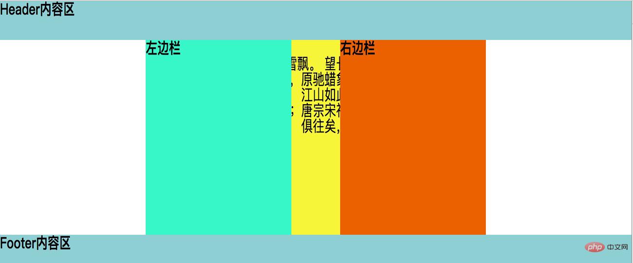
}The rendering at this time:
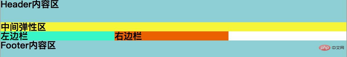
At this time, the three columns in the middle are not in one line It shows that the reason is also very clear. The three columns are all floating, but the width of the middle column is set to 100%, and then the left and right columns cannot support the new line display.
What we need to do now is to move the left column to the left and the right column to the right. Then we need negative margin of css.
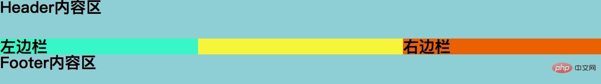
3. Use negative margin layout
Let the box on the left go up
.left{
    margin-left:-100%;
}Let the box on the right go up
.right {
    margin-left:-200px;
}This The renderings
Implementing the solid layout
Although it seems that the layout we want has been achieved, when filling in the content in the middle, we Problems will still be found. In this step, we also give the middle main part a height to facilitate visual effects.
.middle{
    width: 100%;
    height: 200px;
    background-color: #f7f537;
    float:left;
}
.left{
    width: 200px;
    height: 200px;
    background-color: #37f7c8;
    float:left;
}
.right{
    width: 200px;
    height: 200px;
    background-color: #eb6100;
    float:left;
}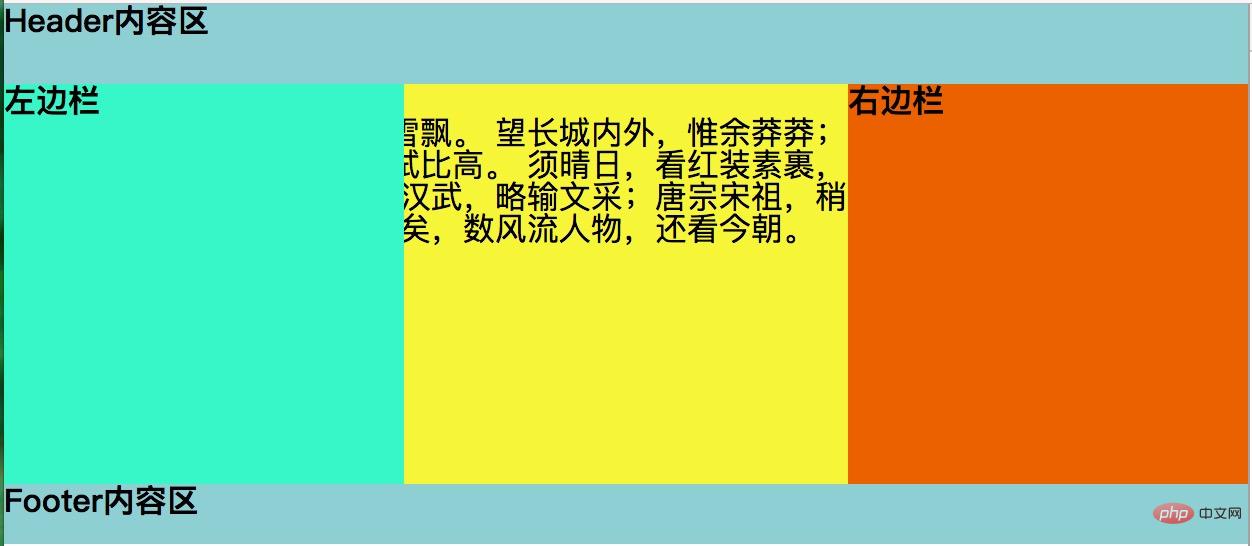
As can be seen from the above renderings, the content of the middle column is obscured by the parts on both sides. This is not what we want, so our work is still Gotta continue.
4. Let the middle adaptive box be displayed safely (use the parent element to set the value of the left and right margins, and squeeze the three sub-boxes of the parent into the middle.)
.container{
    padding: 0 200px;
}Here 200px is the width of the left and right boxes.
The effect is as follows:
Use the parent’s padding to squeeze the box into the middle
We can see that the left and right The padding is there, but the content in the middle box is still suppressed.
5. Separate the left and right sides (add a positioning to the left and right boxes. After adding the positioning, the left and right values can be set for the left and right boxes.)
.left{
    position: relative;
    left: -200px;
}
.right{
    position: relative;
    right: -200px;
}See the final renderings
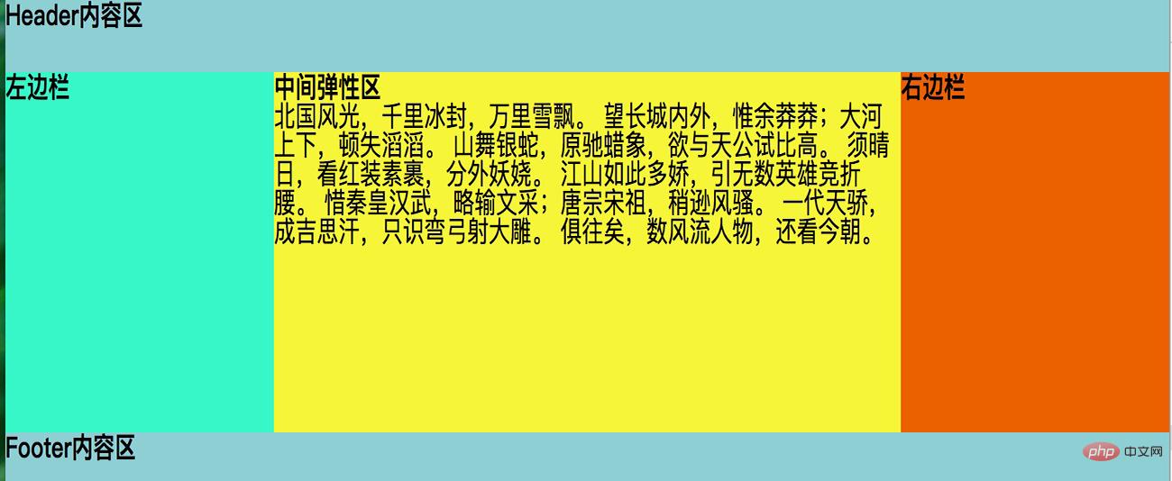
Now our Holy Grail layout is OK! The effect we want is achieved. The left and right boxes are fixed, the middle box is adaptive, and the content of the middle box is not affected at all. I hope everyone has to help.
For more programming-related knowledge, please visit: Programming Learning! !
The above is the detailed content of CSS What is the Holy Grail Layout?. For more information, please follow other related articles on the PHP Chinese website!

Hot AI Tools

Undresser.AI Undress
AI-powered app for creating realistic nude photos

AI Clothes Remover
Online AI tool for removing clothes from photos.

Undress AI Tool
Undress images for free

Clothoff.io
AI clothes remover

Video Face Swap
Swap faces in any video effortlessly with our completely free AI face swap tool!

Hot Article
Hot Tools

Notepad++7.3.1
Easy-to-use and free code editor

SublimeText3 Chinese version
Chinese version, very easy to use

Zend Studio 13.0.1
Powerful PHP integrated development environment

Dreamweaver CS6
Visual web development tools

SublimeText3 Mac version
God-level code editing software (SublimeText3)
Hot Topics
 1386
1386
 52
52

 How to use bootstrap in vue
Apr 07, 2025 pm 11:33 PM
How to use bootstrap in vue
Apr 07, 2025 pm 11:33 PM
Using Bootstrap in Vue.js is divided into five steps: Install Bootstrap. Import Bootstrap in main.js. Use the Bootstrap component directly in the template. Optional: Custom style. Optional: Use plug-ins.
 The Roles of HTML, CSS, and JavaScript: Core Responsibilities
Apr 08, 2025 pm 07:05 PM
The Roles of HTML, CSS, and JavaScript: Core Responsibilities
Apr 08, 2025 pm 07:05 PM
HTML defines the web structure, CSS is responsible for style and layout, and JavaScript gives dynamic interaction. The three perform their duties in web development and jointly build a colorful website.
 How to write split lines on bootstrap
Apr 07, 2025 pm 03:12 PM
How to write split lines on bootstrap
Apr 07, 2025 pm 03:12 PM
There are two ways to create a Bootstrap split line: using the tag, which creates a horizontal split line. Use the CSS border property to create custom style split lines.
 Understanding HTML, CSS, and JavaScript: A Beginner's Guide
Apr 12, 2025 am 12:02 AM
Understanding HTML, CSS, and JavaScript: A Beginner's Guide
Apr 12, 2025 am 12:02 AM
WebdevelopmentreliesonHTML,CSS,andJavaScript:1)HTMLstructurescontent,2)CSSstylesit,and3)JavaScriptaddsinteractivity,formingthebasisofmodernwebexperiences.
 How to resize bootstrap
Apr 07, 2025 pm 03:18 PM
How to resize bootstrap
Apr 07, 2025 pm 03:18 PM
To adjust the size of elements in Bootstrap, you can use the dimension class, which includes: adjusting width: .col-, .w-, .mw-adjust height: .h-, .min-h-, .max-h-
 How to set up the framework for bootstrap
Apr 07, 2025 pm 03:27 PM
How to set up the framework for bootstrap
Apr 07, 2025 pm 03:27 PM
To set up the Bootstrap framework, you need to follow these steps: 1. Reference the Bootstrap file via CDN; 2. Download and host the file on your own server; 3. Include the Bootstrap file in HTML; 4. Compile Sass/Less as needed; 5. Import a custom file (optional). Once setup is complete, you can use Bootstrap's grid systems, components, and styles to create responsive websites and applications.
 How to insert pictures on bootstrap
Apr 07, 2025 pm 03:30 PM
How to insert pictures on bootstrap
Apr 07, 2025 pm 03:30 PM
There are several ways to insert images in Bootstrap: insert images directly, using the HTML img tag. With the Bootstrap image component, you can provide responsive images and more styles. Set the image size, use the img-fluid class to make the image adaptable. Set the border, using the img-bordered class. Set the rounded corners and use the img-rounded class. Set the shadow, use the shadow class. Resize and position the image, using CSS style. Using the background image, use the background-image CSS property.
 How to use bootstrap button
Apr 07, 2025 pm 03:09 PM
How to use bootstrap button
Apr 07, 2025 pm 03:09 PM
How to use the Bootstrap button? Introduce Bootstrap CSS to create button elements and add Bootstrap button class to add button text
