
Use a CSS property to create a responsive website. The following article will introduce to you how it is done. It has certain reference value. Friends in need can refer to it. I hope it will be helpful to everyone. [Related recommendations: CSS Video Tutorial]
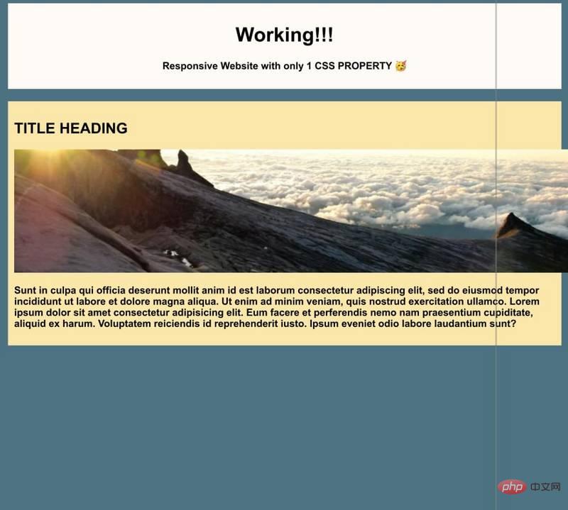
Take this template as an example, no css attributes are applied.

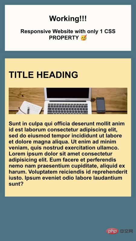
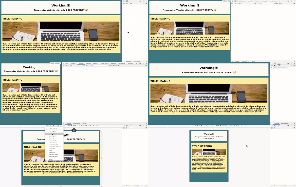
Using the clamp() CSS function, we can create a responsive website with only one attribute.
Now add magic CSS
clamp(minimum, preferred, maximum);
Here it is! You're done

clamp() works by "clamping" or limiting a flexible value, Make it between the minimum and maximum range.
The usage method is as follows:
16px5vw34pxh1 {
font-size: clamp(16px, 5vw, 34px);
}In this example, only if the value is greater than 16px and less than 34px , the h1 font size value will be 5% of the viewport width.
For example, if your viewport width is 300px, your 5vw value will be equal to 15px, however, you will change that font size The value is limited to a minimum of 16px, so that's what will happen.
On the other hand, if your viewport width is 1400px, then 5vw will be as high as 70px! But luckily you're limiting that maximum to 34px, so it won't exceed that.

Online Demo: https://dip15739.github.io/ResponsiveWebsite-CSSproperty/
I can add this code to this template...
img {
  width: clamp(15vw, 800%, 100%);
}
h1 {
  font-size: clamp(20px, 5vw, 35px);
}
p {
  font-size: clamp(10px, 4vw, 20px);
}And literally accepts any other property of length, frequency, angle, time, percentage, number, or integer.

Original text: https://dev.to/dip15739
Author: Dip Vachhani
More programming related knowledge , please visit: programming video! !
The above is the detailed content of How to create a responsive website using only 1 css property?. For more information, please follow other related articles on the PHP Chinese website!