Implement responsive layout using new features of HTML and CSS
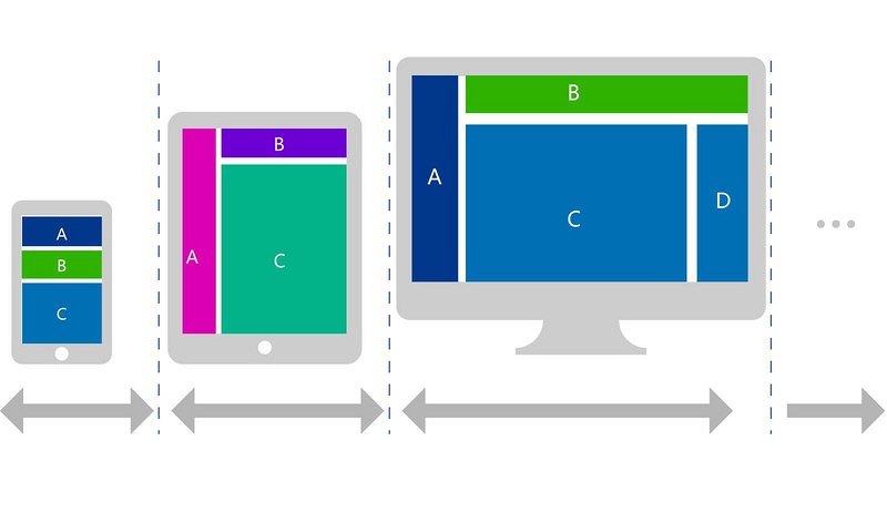
In addition to using media queries and modern CSS layouts (such as flexbox and grid) to create responsive websites, there are certain overlooked things we can do to make responsive websites. In this article, we'll explore the many tools available (around HTML and CSS), from responsive images to relatively new CSS functions that work regardless of whether we use media queries or not.
In fact, media queries, when used together with these features, become more of a supplement than a complete method. Let's see how it works.
True Responsive Images
Remember when we could write width: 100% on an image and call it a day? Of course, this is still effective, and it does make the image more flexible, but it will also bring some disadvantages, the most obvious of which include:
- The image may be deformed to the point of losing focus. Degree.
- Smaller devices will still download the full size image.
When using images on the web, we must ensure that they are optimized in terms of resolution and size. The reason is to make sure we have the right image resolution for the right device, so we don't end up downloading very large and heavy images for smaller screens, which could slow down the performance of the site.
Simply put, we want to ensure that larger, high-resolution images are sent to large screens, while smaller, low-resolution changes are sent to small screens, thereby improving performance and user experience.
HTML provides the <picture></picture> element that allows us to specify the exact image resource to render based on the media query we add. As mentioned before, instead of sending one image (usually a large, high-resolution version) to all screen sizes and scaling it to the viewport width, we specify a set of images that are used for a specific situation.
<picture>
  <source>
  <source>
  <source>
  <img  src="/static/imghw/default1.png" data-src="picture.png" class="lazy" alt="Implement responsive layout using new features of HTML and CSS" >
</source></source></source></picture>
In this example, picture.png is the full size image. From there, we define the next largest version of the picture, picture-lg.png, with successively smaller sizes, until the smallest version, picture-sm.png. Note that we are still using media queries in this approach, but it is the <picture></picture> element itself that drives the responsive behavior, rather than defining breakpoints in CSS.
Media queries have been added appropriately to scale with the picture size:
- Viewports greater than or equal to 1000px will get
picture.png. - Viewports between 601 pixels and 999 pixels will get
picture-lg.png. - Viewports between 401 pixels and 600 pixels will get
picture-sm.png. - Anything smaller than 400px will get
picture-sm.png.
Interestingly, we can also label each image by image density after the URL - 1x, 2x, 3x, etc. It would be fine if we proportioned the different images so that the browser could decide which version to download based on the pixel density of the screen and the viewport size. But notice how many images we ended up defining:
<picture>
  <source>
  <source>
  <source>
  <img  src="/static/imghw/default1.png" data-src="picture.png" class="lazy" alt="Implement responsive layout using new features of HTML and CSS" >
</source></source></source></picture>
Let's look specifically at the two tags nested within the <picture></picture> element: <source> and <code><img src="/static/imghw/default1.png" data-src="https://img.php.cn/upload/image/870/465/873/1606211132104709.jpg" class="lazy" alt="Implement responsive layout using new features of HTML and CSS" >.
The browser will look for the first <source></source> element whose media query matches the current viewport width, and will display the correct image (in the srcset attribute specified in). The <img src="/static/imghw/default1.png" data-src="https://img.php.cn/upload/image/870/465/873/1606211132104709.jpg" class="lazy" alt="Implement responsive layout using new features of HTML and CSS" > element is the last child of the <picture></picture> element and serves as a fallback if no original source tag matches.
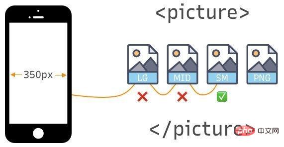
We can also use image density via the srcset attribute to handle responsive images using only the <img src="/static/imghw/default1.png" data-src="flower-fallback.jpg" class="lazy" alt="Implement responsive layout using new features of HTML and CSS" > element:
<img src="/static/imghw/default1.png" data-src="flower-fallback.jpg" class="lazy" alt="Implement responsive layout using new features of HTML and CSS" >
Another thing we can do is write media queries in CSS based on the screen resolution of the device itself (usually measured in dots per inch or dpi) rather than just the device viewport. This means that instead of:
@media only screen and (max-width: 600px) {
  /* Style stuff */
}we now have:
@media only screen and (min-resolution: 192dpi) {
  /* Style stuff */
}This approach allows us to decide what image to render based on the screen resolution of the device itself, which is useful when dealing with high resolution images may be helpful. Basically, this means we can display a high-quality image for screens that support higher resolutions, and a smaller version at a lower resolution. It's worth noting that although mobile device screens are small, their resolution is usually very high. This means that relying solely on resolution may not be the best idea when deciding which image to render. This can result in a large, high-resolution image being displayed on a very small screen, which may not be the version we actually want to display on such a small screen.
body {
  background-image : picture-md.png; /* the default image */
}

@media only screen and (min-resolution: 192dpi) {
  body {
    background-image : picture-lg.png; /* higher resolution */
  }
}<picture></picture> 给我们提供的基本上是对图像进行艺术指导的能力。而且,根据这个想法,我们可以利用CSS的特性,比如 object-fit 属性,当与 object-position 一起使用时,我们可以裁剪图像以获得更好的焦点,同时保持图像的纵横比。
因此,要更改图像的焦点:
@media only screen and (min-resolution: 192dpi) {
  body {
    background-image : picture-lg.png;
    object-fit: cover;
    object-position: 100% 150%; /* moves focus toward the middle-right */
  }
}在CSS中设置minimum和maximum
min() 函数指定一个元素可以缩小到的绝对最小尺寸。这个函数在帮助文本大小在不同屏幕大小之间适当缩放方面非常有用,比如永远不要让流体类型下降到一个清晰的字体大小以下:
html {
  font-size: min(1rem, 22px); /* Stays between 16px and 22px */
}min() 接受两个值,它们可以是相对、百分比或固定单位。在这个例子中,我们告诉浏览器永远不要让带有 .box 类的元素宽度低于45%或600px,以视口宽度最小的为准。
.box {
  width : min(45%, 600px)
}如果45%计算得出的值小于600px,则浏览器将使用45%作为宽度。反之,如果45%的计算值大于600px,那么元素的宽度将使用600px。
max() 函数也是同样的道理,它也接受两个值,但不是指定一个元素的最小尺寸,而是定义它的最大尺寸。
.box {
  width : max(60%, 600px)
}如果60%计算出的数值大于600px,浏览器就会使用60%作为宽度。反过来说,如果60%的计算值小于600px,那么将使用600px作为元素的宽度。
钳制(Clamping)值
我们中的许多人已经为clip()叫嚣了一段时间,实际上我们在所有现代浏览器中都得到了广泛的支持(对不起,IE)。 clamp() 是 min() 和 max() 函数的组合,接受三个参数:
最小值
首选值,以及
最大值
例如:
.box {
  font-size : clamp(1rem, 40px, 4rem)
}浏览器会将字体设置为1rem,直到1rem的计算值大于40px。而当计算值大于40px时?是的,浏览器在达到4rem后将停止增加大小。你可以看到如何使用 clip() 来使元素变得流畅,而无需使用媒体查询。
与响应单位合作
你是否曾经建立过一个大标题或小标题的页面,并羡慕它在桌面屏幕上看起来有多好,但在移动设备上检查时却发现它太大了?我肯定会遇到这种情况,在本节中,我将解释如何处理此类问题。
在CSS中,你可以使用各种度量单位来确定元素的大小或长度,最常用的度量单位包括:px,em,rem,%,vw 和 vh。虽然,还有一些不常用的单位。我们感兴趣的是,px 可以认为是一个绝对单位,而其余的则认为是相对单位。
绝对单位
像素(px)被视为绝对单位,主要是因为像素是固定的,并且不会因其他任何元素的测量而变化。可以将其视为其他一些相对单位使用的基本单位或根单位。试图使用像素来进行响应行为可能会碰到问题,因为它是固定的,但如果你有一些根本不应该调整大小的元素,它们是很好的。
相对单位
相对单位,如 %、em 和 rem,更适合响应式设计,主要是因为它们能够跨越不同的屏幕尺寸进行缩放。
- vw:相对于视口的宽度
- vh:相对于视口的高度
- rem:相对于根(
)元素(默认字体大小通常为16px) - em:相对于父元素
- %:相对于父元素
同样,大多数浏览器的默认字体大小是 16px ,rem 单位使用它来生成计算值。所以,如果用户在浏览器上调整字体大小,页面上的所有内容都会根据根部大小正确缩放。例如,当处理一个根为 16px 时,你指定的数字将乘以该数字乘以默认大小。例如:
.8rem = 12.8px (.8 * 16)
1rem = 16px (1 * 16)
2rem = 32px (2 * 16)
如果你或用户更改默认大小怎么办?我们已经说过,这些都是相对单位,最终的尺寸值将以新的基本尺寸为基础。这在媒体查询中很有用,你只需改变字体大小,整个页面就会相应地放大或缩小。
例如,如果你在CSS中把字体大小改为10px,那么计算出来的大小就会变成。
html {
  font-size : 10px;
}1rem = 10px (1 * 10) 2rem = 20px (2 * 10) .5rem = 5px (.5 * 10)
注意:这也适用于百分比 %。例如:
100% = 16px;
200% = 32px;
50% = 8px;
rem 和 em 单位有什么区别? rem 使用根元素()的字体大小来计算值,而声明 em 值的元素则引用包含它的父元素的字体大小。如果指定的父元素和根元素的大小不同(例如父元素是18px,但根元素是16px),那么em和rem将解析为不同的计算值。这让我们可以更精细地控制我们的元素在不同的响应环境中的响应方式。
vh 是视口高度的首字母缩写,也就是可视屏幕的高度,100vh代表视口高度的100%(取决于设备)。同理,vw 代表视口宽度,意为设备的可视屏幕宽度,100vw字面意思是代表100%的视口宽度。
超越媒体查询
看到了吗?我们刚刚看了一些非常强大且相对较新的 HTML 和 CSS 功能,它们为我们提供了额外的(可能更有效的)构建响应性的方法。这并不是说这些新技术取代了我们一直在做的事情。它们只是我们开发者工具带中的更多工具,让我们有更大的控制权来决定元素在不同上下文中的行为。无论是对字体大小、分辨率、宽度、焦点,还是任何事物的处理,我们对用户体验的控制都比以往更加精细。
所以,下次当你发现自己在一个项目上工作时,你希望在特定设备上对设计的确切外观和感觉有更多的控制,看看原生HTML和CSS能帮上什么忙——事情已经发展到令人难以置信的地步了。
原文地址:https://css-tricks.com/beyond-media-queries-using-newer-html-css-features-for-responsive-designs/
更多编程相关知识,请访问:编程视频课程!!
The above is the detailed content of Implement responsive layout using new features of HTML and CSS. For more information, please follow other related articles on the PHP Chinese website!

Hot AI Tools

Undresser.AI Undress
AI-powered app for creating realistic nude photos

AI Clothes Remover
Online AI tool for removing clothes from photos.

Undress AI Tool
Undress images for free

Clothoff.io
AI clothes remover

AI Hentai Generator
Generate AI Hentai for free.

Hot Article

Hot Tools

Notepad++7.3.1
Easy-to-use and free code editor

SublimeText3 Chinese version
Chinese version, very easy to use

Zend Studio 13.0.1
Powerful PHP integrated development environment

Dreamweaver CS6
Visual web development tools

SublimeText3 Mac version
God-level code editing software (SublimeText3)

Hot Topics
 The width of emsp spaces in HTML is inconsistent. How to reliably implement text indentation?
Apr 04, 2025 pm 11:57 PM
Regarding the problem of inconsistent width of emsp spaces in HTML and Chinese characters in many web tutorials, it is mentioned that occupying the width of a Chinese character, but the actual situation is not...
 How to implement a tight transition animation in React using react-transition-group?
Apr 04, 2025 pm 11:27 PM
Using react-transition-group in React to achieve confusion about closely following transition animations. In React projects, many developers will choose to use react-transition-group library to...
 How to achieve the effect of high input elements but high text at the bottom?
Apr 04, 2025 pm 10:27 PM
How to achieve the height of the input element is very high but the text is located at the bottom. In front-end development, you often encounter some style adjustment requirements, such as setting a height...
 How to implement adaptive layout of Y-axis position in web annotation?
Apr 04, 2025 pm 11:30 PM
The Y-axis position adaptive algorithm for web annotation function This article will explore how to implement annotation functions similar to Word documents, especially how to deal with the interval between annotations...
 How to select and style elements of the first specific class using CSS and JavaScript?
Apr 04, 2025 pm 11:33 PM
How to select and style elements of the first specific class using CSS and JavaScript? In web development, you often encounter the need to select and modify specific classes...
 How to use the clip-path attribute of CSS to achieve the 45-degree curve effect of segmenter?
Apr 04, 2025 pm 11:45 PM
How to achieve the 45-degree curve effect of segmenter? In the process of implementing the segmenter, how to make the right border turn into a 45-degree curve when clicking the left button, and the point...
 Why are the inline-block elements misaligned? How to solve this problem?
Apr 04, 2025 pm 10:39 PM
Regarding the reasons and solutions for misaligned display of inline-block elements. When writing web page layout, we often encounter some seemingly strange display problems. Compare...
 How to achieve the gradient effect of CSS fonts?
Apr 04, 2025 pm 10:12 PM
Implementing the CSS font gradient effect Many developers hope to achieve cool font gradient effect on web pages. This article will explain in detail how to use CSS3 to implement the graph...


