

What is the bootstrap deletion system?

bootstrap grid deletion system refers to a responsive, mobile device-first fluid grid system built into Bootstrap. As the screen device or viewport size increases, the system will automatically be divided into up to 12 columns. ;The implementation principle is to define the container size, divide it into 12 equal parts, then adjust the inner and outer margins, and finally combine the media query to implement the grid system.

Recommended: "bootstrap Basic Tutorial"
Bootstrap Grid System (Layout)
1. Grid system (layout)
Bootstrap has a built-in responsive, mobile device-first fluid grid system that changes with the screen device or viewport (viewport ) the size increases, the system will automatically divide it into up to 12 columns.
I call the grid system in Bootstrap a layout here. It creates a page layout through a series of combinations of rows and columns, and then your content can be placed into the layout you created. Here is a brief introduction to the working principle of the Bootstrap grid system:
The implementation principle of the grid system is very simple, just by defining the container size and dividing it into 12 equal parts (it can also be divided into 24 or 32 parts, but 12 is the most common), then adjust the inner and outer margins, and finally combine it with media queries to create a powerful responsive grid system. The grid system in the Bootstrap framework divides the container into 12 equal parts.
When using it, you can recompile the LESS (or Sass) source code according to the actual situation to modify the value of 12 (that is, change it to 24 or 32. Of course, you can also divide it into more, but it is not recommended to use it this way) ).
2. Usage rules
Bootstrap has a built-in set of responsive and mobile devices.
1. The data row (.row) must be contained in the container (.container) in order to give it appropriate alignment and padding. For example:
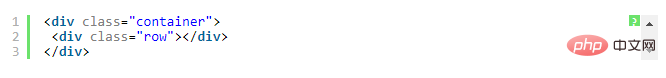
2. You can add columns (.column) in rows (.row), but the sum of the number of columns cannot exceed the total number of bisected columns, such as 12. For example:

3. The specific content should be placed within the column container (column), and only the column (column) can be used as a direct child of the row container (.row) Element
4. Create spacing between columns by setting padding. Then offset the effect of padding by setting negative margins for the first and last columns.
In order to better understand how the grid system of the Bootstrap framework works, let’s take a look A sketch:
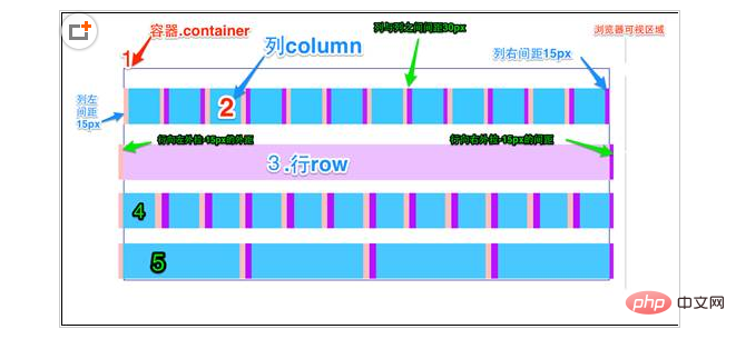
A brief explanation of the diagram:
1. The outermost border, with a large white area, is equivalent to the browser's visible area. viewing area. There is a responsive effect in the grid system of the Bootstrap framework, which comes with four types of browsers (extra small screen, small screen, medium screen and large screen). Its breakpoints (pixel dividing points) are 768px, 992px and 1220px.
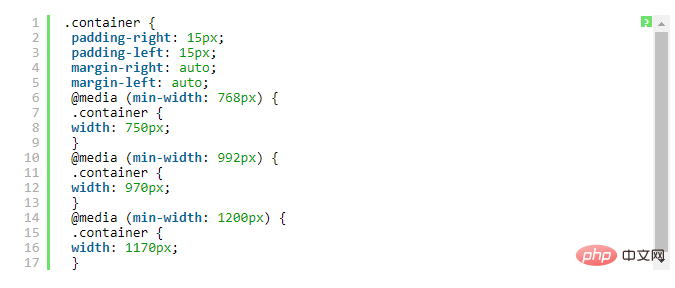
2. The second border (1) is equivalent to the container (.container). For different browser resolutions, the widths are different: automatic, 750px, 970px and 1170px. Set in lines 736 to 756 of bootstrap.css:
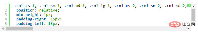
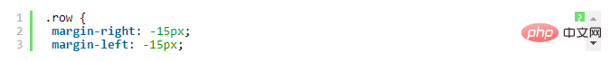
3. The No. 2 horizontal bar explains that the rows (.row) of the container are divided equally. 12 equal parts, that is, columns. Each column has a "padding-left:15px" (pink part in the picture) and a "padding-right:15px" (purple part in the picture). This also causes the padding-left of the first column and the padding-right of the last column to occupy 30px of the total width, making the page unsightly. Of course, this is a good approach if you need to leave a certain spacing. As shown in lines 767 to 772 of bootstrap.css:
4. The No. 3 horizontal bar is the row container (.row), which defines "margin- The values of "left" and "margin-right" are "-15px", which are used to offset the left padding of the first column and the right padding of the last column. You can see in lines 763~767 of bootstrap.css:
5. Put the rows and columns together to see the effect of horizontal bar 4 . That is what we expect to see, there is no space between the first column and the last column and the container (.container).
Horizontal 5 just wants to show everyone that you can arbitrarily combine columns according to your needs, but the sum of their combinations should not exceed the total number of columns.
3. Grid options
The following screenshots can clearly see how Bootstrap’s grid system works on a variety of different mobile devices.
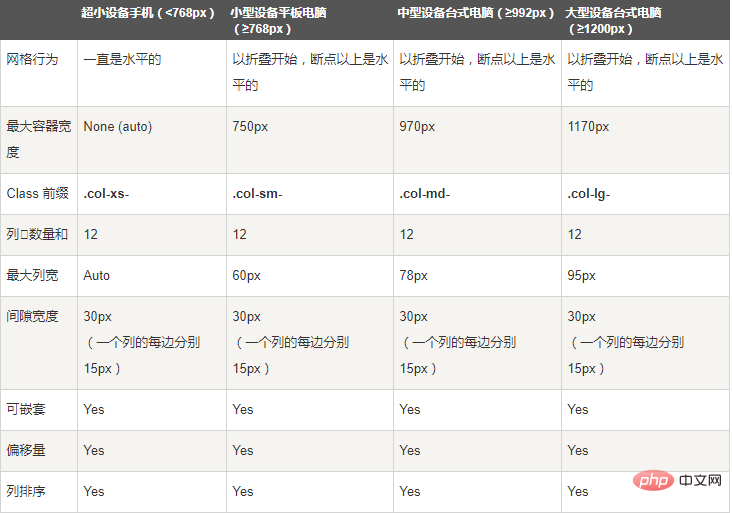
As you can see from the screenshot above, Bootstrap has set up different style classes for different screen sizes (including mobile phones, tablets, PCs, etc.), so that developers can have more choices when developing. According to my understanding: If multiple different above style classes are used on an element, then the element will choose the most appropriate (best matched) style class according to different sizes. A simple example to illustrate: For example, we use two style classes on an element: .col-md- and .col-lg. You can compare it with the screenshot above to see
The first situation: Size》=1200px; then .col-lg will be selected.
Second case: Size》=992px and size》=1200px; then .col-md will be selected.
The third case: If the size is
4. Basic usage
The grid system is used for layout, which is actually a combination of columns. There are four basic uses of the grid system in the Bootstrap framework. Since the Bootstrap framework uses different grid styles for different screen sizes, the examples involved in this section are introduced using the medium screen (970px) as an example. The use of other screens is similar to this one.
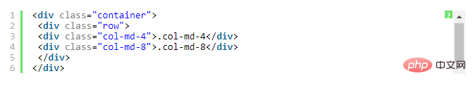
1), column combination
The simple understanding of column combination is to change the numbers to merge the columns (principle: the total number of columns cannot exceed 12), which is somewhat similar to the colspan of the table Attributes, for example:

#Using the above structure, you will see the effect of the following picture:

5. Column offset
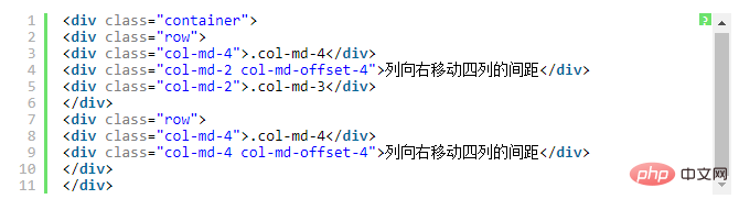
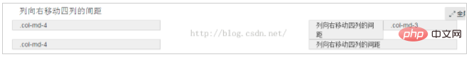
Sometimes, we don’t want two adjacent columns to be close together, but we don’t want to use margin or other technical means. At this time, you can use the column offset (offset) function to achieve this. Using column offset is also very simple. You only need to add the class name "col-md-offset-*" to the column element (where the asterisk represents the number of column combinations to be offset), then the column with this class name will be Offset right. For example, if you add "col-md-offset-4" to a column element, it means that the column is moved to the right by 4 column widths.
Like the sample code above, the effect is as follows
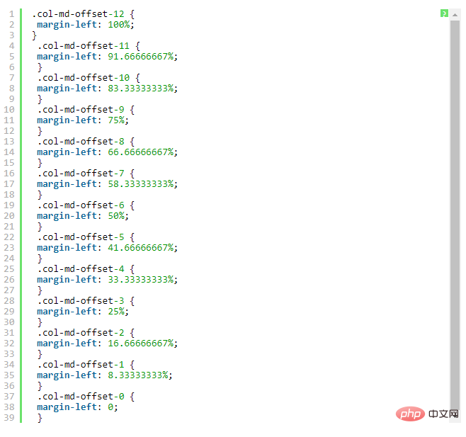
The implementation principle is very simple, that is, using twelve points One (1/12) margin-left. Then there are as many margin-lefts as there are offsets. As shown in lines 1205 to 1241 in bootstrap.css:
Note:
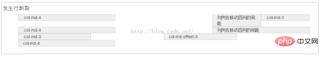
But there is one detail to pay attention to, use "col-md- offset-*" when shifting a column to the right, make sure that the total number of columns and offset columns does not exceed 12, otherwise the column will be displayed with broken rows, such as:
.col-md-3
col-md-offset-3
col-md-4
The total number of columns and offset columns in the above code is 3 3 3 4 = 13>12, so column breaks occur.
Like the above sample code, the effect is as follows
6. Column sorting
Column sorting is actually changing the columns The direction is to change the left and right floating and set the floating distance. In the grid system of the Bootstrap framework, this is done by adding the class names "col-md-push-*" and "col-md-pull-*" (where the asterisk represents the number of column combinations to move).
Let’s take a look at a simple example:
By default, the above code has the following effect:

"col-md-4" is on the left and "col-md-8" is on the right. If you want to swap positions, you need to move "col-md-4" 8 places to the right. The distance between columns is 8 offsets, that is, adding the class name "col-md-push-8" to "
" and calling its style.
Also move "col-md-8" 4 columns to the left, that is, 4 offsets, and add it on "
" Class name "col-md-pull-4":

7. Column nesting
The grid system of the Bootstrap framework also supports column nesting. You can add one or more row containers to a column, and then insert columns into the row containers (using columns as described previously). But in the row container (row) in the column container, when the width is 100%, it is the width of the current outer column. Let’s look at a simple example:
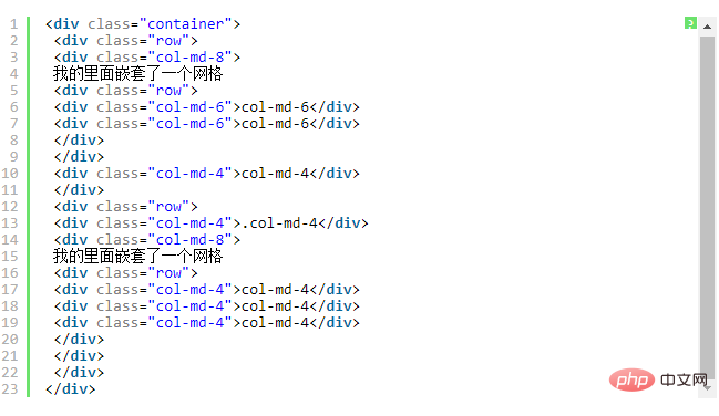
The effect is as follows:

Note: The total number of nested columns also needs to follow different More than 12 columns. Otherwise, the last column will be displayed in a new line.
The above is the detailed content of What is the bootstrap deletion system?. For more information, please follow other related articles on the PHP Chinese website!

Hot AI Tools

Undresser.AI Undress
AI-powered app for creating realistic nude photos

AI Clothes Remover
Online AI tool for removing clothes from photos.

Undress AI Tool
Undress images for free

Clothoff.io
AI clothes remover

Video Face Swap
Swap faces in any video effortlessly with our completely free AI face swap tool!

Hot Article
Hot Tools

Notepad++7.3.1
Easy-to-use and free code editor

SublimeText3 Chinese version
Chinese version, very easy to use

Zend Studio 13.0.1
Powerful PHP integrated development environment

Dreamweaver CS6
Visual web development tools

SublimeText3 Mac version
God-level code editing software (SublimeText3)
Hot Topics
 1387
1387
 52
52

 Do I need to use flexbox in the center of the Bootstrap picture?
Apr 07, 2025 am 09:06 AM
Do I need to use flexbox in the center of the Bootstrap picture?
Apr 07, 2025 am 09:06 AM
There are many ways to center Bootstrap pictures, and you don’t have to use Flexbox. If you only need to center horizontally, the text-center class is enough; if you need to center vertically or multiple elements, Flexbox or Grid is more suitable. Flexbox is less compatible and may increase complexity, while Grid is more powerful and has a higher learning cost. When choosing a method, you should weigh the pros and cons and choose the most suitable method according to your needs and preferences.
 How to get the bootstrap search bar
Apr 07, 2025 pm 03:33 PM
How to get the bootstrap search bar
Apr 07, 2025 pm 03:33 PM
How to use Bootstrap to get the value of the search bar: Determines the ID or name of the search bar. Use JavaScript to get DOM elements. Gets the value of the element. Perform the required actions.
 How to do vertical centering of bootstrap
Apr 07, 2025 pm 03:21 PM
How to do vertical centering of bootstrap
Apr 07, 2025 pm 03:21 PM
Use Bootstrap to implement vertical centering: flexbox method: Use the d-flex, justify-content-center, and align-items-center classes to place elements in the flexbox container. align-items-center class method: For browsers that do not support flexbox, use the align-items-center class, provided that the parent element has a defined height.
 How to write split lines on bootstrap
Apr 07, 2025 pm 03:12 PM
How to write split lines on bootstrap
Apr 07, 2025 pm 03:12 PM
There are two ways to create a Bootstrap split line: using the tag, which creates a horizontal split line. Use the CSS border property to create custom style split lines.
 Bootstrap Accessibility: Building Inclusive and User-Friendly Websites
Apr 07, 2025 am 12:04 AM
Bootstrap Accessibility: Building Inclusive and User-Friendly Websites
Apr 07, 2025 am 12:04 AM
Building an inclusive and user-friendly website with Bootstrap can be achieved through the following steps: 1. Enhance screen reader support with ARIA tags; 2. Adjust color contrast to comply with WCAG standards; 3. Ensure keyboard navigation is friendly. These measures ensure that the website is friendly and accessible to all users, including those with barriers.
 How to resize bootstrap
Apr 07, 2025 pm 03:18 PM
How to resize bootstrap
Apr 07, 2025 pm 03:18 PM
To adjust the size of elements in Bootstrap, you can use the dimension class, which includes: adjusting width: .col-, .w-, .mw-adjust height: .h-, .min-h-, .max-h-
 How to use bootstrap button
Apr 07, 2025 pm 03:09 PM
How to use bootstrap button
Apr 07, 2025 pm 03:09 PM
How to use the Bootstrap button? Introduce Bootstrap CSS to create button elements and add Bootstrap button class to add button text
 How to set up the framework for bootstrap
Apr 07, 2025 pm 03:27 PM
How to set up the framework for bootstrap
Apr 07, 2025 pm 03:27 PM
To set up the Bootstrap framework, you need to follow these steps: 1. Reference the Bootstrap file via CDN; 2. Download and host the file on your own server; 3. Include the Bootstrap file in HTML; 4. Compile Sass/Less as needed; 5. Import a custom file (optional). Once setup is complete, you can use Bootstrap's grid systems, components, and styles to create responsive websites and applications.
