

What's new in css3

The new contents of css3 include: 1. Child selector, used to select elements with a specific parent element; 2. Sibling selector, used to select sibling elements immediately after another element; 3. Other sibling selectors; 4. Structural pseudo-class selectors; 5. Pseudo-element selectors, etc.
The operating environment of this article: windows7 system, css3 version, DELL G3 computer.
New content in CSS3:
##New content in CSS3 Selector
Child selector Child selector is used to select elements with a specific parent element
.box > p{
background-color: pink}Sibling selector Adjacent sibling selector: used to select sibling elements immediately following another element, and both have the same parent element
h1 + p{
margin-top:50px; 满足h1相邻的p标签 }Other sibling selectors Match all element2 elements after element1 in the same parent element. The two elements are the same parent element
h2 ~ p{
background: ff0000; 和h2同级的其他选择器} Structure pseudo-class selector nth-child(n) :n can be numbers, keywords and formulas
Common keywords even: even number, odd: odd number
| Function | |
|---|---|
| Matches the first child element of the parent element e | |
| matches the last e element in the parent element | |
| matches the nth child in the parent element Element e | |
| Specifies the first element of type e | |
| Specifies the last | |
| Specifies the nth | # of type e
Add a new pseudo element, the browser can recognize both single colon and double colon, and double colon is the h5 grammar specification Pseudo elements can only be added to double tags The attribute content:"";
must be written in the pseudo element. There cannot be a space before the colon of the pseudo element
before and after create an element, which is an inline element
| e::after | |
| e:first-letter | |
| e::first-line | |
 input[name]{  选择input中带有name属性的选择器    width:30px;
    height:30px;
  }
  input[type="checkbox"]{  选择input中type="checkbox"属性的选择器    width:30px;
    height:30px;
  }
  input[type^="check"]{  包含input中type="check"开头属性的选择器    width:30px;
    height:30px;
  }
  input[class&="check"]{  包含input中class="box"结尾属性的选择器    width:30px;
    height:30px;
  }
   input[class*="eck"]{  包含input中含有class="eck"属性的选择器    width:30px;
height:30px;New selector weight
The weight of pseudo-class selectors and attribute selectors is equal to the class selector The weight of pseudo-element selectors is equal to the label selector CSS3 box model
css3 can be achieved through box-sizing Specify the box model so that we can set how to calculate the total width and total height of an element
content-box standard mode
The total size of the box is width padding border, and the content area is width and height Part
border-box weird mode
The box size is width and height, add padding and border, the content area will shrink
Border fillet border-radius Set the circle of the border Angular
border-radius: 100px/50px 分别设置水平方向和垂直方向半径border-bottom-right-radius: 50px; 单一属性设置右下角设置
text-shadow text shadow
The horizontal shadow, vertical shadow, blur distance and shadow color can be specified through attribute values
text-shadow text shadow The horizontal shadow, vertical shadow, blur distance and shadow color can be specified through the attribute value
| v-shadow | |
| blur | |
| color | |
文字阴影:水平位置 垂直位置 模糊程度 颜色text-shadow: 10px 20px 5px #f00; Copy after login | Multi-layer shadow: The first written shadow is overlaid on the later written shadow
| ##h-shadow | ||||||||||||
|---|---|---|---|---|---|---|---|---|---|---|---|---|
| v-shadow | Required, vertical shadow position | |||||||||||
| blur | Blur distance | |||||||||||
| ##spread | Shadow size | |||||||||||
| color | Shadow color | |||||||||||
| inset | Outer shadow changed to inner shadow | |||||||||||
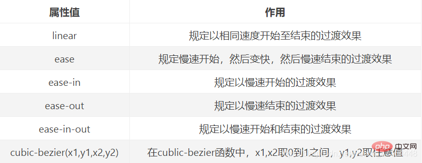
边框阴影:水平位置 垂直位置 模糊程度 拓展大小 颜色 是否内边框阴影box-shadow: 20px 20px 5px 20px #f00 inset; Copy after login 过渡属性transition
transition-property过渡的属性 .box{
width: 100px;
height: 100px;
background-color: aquamarine;
transition: all 2s linear 0s; 过渡属性的使用(动画效果) }
.box:hover{
width: 500px;
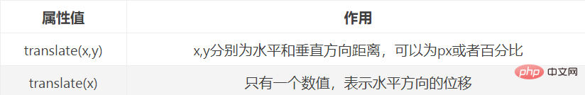
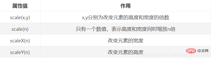
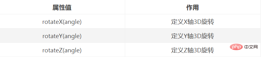
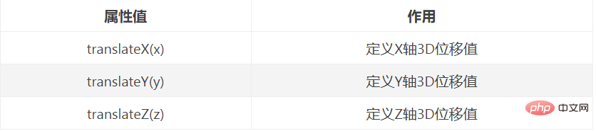
}Copy after login 2D转换-transform transform: translate(10px,10px); Copy after login 缩放scale() transform: rotate(30deg); Copy after login 倾斜skew() transform-origin: left top; 以左上角为基准点 Copy after login 3D转换 transform-style: preserve-3d; Copy after login 浏览器兼容 动画 animation属性 小球运动动画代码 <!DOCTYPE html>
<html lang="en">
<head>
<meta charset="UTF-8">
<meta name="viewport" content="width=device-width, initial-scale=1.0">
<title>Document</title>
<style>
*{
margin: 0;
padding: 0;
}
.box{
width: 100px;
height: 100px;
border-radius: 50%;
margin: 200px auto;
background-color: skyblue;
/* 添加绑定动画 */
animation: move1 2s linear infinite;
}
/* 开头和结尾定义动画效果 */
@keyframes move{
from{
transform: translateY(0);
}
to{
transform: translateY(150px);
}
}
@keyframes move1{
0%{
transform: translateY(0);
}
25%{
transform: translateY(200px);
}
50%{
transform: translateY(0);
}
75%{
transform: translateY(-200px);
}
100%{
transform: translateY(0);
}
}
</style>
</head>
<body>
<p class="box">
</p>
</body>
</html>Copy after login
The above is the detailed content of What's new in css3. For more information, please follow other related articles on the PHP Chinese website! Statement of this Website
The content of this article is voluntarily contributed by netizens, and the copyright belongs to the original author. This site does not assume corresponding legal responsibility. If you find any content suspected of plagiarism or infringement, please contact admin@php.cn

Hot AI Tools
Undresser.AI UndressAI-powered app for creating realistic nude photos 
AI Clothes RemoverOnline AI tool for removing clothes from photos. 
Undress AI ToolUndress images for free 
Clothoff.ioAI clothes remover 
AI Hentai GeneratorGenerate AI Hentai for free. 
Hot Article
R.E.P.O. Energy Crystals Explained and What They Do (Yellow Crystal)
1 months ago
By 尊渡假赌尊渡假赌尊渡假赌
R.E.P.O. Best Graphic Settings
1 months ago
By 尊渡假赌尊渡假赌尊渡假赌
Assassin's Creed Shadows: Seashell Riddle Solution
2 weeks ago
By DDD
R.E.P.O. How to Fix Audio if You Can't Hear Anyone
1 months ago
By 尊渡假赌尊渡假赌尊渡假赌
R.E.P.O. Chat Commands and How to Use Them
1 months ago
By 尊渡假赌尊渡假赌尊渡假赌
Hot Tools
Notepad++7.3.1Easy-to-use and free code editor 
SublimeText3 Chinese versionChinese version, very easy to use 
Zend Studio 13.0.1Powerful PHP integrated development environment 
Dreamweaver CS6Visual web development tools 
SublimeText3 Mac versionGod-level code editing software (SublimeText3)
Hot Topics
CakePHP Tutorial
 1379
1379
 52
52
 How to achieve wave effect with pure CSS3? (code example)
Jun 28, 2022 pm 01:39 PM
How to achieve wave effect with pure CSS3? (code example)
Jun 28, 2022 pm 01:39 PM
How to achieve wave effect with pure CSS3? This article will introduce to you how to use SVG and CSS animation to create wave effects. I hope it will be helpful to you!  Use CSS skillfully to realize various strange-shaped buttons (with code)
Jul 19, 2022 am 11:28 AM
Use CSS skillfully to realize various strange-shaped buttons (with code)
Jul 19, 2022 am 11:28 AM
This article will show you how to use CSS to easily realize various weird-shaped buttons that appear frequently. I hope it will be helpful to you!  How to hide elements in css without taking up space
Jun 01, 2022 pm 07:15 PM
How to hide elements in css without taking up space
Jun 01, 2022 pm 07:15 PM
Two methods: 1. Using the display attribute, just add the "display:none;" style to the element. 2. Use the position and top attributes to set the absolute positioning of the element to hide the element. Just add the "position:absolute;top:-9999px;" style to the element.  How to implement lace borders in css3
Sep 16, 2022 pm 07:11 PM
How to implement lace borders in css3
Sep 16, 2022 pm 07:11 PM
In CSS, you can use the border-image attribute to achieve a lace border. The border-image attribute can use images to create borders, that is, add a background image to the border. You only need to specify the background image as a lace style; the syntax "border-image: url (image path) offsets the image border width inward. Whether outset is repeated;".  It turns out that text carousel and image carousel can also be realized using pure CSS!
Jun 10, 2022 pm 01:00 PM
It turns out that text carousel and image carousel can also be realized using pure CSS!
Jun 10, 2022 pm 01:00 PM
How to create text carousel and image carousel? The first thing everyone thinks of is whether to use js. In fact, text carousel and image carousel can also be realized using pure CSS. Let’s take a look at the implementation method. I hope it will be helpful to everyone!  How to enlarge the image by clicking the mouse in css3
Apr 25, 2022 pm 04:52 PM
How to enlarge the image by clicking the mouse in css3
Apr 25, 2022 pm 04:52 PM
Implementation method: 1. Use the ":active" selector to select the state of the mouse click on the picture; 2. Use the transform attribute and scale() function to achieve the picture magnification effect, the syntax "img:active {transform: scale(x-axis magnification, y Axis magnification);}".  How to set animation rotation speed in css3
Apr 28, 2022 pm 04:32 PM
How to set animation rotation speed in css3
Apr 28, 2022 pm 04:32 PM
In CSS3, you can use the "animation-timing-function" attribute to set the animation rotation speed. This attribute is used to specify how the animation will complete a cycle and set the speed curve of the animation. The syntax is "element {animation-timing-function: speed attribute value;}".  Does css3 animation effect have deformation?
Apr 28, 2022 pm 02:20 PM
Does css3 animation effect have deformation?
Apr 28, 2022 pm 02:20 PM
The animation effect in css3 has deformation; you can use "animation: animation attribute @keyframes ..{..{transform: transformation attribute}}" to achieve deformation animation effect. The animation attribute is used to set the animation style, and the transform attribute is used to set the deformation style. . 
|