 Web Front-end
 JS Tutorial
 Detailed explanation of the underlying principles of CSS and JS animation and how to optimize their performance
Detailed explanation of the underlying principles of CSS and JS animation and how to optimize their performance
javascriptThis column introduces the underlying principles of CSS and JS animation

Overview##Related free learning recommendations: javascript (Video)
You no doubt know that animation plays an important role in creating eye-catching web applications. As users increasingly turn their attention to user experience, merchants are beginning to realize the importance of a flawless, enjoyable user experience, and as a result, web applications are becoming heavier and with more dynamically interactive UIs. This all requires more complex animations to allow users to transition from state to state more smoothly throughout the process. Today, this is not even considered anything special. Users are becoming increasingly picky and, by default, expect highly responsive and interactive user interfaces. However, animating the interface is not necessarily simple. What is animation, when should animation be used, and what kind of video effects should animation have? These are all thorny questions. JavaScript and CSS Animation ComparisonThe two main methods of creating web animations are using JavaScript and CSS. There is no right or wrong choice, it all depends on the effect you want to achieve. CSS AnimationAnimate with CSS The easiest way to make elements move on the screen. Here's going to start with a simple example of how to make an element move 50px on the X and Y axes, using a CSS transition that lasts 1 second.
.box {
  -webkit-transform: translate(0, 0);
  -webkit-transition: -webkit-transform 1000ms;

  transform: translate(0, 0);
  transition: transform 1000ms;
}

.box.move {
  -webkit-transform: translate(50px, 50px);
  transform: translate(50px, 50px);
}move class, the value of transform is changed and the transition effect occurs.
easing attribute, which is actually the movement speed of the animation. This parameter will be introduced in detail later.
p class="box">
  Sample content.
var boxElements = document.getElementsByClassName('box'),
    boxElementsLength = boxElements.length,
    i;

for (i = 0; i The above code snippet is to add the <p>move<code> class to all elements containing the </code>box<code> class to trigger animation. </code></p>Doing this can provide a good balance for your application. You can focus on managing state using JavaScript, just set the appropriate class on the target element and let the browser handle the animation. If you go this route, you can listen to the <p>transitionend<code> event on the element, but only if you drop support for older versions of Internet Explorer: </code></p><p><img src="/static/imghw/default1.png" data-src="https://img.php.cn/upload/image/590/600/983/1607592778931586.png" class="lazy" title="1607592778931586.png" alt="Detailed explanation of the underlying principles of CSS and JS animation and how to optimize their performance"></p>Listening<p>transitionend<code> The triggered event is as follows: </code></p><pre class="brush:php;toolbar:false">var boxElement = document.querySelector('.box');
boxElement.addEventListener('transitionend', onTransitionEnd, false);

function onTransitionEnd() {
  // Handle the transition finishing.
}.box {
/* 动画的名字 */
animation-name: movingBox;
/* 动画的持续时间 */
animation-duration: 2300ms;
/* 动画的运行次数 */
animation-iteration-count: infinite;
/* 设置对象动画在循环中是否反向运动的方法 */
animation-direction: alternate;
}
@keyframes movingBox {
0% {
transform: translate(0, 0);
opacity: 0.4;
}
25% {
opacity: 0.9;
}
50% {
transform: translate(150px, 200px);
opacity: 0.2;
}
100% {
transform: translate(40px, 30px);
opacity: 0.8;
}
}var boxElement = document.querySelector('.box');
var animation = boxElement.animate([
{transform: 'translate(0)'},
{transform: 'translate(150px, 200px)'}
])
animation.addEventListener('finish', function() {
boxElement.style.transform = 'translate(150px, 200px)';
})finish event and set the box.style.transform property to translate(150px, 200px), which value It's the same second style transition performed by CSS animations.
当然,没有任何东西从一个点到另一个点线性移动。 实际上,当事物在我们周围的物理世界中移动时,事物往往会加速或减速,因为我们不是在真空中,并且有不同的因素会影响这一点。 人类的大脑会期望感受这样的移动,所以当为网络应用制作动画的时候,利用此类知识会对自己会有好处。
以下是一些术语需要了解一下:
- ease in — 相对于匀速,开始的时候慢,之后快
- ease out — 相对于匀速,开始时快,结束时候间慢
- ease-in-out — 相对于匀速,开始和结束都慢)两头慢
Easing 关键字
CSS 过渡和动画允许你选择要使用的 easing 类型。 不同的关键字会影响动画的 easing,你也可以完全自定义 easing 方法。
以下为可以选择用来控制 easing 的 CSS 关键字:
- linear
- ease-in
- ease-out
- ease-in-out
让我们深入来了解一下这几个兄弟,并看它们各自展示的效果是怎么样。
Linear 动画
easing 方法的的默认为 linear,以下为 linear 过渡效果的图示:
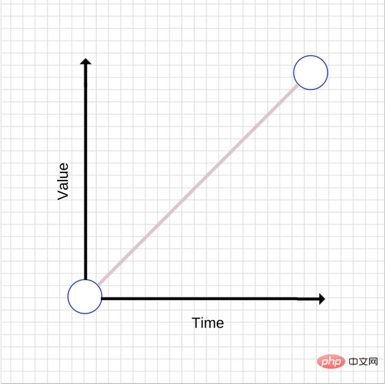
随着时间增加,值等比增加,使用 linear 动效,会让动画不自然,一般来说,避免使用 linear 动效。
以下是如何实现简单的线性动画:
transition: transform 500ms linear;
Ease-out 动画
如前所述,与线性动画相比,easing out 动画开始时快,结束时候间慢,过渡效果的图示如下:
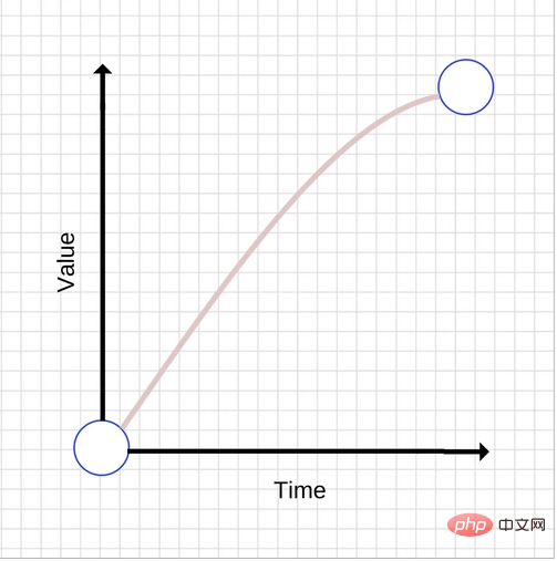
一般来说,easing out过渡效果是最适合做界面体验的,因为快速地启动会给人以快速响应的动画的感觉,而结束时让人感觉很平滑这得归功于不一致的移动速度。
有很多方法可以实现 ease-out 效果,但最简单的是 CSS 中的 ease-out 关键字:
transition: transform 500ms ease-out;
Ease-in 动画
和 ease-out 动画相反-开始时快,结束时候间慢,过渡效果图如下:
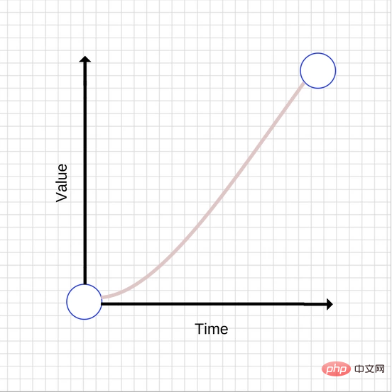
与 ease-out 动画相比, ease-in 可能会让人感到不寻常,由于启动缓慢给人以反应卡顿的感觉,因此会产生一种无反应的感觉。 动画结束很快也会产生一种奇怪的感觉,因为整个动画正在加速,而现实世界中的物体在突然停止时往往会减速。
和 ease-out 和 linear 动画类似,使用 CSS 关键字来实现 ease-in 动画:
transition: transform 500ms ease-in;
Ease-in-out 动画
该动画为 ease-in 和 ease-out 的合集,过渡效果图如下:
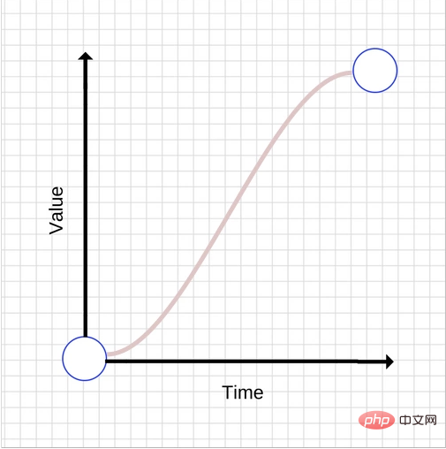
不要使用太长的动画持续时间,因为它们会让你的 UI 感觉没有响应。
用 ease-in-out CSS 关键字来实现 ease-in-out 动画:
transition: transform 500ms ease-in-out;
自定义 easing
你也可以定义自己的 easing 曲线,这可以更好地创建自己想要的动画效果。
实际上, ease-in,linear 及 ease 关键字映射到预定义 贝塞尔曲线 ,可以在 CSS transitions specification 和 Web Animations specification 中查找更多关于贝塞尔曲线的内容。
贝塞尔曲线 (Bézier curves)
Bézier curve(贝塞尔曲线)是应用于二维图形应用程序的数学曲线。 曲线定义:起始点、终止点(也称锚点)、控制点。通过调整控制点,贝塞尔曲线的形状会发生变化。 1962年,法国数学家Pierre Bézier第一个研究了这种矢量绘制曲线的方法,并给出了详细的计算公式,因此按照这样的公式绘制出来的曲线就用他的姓氏来命名,称为贝塞尔曲线。
CSS3 transition-timing-function 属性,其语法如下:
transition-timing-function: linear|ease|ease-in|ease-out|ease-in-out|cubic-bezier(n,n,n,n);
总而言之可以用cubic-bezier(n,n,n,n)的形式来表示全部的属性值,这里就涉及到贝塞尔曲线(Bézier curve)。
让我们看看贝塞尔曲线的工作原理。 贝塞尔曲线需要四个值,或者更准确地说它需要两对数字。 每对描述立方贝塞尔曲线控制点的 X 和 Y 坐标。贝塞尔曲线的起点有一个坐标 (0, 0) ,结束坐标是 (1, 1)。 你可以设置两个对号,两个控制点的 X 值必须在 [0,1] 范围内,并且每个控制点的 Y 值可以超过 [0,1] 限制,尽管规定不清楚多少。
即使每个控制点的 X 和 Y 值稍有变化,也会得到完全不同的曲线。让我们看两张贝塞尔曲线的图,两张图相近但坐标的控制结点却不同。
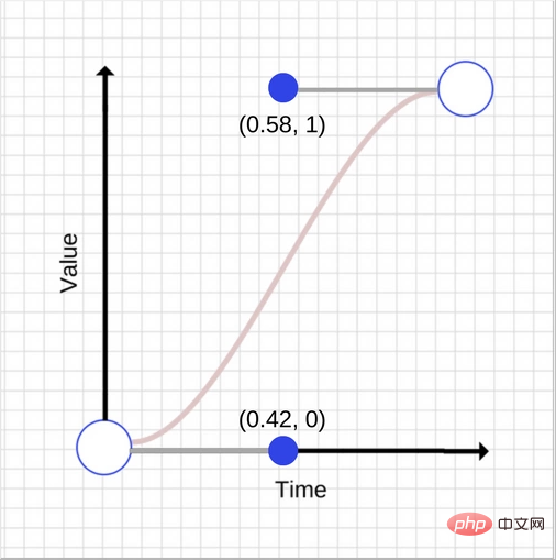
和
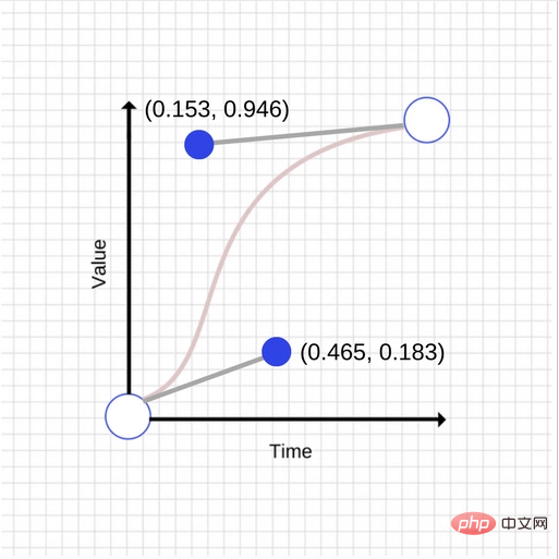
如您所见,两张图有很大的不同, 第一个控制点矢量差为 (0.045,0.183) 矢量差,而第二控制点矢量差为 (-0.427, -0.054) 。
第二条曲线的样式为:
transition: transform 500ms cubic-bezier(0.465, 0.183, 0.153, 0.946);
前两个数字是第一个控制点的 X 和 Y 坐标,后两个数字是第二个控制点的 X 和 Y 坐标。
性能优化
当你在使用动画的时候,你应该维持 60 帧每秒,否则会影响用户体验。
和世界上的其他事物一样,动画也会有性能的开销。一些属性的动画性能开销相比其它属性要小。例如,为元素的 width 和 height 做动画会更改其几何结构并且可能会造成页面上的其它元素移动或者大小的改变,这个过程称为布局。我们在之前的一篇文章 中更详细地讨论了布局和渲染。
通常,你应该避免动画触发布局或重绘的属性。 对于大多数现代浏览器,这意味着把动画局限于 opacity 和 transform 属性。
Will-change
你可以使用 will-change 知浏览器你打算更改元素的属性,这允许浏览器在进行更改之前进行最适当的优化。但是,不要过度使用 will-change,因为这样做会导致浏览器浪费资源,从而导致更多的性能问题。
will-change 用法如下:
.box {
  will-change: transform, opacity;
}该属性在 Chrome, Firefox,Opera 得到很好的兼容。
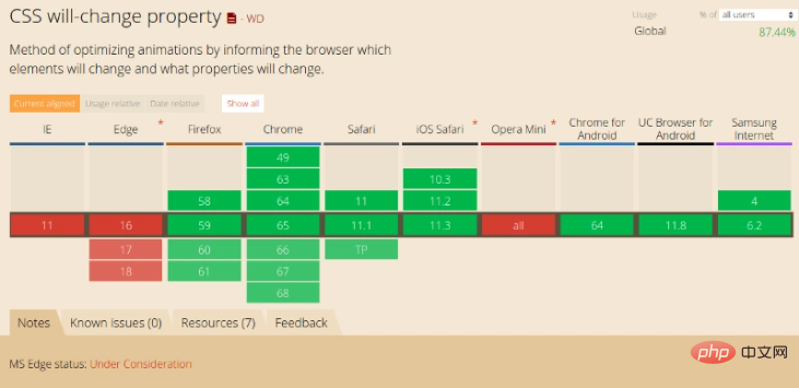
JavaScript 动画和 CSS 动画该如果抉择
- 根据 Google Developer,渲染线程分为 主线程 (main thread) 和 合成线程 (compositor thread)。如果 CSS 动画只是改变
transforms和opacity,这时整个 CSS 动画得以在 合成线程 完成(而JS动画则会在 主线程 执行,然后触发合成线程进行下一步操作),在 JS 执行一些昂贵的任务时,主线程繁忙,CSS 动画由于使用了合成线程可以保持流畅 - 在许多情况下,也可以由合成线程来处理
transforms和opacity属性值的更改。 - 对于帧速表现不好的低版本浏览器,CSS3可以做到自然降级,而JS则需要撰写额外代码。
- CSS动画有天然事件支持(TransitionEnd、AnimationEnd,但是它们都需要针对浏览器加前缀),JS则需要自己写事件。
- 如果有任何动画触发绘画,布局或两者,则需要 “主线程” 才能完成工作。 这对于基于 CSS 和 JavaScript 的动画都是如此,布局或绘制的开销可能会使与 CSS 或 JavaScript 执行相关的任何工作相形见绌,这使得问题没有实际意义。
- CSS3有兼容性问题,而JS大多时候没有兼容性问题。
总结
如果动画只是简单的状态切换,不需要中间过程控制,在这种情况下,css 动画是优选方案。它可以让你将动画逻辑放在样式文件里面,而不会让你的页面充斥 Javascript 库。然而如果你在设计很复杂的富客户端界面或者在开发一个有着复杂 UI 状态的 APP。那么你应该使用 js 动画,这样你的动画可以保持高效,并且你的工作流也更可控。所以,在实现一些小的交互动效的时候,就多考虑考虑 CSS 动画。对于一些复杂控制的动画,使用 javascript 比较可靠。
The above is the detailed content of Detailed explanation of the underlying principles of CSS and JS animation and how to optimize their performance. For more information, please follow other related articles on the PHP Chinese website!

Hot AI Tools

Undresser.AI Undress
AI-powered app for creating realistic nude photos

AI Clothes Remover
Online AI tool for removing clothes from photos.

Undress AI Tool
Undress images for free

Clothoff.io
AI clothes remover

Video Face Swap
Swap faces in any video effortlessly with our completely free AI face swap tool!

Hot Article

Hot Tools

Notepad++7.3.1
Easy-to-use and free code editor

SublimeText3 Chinese version
Chinese version, very easy to use

Zend Studio 13.0.1
Powerful PHP integrated development environment

Dreamweaver CS6
Visual web development tools

SublimeText3 Mac version
God-level code editing software (SublimeText3)

Hot Topics
 1386
1386
 52
52
 Which AI programmer is the best? Explore the potential of Devin, Tongyi Lingma and SWE-agent
Apr 07, 2024 am 09:10 AM
On March 3, 2022, less than a month after the birth of the world's first AI programmer Devin, the NLP team of Princeton University developed an open source AI programmer SWE-agent. It leverages the GPT-4 model to automatically resolve issues in GitHub repositories. SWE-agent's performance on the SWE-bench test set is similar to Devin, taking an average of 93 seconds and solving 12.29% of the problems. By interacting with a dedicated terminal, SWE-agent can open and search file contents, use automatic syntax checking, edit specific lines, and write and execute tests. (Note: The above content is a slight adjustment of the original content, but the key information in the original text is retained and does not exceed the specified word limit.) SWE-A
 PHP and Vue: a perfect pairing of front-end development tools
Mar 16, 2024 pm 12:09 PM
PHP and Vue: a perfect pairing of front-end development tools. In today's era of rapid development of the Internet, front-end development has become increasingly important. As users have higher and higher requirements for the experience of websites and applications, front-end developers need to use more efficient and flexible tools to create responsive and interactive interfaces. As two important technologies in the field of front-end development, PHP and Vue.js can be regarded as perfect tools when paired together. This article will explore the combination of PHP and Vue, as well as detailed code examples to help readers better understand and apply these two
 Revealing the appeal of C language: Uncovering the potential of programmers
Feb 24, 2024 pm 11:21 PM
The Charm of Learning C Language: Unlocking the Potential of Programmers With the continuous development of technology, computer programming has become a field that has attracted much attention. Among many programming languages, C language has always been loved by programmers. Its simplicity, efficiency and wide application make learning C language the first step for many people to enter the field of programming. This article will discuss the charm of learning C language and how to unlock the potential of programmers by learning C language. First of all, the charm of learning C language lies in its simplicity. Compared with other programming languages, C language
 Questions frequently asked by front-end interviewers
Mar 19, 2024 pm 02:24 PM
In front-end development interviews, common questions cover a wide range of topics, including HTML/CSS basics, JavaScript basics, frameworks and libraries, project experience, algorithms and data structures, performance optimization, cross-domain requests, front-end engineering, design patterns, and new technologies and trends. . Interviewer questions are designed to assess the candidate's technical skills, project experience, and understanding of industry trends. Therefore, candidates should be fully prepared in these areas to demonstrate their abilities and expertise.
 Simple JavaScript Tutorial: How to Get HTTP Status Code
Jan 05, 2024 pm 06:08 PM
JavaScript tutorial: How to get HTTP status code, specific code examples are required. Preface: In web development, data interaction with the server is often involved. When communicating with the server, we often need to obtain the returned HTTP status code to determine whether the operation is successful, and perform corresponding processing based on different status codes. This article will teach you how to use JavaScript to obtain HTTP status codes and provide some practical code examples. Using XMLHttpRequest
 Is Django front-end or back-end? check it out!
Jan 19, 2024 am 08:37 AM
Django is a web application framework written in Python that emphasizes rapid development and clean methods. Although Django is a web framework, to answer the question whether Django is a front-end or a back-end, you need to have a deep understanding of the concepts of front-end and back-end. The front end refers to the interface that users directly interact with, and the back end refers to server-side programs. They interact with data through the HTTP protocol. When the front-end and back-end are separated, the front-end and back-end programs can be developed independently to implement business logic and interactive effects respectively, and data exchange.
 Exploring Go language front-end technology: a new vision for front-end development
Mar 28, 2024 pm 01:06 PM
As a fast and efficient programming language, Go language is widely popular in the field of back-end development. However, few people associate Go language with front-end development. In fact, using Go language for front-end development can not only improve efficiency, but also bring new horizons to developers. This article will explore the possibility of using the Go language for front-end development and provide specific code examples to help readers better understand this area. In traditional front-end development, JavaScript, HTML, and CSS are often used to build user interfaces
 Django: A magical framework that can handle both front-end and back-end development!
Jan 19, 2024 am 08:52 AM
Django: A magical framework that can handle both front-end and back-end development! Django is an efficient and scalable web application framework. It is able to support multiple web development models, including MVC and MTV, and can easily develop high-quality web applications. Django not only supports back-end development, but can also quickly build front-end interfaces and achieve flexible view display through template language. Django combines front-end development and back-end development into a seamless integration, so developers don’t have to specialize in learning


