 Web Front-end
 CSS Tutorial
 Introduction to the method of CSS3 Cubic-Bezier() to achieve link hover animation effect
Introduction to the method of CSS3 Cubic-Bezier() to achieve link hover animation effect

We will use CSS3 animated transitions to create a simple but engaging link hover effect that will cause a small popup to pop up when you hover your mouse over a link.
We'll also take a look at CSS3 Cubic-Bezier curves, which are CSS transitions that provide smoother motion for popovers, rather than rigid mechanical motion.
(Recommended tutorial: CSS video tutorial)
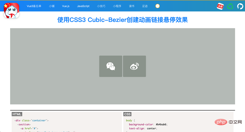
This is our final effect:

Let’s let's start!
HTML part
This is the HTML of our link, the icon comes from iconfont.cn.
<p>
  <section>
    <a>
      <i></i>
      <span>Instagram</span>
    </a>
    <a>
      <i></i>
      <span>Github</span>
    </a>
  </section>
</p>
The span tag will become a popup when you hover over the link. Next, we get into CSS.
CSS Styles and Animations
We center the p container so that the two links are centered on the screen. This also makes it easy to animate small pop-ups as they will pop up from the top of the link.
p.container {
  display: inline-block;
  position:absolute;
  top:50%;
  left:50%;
  -ms-transform:translate(-50%,-50%);
  -webkit-transform:translate(-50%,-50%);
  transform:translate(-50%,-50%);
}Next, we style the link, create a simple background hover effect, and position the social media icons.
a {
  color:#fff;
  background: #8a938b;
  border-radius:4px;
  text-align:center;
  text-decoration:none;
  position: relative;
  display: inline-block;
  width: 120px;
  height: 100px;
  padding-top:12px;
  margin:0 2px;
  -o-transition:all .5s;
  -webkit-transition: all .5s;
  -moz-transition: all .5s;
  transition: all .5s;
   -webkit-font-smoothing: antialiased;
}a:hover {
  background: #5a665e;
}i{
  font-size: 45px;
  vertical-align: middle;
  display: inline-block;
  position: relative;
  top: 20%;
}Next, we will style and animate the popup text.
a span {
  color:#666;
  position:absolute;
  font-family: 'Chelsea Market', cursive;
  bottom:0;
  left:-15px;
  right:-15px;
  padding: 15px 7px;
  z-index:-1;
  font-size:14px;
  border-radius:5px;
  background:#fff;
  visibility:hidden;
  opacity:0;
  -o-transition:all .5s cubic-bezier(0.68, -0.55, 0.265, 1.55);
  -webkit-transition: all .5s cubic-bezier(0.68, -0.55, 0.265, 1.55);
  -moz-transition: all .5s cubic-bezier(0.68, -0.55, 0.265, 1.55);
  transition: all .5s cubic-bezier(0.68, -0.55, 0.265, 1.55);
}/* 当图标处于悬停状态时,文本将弹出 */
a:hover span {
  bottom: 130px;
  visibility:visible;
  opacity:1;
}CSS3 Cubic-BezierThe curve consists of four points p0, p1, p2 and p3 definition. Point p0 is the starting point of the curve, and point p3 is the end point of the curve. The more linear the curve, the stiffer (or less fluid) the movement.
If one point is positive at first and the next point is negative, the motion will be slow at first. When the point value becomes higher than the previous point value, the movement speeds up.
This is the meaning of Cubic-Bezier points in CSS. Since the animation is short, the movements are subtle. The popover starts slowly at the bottom of the square and then starts to accelerate towards the top.
Although you can create animations without Cubic-Bezier curve transitions, the animations differ as follows:
Animation with Cubic-Bezier curve transitions

Animation without Cubic-Bezier curve transition

As you can see, the animation adds life to the hover effect.
The last set of CSS involves styling the little arrow at the bottom of the popup. To learn more about how to make triangles in CSS, check out this CSS tips article.
Summary
We created a minimalist button style link. Links have a basic background hover effect, but we don't stop there. We added a small popup to display the text of the link. With the help of CSS3 Cubic-Bezier Sel curves, the animation is smooth and pleasing to the eye.
This type of knowledge can be useful as part of the design of your website that displays your social media accounts.
Please visit the following address for the sample demonstration and complete code of this article. It is recommended to open https://coding.zhanbing.site on PC
for more programming-related knowledge , please visit: Introduction to Programming! !
The above is the detailed content of Introduction to the method of CSS3 Cubic-Bezier() to achieve link hover animation effect. For more information, please follow other related articles on the PHP Chinese website!

Hot AI Tools

Undresser.AI Undress
AI-powered app for creating realistic nude photos

AI Clothes Remover
Online AI tool for removing clothes from photos.

Undress AI Tool
Undress images for free

Clothoff.io
AI clothes remover

AI Hentai Generator
Generate AI Hentai for free.

Hot Article

Hot Tools

Notepad++7.3.1
Easy-to-use and free code editor

SublimeText3 Chinese version
Chinese version, very easy to use

Zend Studio 13.0.1
Powerful PHP integrated development environment

Dreamweaver CS6
Visual web development tools

SublimeText3 Mac version
God-level code editing software (SublimeText3)

Hot Topics
 1385
1385
 52
52
 An article about memory control in Node
Apr 26, 2023 pm 05:37 PM
The Node service built based on non-blocking and event-driven has the advantage of low memory consumption and is very suitable for handling massive network requests. Under the premise of massive requests, issues related to "memory control" need to be considered. 1. V8’s garbage collection mechanism and memory limitations Js is controlled by the garbage collection machine
 Explore how to write unit tests in Vue3
Apr 25, 2023 pm 07:41 PM
Vue.js has become a very popular framework in front-end development today. As Vue.js continues to evolve, unit testing is becoming more and more important. Today we’ll explore how to write unit tests in Vue.js 3 and provide some best practices and common problems and solutions.
 Let's talk in depth about the File module in Node
Apr 24, 2023 pm 05:49 PM
The file module is an encapsulation of underlying file operations, such as file reading/writing/opening/closing/delete adding, etc. The biggest feature of the file module is that all methods provide two versions of **synchronous** and **asynchronous**, with Methods with the sync suffix are all synchronization methods, and those without are all heterogeneous methods.
 PHP and Vue: a perfect pairing of front-end development tools
Mar 16, 2024 pm 12:09 PM
PHP and Vue: a perfect pairing of front-end development tools. In today's era of rapid development of the Internet, front-end development has become increasingly important. As users have higher and higher requirements for the experience of websites and applications, front-end developers need to use more efficient and flexible tools to create responsive and interactive interfaces. As two important technologies in the field of front-end development, PHP and Vue.js can be regarded as perfect tools when paired together. This article will explore the combination of PHP and Vue, as well as detailed code examples to help readers better understand and apply these two
 How to solve cross-domain issues? A brief analysis of common solutions
Apr 25, 2023 pm 07:57 PM
Cross-domain is a scenario often encountered in development, and it is also an issue often discussed in interviews. Mastering common cross-domain solutions and the principles behind them can not only improve our development efficiency, but also perform better in interviews.
 Questions frequently asked by front-end interviewers
Mar 19, 2024 pm 02:24 PM
In front-end development interviews, common questions cover a wide range of topics, including HTML/CSS basics, JavaScript basics, frameworks and libraries, project experience, algorithms and data structures, performance optimization, cross-domain requests, front-end engineering, design patterns, and new technologies and trends. . Interviewer questions are designed to assess the candidate's technical skills, project experience, and understanding of industry trends. Therefore, candidates should be fully prepared in these areas to demonstrate their abilities and expertise.
 Learn more about Buffers in Node
Apr 25, 2023 pm 07:49 PM
At the beginning, JS only ran on the browser side. It was easy to process Unicode-encoded strings, but it was difficult to process binary and non-Unicode-encoded strings. And binary is the lowest level data format of the computer, video/audio/program/network package
 How to use Go language for front-end development?
Jun 10, 2023 pm 05:00 PM
With the development of Internet technology, front-end development has become increasingly important. Especially the popularity of mobile devices requires front-end development technology that is efficient, stable, safe and easy to maintain. As a rapidly developing programming language, Go language has been used by more and more developers. So, is it feasible to use Go language for front-end development? Next, this article will explain in detail how to use Go language for front-end development. Let’s first take a look at why Go language is used for front-end development. Many people think that Go language is a


