This article will introduce to you the three comparison functions max(), min(), and clamp() in CSS. It has certain reference value. Friends in need can refer to it. I hope it will be helpful to everyone.

Recommended: "css video tutorial"
There are three CSS comparison functions:
CSS min and max functions are similar to min and max in js functions. They are used to take the minimum or maximum value among multiple attributes. The attributes are separated by commas. The example is as follows
      width: min(100px,200px,300px); //取值100px
height: max(100px,200px,300px); //取值300pxAs shown in the picture, the width takes the minimum value of 100px, and the height takes the maximum value of 300px.
clamp function Three parameters need to be passed in, a minimum value, a default value, and a maximum value, which are used to handle boundary values. When the default value is greater than the maximum value, the maximum value is taken. When it is less than the minimum value, the minimum value is taken. When the value is between the minimum and maximum, the default value is used.
clamp(MIN,DEFAULT,MAX)
clamp is equivalent to max(MIN,min(DEFAULT,MAX))
Case
font-size: clamp(20px,10vw,40px);
Under analysis, when 10vw is less than 20px, that is, when the page width is less than or equal to 200px, the minimum font is 20px. When 10vw is greater than 40px, that is, when the page width is greater than or equal to 400px, the maximum font is 40px. At 200px- Between 400px, the calculation is based on the calculation formula of width/10. Let’s verify that
You can see this The three functions only came out recently, so the compatibility is not very good. Domestic browsers are all blocked, and the latest versions of mainstream browsers can basically support it. This is a good thing, because of the role of these three mathematics in responsive development. It is still obvious that the proportion of these three functions in responsive development may gradually increase in the future.
The following will list several commonly used usage scenarios
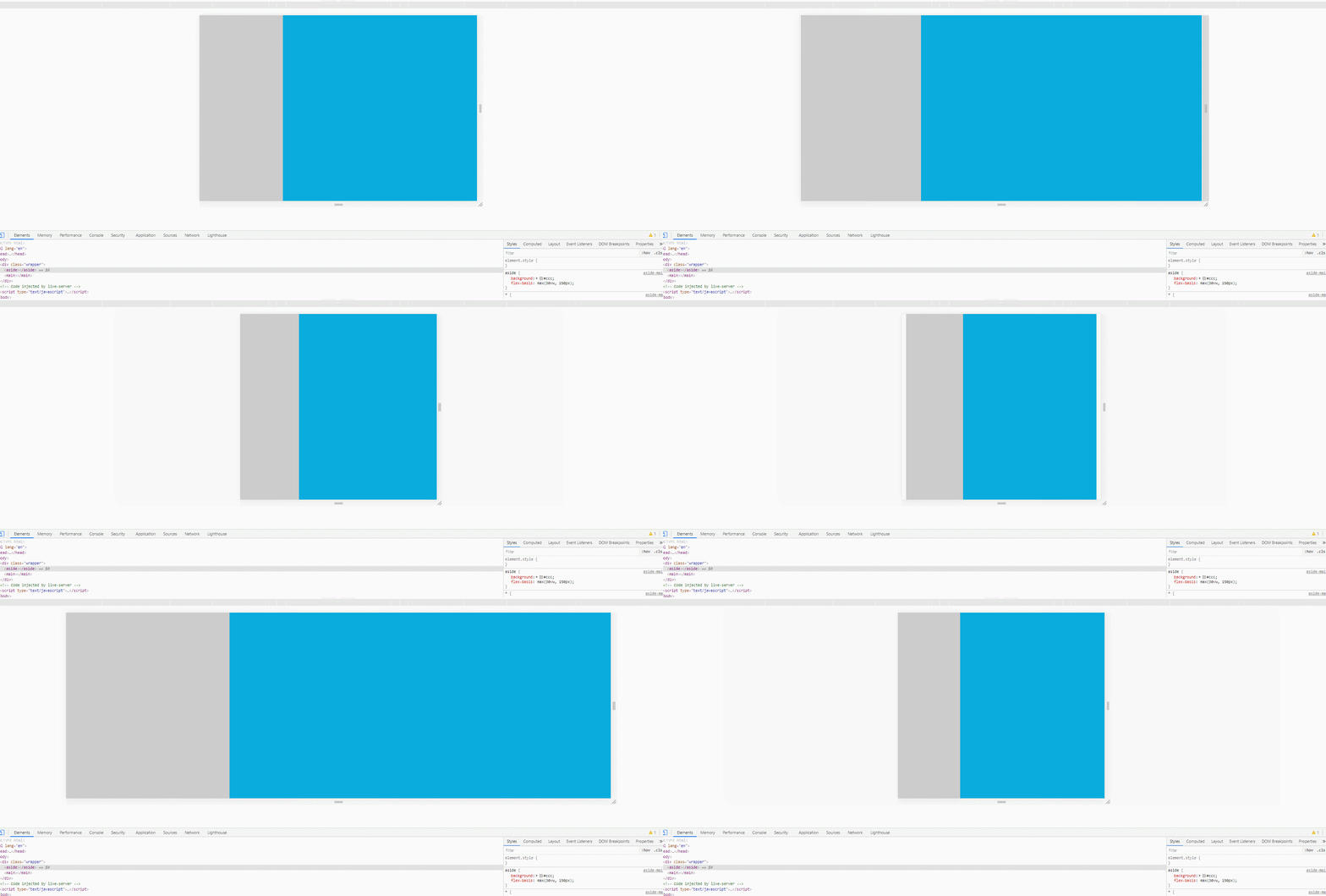
For the side Column layout requires a fixed width of the sidebar. When making a responsive style, you can consider using vw to fix the proportion of the sidebar when the maximum width is exceeded
      aside {
        background: #ccc;
        flex-basis: max(30vw, 150px);
      }
      main {
        background: #09acdd;
        flex-grow: 1;
      }
Limit the maximum and minimum values through clamp, and then the default value in the middle changes according to the window
font-size: clamp(20px, 10vw, 40px);
Gradient specifies the gradient line of the gradient. According to the general operation, the transition will not be smooth enough. There will be an obvious transition line on the mobile terminal
background: linear-gradient(135deg, #2c3e50, #2c3e50, #3498db);
Use min to modify it, the transition will be smoother
background: linear-gradient(135deg, #2c3e50, #2c3e50 min(20vw, 60%), #3498db);
In practical applications, for example, if we want to limit the width on the desktop , to display 100% on the mobile terminal, it needs to be written like this
    .container{
      width: 1440px;
      max-width: 100%;
}Now only
    .container{
      width: min(1440px,100%);
}is very concise and clear.
These three functions are suitable for the development of responsive layout. They can be used as appropriate when compatibility issues do not need to be considered. However, if you want to consider compatibility, it is best not to use. I have been summarizing things related to css functions recently. You are welcome to continue to pay attention. The source code is here, click here and click here
For more programming-related knowledge, please visit: Programming Learning! !
The above is the detailed content of Comparison functions in CSS: max(), min(), clamp(). For more information, please follow other related articles on the PHP Chinese website!