How to set the opacity of css img: first create an HTML and css sample file; then set the style to the specified img as "img{opacity:0.4;filter:alpha(opacity=40);}" that is Can.

The operating environment of this tutorial: Windows7 system, HTML5&&CSS3 version. This method is suitable for all brands of computers.
Recommended: "css Video Tutorial"
Creating transparent images through CSS is easy.
Note: The CSS opacity property is part of the W3C CSS recommendations.
Create a transparent image - Hover effect
In this example, when the user moves the mouse pointer over the image, the transparency of the image will be changed.
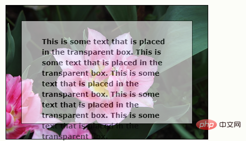
Create a transparent box with text on the background image
This example creates a semi-transparent box that surrounds text.
Example 1 - Create a transparent image
The CSS3 property that defines the transparency effect is opacity.
First, we will show how to create transparent images through CSS.
Regular image:

Same image with transparency:

Please see below CSS:
img
{
opacity:0.4;
filter:alpha(opacity=40); /* 针对 IE8 以及更早的版本 */
}IE9, Firefox, Chrome, Opera and Safari use the opacity property to set transparency. The opacity property can be set to values from 0.0 to 1.0. The smaller the value, the more transparent it is.
IE8 and earlier versions use the filter filter:alpha(opacity=x). x can take values from 0 to 100. The smaller the value, the more transparent it is.
Example 2 - Image transparency - Hover effect
Please move the mouse pointer to the image:

The CSS is like this:
img
{
opacity:0.4;
filter:alpha(opacity=40); /* 针对 IE8 以及更早的版本 */
}
img:hover
{
opacity:1.0;
filter:alpha(opacity=100); /* 针对 IE8 以及更早的版本 */
}The first CSS code block is similar to the code in Example 1. Additionally, we've set the style for when the mouse pointer is over the image. In this example, we want the image to be opaque when the pointer is moved over it.
The corresponding CSS is: opacity=1.
IE8 and earlier browsers: filter:alpha(opacity=100).
When the mouse pointer moves out of the image, the image will be transparent again.
Example 3 - Text in a transparent box
This is some text that is placed in the transparent box. This is some text that is placed in the transparent box. This is some text that is placed in the transparent box. This is some text that is placed in the transparent box. This is some text that is placed in the transparent box.

The source code is like this:
<!DOCTYPE html>
<html>
<head>
<style>
div.background
{
width: 400px;
height: 266px;
background: url('/i/tulip_peach_blossom_w.jpg') no-repeat;
border: 1px solid black;
}
div.transbox
{
width: 338px;
height: 204px;
margin:30px;
background-color: #ffffff;
border: 1px solid black;
/* for IE */
filter:alpha(opacity=60);
/* CSS3 standard */
opacity:0.6;
}
div.transbox p
{
margin: 30px 40px;
}
</style>
</head>
<body>
<div class="background">
<div class="transbox">
<p>
This is some text that is placed in the transparent box.
This is some text that is placed in the transparent box.
This is some text that is placed in the transparent box.
This is some text that is placed in the transparent box.
This is some text that is placed in the transparent box.
</p>
</div>
</div>
</body>
</html>First, we create a div element (class="background"), which has fixed height and width, background image, and border. Then we create a slightly smaller div (class="transbox") inside the first div. The "transbox" div has a fixed width, background color and borders - and it's transparent. Inside the transparent div, we have some text inside the p element.
The above is the detailed content of How to set css img opacity. For more information, please follow other related articles on the PHP Chinese website!