How to achieve mask layer effect in Bootstrap? (code example)
The following article will introduce to you how to Bootstrap achieve the mask layer effect. It has certain reference value. Friends in need can refer to it. I hope it will be helpful to everyone.
Recommended related tutorials: "bootstrap Tutorial"
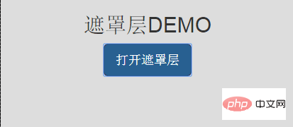
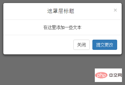
The renderings are as follows:
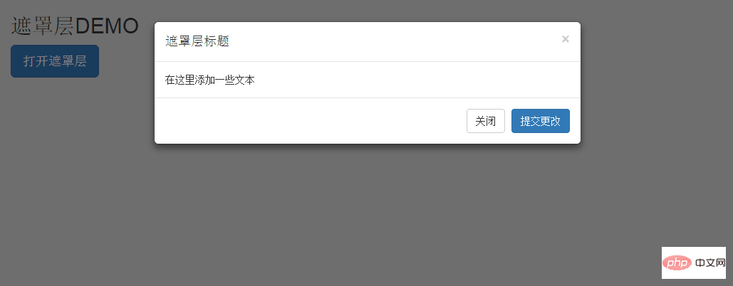
1. Click the open mask layer button
2. Pop up a hidden p
Source code download address: http://download.csdn.net/detail/u014175572/9564824
The implementation code is as follows:
<!DOCTYPE html> <html> <head> <meta charset="utf-8"> <meta http-equiv="X-UA-Compatible" content="IE=edge"> <meta name="viewport" content="width=device-width, initial-scale=1, maximum-scale=1, user-scalable=no"> <!-- 上述3个meta标签*必须*放在最前面,任何其他内容都*必须*跟随其后! --> <title>遮罩层DEM</title> <!-- Bootstrap --> <link href="css/bootstrap.min.css" rel="stylesheet"> <link href="css/index/index.css" rel="stylesheet"> <!-- jQuery (necessary for Bootstrap's JavaScript plugins) --> <script src="js/jquery-2.1.4.min.js"></script> <!-- Include all compiled plugins (below), or include individual files as needed --> <script src="js/bootstrap.min.js"></script> <!-- HTML5 shim and Respond.js for IE8 support of HTML5 elements and media queries --> <!-- WARNING: Respond.js doesn't work if you view the page via file:// --> <!--[if lt IE 9]> <script src="js/adaptIE/html5shiv.min.js"></script> <script src="js/adaptIE/respond.min.js"></script> <![endif]--> <style> </style> </head> <body> <div class="container-fluid text-center"> <h2>遮罩层DEMO</h2> <!-- 按钮触发模态框 --> <button class="btn btn-primary btn-lg" data-toggle="modal" data-target="#myModal"> 打开遮罩层 </button> <!-- 模态框(Modal) --> <div class="modal fade" id="myModal" tabindex="-1" role="dialog" aria-labelledby="myModalLabel" aria-hidden="true"> <div class="modal-dialog"> <div class="modal-content"> <div class="modal-header"> <button type="button" class="close" data-dismiss="modal" aria-hidden="true"> × </button> <h4 class="modal-title" id="myModalLabel"> 遮罩层标题 </h4> </div> <div class="modal-body"> 在这里添加一些文本 </div> <div class="modal-footer"> <button type="button" class="btn btn-default" data-dismiss="modal">关闭 </button> <button type="button" class="btn btn-primary"> 提交更改 </button> </div> </div> <!-- /.modal-content --> </div> <!-- /.modal --> </div> </body> </html>
Code explanation:
- To use a modal window, you need to have some kind of trigger. You can use buttons or links. Here we are using buttons.
- If you look carefully at the code above, you will find that in the
- You need to pay attention to two points in the modal box:
- The first is .modal, which is used to identify the content of
as a modal box.
- The second is .fade class. When the modal is toggled, it causes the content to fade in and out.
- The first is .modal, which is used to identify the content of
- aria-labelledby="myModalLabel", this attribute refers to the title of the modal box.
- Attribute aria-hidden="true" is used to keep the modal window invisible until the trigger is fired (such as clicking on the relevant button).
, modal-header is a class that defines styles for the header of modal windows.
- class="close", close is a CSS class used to style the close button of a modal window.
- data-dismiss="modal" is a custom HTML5 data attribute. Here it is used to close the modal window.
- class="modal-body" is a CSS class of Bootstrap CSS, used to set styles for the body of modal windows.
- class="modal-footer" is a CSS class of Bootstrap CSS, used to set styles for the bottom of modal windows.
- data-toggle="modal", HTML5 custom data attribute data-toggle is used to open a modal window.
For more programming-related knowledge, please visit: Programming Teaching! !
The above is the detailed content of How to achieve mask layer effect in Bootstrap? (code example). For more information, please follow other related articles on the PHP Chinese website!

Hot AI Tools

Undresser.AI Undress
AI-powered app for creating realistic nude photos

AI Clothes Remover
Online AI tool for removing clothes from photos.

Undress AI Tool
Undress images for free

Clothoff.io
AI clothes remover

AI Hentai Generator
Generate AI Hentai for free.

Hot Article

Hot Tools

Notepad++7.3.1
Easy-to-use and free code editor

SublimeText3 Chinese version
Chinese version, very easy to use

Zend Studio 13.0.1
Powerful PHP integrated development environment

Dreamweaver CS6
Visual web development tools

SublimeText3 Mac version
God-level code editing software (SublimeText3)

Hot Topics
 How do I stay up-to-date with the latest Bootstrap releases and updates?
Mar 14, 2025 pm 07:40 PM
The article discusses strategies for staying updated with Bootstrap releases, accessing official documentation, best practices for integration, and community resources for discussion.
 What are the key components of the Bootstrap framework (grid system, typography, components, utilities)?
Mar 14, 2025 pm 07:42 PM
Article discusses key Bootstrap components: grid system, typography, components, and utilities. Focuses on enhancing responsive design and interactive UI creation.
 How do I override Bootstrap's styles without modifying the core framework files?
Mar 14, 2025 pm 07:44 PM
The article discusses methods to override Bootstrap's styles using custom CSS, focusing on creating separate files, using specificity, and best practices for organization.
 How do I use Bootstrap's grid system to create responsive layouts for different screen sizes?
Mar 14, 2025 pm 07:43 PM
Article discusses using Bootstrap's grid system for responsive layouts across devices, detailing structure, customization, and testing tools.
 How do I customize the appearance and behavior of Bootstrap's components?
Mar 18, 2025 pm 01:06 PM
Article discusses customizing Bootstrap's appearance and behavior using CSS variables, Sass, custom CSS, JavaScript, and component modifications. It also covers best practices for modifying styles and ensuring responsiveness across devices.
 Where can I find Bootstrap templates and themes?
Mar 14, 2025 pm 07:39 PM
The article discusses sources for Bootstrap templates and themes, both free and premium. It covers customization and lists reputable sites for downloads.
 How do I contribute to the Bootstrap community?
Mar 14, 2025 pm 07:38 PM
The article outlines ways to contribute to Bootstrap, including code submissions, documentation improvements, bug reporting, and community engagement. It provides detailed steps for submitting pull requests and reporting issues.
 Can I use inline-block in the Bootstrap picture centered?
Mar 04, 2025 pm 03:06 PM
This article examines the effectiveness of using inline-block for centering images within Bootstrap. It argues that while technically feasible, this method is impractical due to complexities in achieving responsive vertical centering and maintenance


