How to use css radial gradient
How to use css radial gradient: first create an HTML sample file; then create a div block; finally add the css style as "background:radial-gradient()" to achieve the radial gradient effect. .

The operating environment of this tutorial: Windows7 system, HTML5&&CSS3 version. This method is suitable for all brands of computers.
Recommended: "css video tutorial"
Radial gradients: From the starting point to the end point, the color performs a circular gradient from the inside to the outside.
Syntax
background:radial-gradient(center,shape size,start-color,……,last-color);
Radial Gradient-Set Shape
Syntax:
background:radial-gradient(shape,start-color,……,last-color);
Description:
shape value can take two
circle——circle
ellipse——ellipse (default)
radial gradient-size keyword
size keyword is OK to end The position of the color. The default value is farthest-corner.
Syntax
background:radial-gradient(size,start-color,……,last-color);
size value is the following four keywords:
closest-side: the closest side
farthest-side: the farthest side
closest-corner: closest corner
farthest-corner: farthest corner
Example:
div {
     width: 300px;
     height: 200px;
     /* Safari 5.1 - 6.0 */
     background: -webkit-radial-gradient(30% 70%, farthest-side, blue, green, yellow, black);
     /* Opera 11.6 - 12.0 */
     background: -o-radial-gradient(30% 70%, farthest-side, blue, green, yellow, black);
     /* Firefox 3.6 - 15 */
     background: -moz-radial-gradient(30% 70%, farthest-side, blue, green, yellow, black);
     /* 标准的语法 */
     background: radial-gradient(30% 70%, farthest-side, blue, green, yellow, black);
}Radial Gradient-Circle Center Position
Grammar:
background:radial-gradient(level-percent vertical-percent,start-color,……,last-color);
Note: The standard syntax at the center of the circle is currently poorly supported by mainstream browsers, so you need to pay attention to adding the browser prefix.
General usage:
-webkit-background:radial-gradient(level-percent vertical-percent,start-color,……,last-color);
-o-background:radial-gradient(level-percent vertical-percent,start-color,……,last-color);
-moz-background:radial-gradient(level-percent vertical-percent,start-color,……,last-color);
background:radial-gradient(level-percent vertical-percent,start-color,……,last-color);
Thinking: 1. What is the meaning of the percentage value behind the color in the gradient?
3-12 Programming exercises
Friends, I have learned CSS3 radial gradient. According to the renderings, I added the code to achieve:
(1) Taking the center (60% 40%) as the starting point, set the center of the circle to the nearest edge, the roundest edge, Four radial gradient effects: closest corner and roundest corner.
(2) The shape of the radial gradient is a circle
(3) The colors from the inside to the outside are red, yellow, green, and blue
The effect picture is as follows

Task
Set the background color radial gradient for each of the four elements
(1)Set the radial gradient size to the nearest edge , farthest edge, closest corner, farthest corner
(2)The center of the gradient is 60% and 40%
(3)The shape of the gradient is a circle
(4) The gradient colors are red, yellow, green, and blue from the inside to the outside.
Reference code:
<!DOCTYPE html>
<html>

<head>
    <meta charset="UTF-8">
    <meta name="viewport" content="width=device-width,initial-scale=1,maximum-scale=1,user-scalable=no">

    <title>径向渐变</title>
    <style>
        div {
            width: 200px;
            height: 300px;
            float: left;
            margin: 100px 0 0 100px;
        }

        /* 补充代码,分别写出4个元素的背景渐变效果 */

        .div1 {
            background: -webkit-radial-gradient(60% 40%,closest-side circle, red,yellow,green,blue);
            /* Opera 11.6 - 12.0 */
            background: -o-radial-gradient(60% 40%,closest-side circle, red,yellow,green,blue);
            /* Firefox 3.6 - 15 */
            background: -moz-radial-gradient(60% 40%,closest-side circle, red,yellow,green,blue);
            /* 标准的语法 */
            background: radial-gradient(60% 40%,closest-side circle, red,yellow,green,blue);
        }
        .div2 {
            background: -webkit-radial-gradient(60% 40%,farthest-side circle, red,yellow,green,blue);
            /* Opera 11.6 - 12.0 */
            background: -o-radial-gradient(60% 40%,farthest-side circle, red,yellow,green,blue);
            /* Firefox 3.6 - 15 */
            background: -moz-radial-gradient(60% 40%,farthest-side circle, red,yellow,green,blue);
            /* 标准的语法 */
            background: radial-gradient(60% 40%,farthest-side circle, red,yellow,green,blue);
        }
        .div3 {
            background: -webkit-radial-gradient(60% 40%,closest-corner circle, red,yellow,green,blue);
            /* Opera 11.6 - 12.0 */
            background: -o-radial-gradient(60% 40%,closest-corner circle, red,yellow,green,blue);
            /* Firefox 3.6 - 15 */
            background: -moz-radial-gradient(60% 40%,closest-corner circle, red,yellow,green,blue);
            /* 标准的语法 */
            background: radial-gradient(60% 40%,closest-corner circle, red,yellow,green,blue);
        }
        .div4 {
            background: -webkit-radial-gradient(60% 40%,farthest-corner circle, red,yellow,green,blue);
            /* Opera 11.6 - 12.0 */
            background: -o-radial-gradient(60% 40%,farthest-corner circle, red,yellow,green,blue);
            /* Firefox 3.6 - 15 */
            background: -moz-radial-gradient(60% 40%,farthest-corner circle, red,yellow,green,blue);
            /* 标准的语法 */
            background: radial-gradient(60% 40%,farthest-corner circle, red,yellow,green,blue);
        }
    </style>
</head>

<body>
    <div></div>
    <div></div>
    <div></div>
    <div></div>
</body>

</html>Radial Gradual-Repeating Gradient
background:repeating-radial-gradient(color1 length|percent,color2 length|percent,……);
3-14 Programming Exercise
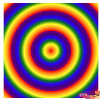
Friends, we have learned CSS3 Radial Repeating gradients in gradients, next, write the code based on the renderings to implement repeated radial gradients of multiple rainbow balls with the center of the element as the origin.
(1) The 7 colors of the rainbow are required. The value range starts from 0% and increases by 5% at a time. For example, red is 0%, orange is 5%, yellow is 10%, and so on
(2) Tips: The color of the rainbow ball can be expressed in English words
(3) The rendering is as follows:

Reference code:
<!DOCTYPE html>
<html>

<head>
    <meta charset="UTF-8">
    <meta name="viewport" content="width=device-width,initial-scale=1,maximum-scale=1,user-scalable=no">

    <title>径向渐变</title>
    <style>
        div {
            width: 400px;
            height: 400px;
            /* 补充代码 */
            background: -webkit-repeating-radial-gradient(closest-side circle, red 0%,orange 5%,yellow 10%,green 15%,blue 20%,indigo 25%,purple 30%);
            /* Opera 11.6 - 12.0 */
            background: -o-repeating-radial-gradient( closest-side circle,red 0%,orange 5%,yellow 10%,green 15%,blue 20%,indigo 25%,purple 30%);
            /* Firefox 3.6 - 15 */
            background: -moz-repeating-radial-gradient(closest-side circle,red 0%,orange 5%,yellow 10%,green 15%,blue 20%,indigo 25%,purple 30%);
            /* 标准的语法 */
            background: repeating-radial-gradient( closest-side circle, red 0%,orange 5%,yellow 10%,green 15%,blue 20%,indigo 25%,purple 30%);
        }
    </style>
</head>

<body>
    <div></div>

</body>

</html>The above is the detailed content of How to use css radial gradient. For more information, please follow other related articles on the PHP Chinese website!

Hot AI Tools

Undresser.AI Undress
AI-powered app for creating realistic nude photos

AI Clothes Remover
Online AI tool for removing clothes from photos.

Undress AI Tool
Undress images for free

Clothoff.io
AI clothes remover

Video Face Swap
Swap faces in any video effortlessly with our completely free AI face swap tool!

Hot Article

Hot Tools

Notepad++7.3.1
Easy-to-use and free code editor

SublimeText3 Chinese version
Chinese version, very easy to use

Zend Studio 13.0.1
Powerful PHP integrated development environment

Dreamweaver CS6
Visual web development tools

SublimeText3 Mac version
God-level code editing software (SublimeText3)

Hot Topics
 1386
1386
 52
52
 How to use bootstrap in vue
Apr 07, 2025 pm 11:33 PM
Using Bootstrap in Vue.js is divided into five steps: Install Bootstrap. Import Bootstrap in main.js. Use the Bootstrap component directly in the template. Optional: Custom style. Optional: Use plug-ins.
 The Roles of HTML, CSS, and JavaScript: Core Responsibilities
Apr 08, 2025 pm 07:05 PM
HTML defines the web structure, CSS is responsible for style and layout, and JavaScript gives dynamic interaction. The three perform their duties in web development and jointly build a colorful website.
 How to write split lines on bootstrap
Apr 07, 2025 pm 03:12 PM
There are two ways to create a Bootstrap split line: using the tag, which creates a horizontal split line. Use the CSS border property to create custom style split lines.
 Understanding HTML, CSS, and JavaScript: A Beginner's Guide
Apr 12, 2025 am 12:02 AM
WebdevelopmentreliesonHTML,CSS,andJavaScript:1)HTMLstructurescontent,2)CSSstylesit,and3)JavaScriptaddsinteractivity,formingthebasisofmodernwebexperiences.
 How to set up the framework for bootstrap
Apr 07, 2025 pm 03:27 PM
To set up the Bootstrap framework, you need to follow these steps: 1. Reference the Bootstrap file via CDN; 2. Download and host the file on your own server; 3. Include the Bootstrap file in HTML; 4. Compile Sass/Less as needed; 5. Import a custom file (optional). Once setup is complete, you can use Bootstrap's grid systems, components, and styles to create responsive websites and applications.
 How to insert pictures on bootstrap
Apr 07, 2025 pm 03:30 PM
There are several ways to insert images in Bootstrap: insert images directly, using the HTML img tag. With the Bootstrap image component, you can provide responsive images and more styles. Set the image size, use the img-fluid class to make the image adaptable. Set the border, using the img-bordered class. Set the rounded corners and use the img-rounded class. Set the shadow, use the shadow class. Resize and position the image, using CSS style. Using the background image, use the background-image CSS property.
 How to resize bootstrap
Apr 07, 2025 pm 03:18 PM
To adjust the size of elements in Bootstrap, you can use the dimension class, which includes: adjusting width: .col-, .w-, .mw-adjust height: .h-, .min-h-, .max-h-
 How to use bootstrap button
Apr 07, 2025 pm 03:09 PM
How to use the Bootstrap button? Introduce Bootstrap CSS to create button elements and add Bootstrap button class to add button text


