

How to achieve frosted glass effect using css?

How to achieve frosted glass effect using css? The following article will introduce to you how to use CSS to achieve a frosted glass effect. It has certain reference value. Friends in need can refer to it. I hope it will be helpful to everyone.
In fact, the blur effect of frosted glass is technically relatively simple, just using the blur attribute in the css filter. But to achieve a good frosted glass effect, you need to pay attention to many details.
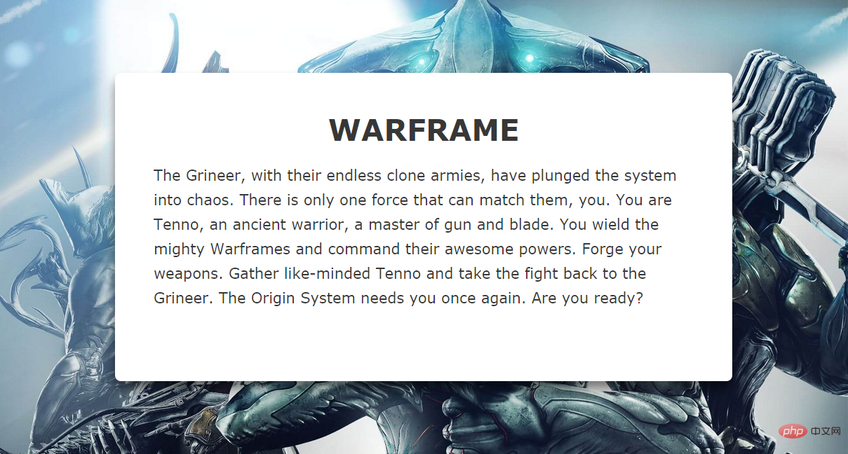
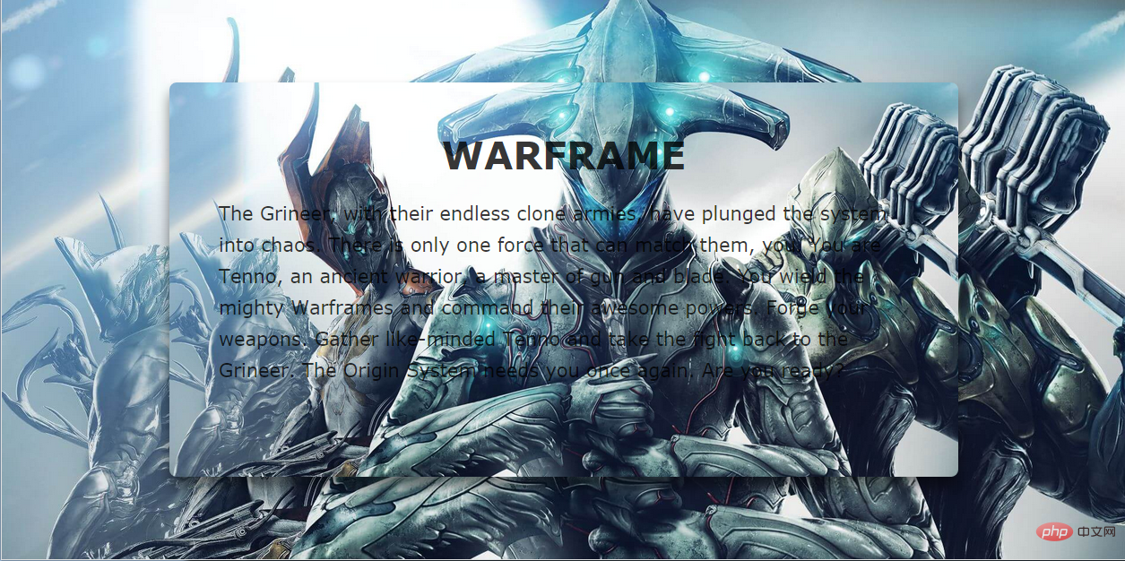
#For example, if we need to change the text area in the middle of the page in the picture above into a frosted glass effect, the first thing that comes to mind is Set a transparency to it and add a blur filter:
.content {
    background-color: rgba(0,0,0,0.3);
    -webkit-filter: blur(2px);
    -moz-filter: blur(2px);
    -ms-filter: blur(2px);
    -o-filter: blur(2px);
    filter: blur(2px);
}But the generated effect is as follows:
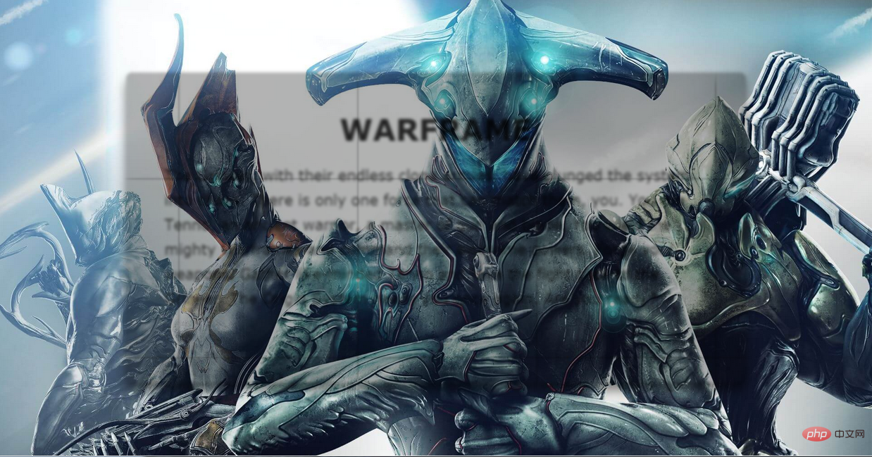
We draw two conclusions from this failed example:
1. Using blur directly on an element will blur all its contents. In order to ensure that the text will not be blurred Remove the need for an extra layer to apply the blur effect separately.
2. The blur effect will not be applied to the elements behind it, so you need to use the content area to have the same background image as the background and blur it.
Let’s solve the first problem first:
The method of adding one more level is not by adding elements, but by pseudo-elements.
.content {
    z-index: 1;
}
.content:after {
    content: '';
    position: absolute;
    top: 0;
    left: 0;
    right: 0;
    bottom: 0;
    background-color: rgba(255,255,255,0.8);
    z-index: -1;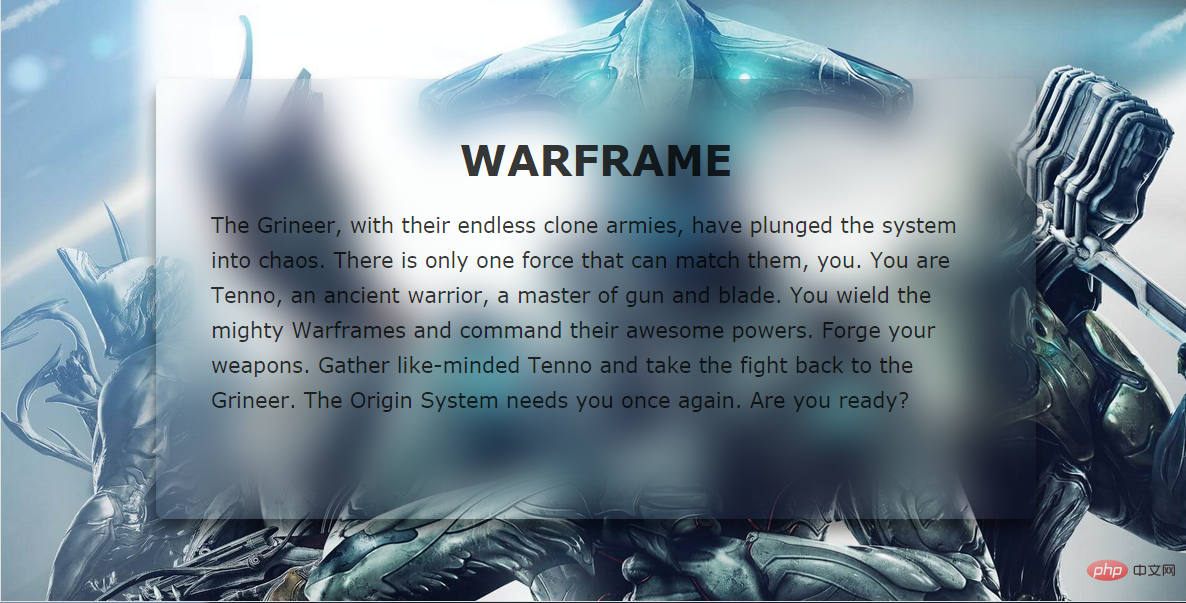
}There are two points to note here. Since the pseudo-element cannot inherit the size of the host element through width:100% and height:100%, the size of the content is inherited through the above method. ;In order to make the pseudo element located below the content, set z-index:-1 for it. To prevent it from being hidden behind the background image, set z-index:1 for content.
Effect:
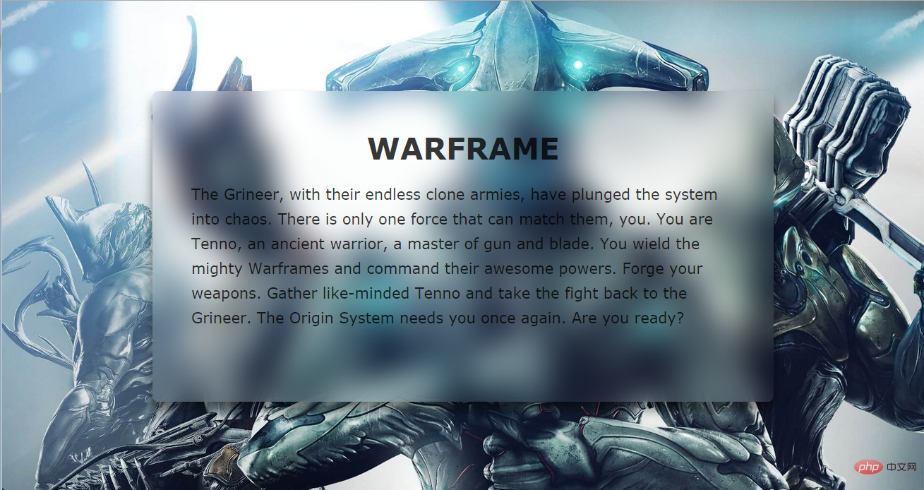
##Next, set the same settings for content::after background image.
As shown in the picture above, even if we set the same background-postion and background-size, the middle part of the picture and the large background are still not spliced successfully.
The solution to this problem is very simple, just add the background-attachment: fixed attribute and then blur it.
.content {
    background-position: center top;
    background-size: cover;
}
.content::after {
    background-image: url(xxx.jpg);
    background-position: center top;
    background-size: cover;
    background-attachment: fixed;
    -webkit-filter: blur(20px);
    -moz-filter: blur(20px);
    -ms-filter: blur(20px);
    -o-filter: blur(20px);
    filter: blur(20px);
}
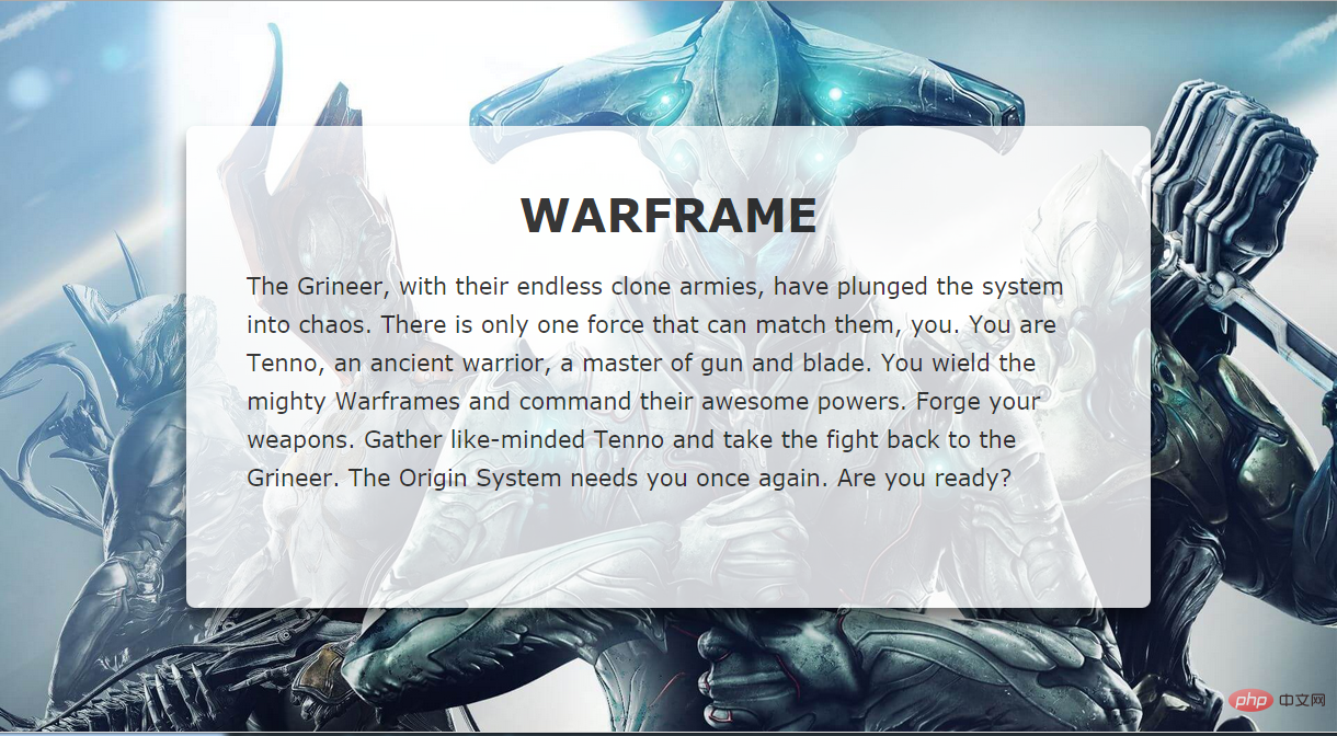
You can see that we basically got the effect we wanted. The only drawback is that the blurring effect at the edge of the element is weakened. In order to solve this problem, we will expand the scope of the pseudo-element, and at the same time, in order to ensure that the effect does not exceed the scope of content, set the overflow:hidden attribute to it.
.content {
  overflow: hidden;
}
.content::after {
  margin: -30px;
}
Such a perfect frosted glass effect is completed. No matter how you change the size of the browser window, the background image of the content part can be Very good splicing with the background, all thanks to the background-attachment attribute.
demo and source code address: https://darylxyx.github.io/Demo/blur/https://github.com /Darylxyx/css-collection/tree/master/blurFor more programming-related knowledge, please visit:
Programming Learning! !
The above is the detailed content of How to achieve frosted glass effect using css?. For more information, please follow other related articles on the PHP Chinese website!

Hot AI Tools

Undresser.AI Undress
AI-powered app for creating realistic nude photos

AI Clothes Remover
Online AI tool for removing clothes from photos.

Undress AI Tool
Undress images for free

Clothoff.io
AI clothes remover

Video Face Swap
Swap faces in any video effortlessly with our completely free AI face swap tool!

Hot Article
Hot Tools

Notepad++7.3.1
Easy-to-use and free code editor

SublimeText3 Chinese version
Chinese version, very easy to use

Zend Studio 13.0.1
Powerful PHP integrated development environment

Dreamweaver CS6
Visual web development tools

SublimeText3 Mac version
God-level code editing software (SublimeText3)
Hot Topics
 1386
1386
 52
52

 How to use bootstrap in vue
Apr 07, 2025 pm 11:33 PM
How to use bootstrap in vue
Apr 07, 2025 pm 11:33 PM
Using Bootstrap in Vue.js is divided into five steps: Install Bootstrap. Import Bootstrap in main.js. Use the Bootstrap component directly in the template. Optional: Custom style. Optional: Use plug-ins.
 The Roles of HTML, CSS, and JavaScript: Core Responsibilities
Apr 08, 2025 pm 07:05 PM
The Roles of HTML, CSS, and JavaScript: Core Responsibilities
Apr 08, 2025 pm 07:05 PM
HTML defines the web structure, CSS is responsible for style and layout, and JavaScript gives dynamic interaction. The three perform their duties in web development and jointly build a colorful website.
 How to write split lines on bootstrap
Apr 07, 2025 pm 03:12 PM
How to write split lines on bootstrap
Apr 07, 2025 pm 03:12 PM
There are two ways to create a Bootstrap split line: using the tag, which creates a horizontal split line. Use the CSS border property to create custom style split lines.
 Understanding HTML, CSS, and JavaScript: A Beginner's Guide
Apr 12, 2025 am 12:02 AM
Understanding HTML, CSS, and JavaScript: A Beginner's Guide
Apr 12, 2025 am 12:02 AM
WebdevelopmentreliesonHTML,CSS,andJavaScript:1)HTMLstructurescontent,2)CSSstylesit,and3)JavaScriptaddsinteractivity,formingthebasisofmodernwebexperiences.
 How to set up the framework for bootstrap
Apr 07, 2025 pm 03:27 PM
How to set up the framework for bootstrap
Apr 07, 2025 pm 03:27 PM
To set up the Bootstrap framework, you need to follow these steps: 1. Reference the Bootstrap file via CDN; 2. Download and host the file on your own server; 3. Include the Bootstrap file in HTML; 4. Compile Sass/Less as needed; 5. Import a custom file (optional). Once setup is complete, you can use Bootstrap's grid systems, components, and styles to create responsive websites and applications.
 How to resize bootstrap
Apr 07, 2025 pm 03:18 PM
How to resize bootstrap
Apr 07, 2025 pm 03:18 PM
To adjust the size of elements in Bootstrap, you can use the dimension class, which includes: adjusting width: .col-, .w-, .mw-adjust height: .h-, .min-h-, .max-h-
 How to use bootstrap button
Apr 07, 2025 pm 03:09 PM
How to use bootstrap button
Apr 07, 2025 pm 03:09 PM
How to use the Bootstrap button? Introduce Bootstrap CSS to create button elements and add Bootstrap button class to add button text
 How to insert pictures on bootstrap
Apr 07, 2025 pm 03:30 PM
How to insert pictures on bootstrap
Apr 07, 2025 pm 03:30 PM
There are several ways to insert images in Bootstrap: insert images directly, using the HTML img tag. With the Bootstrap image component, you can provide responsive images and more styles. Set the image size, use the img-fluid class to make the image adaptable. Set the border, using the img-bordered class. Set the rounded corners and use the img-rounded class. Set the shadow, use the shadow class. Resize and position the image, using CSS style. Using the background image, use the background-image CSS property.
