Detailed explanation of:placeholder-shown pseudo-class in CSS
(Learning video sharing: css video tutorial)
Generally we commonly see placeholder pseudo-class selector is used to modify the default Style and copywriting, I suddenly discovered the placeholder-shown pseudo-class selector. The more official explanation is that the
CSS pseudo-class represents any form element that displays placeholder text.
To put it simply, when the placeholder content of the input box is displayed, what does the input box do?
Compatibility is as follows, there is no problem on mobile terminal
How does placeholder-show work?
:placeholder-shown CSS pseudo-class takes effect when the <input> or <textarea></textarea> element displays placeholder text, simply It means that placeholder will only take effect if it has a value, as shown below:
// html
<input placeholder="placeholder text" />
<textarea placeholder="placeholder text"></textarea>

// css
input:placeholder-shown, textarea:placeholder-shown{
  border:1px solid pink;
}
placeholder is emptyplaceholder-show has no effect:
// html
<input placeholder="" />
<textarea placeholder=" text"></textarea>

:placeholder-shownSet the style of the input element.
input:placeholder-shown {
  border: 1px solid pink;
  background: yellow;
  color: green;
}
color: green, but it has no effect. This is because :placeholder-shown will only target the input itself. For actual placeholder text, the pseudo-element ::placeholder must be used.
input::placeholder {
  color: green;
}
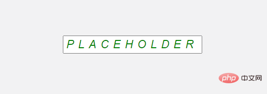
::placeholder-shown is applied ## The style of #placeholder. <div class="code" style="position:relative; padding:0px; margin:0px;"><pre class='brush:php;toolbar:false;'>input:placeholder-shown, textarea:placeholder-shown{
font-style: italic;
text-transform: uppercase;
letter-spacing: 5px;
}</pre><div class="contentsignin">Copy after login</div></div>
 I don’t know what this is, maybe it’s because these attributes are
Inherited, if you know the reason, please leave a message and tell me, thank you. :placeholder-shown vs :empty
is an object specifically used to determine whether an element displays a placeholder. We mainly use it to checkinput Whether the content is empty (assuming that all input has a placeholder). You may be thinking here, is it okay to use empty? Let's take a look. <div class="code" style="position:relative; padding:0px; margin:0px;"><pre class='brush:php;toolbar:false;'>// html
<input value="not empty">
<input><!-- empty -->
// css
input:empty {
border: 1px solid pink;
}
input {
border: 1px solid black;
}</pre><div class="contentsignin">Copy after login</div></div>
 It looks like
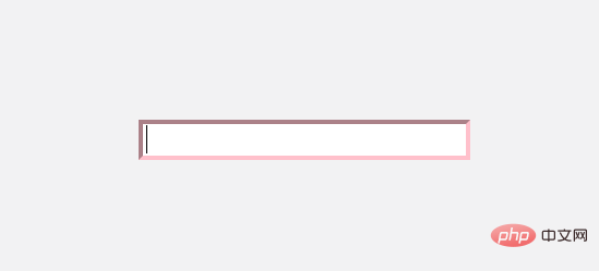
works here because we see a pink border, but this actually Doesn't workThe reason why it displays pink is because the pseudo class increases the weight of the css. Similar to class selectors (i.e.
) having higher weight than type selectors (i.e. input). High authority selectors will always override styles set by low authority. So we can say this: Don't use
to check if the input element is empty. How to check whether the input content is empty (without dot markers)?
The only way we can check if the input is empty is to use
:placeholder-shown. But what happens if our input element has no placeholder? Here's a trick: pass in an empty string " ". <div class="code" style="position:relative; padding:0px; margin:0px;"><pre class='brush:php;toolbar:false;'>// html
<input placeholder=" "><!-- pass empty string -->
//css
input:placeholder-shown {
border-color: pink;
}</pre><div class="contentsignin">Copy after login</div></div>
 Combining other selectors
We can use the
:notpseudo-class to select certain things Inverse operation. Here we can position if the input is not empty. <div class="code" style="position:relative; padding:0px; margin:0px;"><pre class='brush:php;toolbar:false;'>//html
<input placeholder="placeholder" value="not empty" />
// css
input:not(:placeholder-shown) {
border: 1px solid green;
}</pre><div class="contentsignin">Copy after login</div></div>Practical combat
Using
placeholder-shown we can achieve the following animation
 # #The specific code is as follows:
Html
<div class="input">
    <input class="input-fill" placeholder="邮箱">
    <label class="input-label">邮箱</label>
</div>.input{
position: relative;
}
.input-fill{
border: 1px solid #ececec;
outline: none;
padding: 13px 16px 13px;
font-size: 16px;
line-height: 1.5;
width: fit-content;
border-radius: 5px;
}
.input-fill:placeholder-shown::placeholder {
color: transparent;
}
.input-label {
position: absolute;
font-size: 16px;
line-height: 1.5;
left: 16px; top: 14px;
color: #a2a9b6;
padding: 0 2px;
transform-origin: 0 0;
pointer-events: none;
transition: all .25s;
}
.input-fill:focus{
border: 1px solid #2486ff;
}
.input-fill:not(:placeholder-shown) ~ .input-label,
.input-fill:focus ~ .input-label {
transform: scale(0.75) translate(0, -32px);
background-color: #fff;
color: #2486ff;
}Author: Samantha Ming
For more programming-related knowledge, please visit: Introduction to Programming! !
The above is the detailed content of Detailed explanation of:placeholder-shown pseudo-class in CSS. For more information, please follow other related articles on the PHP Chinese website!

Hot AI Tools

Undresser.AI Undress
AI-powered app for creating realistic nude photos

AI Clothes Remover
Online AI tool for removing clothes from photos.

Undress AI Tool
Undress images for free

Clothoff.io
AI clothes remover

AI Hentai Generator
Generate AI Hentai for free.

Hot Article

Hot Tools

Notepad++7.3.1
Easy-to-use and free code editor

SublimeText3 Chinese version
Chinese version, very easy to use

Zend Studio 13.0.1
Powerful PHP integrated development environment

Dreamweaver CS6
Visual web development tools

SublimeText3 Mac version
God-level code editing software (SublimeText3)

Hot Topics
 1378
1378
 52
52
 How to write split lines on bootstrap
Apr 07, 2025 pm 03:12 PM
There are two ways to create a Bootstrap split line: using the tag, which creates a horizontal split line. Use the CSS border property to create custom style split lines.
 How to insert pictures on bootstrap
Apr 07, 2025 pm 03:30 PM
There are several ways to insert images in Bootstrap: insert images directly, using the HTML img tag. With the Bootstrap image component, you can provide responsive images and more styles. Set the image size, use the img-fluid class to make the image adaptable. Set the border, using the img-bordered class. Set the rounded corners and use the img-rounded class. Set the shadow, use the shadow class. Resize and position the image, using CSS style. Using the background image, use the background-image CSS property.
 How to resize bootstrap
Apr 07, 2025 pm 03:18 PM
To adjust the size of elements in Bootstrap, you can use the dimension class, which includes: adjusting width: .col-, .w-, .mw-adjust height: .h-, .min-h-, .max-h-
 The Roles of HTML, CSS, and JavaScript: Core Responsibilities
Apr 08, 2025 pm 07:05 PM
HTML defines the web structure, CSS is responsible for style and layout, and JavaScript gives dynamic interaction. The three perform their duties in web development and jointly build a colorful website.
 How to set up the framework for bootstrap
Apr 07, 2025 pm 03:27 PM
To set up the Bootstrap framework, you need to follow these steps: 1. Reference the Bootstrap file via CDN; 2. Download and host the file on your own server; 3. Include the Bootstrap file in HTML; 4. Compile Sass/Less as needed; 5. Import a custom file (optional). Once setup is complete, you can use Bootstrap's grid systems, components, and styles to create responsive websites and applications.
 How to use bootstrap in vue
Apr 07, 2025 pm 11:33 PM
Using Bootstrap in Vue.js is divided into five steps: Install Bootstrap. Import Bootstrap in main.js. Use the Bootstrap component directly in the template. Optional: Custom style. Optional: Use plug-ins.
 How to use bootstrap button
Apr 07, 2025 pm 03:09 PM
How to use the Bootstrap button? Introduce Bootstrap CSS to create button elements and add Bootstrap button class to add button text
 How to view the date of bootstrap
Apr 07, 2025 pm 03:03 PM
Answer: You can use the date picker component of Bootstrap to view dates in the page. Steps: Introduce the Bootstrap framework. Create a date selector input box in HTML. Bootstrap will automatically add styles to the selector. Use JavaScript to get the selected date.


