 Web Front-end
 CSS Tutorial
 Detailed explanation of css sroll-snap-type attribute (tips to optimize scrolling)
Detailed explanation of css sroll-snap-type attribute (tips to optimize scrolling)

(Learning video sharing: css video tutorial)
According to CSS Scroll Snap Module Level 1 specification , CSS has added a new batch of properties that can control scrolling, so that scrolling can obtain many beautiful interactions that originally required the intervention of JS scripts under the control of CSS alone.
Tips: Some of the Gif images captured in this article involve container scrolling, and the effect is not very good. You can click into the Demo to actually experience it.
sroll-snap-type
First look at sroll-snap-type It may be considered The core attribute style in the new scrolling specification.
scroll-snap-type: Property defines how a snap point in the scroll container is strictly enforced.
It’s a bit difficult to understand just by looking at the definition. Simply put, this attribute specifies whether a container captures internal scrolling actions and specifies how to handle the scroll end state.
Syntax
{
    scroll-snap-type: none | [ x | y | block | inline | both ] [ mandatory | proximity ]?
}For example, suppose we want a horizontally scrollable container. After each scroll, the child elements finally stay The position is not awkwardly divided, but is completely presented in the container. It can be written like this:
<ul>
    <li>1</li>
    <li>2</li>
    <li>3</li>
</ul>ul {
scroll-snap-type: x mandatory;
}
li {
scroll-snap-align: center;
} above scroll-snap-type: x mandatory, x means to capture the scroll in the x-axis direction, and mandatory means to force the element's stay position to the place we specify after the scroll ends.
The left side is how to write a normal scroll container, and the right side is after adding scroll-snap-:
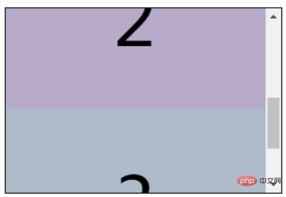
The scrolling in the y-axis direction is the same, just simply change the scroll-snap-type:
ul {
    scroll-snap-type: y mandatory;
}
##CodePen Demo -- CSS Scroll Snap Demo## The mandatory in
#scroll-snap-type and the other in proximityscroll-snap-type The key point is mandatory and proximity.
- mandatory: Usually we use this in CSS code. The English meaning of mandatory is mandatory, which means that after the scrolling ends, the scrolling stop point must be mandatory. Stop at the place we specify
- proximity: English means close, close, approximately, in this attribute it means that after the scrolling ends, the scrolling stop point may It is the place where the scrolling stops, and it may also make additional moves and stop at the place we specify
scroll- If the scroll container of snap-type: y proximity is not set additionally scroll-snap-margin/scroll-snap-padding, it may end up like this~awkward ~Position:
当然,还有一种比较特殊的情况是, CodePen Demo -- CSS Scroll Snap Both mandatory Demo 使用 其需要作用在父元素上,可选值有三个: 什么意思呢,看看示意图: 可以类比单个元素在 flexbox 里面的 再看看实际的 Demo ,将 使当前聚焦的滚动子元素在滚动方向上相对于父容器顶部对齐。 使当前聚焦的滚动子元素在滚动方向上相对于父容器中心对齐。 使当前聚焦的滚动子元素在滚动方向上相对于父容器底部对齐。 CodePen Demo -- CSS Scroll Snap Demo 如果子元素大小不一,也能有非常好的表现,使用 CodePen Demo -- CSS Scroll Snap 不规则子元素滚动 Demo 上述的 其中: 举个例子,在竖向滚动下,给滚动父容器添加一个 我们希望滚动子元素在 总结一下就是,scroll-snap-align 可以对滚动之后的对齐方式进行简单控制,而配合 标准的发展过程,早年间的规范如今废除,这个了解一下即可,新标准现在是这几个,并且大部分浏览器已经兼容: scroll-snap-stop 是一个仍处于实验室的标准,本文没有过多介绍,我自己在几个不同浏览器尝试了下,暂时没有发现浏览器支持这个属性,但是最新的标准里面是有关于它的明确的定义的。 在实际应用中,应用在全屏滚动/广告banner上有很多用武之地: CodePen Demo -- full screen scroll 当然,兼容性现在还是很大的问题: 不过在很多场景下,就算 For more programming-related knowledge, please visit: Introduction to Programming! ! The above is the detailed content of Detailed explanation of css sroll-snap-type attribute (tips to optimize scrolling). For more information, please follow other related articles on the PHP Chinese website!
scroll-snap-type: both mandatory
scroll-snap-type: both mandatory,表示横向与竖向的滚动,都会同时进行捕捉,也是可以的: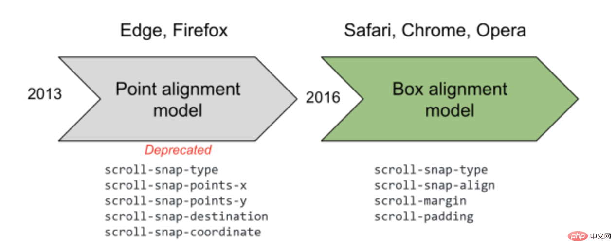
scroll-snap-align
scroll-snap-align 可以简单的控制将要聚焦的当前滚动子元素在滚动方向上相对于父容器的对齐方式。{
scroll-snap-align: start | center | end;
}

justify-content 属性的 flex-start | flex-end | center,规定当前元素在主轴上相对父容器的对齐方式去理解。scroll-snap-align 添加到滚动子容器上:scroll-snap-align: start

scroll-snap-align: center

scroll-snap-align: end

不规则子元素滚动
scroll-snap-align: center,使得不规则子元素在每次滚动后居于容器中间:scroll-margin / scroll-padding
scroll-snap-align 很好用,可以控制滚动子元素与父容器的对齐方式。然而可选的值只有三个,有的时候我们希望进行一些更精细的控制时,可以使用 scroll-margin 或者 scroll-paddingscroll-padding-top: 30px 等同于给每个子元素添加 ``scroll-margin-top: 30px`:scroll-snap-align: start 的基础上,与容器顶部的距离为 30px:<ul class="snap">
<li>1</li>
<li>2</li>
<li>3</li>
...
</ul>
.snap {
    overflow-x: auto;
    scroll-snap-type: y mandatory;
    scroll-padding-top: 30px;
}

li {
    scroll-snap-align: start;
}
scroll-margin / scroll-padding 则可以进行精确控制。废弃的 scroll-snap-points-x / scroll-snap-points-y

实际应用,渐进增强


scroll-snap- 相关几个属性暂不兼容,也不会对正常使用造成影响,所以在很多场景,这些属性都可以直接应用上去,对支持的浏览器提供更好的交互。

Hot AI Tools

Undresser.AI Undress
AI-powered app for creating realistic nude photos

AI Clothes Remover
Online AI tool for removing clothes from photos.

Undress AI Tool
Undress images for free

Clothoff.io
AI clothes remover

Video Face Swap
Swap faces in any video effortlessly with our completely free AI face swap tool!

Hot Article

Hot Tools

Notepad++7.3.1
Easy-to-use and free code editor

SublimeText3 Chinese version
Chinese version, very easy to use

Zend Studio 13.0.1
Powerful PHP integrated development environment

Dreamweaver CS6
Visual web development tools

SublimeText3 Mac version
God-level code editing software (SublimeText3)

Hot Topics
 1386
1386
 52
52
 How to use bootstrap in vue
Apr 07, 2025 pm 11:33 PM
Using Bootstrap in Vue.js is divided into five steps: Install Bootstrap. Import Bootstrap in main.js. Use the Bootstrap component directly in the template. Optional: Custom style. Optional: Use plug-ins.
 The Roles of HTML, CSS, and JavaScript: Core Responsibilities
Apr 08, 2025 pm 07:05 PM
HTML defines the web structure, CSS is responsible for style and layout, and JavaScript gives dynamic interaction. The three perform their duties in web development and jointly build a colorful website.
 How to write split lines on bootstrap
Apr 07, 2025 pm 03:12 PM
There are two ways to create a Bootstrap split line: using the tag, which creates a horizontal split line. Use the CSS border property to create custom style split lines.
 Understanding HTML, CSS, and JavaScript: A Beginner's Guide
Apr 12, 2025 am 12:02 AM
WebdevelopmentreliesonHTML,CSS,andJavaScript:1)HTMLstructurescontent,2)CSSstylesit,and3)JavaScriptaddsinteractivity,formingthebasisofmodernwebexperiences.
 How to set up the framework for bootstrap
Apr 07, 2025 pm 03:27 PM
To set up the Bootstrap framework, you need to follow these steps: 1. Reference the Bootstrap file via CDN; 2. Download and host the file on your own server; 3. Include the Bootstrap file in HTML; 4. Compile Sass/Less as needed; 5. Import a custom file (optional). Once setup is complete, you can use Bootstrap's grid systems, components, and styles to create responsive websites and applications.
 How to insert pictures on bootstrap
Apr 07, 2025 pm 03:30 PM
There are several ways to insert images in Bootstrap: insert images directly, using the HTML img tag. With the Bootstrap image component, you can provide responsive images and more styles. Set the image size, use the img-fluid class to make the image adaptable. Set the border, using the img-bordered class. Set the rounded corners and use the img-rounded class. Set the shadow, use the shadow class. Resize and position the image, using CSS style. Using the background image, use the background-image CSS property.
 How to resize bootstrap
Apr 07, 2025 pm 03:18 PM
To adjust the size of elements in Bootstrap, you can use the dimension class, which includes: adjusting width: .col-, .w-, .mw-adjust height: .h-, .min-h-, .max-h-
 How to use bootstrap button
Apr 07, 2025 pm 03:09 PM
How to use the Bootstrap button? Introduce Bootstrap CSS to create button elements and add Bootstrap button class to add button text


