Talk about blending modes in CSS

#What is blending?
According to Wikipedia:
❝A blending mode (or blending mode) in digital image editing and computer graphics is used to determine how two layers interact with each other Blending. In most applications, the default blending mode simply hides the bottom layer by covering it with the top layer's content.
❞
In CSS, there are two properties responsible for blending. mix-blend-mode is used to mix DOM elements, background-blend-mode is used to combine multiple CSS backgrounds.
(Learning video sharing: css video tutorial)
Enter<span style="font-size: 20px;">mix-Blend-Mode</span>
Basic example
Let’s take a basic example Here's how it works. I have a circle above my title. What I'm going to do is blend the text with the circles.
『HTML』
<div class="circle"></div>
<p>Blend Me</p>
『CSS』
Added mix-blend-mode for text elements : overlay, thus blending it with the circle.
Case source code: https://codepen.io/shadeed/pen/a9c6751c0b99d3dbb04fd9514433e09e?editors=0100
Pictures with text
I think this is a widely used blending mode. The text is at the top and the pictures are at the bottom.

Added the following to the title:
.hero-title {
    color: #000;
    mix-blend-mode: overlay;
}More than just changing the blending mode. For example, we can increase creativity by creating animations.

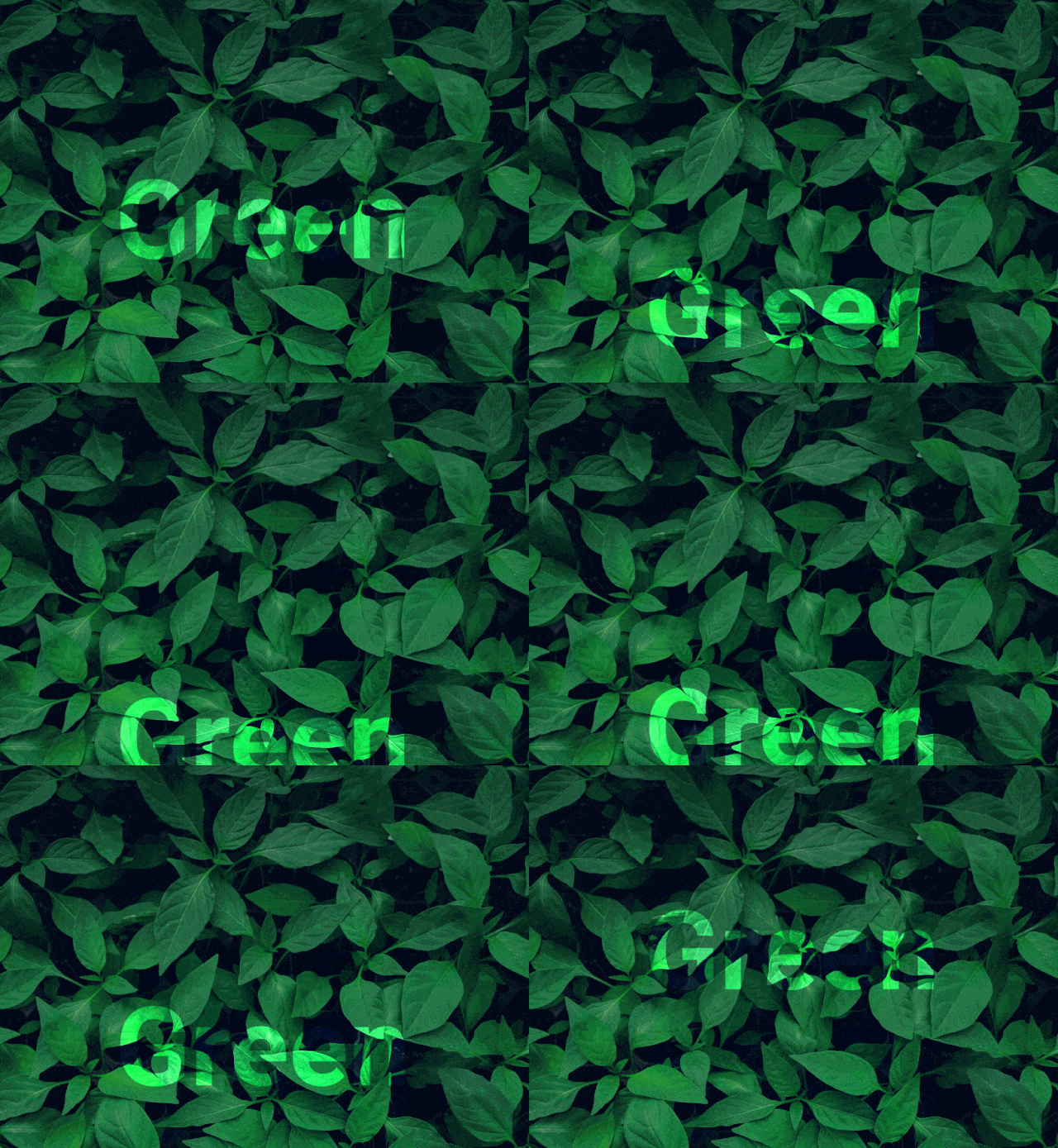
In this example I want to explore how the text blends with the background of leaves. Since the image contains dark and bright spots, this can be very useful in making the text appear to be moving under each leaf.
Case source code: https://codepen.io/shadeed/pen/ef8d675755fde8087d9439b5593e1956?editors=0100
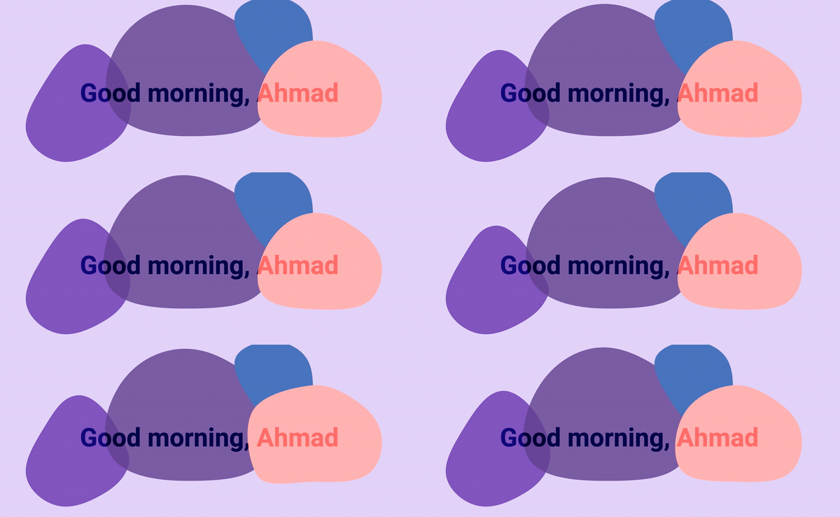
Text with SVG Graphics An interesting effect is to have a title on a background with vectors and shapes. It becomes more interesting when the shapes are different colors.
What can we do with these blob shapes? I used the MorphSVG plugin to change the path of each blog shape. This produced an interesting result. 
 Case source code: https://codepen.io/shadeed/pen/daa6d51bfec15e3cbaef12e8387c97f3?editors=0010
Mixing real elements
The effect that caught my eye is when the element has a white background and a black foreground using `mix-blend-mode: screen`. 
Magnifying Glass Class
I used an SVG and applied the following to it. Notice how the black areas become transparent when using the screen.
##Case source code: https://codepen.io/shadeed/pen/4d309070bd3855c1b87a955ac2cec95e?editors=0100
Video Cover
For me, this is a very useful use case. I often need to add a play icon to indicate that there is a video in the article, so I end up using an SVG that is transparent from the center.
This sounds correct, but it has certain limitations. What if you want to add a hover effect to fill the triangle? This is not possible since shapes are subtracted in SVG. One workaround is to put a circle behind the SVG and color it on hover.
 Thanks to blending modes, I can quickly achieve this effect by controlling the embedded SVG on hover.
.article__play {
    mix-blend-mode: screen;
}

.article:hover .article__play {
    mix-blend-mode: normal;
}

.article:hover .article__play {
    .play__base {
      fill: #005FFF;
    }

    .play__icon {
      fill: #fff;
    }
}事例源码:https://codepen.io/shadeed/pen/e06735fd2d2fd707a37f2c4804379342?editors=0100
储值卡
另一种情况是使用裁切图像并将其与其下方的背景融合,结果非常有趣。
img {
    position: absolute;
    right: -15px;
    top: 0;
    width: 110px;
    mix-blend-mode: screen;
}这个想法是把图片放在右边,左边有标题和描述。

同样,通过为每张卡添加多个背景可以更好:

事例源码:https://codepen.io/shadeed/pen/a30f4ac9af6c6ec87a30f63deb2fc2c5?editors=1000
从徽标背景中删除白色
我在Photoshop的早期就知道这个技巧。有时,我需要一个品牌的标志,它是很难得到一个透明的PNG版本。使用混合模式,这很容易解决。
我模拟了Facebook和Amazon徽标,并在每个徽标下添加了白色背景。

现在来解决这个问题,添加了以下CSS:
img {
    mix-blend-mode: multiply;
    filter: contrast(2);
}注意,我添加了filter: contrast(2)来增加徽标的对比度。应用混合效果使他们比原来的颜色深一点。

问题已解决!当然,我不建议使用此功能。但是,如果我被迫这么做,我将使用它来节省时间,当原始徽标到达时,我可以替换它并消除混合效果。
事例源码:https://codepen.io/shadeed/pen/c8d0b773adf24901319794bda90d6a4e?editors=0100
Isolation
isolation CSS属性定义该元素是否必须创建一个新的层叠上下文(stacking context)。
该属性的主要作用是当和background-blend-mode属性一起使用时,可以只混合一个指定元素栈的背景:它允许使一组元素从它们后面的背景中独立出来,只混合这组元素的背景。
「html」
<div>
  <span>CSS is Awesome</span>
</div>
「css」
div {
  isolation: isolate; /* Creates a new stacking context */
}

span {
    mix-blend-mode: difference;
}
如你所见,文本“ CSS很棒”仅在其父代的边界内融合。外面的东西不会混在一起。换句话说,它是孤立的。
事例源码:https://codepen.io/shadeed/pen/3b84bf8730ae27563f983e036f96aacb?editors=1100
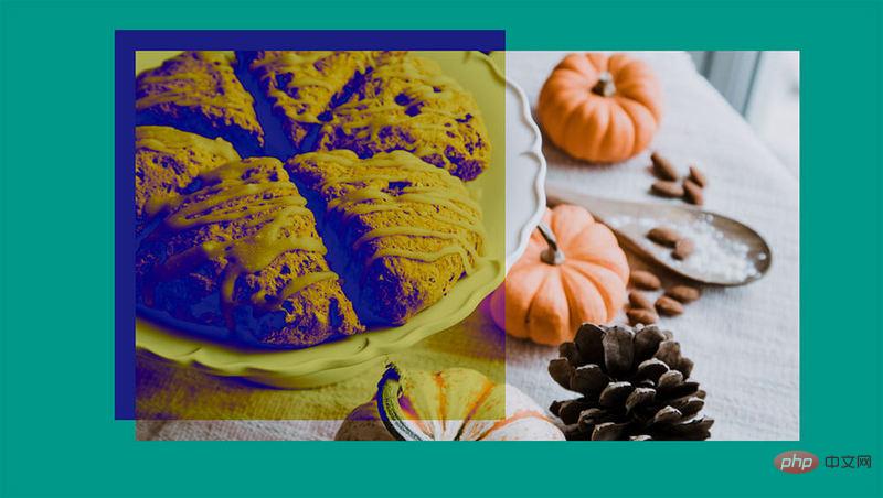
isolation 可以通过使用创建新的堆栈上下文的属性来实现。例如,如果父元素具有opacity 属性,这将影响结果。
「html」
<div>
  <img class="lazy lazy"  src="/static/imghw/default1.png"  data-src="cake.jpg"   data- alt="">
</div>
「css」
div {
  opacity: 0.99; /* Creates a new stacking context, which result to an isolated group */
}

img {
  mix-blend-mode: difference;
}
事例源码:https://codepen.io/shadeed/pen/b6fcced3fba405846b2e93779282f3cb?editors=0100
进入Background-Blend-Mode
它的工作方式类似mix-blend-mode,但具有多个背景图像。每个背景可以有自己的混合模式,举个例子。
在此示例中,将三层混合在一起:基础图像,实心填充(Solid Fill)和渐变填充(radient Fill.)。
.elem {
    background: linear-gradient(45deg, #000 10%, transparent),
              linear-gradient(#3754C7, #3754C7),
              url(nature.jpg);
  background-size: cover;
  background-blend-mode: overlay, color;
}在CSS中,应该以正确的方式对每个背景进行排序。堆叠顺序从上到下,如上图所示。
事例源码:https://codepen.io/shadeed/pen/b4351fd10c5ff1e0a5b210f87c1040cd?editors=1100
着色图像
通过使用径向梯度,有一些有趣的结果比有用。这个想法是添加一个彩色的图像,使它与它混合。
:root {
  --color: #000;
  --size: 250px; /* Gradient Size */
}

.elem-1 {
  background: radial-gradient(circle var(--size) at center, transparent, var(--color)),
              url(nature.jpg);
}通过对元素应用background-blend-mode: color,结果是图像的去饱和版本。
事例源码:https://codepen.io/shadeed/pen/3779d5b0ab6e013487638492573739f8
「浏览器支持」
Original address: https://css-tricks.com/basics-css-blend-modes/
Author: Ahmad Shaeed
Translated address: https:// segmentfault.com/a/1190000038883022
For more programming-related knowledge, please visit: Introduction to Programming! !
The above is the detailed content of Talk about blending modes in CSS. For more information, please follow other related articles on the PHP Chinese website!

Hot AI Tools

Undresser.AI Undress
AI-powered app for creating realistic nude photos

AI Clothes Remover
Online AI tool for removing clothes from photos.

Undress AI Tool
Undress images for free

Clothoff.io
AI clothes remover

Video Face Swap
Swap faces in any video effortlessly with our completely free AI face swap tool!

Hot Article

Hot Tools

Notepad++7.3.1
Easy-to-use and free code editor

SublimeText3 Chinese version
Chinese version, very easy to use

Zend Studio 13.0.1
Powerful PHP integrated development environment

Dreamweaver CS6
Visual web development tools

SublimeText3 Mac version
God-level code editing software (SublimeText3)

Hot Topics
 1392
1392
 52
52
 How to use bootstrap in vue
Apr 07, 2025 pm 11:33 PM
Using Bootstrap in Vue.js is divided into five steps: Install Bootstrap. Import Bootstrap in main.js. Use the Bootstrap component directly in the template. Optional: Custom style. Optional: Use plug-ins.
 The Roles of HTML, CSS, and JavaScript: Core Responsibilities
Apr 08, 2025 pm 07:05 PM
HTML defines the web structure, CSS is responsible for style and layout, and JavaScript gives dynamic interaction. The three perform their duties in web development and jointly build a colorful website.
 How to write split lines on bootstrap
Apr 07, 2025 pm 03:12 PM
There are two ways to create a Bootstrap split line: using the tag, which creates a horizontal split line. Use the CSS border property to create custom style split lines.
 Understanding HTML, CSS, and JavaScript: A Beginner's Guide
Apr 12, 2025 am 12:02 AM
WebdevelopmentreliesonHTML,CSS,andJavaScript:1)HTMLstructurescontent,2)CSSstylesit,and3)JavaScriptaddsinteractivity,formingthebasisofmodernwebexperiences.
 How to use bootstrap button
Apr 07, 2025 pm 03:09 PM
How to use the Bootstrap button? Introduce Bootstrap CSS to create button elements and add Bootstrap button class to add button text
 How to resize bootstrap
Apr 07, 2025 pm 03:18 PM
To adjust the size of elements in Bootstrap, you can use the dimension class, which includes: adjusting width: .col-, .w-, .mw-adjust height: .h-, .min-h-, .max-h-
 How to set up the framework for bootstrap
Apr 07, 2025 pm 03:27 PM
To set up the Bootstrap framework, you need to follow these steps: 1. Reference the Bootstrap file via CDN; 2. Download and host the file on your own server; 3. Include the Bootstrap file in HTML; 4. Compile Sass/Less as needed; 5. Import a custom file (optional). Once setup is complete, you can use Bootstrap's grid systems, components, and styles to create responsive websites and applications.
 How to insert pictures on bootstrap
Apr 07, 2025 pm 03:30 PM
There are several ways to insert images in Bootstrap: insert images directly, using the HTML img tag. With the Bootstrap image component, you can provide responsive images and more styles. Set the image size, use the img-fluid class to make the image adaptable. Set the border, using the img-bordered class. Set the rounded corners and use the img-rounded class. Set the shadow, use the shadow class. Resize and position the image, using CSS style. Using the background image, use the background-image CSS property.


