

css to achieve points animation effect


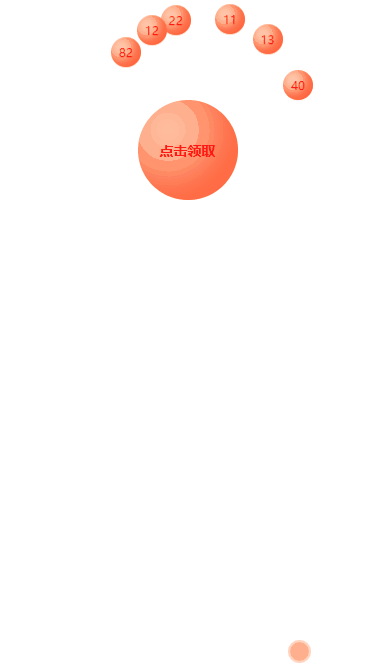
In a recent project, I want to have an effect of collecting points. According to the boss’s description, this effect is similar to the effect of collecting energy in Alipay Ant Forest. The overall effect is that there are several points elements floating around the tree, sliding up and down, like stars twinkling. After clicking to receive them, they slide along the center of the tree and disappear. The energy on the tree increases, and finally expands and becomes bigger.
1. Overall idea
First of all, I think that the basic outline is an earth, surrounded by several twinkling small stars in a semicircle, and then they fall to the earth at the same time. Use css positioning, border-radius to draw a circle, animation, click action to trigger a new animation, and the point increment effect is similar to countUp.js, but this plug-in is not used here and is implemented manually.
(Learning video sharing: css video tutorial)
1.1 Semicircle surround effect
This Involving mathematical knowledge, the radian is obtained based on the angle (radians = angle * pi/180), and then converted into coordinates, so that the integral elements surround the total integral. The key code is as follows:
this.integral.forEach(i => {
    // 角度转化为弧度
    let angle = Math.PI / 180 * this.getRandomArbitrary(90, 270)
    // 根据弧度获取坐标
    i.x = xAxis + 100 * Math.sin(angle)
    i.y = 100 + 100 * Math.cos(angle)
    // 贝塞尔函数
    i.timing = this.timeFun[parseInt(this.getRandomArbitrary(0, 3))]
})Note that the function of getRandomArbitrary() function is to obtain random numbers, as follows:
// 求两个数之间的随机数
getRandomArbitrary(min, max) {
    return Math.random() * (max - min) + min;
}timeFunc is a collection of Bessel function names, in order to achieve the effect of integral flashing (up and down sliding), defined in data:
timeFun: ['ease', 'ease-in', 'ease-in-out', 'ease-out'], // 贝塞尔函数实现闪烁效果
1.2 Points flashing (sliding up and down)
Use css animation animation to realize points sliding up and down, here The way that can be thought of is transform: translateY(5px), which is to move a certain distance on the y-axis and play the animation in a loop. The code is as follows:
.foo {
    display: flex;
    font-size: 10px;
    align-items: center;
    justify-content: center;
    width: 30px;
    height: 30px;
    position: fixed;
    top: 0;
    left: 0;
    animation-name: slideDown;
    /*默认贝塞尔函数*/
    animation-timing-function: ease-out;
    /*动画时间*/
    animation-duration: 1500ms;
    /*动画循环播放*/
    animation-iteration-count: infinite;
    -moz-box-shadow: -5px -5px 10px 3px rgb(277, 102, 63) inset;
    -webkit-box-shadow: -5px -5px 10px 3px rgb(277, 102, 63) inset;
    box-shadow: -5px -5px 10px 3px rgb(277, 102, 63) inset;
}

/*小积分上下闪烁*/
@keyframes slideDown {
    from {
        transform: translateY(0);
    }
    50% {
        transform: translateY(5px);
        background-color: rgb(255, 234, 170);
    }
    to {
        transform: translateY(0);
        background: rgb(255, 202, 168);
    }
}Note that in addition to moving the points up and down, I also let the background color change accordingly. The pace of moving up and down cannot be consistent, otherwise it will look dull, so use a random number function to randomly select one of the Bessel functions, so that the integrating ball slides up and down and looks uneven. The key code is as follows:
/*html*/{{item.value}}/*js*/ // data中定义 timeFun: ['ease', 'ease-in', 'ease-in-out', 'ease-out'], // 贝塞尔函数实现闪烁效果 // 随机获取贝塞尔函数 i.timing = this.timeFun[parseInt(this.getRandomArbitrary(0, 3))]
1.3 Increasing effect of total points
After clicking to collect the points, the total points must be accumulated. This is similar to countUp.js effect, but this plug-in cannot be quoted here for this function. The project uses vue.js. It is easy to think of modifying the responsive attributes of data to change the numbers. The key is how to make this change not all at once, but gradually. My idea here is Promise setTimeout, modifying the data attribute at certain intervals, so that it does not appear to change suddenly.
In order to make the animation effect look smooth, divide the total time (1500 milliseconds) by the number of small integrals to get a value similar to the animation key frame. This value is used as the number of changes, and then executed at certain intervals. once. All animation times are set to 1500 milliseconds so that the overall effect is consistent.
The key code is as follows:
this.integralClass.fooClear = true
this.totalClass.totalAdd = true
this.totalText = `${this.totalIntegral}积分`
let count = this.integral.length, timeoutID = null, tasks = [], totalTime = parseInt(1500 / count)
const output = (i) => new Promise((resolve) => {
    timeoutID = setTimeout(() => {
        // 积分递增
        this.totalIntegral += this.integral[i].value
        // 修改响应式属性
        this.totalText = `${this.totalIntegral}积分`
        resolve();
    }, totalTime * i);
})
for (var i = 0; i < 5; i++) {
    tasks.push(output(i));
}
Promise.all(tasks).then(() => {
    clearTimeout(timeoutID)
})1.4 The small points disappear, and the total points expansion effect
The last step is, small points Move along the direction of the total integral and disappear, and the total integral expands.
The small integral moves and disappears, the x-axis coordinate moves to the x-axis coordinate of the total integral, and the y-axis moves to the y-axis coordinate of the total integral. In fact, the coordinate point becomes the same as the total integral, so it looks like this Movement along the center is the same. When the coordinates of all small integrals move here, the data can be deleted. The key css is as follows:
.fooClear {
    animation-name: clearAway;
    animation-timing-function: ease-in-out;
    animation-iteration-count: 1;
    animation-fill-mode: forwards;
    -webkit-animation-duration: 1500ms;
    -moz-animation-duration: 1500ms;
    -o-animation-duration: 1500ms;
    animation-duration: 1500ms;
}

/*清除小的积分*/
@keyframes clearAway {
    to {
        top: 150px;
        left: 207px;
        opacity: 0;
        visibility: hidden;
        width: 0;
        height: 0;
    }
}The total points are expanded. My implementation idea here is transform: scale(1.5, 1.5); that is, make it a little larger than the original size, and finally return to the original size. transform: scale(1 , 1);, the key css is as follows:
.totalAdd {
    animation-name: totalScale;
    animation-timing-function: ease-in-out;
    /*动画只播放一次*/
    animation-iteration-count: 1;
    /*动画停留在最后一个关键帧*/
    animation-fill-mode: forwards;
    -webkit-animation-duration: 1500ms;
    -moz-animation-duration: 1500ms;
    -o-animation-duration: 1500ms;
    animation-duration: 1500ms;
}

@keyframes totalScale {
    50% {
        transform: scale(1.15, 1.15);
        -ms-transform: scale(1.15, 1.15);
        -moz-transform: scale(1.15, 1.15);
        -webkit-transform: scale(1.15, 1.15);
        -o-transform: scale(1.15, 1.15);
    }
    to {
        transform: scale(1, 1);
        -ms-transform: scale(1, 1);
        -moz-transform: scale(1, 1);
        -webkit-transform: scale(1, 1);
        -o-transform: scale(1, 1);
    }
}At this point, the logic of the entire animation has been clarified. Let’s write a demo first. I have put the code on github to integrate the animation.
The effect is as follows:
2. Implemented in the project
Finally, in the project, a Ajax request is to collect points. You only need to put the animation in the ajax request success callback and you are done. The key js code is as follows:
// 一键领取积分
aKeyReceive() {
    if (this.unreceivedIntegral.length === 0) {
        return bottomTip("暂无未领积分")
    }
    if (this.userInfo.memberAKeyGet) {
        let param = {
            memberId: this.userInfo.memberId,
            integralIds: this.unreceivedIntegral.map(u => u.id).join(","),
            integralValue: this.unreceivedIntegral.reduce((acc, curr, index, arr) => { return acc + curr.value }, 0)
        }
        this.$refs.resLoading.show(true)
        api.getAllChangeStatus(param).then(res => {
            let data = res.data
            if (data.success) {
                this.getRecordIntegralList()
                this.playIntegralAnim()
            } else {
                bottomTip(data.message)
            }
        }).finally(() => {
            this.$refs.resLoading.show(false)
        })
    } else {
        this.$refs.refPopTip.show()
    }
},
// 领取积分的动画
playIntegralAnim() {
    this.integralClass.fooClear = true
    this.totalClass.totalAdd = true
    this.totalText = `${this.statisticsData.useValue}积分`
    let count = this.unreceivedIntegral.length, timeoutID = null, tasks = [], totalTime = parseInt(1500 / count)
    const output = (i) => new Promise((resolve) => {
        timeoutID = setTimeout(() => {
            this.statisticsData.useValue += this.unreceivedIntegral[i].value
            this.totalText = `${this.statisticsData.useValue}积分`
            resolve();
        }, totalTime * i);
    })
    for (let i = 0; i < count; i++) {
        tasks.push(output(i));
    }
    Promise.all(tasks).then(() => {
        clearTimeout(timeoutID)
    })
}The final effect after the project is online is as follows:

Note that the reason why the page flashes here is because there is an ajax request The loading state is actually dispensable if the server is completely reliable.
Finally, if you readers have similar needs, you may wish to learn from them. If you have better ideas, please bring them to my reference.
For more programming-related knowledge, please visit: Programming Learning! !
The above is the detailed content of css to achieve points animation effect. For more information, please follow other related articles on the PHP Chinese website!

Hot AI Tools

Undresser.AI Undress
AI-powered app for creating realistic nude photos

AI Clothes Remover
Online AI tool for removing clothes from photos.

Undress AI Tool
Undress images for free

Clothoff.io
AI clothes remover

AI Hentai Generator
Generate AI Hentai for free.

Hot Article
Hot Tools

Notepad++7.3.1
Easy-to-use and free code editor

SublimeText3 Chinese version
Chinese version, very easy to use

Zend Studio 13.0.1
Powerful PHP integrated development environment

Dreamweaver CS6
Visual web development tools

SublimeText3 Mac version
God-level code editing software (SublimeText3)
Hot Topics


 What does placeholder mean in vue
May 07, 2024 am 09:57 AM
What does placeholder mean in vue
May 07, 2024 am 09:57 AM
In Vue.js, the placeholder attribute specifies the placeholder text of the input element, which is displayed when the user has not entered content, provides input tips or examples, and improves form accessibility. Its usage is to set the placeholder attribute on the input element and customize the appearance using CSS. Best practices include being relevant to the input, being short and clear, avoiding default text, and considering accessibility.
 What does span mean in js
May 06, 2024 am 11:42 AM
What does span mean in js
May 06, 2024 am 11:42 AM
The span tag can add styles, attributes, or behaviors to text. It is used to: add styles, such as color and font size. Set attributes such as id, class, etc. Associated behaviors such as clicks, hovers, etc. Mark text for further processing or citation.
 What does rem mean in js
May 06, 2024 am 11:30 AM
What does rem mean in js
May 06, 2024 am 11:30 AM
REM in CSS is a relative unit relative to the font size of the root element (html). It has the following characteristics: relative to the root element font size, not affected by the parent element. When the root element's font size changes, elements using REM will adjust accordingly. Can be used with any CSS property. Advantages of using REM include: Responsiveness: Keep text readable on different devices and screen sizes. Consistency: Make sure font sizes are consistent throughout your website. Scalability: Easily change the global font size by adjusting the root element font size.
 How to introduce images into vue
May 02, 2024 pm 10:48 PM
How to introduce images into vue
May 02, 2024 pm 10:48 PM
There are five ways to introduce images in Vue: through URL, require function, static file, v-bind directive and CSS background image. Dynamic images can be handled in Vue's computed properties or listeners, and bundled tools can be used to optimize image loading. Make sure the path is correct otherwise a loading error will appear.
 What is the function of span tag
Apr 30, 2024 pm 01:54 PM
What is the function of span tag
Apr 30, 2024 pm 01:54 PM
The SPAN tag is an inline HTML tag that is used to highlight text by applying attributes such as style, color, and font size. This includes emphasizing text, grouping text, adding hover effects, and dynamically updating content. It is used by placing <span> and </span> tags around the text you want to emphasize, and is manipulated via CSS styling or JavaScript. The benefits of SPAN tags include semantic clarity, styling flexibility, and ease of maintenance.
 How to wrap prompt in js
May 01, 2024 am 06:24 AM
How to wrap prompt in js
May 01, 2024 am 06:24 AM
When using the prompt() method in JavaScript, you can achieve line breaks through the following three methods: 1. Insert the "\n" character at the position where you want to break the line; 2. Use the line break character in the prompt text; 3. Use CSS's "white" -space: pre" style forces line breaks.
 What language is the browser plug-in written in?
May 08, 2024 pm 09:36 PM
What language is the browser plug-in written in?
May 08, 2024 pm 09:36 PM
Browser plug-ins are usually written in the following languages: Front-end languages: JavaScript, HTML, CSS Back-end languages: C++, Rust, WebAssembly Other languages: Python, Java
 What is node in js
May 07, 2024 pm 09:06 PM
What is node in js
May 07, 2024 pm 09:06 PM
Nodes are entities in the JavaScript DOM that represent HTML elements. They represent a specific element in the page and can be used to access and manipulate that element. Common node types include element nodes, text nodes, comment nodes, and document nodes. Through DOM methods such as getElementById(), you can access nodes and operate on them, including modifying properties, adding/removing child nodes, inserting/replacing nodes, and cloning nodes. Node traversal helps navigate within the DOM structure. Nodes are useful for dynamically creating page content, event handling, animation, and data binding.
