

bootstrap implements simple side navigation bar effect

This article will introduce to you how to implement the bootstrap side navigation bar. It has certain reference value. Friends in need can refer to it. I hope it will be helpful to everyone.
Related recommendations: "bootstrap tutorial"
bootstrap side navigation bar implementation principle
The side sliding bar uses positioning fixed
Use bootstrap responsively using the tool class visible-sm visible-xs hidden-xs hidden -sm and other adaptations to different screens
The side-sliding effect of the side-sliding bar is not implemented using the jquery method. Instead, the css3 transforms attribute is used to move the div and create the side-sliding animation effect. The css attribute transition
is used. Disadvantages: using two sets of menus, one is the menu displayed on the PC screen, and the other is the mobile navigation menu displayed on the mobile terminal. This disadvantage is relatively obvious. , generate irrelevant tags, the advantage is less code, simple and easy to accept
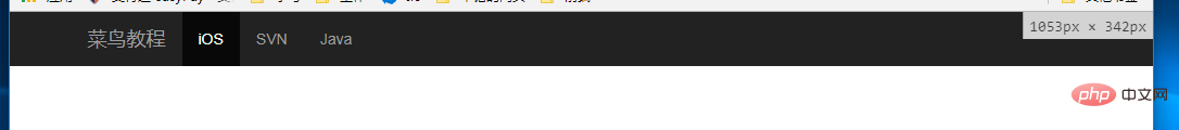
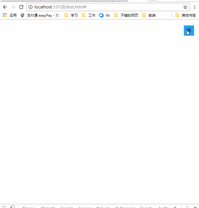
Rendering
##bootstrap navigation bar layout
    <!--手机导航栏-->
    <div>
        <ul>
            <li><a>首页</a></li>
            <li><a>Java</a></li>
            <li><a>SVN</a></li>
            <li><a>iOS</a></li>
        </ul>
    </div>
    <!--pc导航栏-->
    <nav>
        <div>
            <div>
                <a>菜鸟教程</a>
            </div>
            <div>
                <ul>
                    <li><a>iOS</a></li>
                    <li><a>SVN</a></li>
                    <li><a>Java</a></li>
                </ul>
            </div>
        </div>
    </nav>
    <!--手机导航栏侧滑-->
    <div>
        <a>
            <span></span>
        </a>
    </div>
For details on the bootstrap responsive tool class, please see: https://www.runoob.com/bootstrap/bootstrap-responsive-utilities.html
css to achieve layout and side-sliding effects (side-sliding Key css3 attributes transform, transition)
Not much code, only 10 lines * {margin:0;padding:0;}
#mobile-menu {position:fixed;top:0;left:0;width:220px;height:100%;background-color:#373737;z-index:9999;}
a:hover ,a:focus{text-decoration:none}
.mobile-nav ul li a {color:gray;display:block;padding:1em 5%; border-top:1px solid #4f4f4f;border-bottom:1px solid #292929;transition:all 0.2s ease-out;cursor:pointer;#mobile-menu {position:fixed;top:0;left:0;width:220px;height:100%;background-color:#373737;z-index:9999;transition:all 0.3s ease-in;}}
.mobile-nav ul li a:hover {background-color: #23A1F6;color: #ffffff;}
.show-nav {transform:translateX(0);}
.hide-nav {transform:translateX(-220px);} /*侧滑关键*/
.mobile-nav-taggle {height:35px;line-height:35px;width:35px;background-color:#23A1F6;color:#ffffff;display:inline-block;text-align:center;cursor:pointer}
.nav.avbar-inverse{position:relative;}
.nav-btn {position:absolute;right:20px;top:20px;}It is worth noting that there are two properties of css3:transform: rotation div supports 2D or 3D rotation of elements. The attribute value translateX (X) is the distance moved by Xpx on the X axis
http://www.w3school.com.cn/cssref/pr_transform.asp
And side sliding The animation effect is to use the transition attribute to set the effect of the transition animation of the attribute. Syntax
transition: property duration timing-function delay;
http://www.w3school.com.cn/cssref/pr_transition.asp
Click event switches side sliding
        $("#mobile-nav-taggle").click(function () {
            var mobileMenu = $("#mobile-menu");
            if (mobileMenu.hasClass("show-nav")) {
                setTimeout(function () {
                    mobileMenu.addClass("hide-nav").removeClass("show-nav");
                }, 100)
            }
            else {
                setTimeout(function (){
                    mobileMenu.addClass("show-nav").removeClass("hide-nav");
                }, 100)
            }
})Summary
It is not recommended to use two menu navigation bars, disadvantages Obviously, it's just to achieve the effect, don't mind, in fact it can also be achieved with a menu navigation bar, try media and it can be achieved. Code download: http://download.csdn.net/detail/kebi007/9909725Introduction to Programming ! !
The above is the detailed content of bootstrap implements simple side navigation bar effect. For more information, please follow other related articles on the PHP Chinese website!

Hot AI Tools

Undresser.AI Undress
AI-powered app for creating realistic nude photos

AI Clothes Remover
Online AI tool for removing clothes from photos.

Undress AI Tool
Undress images for free

Clothoff.io
AI clothes remover

Video Face Swap
Swap faces in any video effortlessly with our completely free AI face swap tool!

Hot Article
Hot Tools

Notepad++7.3.1
Easy-to-use and free code editor

SublimeText3 Chinese version
Chinese version, very easy to use

Zend Studio 13.0.1
Powerful PHP integrated development environment

Dreamweaver CS6
Visual web development tools

SublimeText3 Mac version
God-level code editing software (SublimeText3)
Hot Topics
 1387
1387
 52
52

 How to get the bootstrap search bar
Apr 07, 2025 pm 03:33 PM
How to get the bootstrap search bar
Apr 07, 2025 pm 03:33 PM
How to use Bootstrap to get the value of the search bar: Determines the ID or name of the search bar. Use JavaScript to get DOM elements. Gets the value of the element. Perform the required actions.
 How to use bootstrap in vue
Apr 07, 2025 pm 11:33 PM
How to use bootstrap in vue
Apr 07, 2025 pm 11:33 PM
Using Bootstrap in Vue.js is divided into five steps: Install Bootstrap. Import Bootstrap in main.js. Use the Bootstrap component directly in the template. Optional: Custom style. Optional: Use plug-ins.
 How to do vertical centering of bootstrap
Apr 07, 2025 pm 03:21 PM
How to do vertical centering of bootstrap
Apr 07, 2025 pm 03:21 PM
Use Bootstrap to implement vertical centering: flexbox method: Use the d-flex, justify-content-center, and align-items-center classes to place elements in the flexbox container. align-items-center class method: For browsers that do not support flexbox, use the align-items-center class, provided that the parent element has a defined height.
 How to write split lines on bootstrap
Apr 07, 2025 pm 03:12 PM
How to write split lines on bootstrap
Apr 07, 2025 pm 03:12 PM
There are two ways to create a Bootstrap split line: using the tag, which creates a horizontal split line. Use the CSS border property to create custom style split lines.
 How to resize bootstrap
Apr 07, 2025 pm 03:18 PM
How to resize bootstrap
Apr 07, 2025 pm 03:18 PM
To adjust the size of elements in Bootstrap, you can use the dimension class, which includes: adjusting width: .col-, .w-, .mw-adjust height: .h-, .min-h-, .max-h-
 How to use bootstrap button
Apr 07, 2025 pm 03:09 PM
How to use bootstrap button
Apr 07, 2025 pm 03:09 PM
How to use the Bootstrap button? Introduce Bootstrap CSS to create button elements and add Bootstrap button class to add button text
 How to set up the framework for bootstrap
Apr 07, 2025 pm 03:27 PM
How to set up the framework for bootstrap
Apr 07, 2025 pm 03:27 PM
To set up the Bootstrap framework, you need to follow these steps: 1. Reference the Bootstrap file via CDN; 2. Download and host the file on your own server; 3. Include the Bootstrap file in HTML; 4. Compile Sass/Less as needed; 5. Import a custom file (optional). Once setup is complete, you can use Bootstrap's grid systems, components, and styles to create responsive websites and applications.
 How to insert pictures on bootstrap
Apr 07, 2025 pm 03:30 PM
How to insert pictures on bootstrap
Apr 07, 2025 pm 03:30 PM
There are several ways to insert images in Bootstrap: insert images directly, using the HTML img tag. With the Bootstrap image component, you can provide responsive images and more styles. Set the image size, use the img-fluid class to make the image adaptable. Set the border, using the img-bordered class. Set the rounded corners and use the img-rounded class. Set the shadow, use the shadow class. Resize and position the image, using CSS style. Using the background image, use the background-image CSS property.
