What are the advantages and disadvantages of flex layout
The advantages and disadvantages of flex layout are: 1. The advantage of flex layout is that it is easy to use, and it is easy to achieve a certain layout effect according to flex rules; 2. The disadvantage is that browser compatibility is relatively poor and can only be compatible with ie9 and above.
The operating environment of this article: Acer S40-51, HBuilderX.3.0.5&&css3 version, Windows10 Home Chinese version
Recommended: css Video tutorial
The advantages and disadvantages of flex layout are:
CSS3 Flexible Box (Flexible Box or flexbox) is a type of layout that needs to be adapted when the page needs to A layout method that ensures elements behave appropriately across different screen sizes and device types.
The purpose of introducing the flexible box layout model is to provide a more efficient way to arrange, align and allocate empty space to sub-elements in a container.
The advantages and disadvantages of the flex layout introduced by css3:
The advantage is that it is easy to use and it is easy to achieve a certain layout effect according to flex rules.
The disadvantage is: the browser compatibility is relatively poor and can only be compatible with ie9 and above.
Introduction to flex layout introduced by css3:
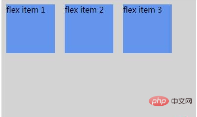
The flexible box is composed of a flexible container (Flex container) and a flexible sub-element (Flex item). A flex container is defined as a flex container by setting the display property to flex or inline-flex. A flex container contains one or more flex child elements.
Note: The outside of the flexible container and inside the flexible sub-element are rendered normally. The flex box only defines how the flex child elements are laid out within the flex container. Flex child elements are usually displayed in a row within the flex box. By default there is only one row per container.
Example:
##
<!DOCTYPE html>
<html>
<head>
<meta charset="utf-8">
<title>php中文网</title>
<style>
.flex-container {
    display: -webkit-flex;
    display: flex;
    width: 400px;
    height: 250px;
    background-color: lightgrey;
}
.flex-item {
    background-color: cornflowerblue;
    width: 100px;
    height: 100px;
    margin: 10px;
}
</style>
</head>
<body>
<div class="flex-container">
  <div class="flex-item">flex item 1</div>
  <div class="flex-item">flex item 2</div>
  <div class="flex-item">flex item 3</div>
</div>
</body>
</html>
If you want to learn more about programming, please pay attention to the php training column!
The above is the detailed content of What are the advantages and disadvantages of flex layout. For more information, please follow other related articles on the PHP Chinese website!

Hot AI Tools

Undresser.AI Undress
AI-powered app for creating realistic nude photos

AI Clothes Remover
Online AI tool for removing clothes from photos.

Undress AI Tool
Undress images for free

Clothoff.io
AI clothes remover

AI Hentai Generator
Generate AI Hentai for free.

Hot Article

Hot Tools

Notepad++7.3.1
Easy-to-use and free code editor

SublimeText3 Chinese version
Chinese version, very easy to use

Zend Studio 13.0.1
Powerful PHP integrated development environment

Dreamweaver CS6
Visual web development tools

SublimeText3 Mac version
God-level code editing software (SublimeText3)

Hot Topics
 1377
1377
 52
52
 Guide to solving misalignment of WordPress web pages
Mar 05, 2024 pm 01:12 PM
Guide to solving misaligned WordPress web pages In WordPress website development, sometimes we encounter web page elements that are misaligned. This may be due to screen sizes on different devices, browser compatibility, or improper CSS style settings. To solve this misalignment, we need to carefully analyze the problem, find possible causes, and debug and repair it step by step. This article will share some common WordPress web page misalignment problems and corresponding solutions, and provide specific code examples to help develop
 How to implement responsive layout using Vue
Nov 07, 2023 am 11:06 AM
Vue is a very excellent front-end development framework. It adopts the MVVM mode and achieves a very good responsive layout through two-way binding of data. In our front-end development, responsive layout is a very important part, because it allows our pages to display the best effects for different devices, thereby improving user experience. In this article, we will introduce how to use Vue to implement responsive layout and provide specific code examples. 1. Use Bootstrap to implement responsive layout. Bootstrap is a
 What are the commonly used Flex layout properties?
Feb 25, 2024 am 10:42 AM
What are the common properties of flex layout? Specific code examples are required. Flex layout is a powerful tool for designing responsive web page layouts. It makes it easy to control the arrangement and size of elements in a web page by using a flexible set of properties. In this article, I will introduce the common properties of Flex layout and provide specific code examples. display: Set the display mode of the element to Flex. .container{display:flex;}flex-directi
 Solve the problem of flex layout style in Vue
Jun 30, 2023 pm 08:51 PM
Vue is a popular JavaScript framework that is widely used in front-end development. Its flexibility and powerful features allow developers to easily build interaction-rich web applications. In Vue development, flex layout is almost everywhere. However, when using flex layout, you sometimes encounter some styling issues. This article will introduce some methods to solve the style problems caused by flex layout. First, let us understand the basic concepts of flex layout. Flex layout provides a flexible box model
 How to implement two-column layout through CSS Flex layout
Sep 26, 2023 am 10:54 AM
How to implement two-column layout through CSSFlex flexible layout CSSFlex flexible layout is a modern layout technology that can simplify the process of web page layout, allowing designers and developers to easily create layouts that are flexible and adaptable to various screen sizes. Among them, implementing a two-column layout is one of the common requirements in Flex layout. In this article, we will introduce how to use CSSFlex elastic layout to implement a simple two-column layout and provide specific code examples. Using Flex containers and projects
 How to implement irregular grid layout through CSS Flex layout
Sep 28, 2023 pm 09:49 PM
How to implement irregular grid layout through CSSFlex elastic layout. In web design, it is often necessary to use grid layout to achieve page segmentation and layout. Usually grid layout is regular, and each grid is the same size. Sometimes we may need to implement some irregular grid layout. CSSFlex elastic layout is a powerful layout method that can easily implement various grid layouts, including irregular grid layouts. Below we will introduce how to use CSSFlex elastic layout to achieve different
 How to achieve vertical centering of page elements through CSS Flex layout
Sep 27, 2023 pm 03:52 PM
How to achieve vertical centering of page elements through CSSFlex elastic layout In web design, we often encounter situations where page elements need to be vertically centered. CSSFlex elastic layout is an elegant, concise and flexible layout method that can easily achieve vertical centering of page elements. This article will introduce in detail how to use CSSFlex layout to achieve vertical centering of page elements and provide specific code examples. 1. Basic Principles To use CSSFlex layout to achieve vertical centering of page elements, the following are required:
 Optimize WordPress layout and eliminate misalignment problems
Mar 05, 2024 pm 05:36 PM
Optimize WordPress layout and eliminate misalignment problems. In the process of building a website using WordPress, layout misalignment is a common problem, which brings trouble to users when browsing the website. Correct layout is a crucial part of website design, which directly affects user experience and page display effects. Therefore, in order to eliminate the misalignment problem, we need to optimize the WordPress layout and implement it through specific code examples. Here are some common layout problems and corresponding solutions: Responsive layout problems:


