 Web Front-end
 CSS Tutorial
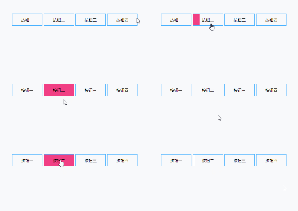
 Use css pseudo-classes to achieve mouse-over button animation effects
Use css pseudo-classes to achieve mouse-over button animation effects
The

button is a very common function for developers. The front end usually adds some operation interaction styles to buttons to increase some user experience.
For example: hover style, click style, loading style, etc. Let's learn about css3 animation and css pseudo-classes through simple examples.
Example 1
<button class="btn-1">按钮一</button>
<style>
button{
position: relative;
width: 100px;
height: 40px;
border: 1px solid #46b0ff;
background: none;
cursor: pointer;
}
button:after{
position: absolute;
content: '';
width: 100%;
height: 100%;
top: 0;
left: 0;
}
.btn-1:after{
opacity: 0;
background: #46b0ff;
transition: all .3s;
z-index: -1;
}
.btn-1:hover:after{
opacity: 1;
}
</style>
Analysis:
1. Use pseudo-class as mouse: after hover event, For the background of the button, relative positioning (relative) and absolute positioning (absolute) are used here
Remember: when using absolutely positioned elements, the parent element must use relative positioning, otherwise the element will keep looking upwards for the relatively positioned element. , until the root node.
2. Here, transition is used to describe the :hover event animation. The animation is completed in 0.3s and the transparency of :after is changed. all is all behavior.
Of course, we have a simpler implementation here. It is ok to directly change the background without using a type. Please see the code:
<button class="btn-1">按钮一</button>

<style>
button{
  position: relative;
  width: 100px;
  height: 40px;
  border: 1px solid #46b0ff;
  background: none;
  cursor: pointer;
  background: rgba(70, 176, 255, 0);
  transition: all 1s;
}
.btn-1:hover{
  background: rgba(70, 176, 255, 1);
}
</style>ok. Based on Example 1, we will add Further, please see Example 2
Example 2
<button class="btn-2">按钮二</button>

<style>
...
/* 这里省略上方的公共样式 */
.btn-2:after{
  width: 0;
  background: #f13f84;
  transition: all .3s;
  z-index: -1;
}
.btn-2:hover:after{
  width: 100%;
}
</style>
<button class="btn-3">按钮三</button>

<style>
...
/* 这里省略上方的公共样式 */
.btn-2:after{
  width: 0;
  background: #f13f84;
  transition: all .3s;
  z-index: -1;
}
.btn-2:hover:after{
  width: 100%;
}
</style>Introduction to Programming! !
The above is the detailed content of Use css pseudo-classes to achieve mouse-over button animation effects. For more information, please follow other related articles on the PHP Chinese website!

Hot AI Tools

Undresser.AI Undress
AI-powered app for creating realistic nude photos

AI Clothes Remover
Online AI tool for removing clothes from photos.

Undress AI Tool
Undress images for free

Clothoff.io
AI clothes remover

AI Hentai Generator
Generate AI Hentai for free.

Hot Article

Hot Tools

Notepad++7.3.1
Easy-to-use and free code editor

SublimeText3 Chinese version
Chinese version, very easy to use

Zend Studio 13.0.1
Powerful PHP integrated development environment

Dreamweaver CS6
Visual web development tools

SublimeText3 Mac version
God-level code editing software (SublimeText3)

Hot Topics
 Demystifying Screen Readers: Accessible Forms & Best Practices
Mar 08, 2025 am 09:45 AM
This is the 3rd post in a small series we did on form accessibility. If you missed the second post, check out "Managing User Focus with :focus-visible". In
 Create a JavaScript Contact Form With the Smart Forms Framework
Mar 07, 2025 am 11:33 AM
This tutorial demonstrates creating professional-looking JavaScript forms using the Smart Forms framework (note: no longer available). While the framework itself is unavailable, the principles and techniques remain relevant for other form builders.
 Adding Box Shadows to WordPress Blocks and Elements
Mar 09, 2025 pm 12:53 PM
The CSS box-shadow and outline properties gained theme.json support in WordPress 6.1. Let's look at a few examples of how it works in real themes, and what options we have to apply these styles to WordPress blocks and elements.
 Working With GraphQL Caching
Mar 19, 2025 am 09:36 AM
If you’ve recently started working with GraphQL, or reviewed its pros and cons, you’ve no doubt heard things like “GraphQL doesn’t support caching” or
 Making Your First Custom Svelte Transition
Mar 15, 2025 am 11:08 AM
The Svelte transition API provides a way to animate components when they enter or leave the document, including custom Svelte transitions.
 Show, Don't Tell
Mar 16, 2025 am 11:49 AM
How much time do you spend designing the content presentation for your websites? When you write a new blog post or create a new page, are you thinking about
 Classy and Cool Custom CSS Scrollbars: A Showcase
Mar 10, 2025 am 11:37 AM
In this article we will be diving into the world of scrollbars. I know, it doesn’t sound too glamorous, but trust me, a well-designed page goes hand-in-hand
 What the Heck Are npm Commands?
Mar 15, 2025 am 11:36 AM
npm commands run various tasks for you, either as a one-off or a continuously running process for things like starting a server or compiling code.


