

This article will introduce some ways to use background, mix-blend-mode, mask in CSS and some related Properties to create some slightly more complex and cool backgrounds.
Through this article, you will learn about some of the more powerful uses of CSS background, and learn to use some background-related properties to create more complex background patterns in different ways. In this process, you will better master different gradient techniques and have a deeper understanding of various gradients.
At the same time, with the help of the powerful CSS-Doodle, you will learn how to use a set of rules to quickly create a large number of different random patterns, feel the power of CSS, and enter the beauty of CSS.
We all know that background in CSS is very powerful.
First of all, let’s review the basics. In daily life, the following 4 types should be used most:
background: #000:
background: linear-gradient(#fff, #000) :
background: radial-gradient(#fff, #000) :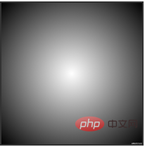
background: conic-gradient(#fff, #000) :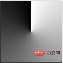
Or a single radial-gradient, for background, it supports the overlay of multiple gradients, which is very important;
(repeating-radial-gradeint), it can reduce a lot of code
Transparency is everywhere
and mask, the soul of creating complex patterns
mix-blend- The role of mode.
repeating-linear-gradient to repeat the linear gradient to create two background stripes with opposite angles. Normally, without using blending modes, layer the two patterns together and see what happens.


mix-blend-mode: multiply to the top layer pattern, Do it again and see what happens this time.
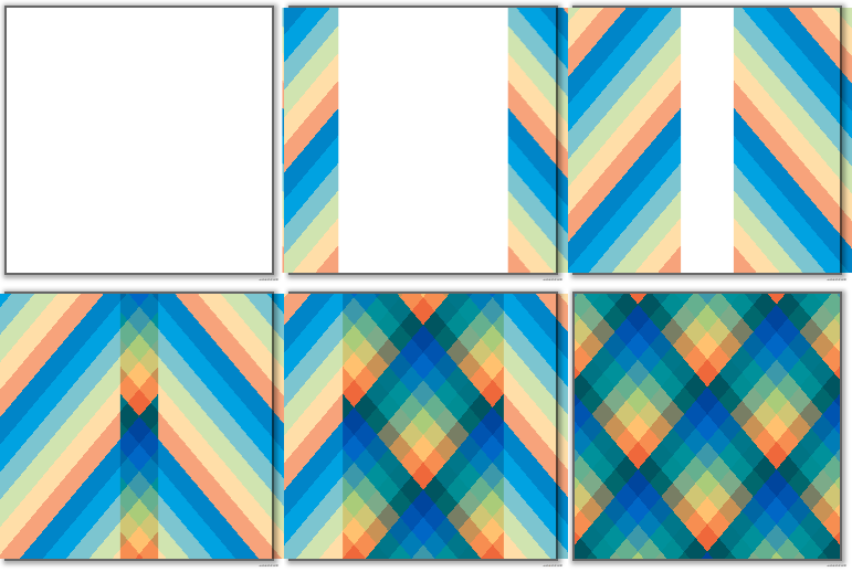
CodePen Demo - Repeating-linear-gradient background & mix-blend-mode
mix-blend-mode
So why is mix-blend-mode: multiply used above? Is it possible to use other blending modes?
sure. This is just an example, mix-blend-mode: multiply means multiply in PS, and it belongs to one of the darkening mode groups of layer blending modes.
We use the above DEMO and try other blending modes to get different effects.

#It can be seen that the superposition of different blending modes has very different effects. Of course, by using different blending modes, we can create patterns with different effects.
CodePen Demo - Repeating-linear-gradient background & mix-blend-mode
That’s it! I have to introduce an artifact for writing CSS - CSS-Doodle. I have mentioned CSS-doodle many times in many other articles. Simply put, it is a Web-Component based library. It allows us to quickly create pages based on CSS Grid layout, and provides various convenient instructions and functions (random, loop, etc.), allowing us to obtain different CSS effects through a set of rules.
Still taking the above DEMO as an example, we randomize the color, thickness, and angle of the repeated stripe background generated by repeating-linear-gradient, and randomly select the blending mode, and then Use CSS-Doodle to quickly and randomly create various patterns based on this rule:
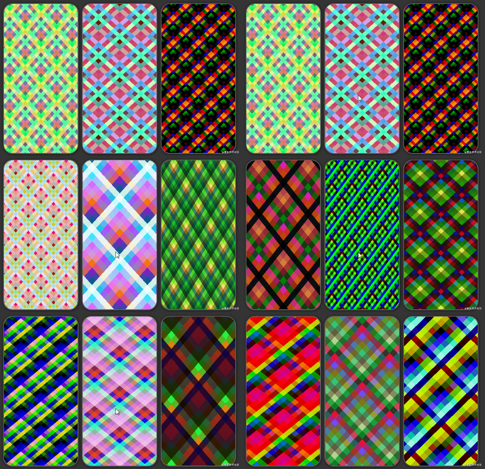
You can click in to try it, and you can randomly generate different effects with a click of the mouse:
CodePen Demo -- CSS Doodle - CSS MIX-BLEND-MODE Background
Of course, the above is Linear gradient, similarly, we can also use radial gradient to apply the same routine.
We can use radial gradients to generate multiple radial gradients. Like this:

Apply background-size to the image and it will look like this:
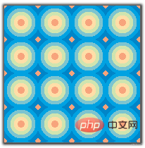
Like above, we slightly deform this graphic, then overlay two layers, and add CSS styles to the top graphic mix-blend-mode: darken:

CodePen Demo -- radial-gradient & mix-blend-mode Demo
Again, we use CSS-Doodle and apply the above rules to radial gradients, and we can also get a series of interesting background images.
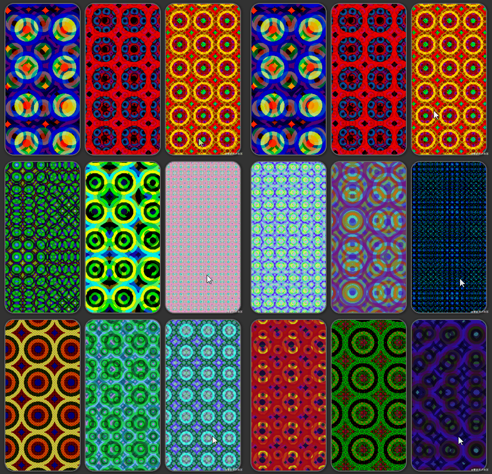
You can click in to try it, and you can randomly generate different effects by clicking the mouse:
CodePen Demo -- CSS Doodle - CSS MIX- BLEND-MODE Background 2
Of course, the above overlays are very simple pattern overlays, but after mastering this principle, you can try it yourself to create more complex fusions.
The above-mentioned overlay effect is based on the overlay of large solid colors. Of course, mix-blend-mode can also collide with real gradients to create more sparks.
Use blending modes on different gradient backgrounds? What wonderful effects would that have?
Used properly, it might look like this:
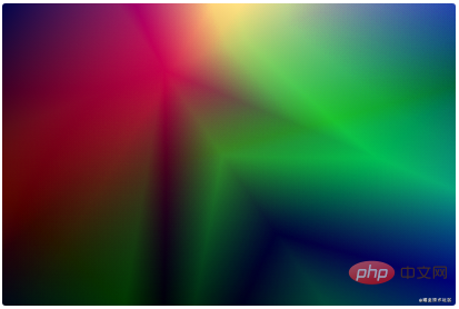
umm, a completely different style than the striped pattern above.
You can click into gradienta.io to take a look. Here is a library of gradient overlay background patterns created using CSS.
Now, let’s also implement one.
First, we use linear gradient or radial gradient to create several gradient patterns at will, as shown below:

Next, we use a blending mode to overlay two by two, starting from the second layer. A total of 5 blending modes need to be set. Here I used overlay , multiply, difference, difference, overlay. Look at the superimposed effect, it’s very nice:

CodePen Demo -- Graideint background mix
Because of the above animated GIF The compression rate is very high, so the jaggies look obvious and the image is blurry. You can click on the link above to have a look.
Then, we can add another filter: hue-rotate() to the superimposed image to make it move, zoom in a little to see the effect, gorgeous light and shadow Effect:

CodePen Demo -- Graideint background mix 2
Hey, right, we can continue to move out CSS-Doodle here.
Random gradients, random blending modes, superimposed together, let’s get cool.
Use CSS-Doodle to randomly create different gradients, use different blending modes randomly, let them overlap , and see the effect:

Of course, since it is a completely randomly generated effect, sometimes the generated effect is not very good-looking or is simply a solid color. But most of them are pretty good
CodePen Demo -- CSS Doodle Mix Gradient
Thank you for persisting and seeing this. The above-mentioned first half mainly uses mixing mode. Next, in the second half, we will mainly use mask. The excitement continues.
To remove the blending mode, there is a very interesting attribute related to the background--MASK.
mask is translated as mask. In CSS, the mask attribute allows users to hide part or all of the visible area of an element by masking or cropping images of specific areas. To put it simply, mask allows us to flexibly control the image, set a part to be displayed, and the remaining part to be hidden.
Use mask to cut the pattern
gradient to create such a gradient pattern:
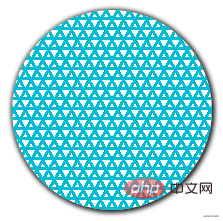 Its CSS code is probably like this:
:root {
    $colorMain: #673ab7;
}
{
    background:
        repeating-linear-gradient(0, $colorSub 0, $colorSub 3px, transparent 3px, transparent 10px),
        repeating-linear-gradient(60deg, $colorSub 0, $colorSub 3px, transparent 3px, transparent 10px),
        repeating-linear-gradient(-60deg, $colorSub 0, $colorSub 3px, transparent 3px, transparent 10px);
}If we superimpose a mask like this on this pattern:
{
    mask: conic-gradient(from -135deg, transparent 50%, #000);
}If the above mask is represented by background, it is like this
background: conic-gradient(from -135deg, transparent 50%, #000 ), the pattern is like this:
 The two are superimposed together. According to the function of the mask,
. You will get such an effect:
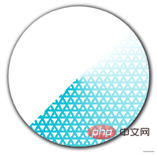 ##CodePen Demo -- mask & background Demo
 CodePen Demo -- mask & background Demo
Next, while using mask to cut the image, we will use -webkit-mask-compositemix-blend-mode / background-blend-mode. -webkit-mask-composite: Property specifies how multiple mask images applied to the same element are composited with each other.
通俗点来说,他的作用就是,当一个元素存在多重 mask 时,我们就可以运用 -webkit-mask-composite 进行效果叠加。
注意,这里的一个前提,就是当 mask 是多重 mask 的时候(类似于 background,mask 也是可以存着多重 mask),-webkit-mask-composite 才会生效。这也就元素的 mask 可以指定多个,逗号分隔。
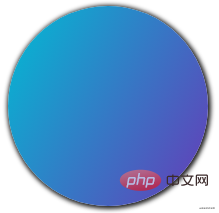
假设我们有这样一张背景图:
:root {
    $colorMain: #673ab7;
    $colorSub: #00bcd4;
}
div {
    background: linear-gradient(-60deg, $colorMain, $colorSub);
}
我们的 mask 如下:
{
    mask:
            repeating-linear-gradient(30deg, #000 0, #000 10px, transparent 10px, transparent 45px),
            repeating-linear-gradient(60deg, #000 0, #000 10px, transparent 10px, transparent 45px),
            repeating-linear-gradient(90deg, #000 0, #000 10px, transparent 10px, transparent 45px);
}mask 表述成 background 的话大概是这样:
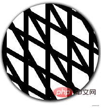
如果,不添加任何 -webkit-mask-composite,叠加融合之后的效果是这样:
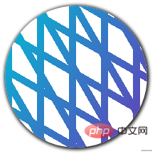
如果添加一个 -webkit-mask-composite: xor,则会变成这样:
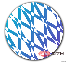
可以看到,线条的交汇叠加处,有了不一样的效果。
CodePen Demo -- background & -webkit-mask-composite
了解了基本原理之后,上 CSS-Doodle,我们利用多重 mask 和 -webkit-mask-composite,便可以创造出各式各样的美妙背景图案:
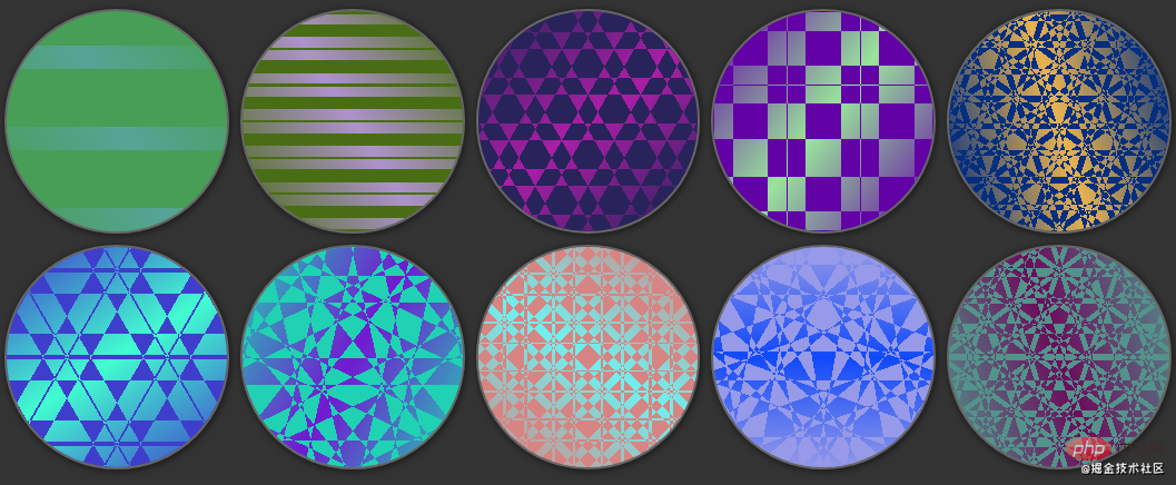
是不是很类似万花筒?
借助了 CSS-Doodle,我们只设定大致的规则,辅以随机的参数,随机的大小。接着就是一幅幅美妙的背景图应运而生。
下面是运用上述规则的尝试的一些图案:
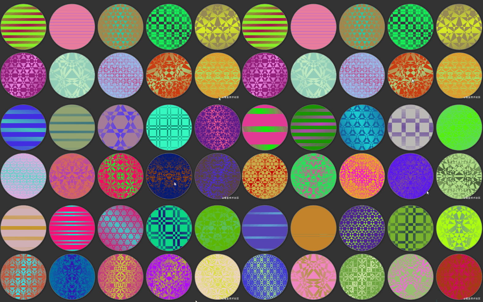
CodePen Demo -- CSS Doodle - CSS MASK Background
当然,可以尝试变换外形,譬如让它长得像个手机壳。
下面两个 DEMO 也是综合运用了上述的一些技巧的示例,仿佛一个个手机壳的图案。
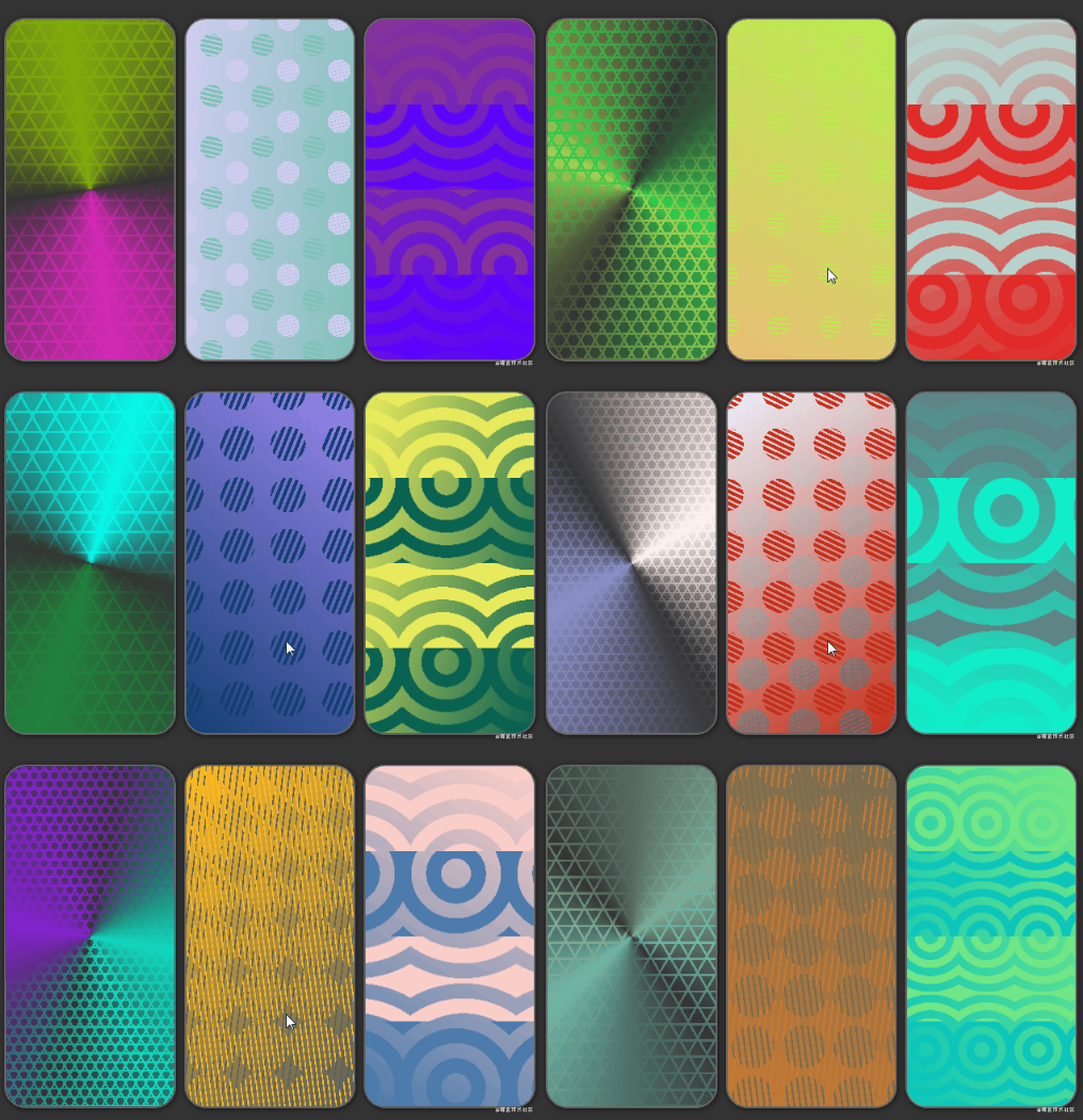
CodePen Demo -- CSS Doodle - CSS MASK Background 2

CodePen Demo -- CSS Doodle - CSS MASK Background 3
背景 background 不仅仅只是纯色、线性渐变、径向渐变、角向渐变。混合模式、滤镜、遮罩也并不孤独。
当 background 配合混合模式 mix-blend-mode,background-blend-mode、滤镜 filter、以及遮罩 mask 的时候,它们就可以组合变幻出各种不同的效果。
到目前为止,CSS 已经越来越强大,它不仅仅可以用于写业务,也可以创造很多有美感的事物,只要我们愿意去多加尝试,便可以创造出美妙的图案。
本文转载自:https://www.cnblogs.com/coco1s/p/14376348.html
作者:ChokCoco
更多编程相关知识,请访问:编程视频!!
The above is the detailed content of Learn the powerful usage of CSS background through examples (worth collecting). For more information, please follow other related articles on the PHP Chinese website!