Learn more about the border-image-slice property in CSS3

[Recommended tutorial: CSS video tutorial]
First of all, let’s understand what it does.
Description:
Document description: It controls the inward offset of the image boundary.
what? ? ? What does this mean? I can't understand it at all! ! ! Okay, let’s not rush, let’s take a look:
Basic knowledge:
When we reference the border image through border-image-source, border-image-sliceThe attribute will divide the image into 9 areas: four corners, four edges (edges) and the center area. Four slicing lines, set a given distance from their respective sides, control the size of the area. 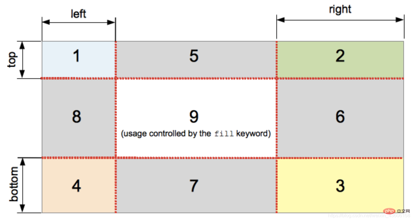
This feels like I understand it better. After using the border-image-slice attribute, I divided the image into nine parts.
Let’s look down:
The above picture illustrates the location of each area.
Areas 1-4 are corner regions. Each is used once to form the corners of the final boundary image. (Each one is used a single time to form the corners of the final border image.)
Region 5-8 edge region. Repeat in the final border image, scaling or modifying them to match the dimensions of the element. (These are repeated, scaled, or otherwise modified in the final border image to match the dimensions of the element.)
Region 9 is the central region (middle region). It is discarded by default, but if the keyword fill is set, it will be used as a background image. (It is discarded by default, but is used like a background image if the keyword fill is set.)
The middle area will not be used by the border, but will be used as background-image when the fill keyword is set. . This keyword can be set in any position of the attribute (before, after, or between two values)
After reading the basic knowledge above, let’s take a look at its parameters:
Introduction to possible parameter values:

Parameters:
/* 只有一个值的时候它控制所有的边 */
border-image-slice: 30%;

/* 有俩个值的的时候它分别控制垂直方向 | 水平方向 */
border-image-slice: 10% 30%;

/* 有三个值的时候它分别控制 顶部 | 水平方向 | 底部 */
border-image-slice: 30 30% 45;

/* 四个值那就是对应 上 右 下 左 */
border-image-slice: 7 12 14 5;

/* 使用fill(fill可以放在任意位置)那就开启了第九个九宫格 */
border-image-slice: 10% fill 7 12;

/* Global values */
border-image-slice: inherit;
border-image-slice: initial;
border-image-slice: unset;
Specific usage:
Let’s start with the initial 100% to see the effect. : 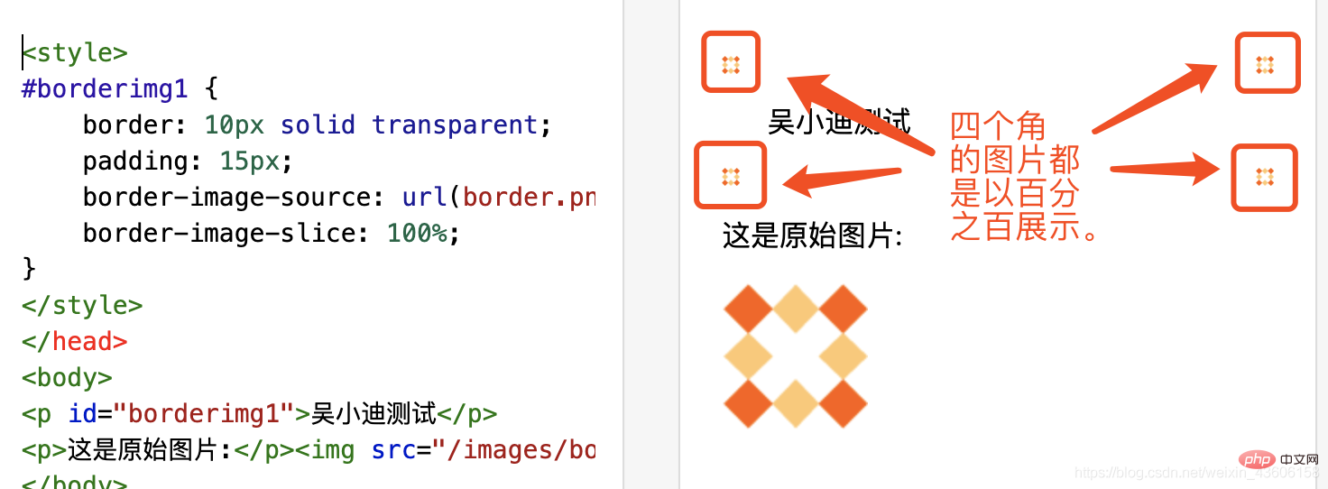
Then seventy percent: 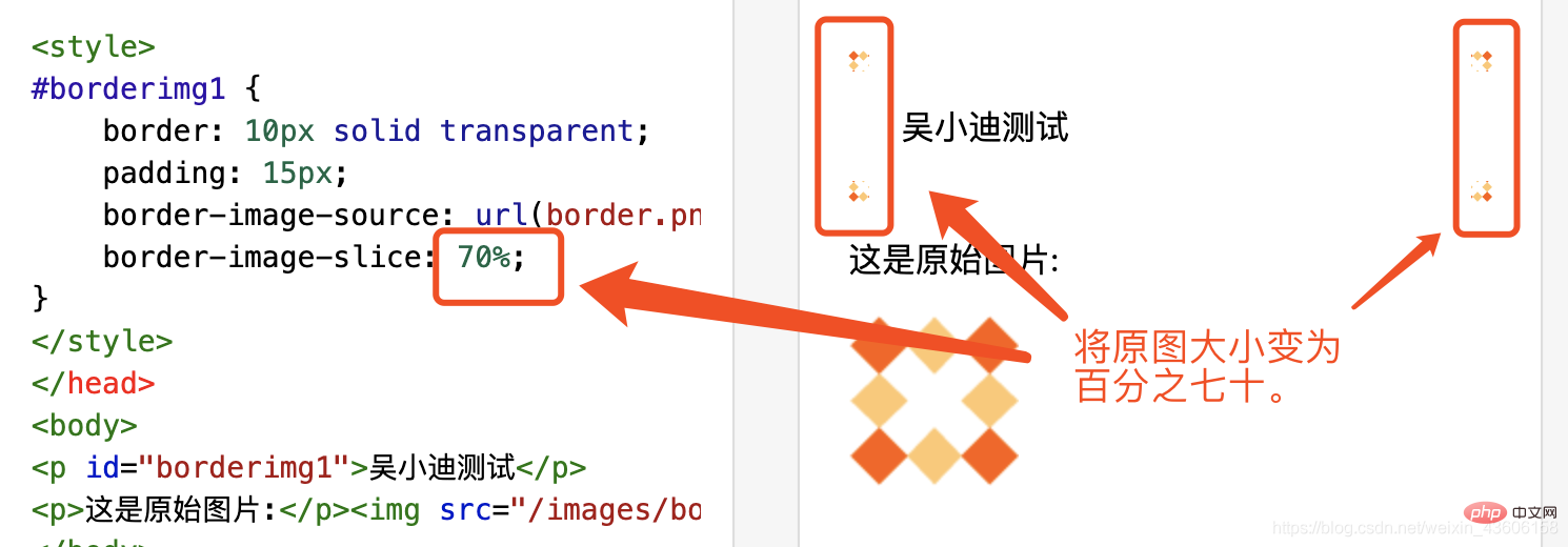
Thirty-five percent: 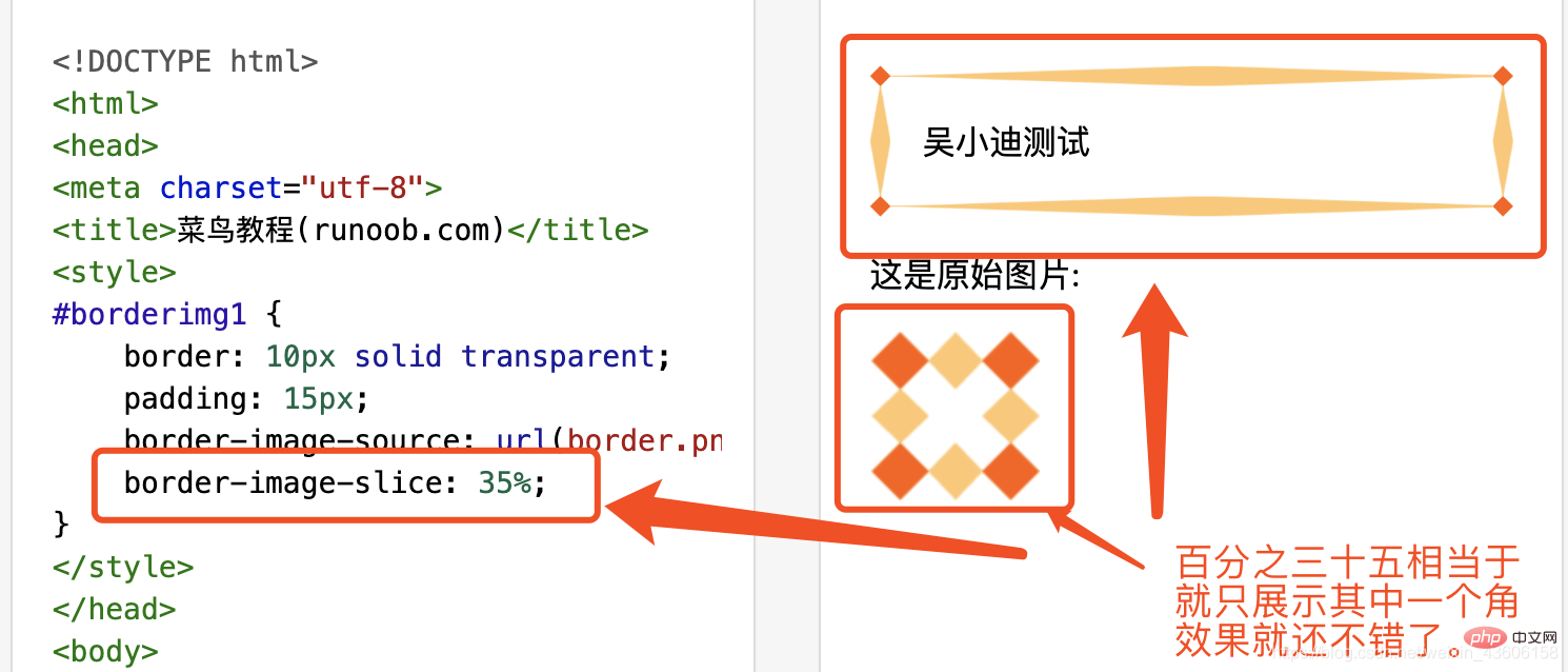
Small summary:
We can now clearly understand that border-image-slice controls the display of the background-image-source in the four corners.
But now friends must be very curious about the four sides in the 35% case. 
The author will explain these four sides separately. If the border-image-slice is less than 50%, it will be stretched to full. Then we control its filling status through the border-image-repeat attribute. 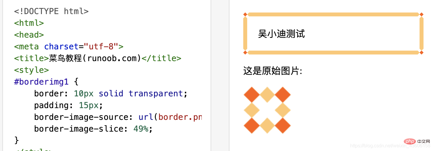
Of course, there are still some things that are confusing and do not understand. Everyone is welcome to discuss and study in the comment area below~
For more programming-related knowledge, please visit: ProgrammingTeaching! !
The above is the detailed content of Learn more about the border-image-slice property in CSS3. For more information, please follow other related articles on the PHP Chinese website!

Hot AI Tools

Undresser.AI Undress
AI-powered app for creating realistic nude photos

AI Clothes Remover
Online AI tool for removing clothes from photos.

Undress AI Tool
Undress images for free

Clothoff.io
AI clothes remover

AI Hentai Generator
Generate AI Hentai for free.

Hot Article

Hot Tools

Notepad++7.3.1
Easy-to-use and free code editor

SublimeText3 Chinese version
Chinese version, very easy to use

Zend Studio 13.0.1
Powerful PHP integrated development environment

Dreamweaver CS6
Visual web development tools

SublimeText3 Mac version
God-level code editing software (SublimeText3)

Hot Topics
 How to achieve wave effect with pure CSS3? (code example)
Jun 28, 2022 pm 01:39 PM
How to achieve wave effect with pure CSS3? This article will introduce to you how to use SVG and CSS animation to create wave effects. I hope it will be helpful to you!
 Use CSS skillfully to realize various strange-shaped buttons (with code)
Jul 19, 2022 am 11:28 AM
This article will show you how to use CSS to easily realize various weird-shaped buttons that appear frequently. I hope it will be helpful to you!
 How to hide elements in css without taking up space
Jun 01, 2022 pm 07:15 PM
Two methods: 1. Using the display attribute, just add the "display:none;" style to the element. 2. Use the position and top attributes to set the absolute positioning of the element to hide the element. Just add the "position:absolute;top:-9999px;" style to the element.
 How to implement lace borders in css3
Sep 16, 2022 pm 07:11 PM
In CSS, you can use the border-image attribute to achieve a lace border. The border-image attribute can use images to create borders, that is, add a background image to the border. You only need to specify the background image as a lace style; the syntax "border-image: url (image path) offsets the image border width inward. Whether outset is repeated;".
 It turns out that text carousel and image carousel can also be realized using pure CSS!
Jun 10, 2022 pm 01:00 PM
How to create text carousel and image carousel? The first thing everyone thinks of is whether to use js. In fact, text carousel and image carousel can also be realized using pure CSS. Let’s take a look at the implementation method. I hope it will be helpful to everyone!
 How to enlarge the image by clicking the mouse in css3
Apr 25, 2022 pm 04:52 PM
Implementation method: 1. Use the ":active" selector to select the state of the mouse click on the picture; 2. Use the transform attribute and scale() function to achieve the picture magnification effect, the syntax "img:active {transform: scale(x-axis magnification, y Axis magnification);}".
 css3 what is adaptive layout
Jun 02, 2022 pm 12:05 PM
Adaptive layout, also known as "responsive layout", refers to a web page layout that can automatically recognize the screen width and make corresponding adjustments; such a web page can be compatible with multiple different terminals instead of making a specific version for each terminal. . Adaptive layout was born to solve the problem of mobile web browsing, and can provide a good user experience for users using different terminals.
 Does css3 animation effect have deformation?
Apr 28, 2022 pm 02:20 PM
The animation effect in css3 has deformation; you can use "animation: animation attribute @keyframes ..{..{transform: transformation attribute}}" to achieve deformation animation effect. The animation attribute is used to set the animation style, and the transform attribute is used to set the deformation style. .


