An in-depth analysis of panel components in Bootstrap
This article will take you to learn more about the panel components in Bootstrap. It has certain reference value. Friends in need can refer to it. I hope it will be helpful to everyone.

Related recommendations: "bootstrap Tutorial"
The main function of the panel component is to handle some functions that cannot be completed by other components. With different source codes in different versions:
LESS: panels.less
SASS:_panels.scss
The basic panel is very simple. It is a p container that uses the .panel class style to generate a text display block with a border. Since the panel does not control the theme color, a control color is added based on the .panel. The theme class .panel-default, add a p.panel-body inside to place the main content of the panel
.panel mainly has certain settings for borders, spacing, rounded corners, and left and right:
.panel {
  margin-bottom: 20px;
  background-color: #fff;
  border: 1px solid transparent;
  border-radius: 4px;
  -webkit-box-shadow: 0 1px 1px rgba(0, 0, 0, .05);
          box-shadow: 0 1px 1px rgba(0, 0, 0, .05);
}
.panel-body {
  padding: 15px;
}Use of basic panels:
<h1 id="基础面板">基础面板</h1>
    <div>
        <div>这是一个基础面板,带默认主题样式风格</div>
    </div>

Panels with head and tail
bootstrap for Enrich the functions of the panel, and specifically add the effect of the panel header and the panel tail to the panel,
.panel-heading: Set the panel header style
.panel-footer: Set the panel tail style
.panel-headingh and .panel-footer only set the spacing and fillet styles
.panel-heading {
  padding: 10px 15px;
  border-bottom: 1px solid transparent;
  border-top-left-radius: 3px;
  border-top-right-radius: 3px;
}
.panel-heading > .dropdown .dropdown-toggle {
  color: inherit;
}
.panel-title {
  margin-top: 0;
  margin-bottom: 0;
  font-size: 16px;
  color: inherit;
}
.panel-title > a {
  color: inherit;
}
.panel-footer {
  padding: 10px 15px;
  background-color: #f5f5f5;
  border-top: 1px solid #ddd;
  border-bottom-right-radius: 3px;
  border-bottom-left-radius: 3px;
}Example:
<h1 id="带有头和尾的面板">带有头和尾的面板</h1>
    <div class="panel panel-default">
        <div class="panel-heading">这里是面板头部标题</div>
        <div class="panel-body">这里是面板内容部分这里是面板内容部分这里是面板内容部分这里是面板内容部分这里是面板内容部分这里是面板内容部分这里是面板内容部分</div>
        <div class="panel-footer">这里是面板尾部部分</div>
    </div>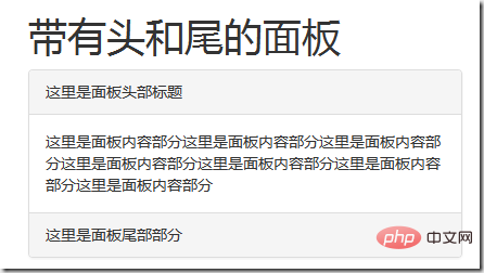
Color panel
Since the .panel style is not There is no style setting for the theme color. In addition to the default theme (.panel-default) style, the panel component in the bootstrap framework also includes the following theme styles:
.panel -primary: key points blue
- ##.panel-success: success green ##.panel-info: information blue (light)
- .panel-warning: Warning Yellow
- .panel-danger: Danger Red
- This Several styles only change the background color, text, and border color of the panel
The method of use is very simple, just add the required theme class name to the class name of .panel
Example :
<h1 id="彩色面板">彩色面板</h1>
    <div class="panel panel-default">
        <div class="panel-heading">白头吟</div>
        <div class="panel-body">皑如山上雪,皎若云间月。
            闻君有两意,故来相决绝。
            今日斗酒会,明旦沟水头。
            躞蹀御沟上,沟水东西流。
            凄凄复凄凄,嫁娶不须啼。
            愿得一人心,白首不相离。
            竹竿何袅袅,鱼尾何簁簁!
            男儿重意气,何用钱刀为!</div>
        <div class="panel-footer">作者:卓文君</div>
    </div>
    <div class="panel panel-primary">
        <div class="panel-heading">无题</div>
        <div class="panel-body">昨夜星辰昨夜风,画楼西畔桂堂东。
            身无彩凤双飞翼,心有灵犀一点通。
            隔座送钩春酒暖,分曹射覆蜡灯红。
            嗟余听鼓应官去,走马兰台类转蓬。</div>
        <div class="panel-footer">作者:李商隐</div>
    </div>
    <div class="panel panel-success">
        <div class="panel-heading">青玉案·元夕</div>
        <div class="panel-body">东风夜放花千树,更吹落,星如雨。宝马雕车香满路。凤箫声动,玉壶光转,一夜鱼龙舞。
              蛾儿雪柳黄金缕,笑语盈盈暗香去。众里寻他千百度,蓦然回首,那人却在,灯火阑珊处。</div>
        <div class="panel-footer">作者: 辛弃疾</div>
    </div>
    <div class="panel panel-info">
        <div class="panel-heading">离思</div>
        <div class="panel-body">曾经沧海难为水,除却巫山不是云。
            取次花丛懒回顾,半缘修道半缘君。</div>
        <div class="panel-footer">作者: 元稹</div>
    </div>
    <div class="panel panel-danger">
        <div class="panel-heading">画梅</div>
        <div class="panel-body">微雪初消月半池,篱边遥见两三枝。
            清香传得天心在,未话寻常草木知。</div>
        <div class="panel-footer">作者: 方孝孺</div>
    </div>
    <div class="panel panel-warning">
        <div class="panel-heading">菊花</div>
        <div class="panel-body">秋丛绕舍似陶家,遍绕篱边日渐斜。
            不是花中偏爱菊,此花开尽更无花。</div>
        <div class="panel-footer">作者: 元稹</div>
</div>The effect is as follows:
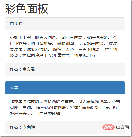
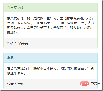
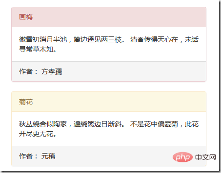
Generally speaking, the panel can be understood as an area. When using the panel, the required content will be placed in the .panel-body container. The content inside may be pictures and tables. , lists, etc.; let’s take a look at the effect of nested tables and list groups in the panel. Here is an example of a nested table:
<h1 id="面板中嵌套表格">面板中嵌套表格</h1>
    <div class="panel panel-default">
        <div class="panel-heading">描写花的诗句</div>
        <div class="panel-body">
            <p>诗人对菊花由衷喜爱:开得正旺的菊花一簇簇、一丛丛,遍布屋舍四周,他沿着竹篱,忘情地欣赏这些亲手栽种的秋菊,不觉日已西斜。</p>
            <table class="table table-bordered">
                <thead>
                    <tr>
                        <th>不是花中偏爱菊,此花开尽更无花《菊花》</th>
                        <th>愿得一人心,白首不相离《白头吟》</th>
                        <th>床前明月光,疑是地上霜《静夜思》</th>
                    </tr>
                </thead>
                <tbody>
                    <tr>
                        <td>先天下之忧而忧,后天下之乐而乐《岳阳楼记》</td>
                        <td>我欲与君相知,长命无绝衰《上邪》</td>
                        <td>人面不知何处去,桃花依旧笑春风《题都城南庄》</td>
                    </tr>
                </tbody>
            </table>
        </div>
        <div class="panel-footer">这首诗取陶诗的意境,且也以淡雅朴素的语言吟咏,便不似陶公全用意象,蕴藉之至;而是在描绘具象之后,以自述的方式道出爱菊之由而又不一语说尽,留下了想象空间让人们去回味咀嚼,这就增强了它的艺术感染力。因而历来被人们所喜爱</div>
</div>In actual application, maybe the table There is no need for any spacing between the edge of the panel and the panel-body, but the .panel-body sets a padding value of 15px. In order to achieve this effect, the table can be extracted outside the panel-body during actual use: 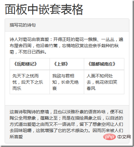
<div class="panel panel-default">
        <div class="panel-heading">描写花的诗句</div>
        <div class="panel-body">
            <p>诗人对菊花由衷喜爱:开得正旺的菊花一簇簇、一丛丛,遍布屋舍四周,他沿着竹篱,忘情地欣赏这些亲手栽种的秋菊,不觉日已西斜。</p>

        </div>
        <table class="table table-bordered">
            <thead>
            <tr>
                <th>《岳阳楼记》</th>
                <th>《上邪》</th>
                <th>《题都城南庄》</th>
            </tr>
            </thead>
            <tbody>
            <tr>
                <td>先天下之忧而忧,后天下之乐而乐</td>
                <td>我欲与君相知,长命无绝衰</td>
                <td>人面不知何处去,桃花依旧笑春风</td>
            </tr>
            </tbody>
        </table>
        <div class="panel-footer">这首诗取陶诗的意境,且也以淡雅朴素的语言吟咏,便不似陶公全用意象,蕴藉之至;而是在描绘具象之后,以自述的方式道出爱菊之由而又不一语说尽,留下了想象空间让人们去回味咀嚼,这就增强了它的艺术感染力。因而历来被人们所喜爱</div>
    </div>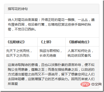
面板中嵌套列表组
例子:
<h1 id="面板中嵌套列表组">面板中嵌套列表组</h1>
    <div class="panel panel-default">
        <div class="panel-heading">描写花的诗句</div>
        <div class="panel-body">
            <p>面板嵌套列表组</p>
            <ul class="list-group">
                <li class="list-group-item">列表项1</li>
                <li class="list-group-item">列表项2</li>
                <li class="list-group-item">列表项3</li>
                <li class="list-group-item">列表项4</li>
                <li class="list-group-item">列表项5</li>
            </ul>
        </div>
        <div class="panel-footer">作者:李商隐</div>
    </div>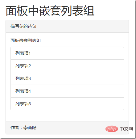
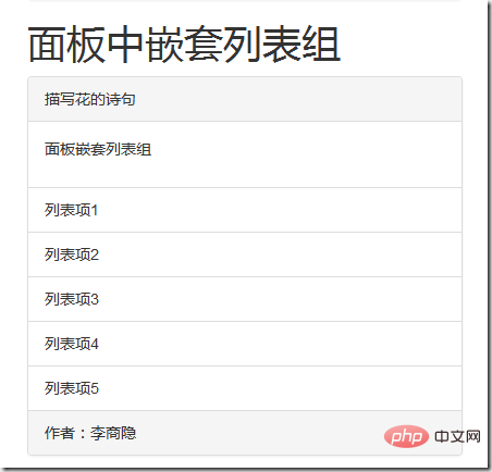
面板嵌套列表组合嵌套表格一样,如果不需要这样的间距,完全可以把列表组从.panel-body中提取出来
例子:
<h1 id="面板中嵌套列表组">面板中嵌套列表组</h1>
    <div class="panel panel-default">
        <div class="panel-heading">描写花的诗句</div>
        <div class="panel-body">
            <p>面板嵌套列表组</p>

        </div>
        <ul class="list-group">
            <li class="list-group-item">列表项1</li>
            <li class="list-group-item">列表项2</li>
            <li class="list-group-item">列表项3</li>
            <li class="list-group-item">列表项4</li>
            <li class="list-group-item">列表项5</li>
        </ul>
        <div class="panel-footer">作者:李商隐</div>
</div>效果如下:
更多编程相关知识,请访问:编程视频!!
The above is the detailed content of An in-depth analysis of panel components in Bootstrap. For more information, please follow other related articles on the PHP Chinese website!

Hot AI Tools

Undresser.AI Undress
AI-powered app for creating realistic nude photos

AI Clothes Remover
Online AI tool for removing clothes from photos.

Undress AI Tool
Undress images for free

Clothoff.io
AI clothes remover

Video Face Swap
Swap faces in any video effortlessly with our completely free AI face swap tool!

Hot Article

Hot Tools

Notepad++7.3.1
Easy-to-use and free code editor

SublimeText3 Chinese version
Chinese version, very easy to use

Zend Studio 13.0.1
Powerful PHP integrated development environment

Dreamweaver CS6
Visual web development tools

SublimeText3 Mac version
God-level code editing software (SublimeText3)

Hot Topics
 1386
1386
 52
52
 How to get the bootstrap search bar
Apr 07, 2025 pm 03:33 PM
How to use Bootstrap to get the value of the search bar: Determines the ID or name of the search bar. Use JavaScript to get DOM elements. Gets the value of the element. Perform the required actions.
 How to use bootstrap in vue
Apr 07, 2025 pm 11:33 PM
Using Bootstrap in Vue.js is divided into five steps: Install Bootstrap. Import Bootstrap in main.js. Use the Bootstrap component directly in the template. Optional: Custom style. Optional: Use plug-ins.
 How to do vertical centering of bootstrap
Apr 07, 2025 pm 03:21 PM
Use Bootstrap to implement vertical centering: flexbox method: Use the d-flex, justify-content-center, and align-items-center classes to place elements in the flexbox container. align-items-center class method: For browsers that do not support flexbox, use the align-items-center class, provided that the parent element has a defined height.
 How to write split lines on bootstrap
Apr 07, 2025 pm 03:12 PM
There are two ways to create a Bootstrap split line: using the tag, which creates a horizontal split line. Use the CSS border property to create custom style split lines.
 How to resize bootstrap
Apr 07, 2025 pm 03:18 PM
To adjust the size of elements in Bootstrap, you can use the dimension class, which includes: adjusting width: .col-, .w-, .mw-adjust height: .h-, .min-h-, .max-h-
 How to set up the framework for bootstrap
Apr 07, 2025 pm 03:27 PM
To set up the Bootstrap framework, you need to follow these steps: 1. Reference the Bootstrap file via CDN; 2. Download and host the file on your own server; 3. Include the Bootstrap file in HTML; 4. Compile Sass/Less as needed; 5. Import a custom file (optional). Once setup is complete, you can use Bootstrap's grid systems, components, and styles to create responsive websites and applications.
 How to insert pictures on bootstrap
Apr 07, 2025 pm 03:30 PM
There are several ways to insert images in Bootstrap: insert images directly, using the HTML img tag. With the Bootstrap image component, you can provide responsive images and more styles. Set the image size, use the img-fluid class to make the image adaptable. Set the border, using the img-bordered class. Set the rounded corners and use the img-rounded class. Set the shadow, use the shadow class. Resize and position the image, using CSS style. Using the background image, use the background-image CSS property.
 How to use bootstrap button
Apr 07, 2025 pm 03:09 PM
How to use the Bootstrap button? Introduce Bootstrap CSS to create button elements and add Bootstrap button class to add button text


