

This article will introduce to you how to use pure CSS to achieve the rolling shadow effect. It has certain reference value. Friends in need can refer to it. I hope it will be helpful to everyone.

[Recommended tutorial: CSS video tutorial]
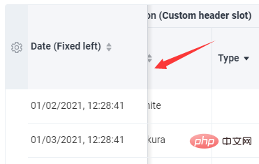
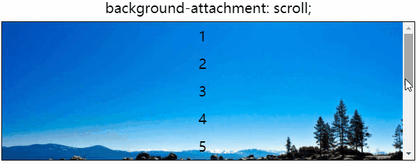
Let’s get straight to the point, there is such a very common situation, for For some scrollable elements. Usually when scrolling, a shadow is added to the side perpendicular to the scrolling to indicate that an element is currently being scrolled out of the visible area, similar to this:
You can see that during the scrolling process, a shadow will appear:
For the columns on both sides During the scrolling process, the problem of standing still and adsorbing on the boundary can usually be solved by using CSS position: sticky.
But for the shadow that only appears during the scrolling process (the content in the scroll container has no welt, the shadow appears, and the welt, the shadow disappears), the previous approach has always been required Done with the help of JS.
So, is there a solution that can be achieved with pure CSS? Hehehe, yes. There is a very clever deception, let us uncover it step by step.
background-attachment To implement the above scrolling shadow using pure CSS, The core element to be used is background-attachment.
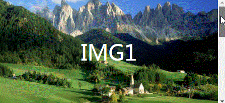
In an earlier article - CSS to achieve parallax effect, background-attachment was introduced in detail, with the help of background-attachment: fixed can easily realize the scrolling parallax of the website or the watermark effect similar to the picture click, similar to this:
Of course, today we The protagonist is not background-attachment: fixed, but background-attachment: srcoll.
background-attachment: srcollFirst of all, let me introduce background- attachment, if background-image is specified, then background-attachment determines whether the background is fixed in the viewport or scrolls with the block containing it.
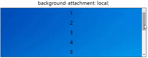
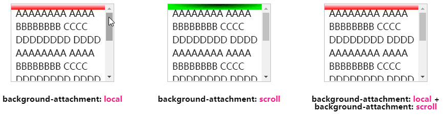
To put it simply, it determines how the background pattern moves in a scrollable container. Through two simple demos, understand background-attachment: srcoll and background-attachment: local.
background-attachment: local, this is consistent with our daily usage. The background pattern of the scrollable container scrolls with the container:
##background-attachment: scroll, this is today’s protagonist, it indicates that the background is fixed relative to the element itself, rather than random. Scroll along with its content:
If you haven’t figured out the difference yet, you can click on the DEMO below to feel it for yourself:
Demo address: https://codepen.io/Chokcoco/pen/xJJorg
srcoll Used simultaneously with local to achieve blindnessGo here, Maybe many students are still confused, what should we do? How does this relate to the scrolling shadow in this article?
Don't worry, the difficulty with rolling shadows is that there is no shadow when there is no scrolling initially. The shadow will only appear when you start scrolling.
So here, we use the two attributes background-attachment: srcoll and background-attachment: local. During the initial scrolling, Use two layers of backgrounds superimposed together to hide the shadow background. When you actually scroll, remove the superimposed part and only the shadow part will leak out.
Um? What's the meaning. We use the scroll container and add two gradient effects, using background-attachment: srcoll and background-attachment: local respectively, and then superimpose them, like this:
<!-- 可滚动容器 -->
<ul>
    <li>...</li>
    ...
    <li>...</li>
</ul>// 情形一:
.g-one {
background: linear-gradient(#fff, #f00);
background-size: 100% 10px;
background-repeat: no-repeat;
background-attachment: local;
}
// 情形二:
.g-two {
background: radial-gradient(at 50% 0, #000, #0f0 70%);
background-size: 100% 10px;
background-repeat: no-repeat;
background-attachment: scroll;
}
// 情形三:
.g-combine {
background:
linear-gradient(#fff, #f00),
radial-gradient(at 50% 0%, #000, #0f0 70%);
background-size: 100% 10px, 100% 10px;
background-repeat: no-repeat;
background-attachment: local, scroll;
}The actual effect is like this. One background scrolls with the container, and the other background is fixed with the container. The background that scrolls with the container serves as the initial mask layer:
OK, you can see the big picture, when scrolling, the last picture is superimposed , in fact, what we need is the effect of displaying different colors (shadows) when scrolling. Let’s adjust the colors of the two gradients. The mask layer (background-attachment: local) is white, and then the fixed shadow layer (background-attachment: scroll) is set. Use a radial gradient to simulate the shadow color we want.
The CSS code is probably like this:
.g-final {
    background:
        linear-gradient(#fff, transparent 100%),
        linear-gradient(rgba(0, 0, 0, .5), transparent 100%);
    background-size: 100% 30px, 100% 10px;
    background-repeat: no-repeat;
    background-attachment: local, scroll;
}Use linear-gradient(rgba(0, 0, 0, .5) , transparent 100%) A linear gradient simulates a shade of gray:
OK, you’re done. For all the above DEMOs, you can click here to take a look:
Demo address: https://codepen.io/Chokcoco/pen/QWKmjKd
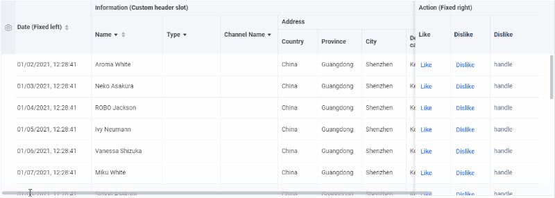
As shown at the beginning of the article, this technique can also be used directly in table:
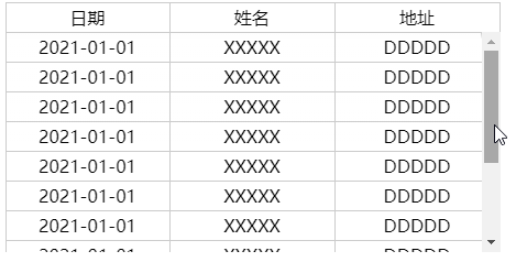
##Demo address: https://codepen.io/Chokcoco/pen/abmqMJQ
background simulation In fact, the final effect is that the content is in the shadow (above the background), but the actual effect is not very different. If you can tolerate this, this solution is completely available.
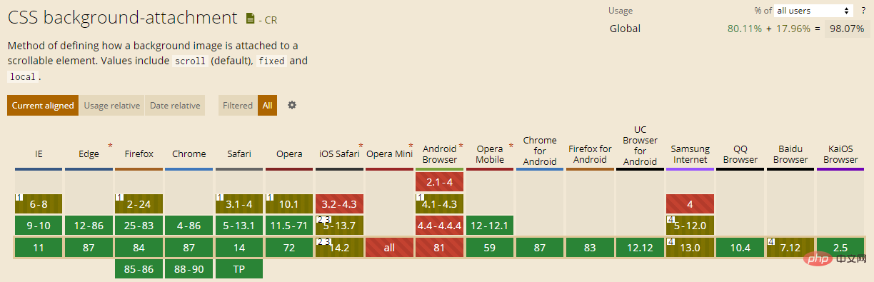
background-attachment compatibility issues. Let's look at CAN I USE:
background- attachment: fixed, has little impact on the effect of this article.
Okay, this article ends here. For more programming-related knowledge, please visit: Programming Teaching! !
The above is the detailed content of Tips for implementing scrolling shadow effect with CSS (share). For more information, please follow other related articles on the PHP Chinese website!


![[Web front-end] Node.js quick start](https://img.php.cn/upload/course/000/000/067/662b5d34ba7c0227.png)


