

How to set triangle in css

How to set triangles in css: first create an HTML sample file; then set a span element as a block-level element, and set the four sides of the border to different colors; finally, set the top border and left and right borders The width can be realized as a triangle.

The operating environment of this tutorial: Windows7 system, HTML5&&CSS3 version, Dell G3 computer.
Use css to set triangles
1. In development, some small triangles are sometimes used to emphasize or mark elements, so as to distinguish different projects, and then The effect is achieved by drawing the triangle in a more obvious color. Then how to draw the triangle? I didn't know it before. Recently, I saw some web pages using it. When marking, they all use background images. Mark it so that when the web page is displayed, it feels a bit stiff. After all, the loading of images is not as smooth as css loading.
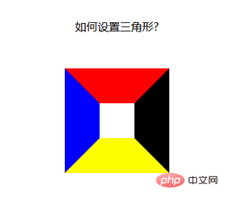
Let’s look at a piece of code: Here, a span element is set as a block-level element, and the four sides of the border are set separately. All are different colors:
<!DOCTYPE html>
<html>
<head>
    <meta charset="UTF-8">
    <meta name="viewport" content="width=device-width, initial-scale=1.0">
    <meta http-equiv="X-UA-Compatible" content="ie=edge">
    <title>Document</title>
    <style>
        div {
            width: 100%;
            margin: 50px 0;
            text-align: center;
        }
        span {
            position: relative;
            margin: 0 auto;
            display: block;
            width: 50px;
            height: 50px;
            border-style: solid;
            border-width: 50px;
            border-top-color: red;
            border-left-color: blue;
            border-bottom-color: yellow;
            border-right-color: black;
        }
    </style>
</head>
<body>
    <div>如何设置三角形?</div>
    <div>
        <span>
        </span>
    </div>
</body>
</html>Running results: It is found that the borders on the four sides are actually this kind of trapezoidal structure. If the upper and lower parts of the trapezoid are changed to 0, wouldn’t it be the triangle we want? And this It cannot be done using html and css. It can be implemented without using static pages, and there is no problem of discontinuous display of images;
The next step is to change the upper and lower parts of the trapezoid to 0 [Recommendation: " css video tutorial》】
The top and bottom become 0. It’s very simple, just set the height and width of the element to 0
width:----->0 Get two kinds of arrows, up and down
height:------->0 Get two kinds of arrows, left and right
1. When we want the up arrow, remove the left and right borders and the bottom border of the element
2. When we want the down arrow, Just remove the left and right borders and top border of the element
3. When we want the left arrow, remove the top, bottom and right borders
4. When we want the right arrow When the time comes, just remove the upper and lower borders and the left border
The idea is good, I tried it, and if I want to add an arrow: set the css as follows:
span {
            position: relative;
            margin: 0 auto;
            display: block;
            width: 0px;
            height: 0px;
            border-style: solid;
            border-width: 50px;

            /* 设置上边框和左右边框宽度为0 开始*/
            border-top-width: 0;
            border-left-width: 0;
            border-right-width: 0;
            /* 设置上边框和左右边框宽度为0 开始*/

            border-top-color: red;
            border-left-color: blue;
            border-bottom-color: yellow;
            border-right-color: black;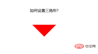
}Running results: I found that it doesn’t work, what? None
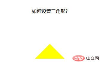
Let’s change the method: Since setting the width doesn’t work, let’s set the color. Just set the color of the top, left, and right borders to be transparent. Is that enough? In the css, there happens to be a value that sets the color to transparent
span {
            position: relative;
            margin: 0 auto;
            display: block;
            width: 0px;
            height: 0px;
            border-style: solid;
            border-width: 50px;

            /* 设置上边框和左右边框宽度为0 开始*/
            border-top-color: transparent;
            border-left-color: transparent;
            border-right-color: transparent;
            /* 设置上边框和左右边框宽度为0 开始*/

            /* border-top-color: red;
            border-left-color: blue; */
            border-bottom-color: yellow;
            /* border-right-color: black; */
}Run result: OK, you’re done! ! !
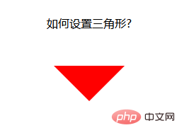
Set the down arrow:
span {
            position: relative;
            margin: 0 auto;
            display: block;
            width: 0px;
            height: 0px;
            border-style: solid;
            border-width: 50px;

            /* 设置上边框和左右边框宽度为0 开始*/
            border-bottom-color: transparent;
            border-left-color: transparent;
            border-right-color: transparent;
            /* 设置上边框和左右边框宽度为0 开始*/

            border-top-color: red;
            /* border-left-color: blue;
            border-bottom-color: yellow;
            border-right-color: black; */
        }
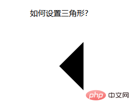
Set the left arrow:
span {
            position: relative;
            margin: 0 auto;
            display: block;
            width: 0px;
            height: 0px;
            border-style: solid;
            border-width: 50px;

            /* 设置上边框和左右边框宽度为0 开始*/
            border-top-color: transparent;
            border-bottom-color: transparent;
            /* border-left-color: transparent; */
            border-right-color: transparent;
            /* 设置上边框和左右边框宽度为0 开始*/

            /* border-top-color: red; */
            border-left-color: blue;
            /* border-bottom-color: yellow;
            border-right-color: black; */
        }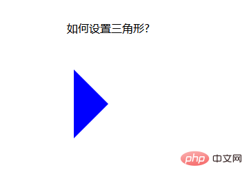
Set the right arrow:
span {
            position: relative;
            margin: 0 auto;
            display: block;
            width: 0px;
            height: 0px;
            border-style: solid;
            border-width: 50px;

            border-top-color: transparent;
            border-bottom-color: transparent;
            border-left-color: transparent;
            /* border-right-color: transparent; */

            /* border-top-color: red;
            border-left-color: blue;
            border-bottom-color: yellow; */
            border-right-color: black;
        }
Of course, css can also be written in Together, this looks simpler:
span {
            position: relative;
            margin: 0 auto;
            display: block;
            width: 0px;
            height: 0px;
            /* 先后设置上右下左的border-color属性都是一样的,需要哪个箭头,再设置哪个方向的颜色属性,这样,最后设置的属性覆盖了前面的属性,就变成箭头了 */
            border: 50px solid transparent;
            border-top-color: red;
        }
The above is an arrow set using a combination of html and css. Can it be made simpler?
Below, I use the class attribute to set the arrow. When an arrow is needed, just add the class attribute directly. When the arrow is not wanted, just remove the class.
Let’s look at an example:
<!DOCTYPE html>
<html>

<head>
    <meta charset="UTF-8">
    <meta name="viewport" content="width=device-width, initial-scale=1.0">
    <meta http-equiv="X-UA-Compatible" content="ie=edge">
    <title>Document</title>
    <style>
        div {
            width: 100%;
            margin: 50px 0;
            text-align: center;
        }

        .jindaobox {
            position: relative;
            width: 980px;
            margin: 20px auto;

        }

        li {
            list-style: none;
            float: left;
            position: relative;
            border: 1px solid #eee;
            margin-right: 30px;
            padding: 10px 20px;
            border-radius: 5px;
            -webkit-border-radius: 5px;
            -moz-border-radius: 5px;
            -ms-border-radius: 5px;
            -o-border-radius: 5px;
        }

        .active {
            border: 1px solid red !important;

        }

        .active::after {
            position: absolute;
            content: "";
            height: 0;
            width: 0;

            border: 8px solid transparent;
            border-top-color: red;

            top: 0;
            left: 0;
            right: 0;
            margin: auto;
        }
    </style>
</head>

<body>
    <div>请选择你喜欢的电影</div>
    <ul>
        <li>飞龙在天</li>
        <li class="lis  active">紫川</li>
        <li>封神演义</li>
        <li class="lis  active">风云第一刀</li>
        <li>天外飞仙</li>
    </ul>

</body>

</html>Running result:
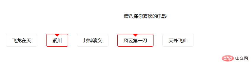
In this way, the method of using the class attribute to control the arrow is realized. When it needs to be selected, Just add an active class attribute to the li element. When it is not needed, remove the active class attribute.
The above is the detailed content of How to set triangle in css. For more information, please follow other related articles on the PHP Chinese website!

Hot AI Tools

Undresser.AI Undress
AI-powered app for creating realistic nude photos

AI Clothes Remover
Online AI tool for removing clothes from photos.

Undress AI Tool
Undress images for free

Clothoff.io
AI clothes remover

AI Hentai Generator
Generate AI Hentai for free.

Hot Article
Hot Tools

Notepad++7.3.1
Easy-to-use and free code editor

SublimeText3 Chinese version
Chinese version, very easy to use

Zend Studio 13.0.1
Powerful PHP integrated development environment

Dreamweaver CS6
Visual web development tools

SublimeText3 Mac version
God-level code editing software (SublimeText3)
Hot Topics
 1382
1382
 52
52

 The Roles of HTML, CSS, and JavaScript: Core Responsibilities
Apr 08, 2025 pm 07:05 PM
The Roles of HTML, CSS, and JavaScript: Core Responsibilities
Apr 08, 2025 pm 07:05 PM
HTML defines the web structure, CSS is responsible for style and layout, and JavaScript gives dynamic interaction. The three perform their duties in web development and jointly build a colorful website.
 How to use bootstrap in vue
Apr 07, 2025 pm 11:33 PM
How to use bootstrap in vue
Apr 07, 2025 pm 11:33 PM
Using Bootstrap in Vue.js is divided into five steps: Install Bootstrap. Import Bootstrap in main.js. Use the Bootstrap component directly in the template. Optional: Custom style. Optional: Use plug-ins.
 How to write split lines on bootstrap
Apr 07, 2025 pm 03:12 PM
How to write split lines on bootstrap
Apr 07, 2025 pm 03:12 PM
There are two ways to create a Bootstrap split line: using the tag, which creates a horizontal split line. Use the CSS border property to create custom style split lines.
 How to resize bootstrap
Apr 07, 2025 pm 03:18 PM
How to resize bootstrap
Apr 07, 2025 pm 03:18 PM
To adjust the size of elements in Bootstrap, you can use the dimension class, which includes: adjusting width: .col-, .w-, .mw-adjust height: .h-, .min-h-, .max-h-
 How to set up the framework for bootstrap
Apr 07, 2025 pm 03:27 PM
How to set up the framework for bootstrap
Apr 07, 2025 pm 03:27 PM
To set up the Bootstrap framework, you need to follow these steps: 1. Reference the Bootstrap file via CDN; 2. Download and host the file on your own server; 3. Include the Bootstrap file in HTML; 4. Compile Sass/Less as needed; 5. Import a custom file (optional). Once setup is complete, you can use Bootstrap's grid systems, components, and styles to create responsive websites and applications.
 How to insert pictures on bootstrap
Apr 07, 2025 pm 03:30 PM
How to insert pictures on bootstrap
Apr 07, 2025 pm 03:30 PM
There are several ways to insert images in Bootstrap: insert images directly, using the HTML img tag. With the Bootstrap image component, you can provide responsive images and more styles. Set the image size, use the img-fluid class to make the image adaptable. Set the border, using the img-bordered class. Set the rounded corners and use the img-rounded class. Set the shadow, use the shadow class. Resize and position the image, using CSS style. Using the background image, use the background-image CSS property.
 How to view the date of bootstrap
Apr 07, 2025 pm 03:03 PM
How to view the date of bootstrap
Apr 07, 2025 pm 03:03 PM
Answer: You can use the date picker component of Bootstrap to view dates in the page. Steps: Introduce the Bootstrap framework. Create a date selector input box in HTML. Bootstrap will automatically add styles to the selector. Use JavaScript to get the selected date.
 How to use bootstrap button
Apr 07, 2025 pm 03:09 PM
How to use bootstrap button
Apr 07, 2025 pm 03:09 PM
How to use the Bootstrap button? Introduce Bootstrap CSS to create button elements and add Bootstrap button class to add button text
