

How to set the image to hexagon in css

How to set a hexagonal image in css: first create an HTML sample file; then introduce the image into the body; finally implement the image through css styles such as "transform: rotate(120deg);overflow: hidden;" Just be hexagonal.
The operating environment of this tutorial: Windows7 system, HTML5&&CSS3 version, Dell G3 computer.
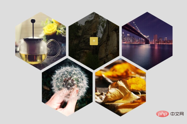
CSS3 to achieve hexagonal Div image display effect
1. Effect picture
css Video Tutorial"]
<!DOCTYPE html><html><head>
    <meta http-equiv="Content-Type" content="text/html; charset=utf-8" />
    <title>CSS3 实现六边形图片展示效果</title>
    <style type="text/css">
        body, p, img, ul, li        {
            margin: 0;
            padding: 0;
        }
        body        {
            font-size: 12px;
            background-color: #DDD;
            min-width: 1200px;
        }
        ul, ul li        {
            list-style: none;
        }
        .clear        {
            clear: both;
        }
        .box        {
            position: relative;
            width: 630px;
            margin: 100px auto;
        }
        .lineF, .lineS        {
            position: absolute;
            visibility: hidden;
        }
        .lineS        {
            top: 182px;
            left: 105px;
        }
        .boxF, .boxS, .boxT, .overlay        {
            width: 200px;
            height: 250px;
            overflow: hidden;
        }
        .boxF, .boxS        {
            visibility: hidden;
        }
        .boxF        {
            transform: rotate(120deg);
            float: left;
            margin-left: 10px;
            -ms-transform: rotate(120deg);
            -moz-transform: rotate(120deg);
            -webkit-transform: rotate(120deg);
        }
        .boxS        {
            transform: rotate(-60deg);
            -ms-transform: rotate(-60deg);
            -moz-transform: rotate(-60deg);
            -webkit-transform: rotate(-60deg);
        }
        .boxT        {
            transform: rotate(-60deg);
            background: no-repeat 50% center;
            background-size: 125% auto;
            -ms-transform: rotate(-60deg);
            -moz-transform: rotate(-60deg);
            -webkit-transform: rotate(-60deg);
            visibility: visible;
        }
        .overlay        {
            transition: all 250ms ease-in-out 0s;
            display: none;
            position: relative;
        }
        .overlay:hover        {
            background-color: rgba(0,0,0,0.6);
        }
        .boxT:hover .overlay        {
            display: block;
        }
        .overlay a        {
            display: inline-block;
            position: absolute;
            left: 50%;
            top: 50%;
            margin: -16px 0 0 -16px;
            border-radius: 3px;
            background-color: #d3b850;
            text-align: center;
            line-height: 32px;
            width: 32px;
            height: 32px;
            text-decoration: none;
            color: White;
            font-size: 18px;
            font-weight: bolder;
        }
    </style></head><body>
    <p class="box">
        <!--第一行(lineFirst)-->
        <p class="lineF">
            <p class="boxF">
                <p class="boxS">
                    <p class="boxT" style="background-image: url(img/1.jpg);">
                        <p class="overlay">
                            <a href="#">+</a>
                        </p>
                    </p>
                </p>
            </p>
            <p class="boxF">
                <p class="boxS">
                    <p class="boxT" style="background-image: url(img/2.jpg);">
                        <p class="overlay">
                            <a href="#">+</a>
                        </p>
                    </p>
                </p>
            </p>
            <p class="boxF">
                <p class="boxS">
                    <p class="boxT" style="background-image: url(img/3.jpg);">
                        <p class="overlay">
                            <a href="#">+</a>
                        </p>
                    </p>
                </p>
            </p>

        </p>
        <!--第二行(lineSecond)-->
        <p class="lineS">
            <p class="boxF">
                <p class="boxS">
                    <p class="boxT" style="background-image: url(img/4.jpg);">
                        <p class="overlay">
                            <a href="#">+</a>
                        </p>
                    </p>
                </p>
            </p>
            <p class="boxF">
                <p class="boxS">
                    <p class="boxT" style="background-image: url(img/5.jpg);">
                        <p class="overlay">
                            <a href="#">+</a>
                        </p>
                    </p>
                </p>
            </p>
        </p>
</p></body></html>The above is the detailed content of How to set the image to hexagon in css. For more information, please follow other related articles on the PHP Chinese website!

Hot AI Tools

Undresser.AI Undress
AI-powered app for creating realistic nude photos

AI Clothes Remover
Online AI tool for removing clothes from photos.

Undress AI Tool
Undress images for free

Clothoff.io
AI clothes remover

AI Hentai Generator
Generate AI Hentai for free.

Hot Article
Hot Tools

Notepad++7.3.1
Easy-to-use and free code editor

SublimeText3 Chinese version
Chinese version, very easy to use

Zend Studio 13.0.1
Powerful PHP integrated development environment

Dreamweaver CS6
Visual web development tools

SublimeText3 Mac version
God-level code editing software (SublimeText3)
Hot Topics


 How to use the locally installed 'Jingnan Mai Round Body' on a web page and solve the display problem?
Apr 05, 2025 pm 02:06 PM
How to use the locally installed 'Jingnan Mai Round Body' on a web page and solve the display problem?
Apr 05, 2025 pm 02:06 PM
How to use locally installed font files on web pages In web development, users may want to use specific fonts installed on their computers to enhance the network...
 How to adapt and adjust the label size of the Element-UI horizontal menu el-menu on the PC and mobile side?
Apr 05, 2025 am 10:12 AM
How to adapt and adjust the label size of the Element-UI horizontal menu el-menu on the PC and mobile side?
Apr 05, 2025 am 10:12 AM
The adaptation issues of the Element-UI menu component el-menu and label size adjustment During the development process of using the Element-UI framework, the flexibility and ease of use of the el-menu component...
 Element-UI el-menu component: How to adjust the size of menu labels and control the display of submenu in different modes?
Apr 05, 2025 am 10:36 AM
Element-UI el-menu component: How to adjust the size of menu labels and control the display of submenu in different modes?
Apr 05, 2025 am 10:36 AM
The label size adjustment of the Element-UI menu component el-menu and the behavior differences under the mode attributes of the Element-UI menu component will be used to determine the different mode modes of the el-menu component in the Element-UI framework...
 How to use CSS to achieve a gradient effect of the background color transition from left to right and gradually becoming lighter from top to bottom?
Apr 05, 2025 pm 12:57 PM
How to use CSS to achieve a gradient effect of the background color transition from left to right and gradually becoming lighter from top to bottom?
Apr 05, 2025 pm 12:57 PM
CSS gradient color effect implementation: Gradient background color from top to bottom In web design, how to transition from left to right in the search box and the background color under the carousel image...
 How to customize resize symbols through CSS to match background color?
Apr 05, 2025 pm 02:09 PM
How to customize resize symbols through CSS to match background color?
Apr 05, 2025 pm 02:09 PM
How to customize resize symbols with CSS to match background color? In web design, the details of the user experience can often significantly improve the overall effect. For example...
 How to solve the problem of page jitter caused by dynamically setting elements to fixed in JavaScript?
Apr 05, 2025 am 11:39 AM
How to solve the problem of page jitter caused by dynamically setting elements to fixed in JavaScript?
Apr 05, 2025 am 11:39 AM
How to solve the problem of page jitter caused by dynamically setting elements to fixed by JS. When dynamically setting elements to fixed by JavaScript, you sometimes encounter page jitter...
 Under a fixed width layout, what is the relationship between the font size and the letter width?
Apr 05, 2025 pm 12:51 PM
Under a fixed width layout, what is the relationship between the font size and the letter width?
Apr 05, 2025 pm 12:51 PM
Under fixed width layout, the subtle relationship between font size and letter width When designing web pages, we often encounter the need to line up in fixed width containers...
 How to implement a custom theme by overriding the SCSS variable of Element?
Apr 05, 2025 pm 01:45 PM
How to implement a custom theme by overriding the SCSS variable of Element?
Apr 05, 2025 pm 01:45 PM
How to implement a custom theme by overriding the SCSS variable of Element? Using Element...
