
 Web Front-end
CSS Tutorial
Usage scenarios, techniques and benefits of css multiple backgrounds
Web Front-end
CSS Tutorial
Usage scenarios, techniques and benefits of css multiple backgrounds
Usage scenarios, techniques and benefits of css multiple backgrounds

[Recommended tutorial: CSS video tutorial]
CSS background is one of the most commonly used CSS properties. However, not all developers know how to use multiple backgrounds. This time has been all about using a variety of background scenes. In this article, the background-image` property will be introduced in detail, combined with graphics to explain the use of multiple backgrounds and their practical benefits.
If you still know about the CSS background property, you can go to MDN to check the related knowledge first.
Introduction
CSS backgroundproperty is the abbreviation of the following properties:
background-clip, background-color, background-image, background-origin, background-position, background-repeat, background-size and background-attachment.
For this article, we will focus on background-image, background-position and background-size. are you ready? let's start!
Consider the following example:
.element {
  background: url(cool.jpg) top left/50px 50px no-repeat;
}The background image is located in the upper left corner of the element and has a size of 50px * 50px. It is important to understand and remember the order of position and size.
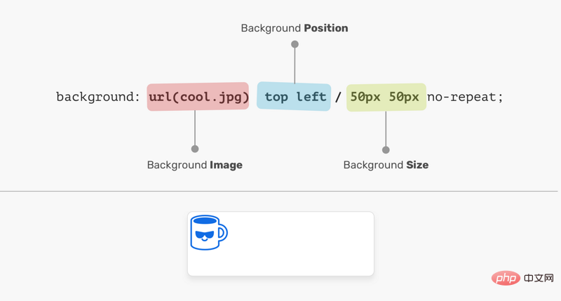
In the picture above, background-position is followed by background-size. Their order cannot be exchanged, otherwise it will be invalid, as shown below:
.element {
    /* 警告:无效的CSS */
    background: url(cool.jpg) 50px 50px/top left no-repeat;
}Background Position
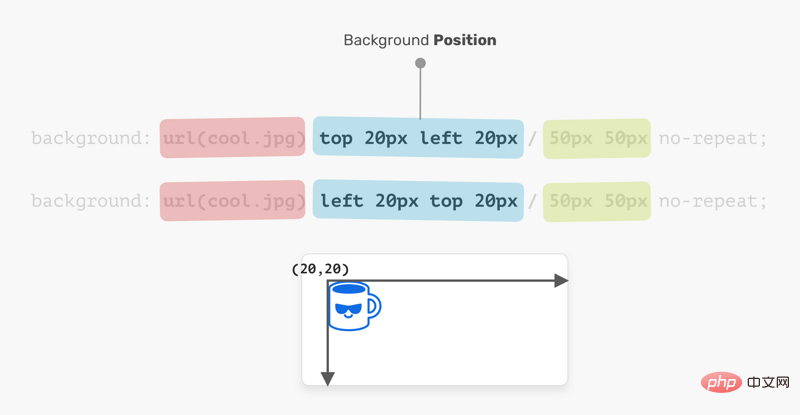
The positioning of the element is relative to the positioning layer set by the background-origin attribute. I like the flexibility of background-position, which has multiple ways to position elements:
- keyword value(
top,right,bottom,left,center) - percentage value, such as:
50% - Length value, such as:
20px,2.5rem - Edge offset value, such as:
top 20px left 10px
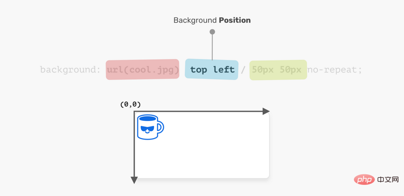
The coordinate system starts from the upper left corner and the default value is 0% 0%.
It is worth mentioning that the value of top left is the same as the value of left top. The browser is smart enough to determine which of these is for the x axis and which is for the y axis.
.element {
    background: url(cool.jpg) top left/50px 50px no-repeat;
    /* 上面与下面相同 */
    background: url(cool.jpg) left top/50px 50px no-repeat;
}Background Size
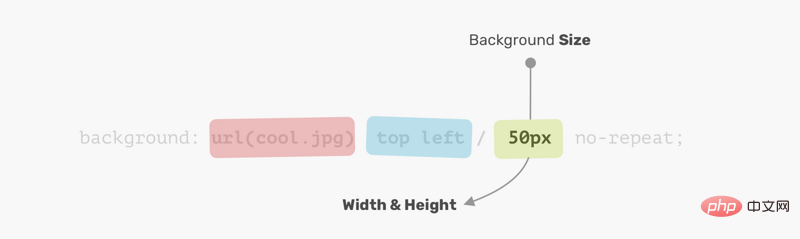
For the background-size property, the first is width, the second One is height.
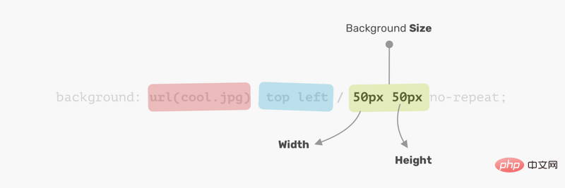
Instead of using two values, you can use one value which means both width and height are the same.
Now that I understand how CSS background works, let’s explore how to use multiple backgrounds.
Multiple backgrounds
backgroundProperties can have one or more layers, separated by commas. If multiple backgrounds are the same size, one will cover the other.
.element {
    background: url(cool.jpg) top left/50px 50px no-repeat,
    url(cool.jpg) center/50px 50px no-repeat;
}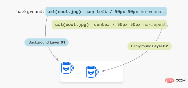
In the image above, we have two background layers. Every location is different. This is the basic usage of multiple backgrounds, let's examine a more advanced example.
Placement order
When placing multiple backgrounds, and one background occupies the entire width and height of its parent, the placement order may be a bit messy. Consider the following example:
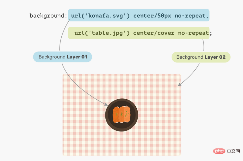
.hero {
  min-height: 350px;
  background: url('table.jpg') center/cover no-repeat,
    url('konafa.svg') center/50px no-repeat;
}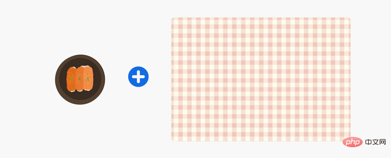
We have a picture of a plate and a table, which one do you think will be on top?
The answer is Table. In CSS, the first background can be placed on the second background, the second background can be placed on the third background, and so on. By replacing the order of the backgrounds, the expected results can be obtained.
Use cases and examples
Mask layer
Often, we may need to place a mask layer on top of a certain part in order to use The text is easy to read. This can be easily done by stacking two backgrounds.
.hero {
    background: linear-gradient(rgba(0, 0, 0, 0.15), rgba(0, 0, 0, 0.15)),
    url("landscape.jpg") center/cover;
}
The good thing is, we can apply color to elements using the same method as above. Consider the following:
.hero {
    background: linear-gradient(135deg, rgba(177, 234, 77, 0.25), rgba(69, 149, 34, 0.25),
    url("landscape.jpg") center/cover;
}
用 CSS 绘图
使用 CSS 渐变绘制的可能性是无限的。 你可以使用linear-gradient或radial-gradient等。接着,我们来看看如何使用它两兄弟绘制笔记本电脑。
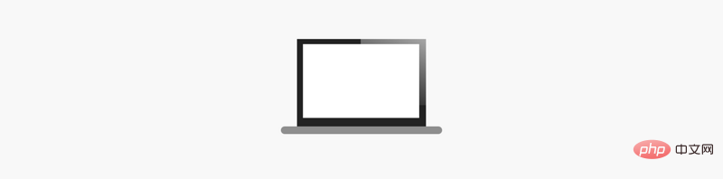
拆解笔记本电脑,看看我们需要使用什么渐变。
拆解笔记本电脑的时,更容易考虑如何使用多个 CSS 背景来实现它。
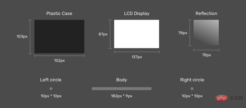
接下来是图纸。 首先是将每个渐变定义为CSS变量及其大小。 我喜欢使用CSS变量,因为它可以减少代码的复杂性,使代码更简洁,更易于阅读。
:root {
  --case: linear-gradient(#222, #222);
  --case-size: 152px 103px;

  --display: linear-gradient(#fff, #fff);
  --display-size: 137px 87px;

  --reflection: linear-gradient(205deg, #fff, rgba(255, 255, 255, 0));
  --reflection-size: 78px 78px;

  --body: linear-gradient(#888, #888);
  --body-size: 182px 9px;

  --circle: radial-gradient(9px 9px at 5px 5.5px, #888 50%, transparent 50%);
  --circle-size: 10px 10px;
}现在我们定义了渐变及其大小,下一步是放置它们。 考虑下图,以获得更好的视觉解释。

显示影像
如前所述,应该首先定义需要在顶部的元素。 在我们的情况下,显示影像应该是第一个渐变。

显示 LCD
显示屏位于x轴中心,距y轴6px。

显示 外壳
外壳位于显示器下方,位于x轴的中心,距y轴的位置为0px。

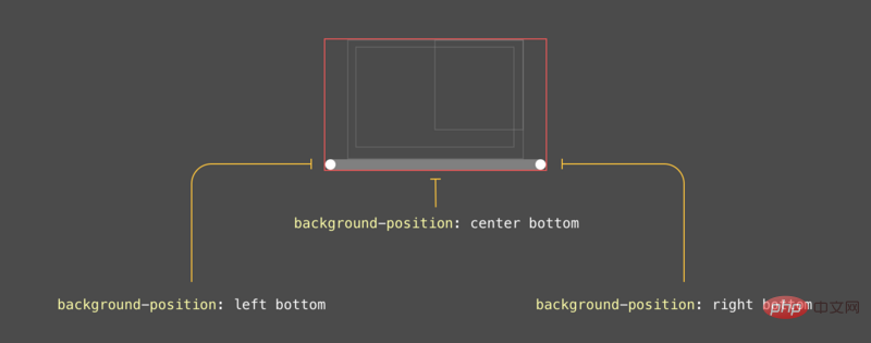
主体
这是图形中最有趣的组件。 首先,主体是一个矩形,每个侧面(左侧和右侧)有两个圆圈。
最终结果
:root {
  --case: linear-gradient(#222, #222);
  --case-size: 152px 103px;
  --case-pos: center 0;

  --display: linear-gradient(#fff, #fff);
  --display-size: 137px 87px;
  --display-pos: center 6px;

  --reflection: linear-gradient(205deg, #fff, rgba(255, 255, 255, 0));
  --reflection-size: 78px 78px;
  --reflection-pos: top right;

  --body: linear-gradient(#888, #888);
  --body-size: 182px 9px;
  --body-pos: center bottom;

  --circle: radial-gradient(9px 9px at 5px 5.5px, #888 50%, transparent 50%);
  --circle-size: 10px 10px;
  --circle-left-pos: left bottom;
  --circle-right-pos: right bottom;
}

.cool {
  width: 190px;
  height: 112px;

  background-image: var(--reflection), var(--display), var(--case), var(--circle), var(--circle), var(--body);

  background-size: var(--reflection-size), var(--display-size), var(--case-size), var(--circle-size), var(--circle-size), var(--body-size);

  background-position: var(--reflection-pos), var(--display-pos), var(--case-pos), var(--circle-left-pos), var(--circle-right-pos), var(--body-pos);

  background-repeat: no-repeat;

  /*outline: solid 1px;*/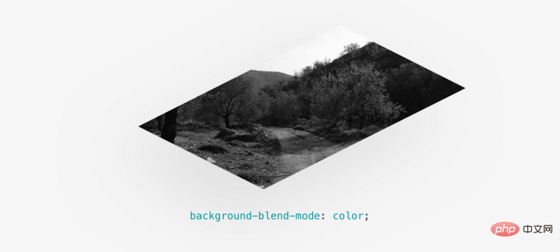
}混合多种背景
混合使用多个背景时会令人兴奋。 考虑一下您在CSS中有一个背景图像,并且想要将其变成黑白图像。
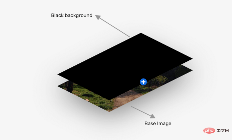
.hero {
  background: linear-gradient(#000, #000),
  url("landscape.jpg") center/cover;
  background-blend-mode: color;
}
更多编程相关知识,请访问:编程视频!!
The above is the detailed content of Usage scenarios, techniques and benefits of css multiple backgrounds. For more information, please follow other related articles on the PHP Chinese website!

Hot AI Tools

Undresser.AI Undress
AI-powered app for creating realistic nude photos

AI Clothes Remover
Online AI tool for removing clothes from photos.

Undress AI Tool
Undress images for free

Clothoff.io
AI clothes remover

AI Hentai Generator
Generate AI Hentai for free.

Hot Article
Hot Tools

Notepad++7.3.1
Easy-to-use and free code editor

SublimeText3 Chinese version
Chinese version, very easy to use

Zend Studio 13.0.1
Powerful PHP integrated development environment

Dreamweaver CS6
Visual web development tools

SublimeText3 Mac version
God-level code editing software (SublimeText3)
Hot Topics


 How to make progress bar with h5
Apr 06, 2025 pm 12:09 PM
How to make progress bar with h5
Apr 06, 2025 pm 12:09 PM
Create a progress bar using HTML5 or CSS: Create a progress bar container. Set the progress bar width. Create internal elements of the progress bar. Sets the internal element width of the progress bar. Use JavaScript, CSS, or progress bar library to display progress.
 How to set h5 table border
Apr 06, 2025 pm 12:18 PM
How to set h5 table border
Apr 06, 2025 pm 12:18 PM
In HTML, set H5 table borders through CSS: Introduce a CSS style sheet, style the border using border attributes (including border-width, border-style, and border-color sub-properties), and apply the style to the table elements. In addition, specific border styles can be set, such as border-top, border-right, border-bottom, and border-left.
 How to run the h5 project
Apr 06, 2025 pm 12:21 PM
How to run the h5 project
Apr 06, 2025 pm 12:21 PM
Running the H5 project requires the following steps: installing necessary tools such as web server, Node.js, development tools, etc. Build a development environment, create project folders, initialize projects, and write code. Start the development server and run the command using the command line. Preview the project in your browser and enter the development server URL. Publish projects, optimize code, deploy projects, and set up web server configuration.
 How to make h5 click icon
Apr 06, 2025 pm 12:15 PM
How to make h5 click icon
Apr 06, 2025 pm 12:15 PM
The steps to create an H5 click icon include: preparing a square source image in the image editing software. Add interactivity in the H5 editor and set the click event. Create a hotspot that covers the entire icon. Set the action of click events, such as jumping to the page or triggering animation. Export H5 documents as HTML, CSS, and JavaScript files. Deploy the exported files to a website or other platform.
 How to make pop-up windows with h5
Apr 06, 2025 pm 12:12 PM
How to make pop-up windows with h5
Apr 06, 2025 pm 12:12 PM
H5 pop-up window creation steps: 1. Determine the triggering method (click, time, exit, scroll); 2. Design content (title, text, action button); 3. Set style (size, color, font, background); 4. Implement code (HTML, CSS, JavaScript); 5. Test and deployment.
 How to solve the h5 compatibility problem
Apr 06, 2025 pm 12:36 PM
How to solve the h5 compatibility problem
Apr 06, 2025 pm 12:36 PM
Solutions to H5 compatibility issues include: using responsive design that allows web pages to adjust layouts according to screen size. Use cross-browser testing tools to test compatibility before release. Use Polyfill to provide support for new APIs for older browsers. Follow web standards and use effective code and best practices. Use CSS preprocessors to simplify CSS code and improve readability. Optimize images, reduce web page size and speed up loading. Enable HTTPS to ensure the security of the website.
 How to make the h5 drop-down menu
Apr 06, 2025 pm 12:24 PM
How to make the h5 drop-down menu
Apr 06, 2025 pm 12:24 PM
The Create H5 drop-down menu includes the following steps: Create a drop-down list, apply a CSS style, add toggle effects, and handle user selections. The specific steps are as follows: Use HTML to create a drop-down list. Use CSS to adjust the appearance of the drop-down menu. Use JavaScript or CSS to achieve the switching effect. Listen to change events to handle user selections.
 How to do the h5 progress bar
Apr 06, 2025 am 11:54 AM
How to do the h5 progress bar
Apr 06, 2025 am 11:54 AM
There are two ways to make an H5 progress bar: using HTML progress bar elements and using JavaScript to create a progress bar. The HTML progress bar element method involves creating a progress bar element and setting its maximum and current value, while the JavaScript method includes creating a progress bar container and a function that updates the progress bar.
