How to set the upper and lower spacing in css: 1. Use the line-height attribute to set the upper and lower spacing, the syntax "line-height: spacing value;"; 2. Use the margin-top and margin-bottom attributes to set the upper and lower spacing respectively. Spacing, the syntax is "margin-top: top spacing value; margin-bottom: bottom spacing value;"; 3. Use the padding-top and padding-bottom attributes to set the top and bottom spacing respectively.

The operating environment of this tutorial: Windows 7 system, CSS3&&HTML5 version, Dell G3 computer.
1. Use the line-height attribute to set the upper and lower spacing
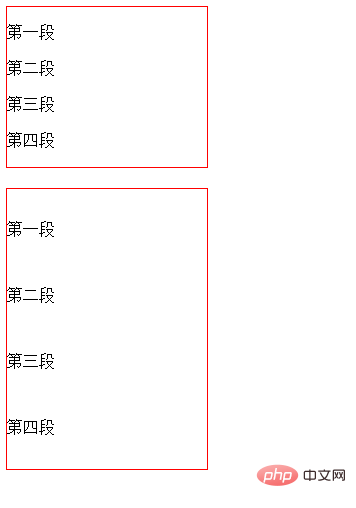
The line-height attribute is used to set the distance between lines (line height), which can control text lines and lines. the distance between.
<!DOCTYPE html>
<html>

	<head>
		<meta charset="utf-8">
		<style type="text/css">
			div{
				width: 200px;
				border: 1px solid red;
			}
			.abc {
				line-height: 50px;
			}
		</style>
	</head>

	<body>
		<div >
			<p>第一段</p>
			<p>第二段</p>
			<p>第三段</p>
			<p>第四段</p>
		</div><br>
		<div class="abc">
			<p>第一段</p>
			<p>第二段</p>
			<p>第三段</p>
			<p>第四段</p>
		</div>
	</body>

</html>Rendering:

Description:
The implementation height (line spacing) is essentially through the upper spacing, It is controlled by the bottom spacing, not the height of the text (the distance from the top edge to the bottom edge of the text). If the pixels of the text are 16px, the larger the line height is, the pixels of the text will remain unchanged, but the upper and lower spacing of the text will change. If the line height is 26px, then the top and bottom spacing are 5px each. That is, increasing the row height will only increase the top and bottom spacing.
Tips: The line height of multi-line text is actually from the bottom edge of the line of text to the bottom edge of the next line of text

2. Use the margin-top and margin-bottom properties to set the top and bottom spacing
The margin-top property sets the top margin of the element.
margin-bottom attribute sets the bottom margin of the element.
<!DOCTYPE html>
<html>

	<head>
		<meta charset="utf-8">
		<style type="text/css">
			div{
				width: 200px;
				border: 1px solid red;
			}
			.abc p {
				margin-top:50px;
				margin-bottom:50px;
			}
		</style>
	</head>

	<body>
		<div >
			<p>第一段</p>
			<p>第二段</p>
			<p>第三段</p>
			<p>第四段</p>
		</div><br>
		<div class="abc">
			<p>第一段</p>
			<p>第二段</p>
			<p>第三段</p>
			<p>第四段</p>
		</div>
	</body>

</html>Rendering:
3. Use padding-top and padding-bottom attributes to set the top and bottom spacing
The padding-top attribute sets the top padding (space) of the element.
The padding-bottom attribute sets the bottom padding (space) of the element.
<!DOCTYPE html>
<html>

	<head>
		<meta charset="utf-8">
		<style type="text/css">
			div{
				width: 200px;
				border: 1px solid red;
			}
			.abc p {
				padding-top:30px;
				padding-bottom:30px;
			}
		</style>
	</head>

	<body>
		<div >
			<p>第一段</p>
			<p>第二段</p>
			<p>第三段</p>
			<p>第四段</p>
		</div><br>
		<div class="abc">
			<p>第一段</p>
			<p>第二段</p>
			<p>第三段</p>
			<p>第四段</p>
		</div>
	</body>

</html>Rendering:
Description:
These two attributes set the upper and lower padding of the element respectively. width. Top and bottom padding set on inline non-replaced elements will not affect line height calculations. Therefore, if an element has both padding and background, it may visually extend to other lines and may overlap with other content. . Negative padding values are not allowed.
[Recommended tutorials: CSS video tutorial, html video tutorial]
The above is the detailed content of How to set the upper and lower spacing in css. For more information, please follow other related articles on the PHP Chinese website!