How to achieve carousel effect with css
In CSS, you can use the "@keyframes" rule and the "animation" attribute to define animations to achieve the carousel switching effect. Animation is the effect of gradually changing an element from one style to another. One or a group of animations can be precisely controlled by setting multiple nodes, which is often used to achieve complex animation effects.

The operating environment of this tutorial: Windows 7 system, CSS3&&HTML5 version, Dell G3 computer.
The power of css3 animation effects is self-evident. Since its emergence, its popularity has not diminished. Its advantages and disadvantages compared with js animation have also been a topic of debate in the front-end industry. There is no doubt that the emergence of css3 animation has a certain influence on the future. It reduces the difficulty of implementing animation effects to a certain extent and is conducive to front-end learning. Its streamlined code size liberates us from annoying js debugging. Of course, CSS animation effects have their limitations. We cannot simulate all of them with CSS3 only. It's animation, and the other thing is browser compatibility. This time we use CSS3 to implement a carousel effect and experience the power of CSS3.
First of all, we have only implemented automatic carousel, and the effect is also the most common fade-in and fade-out. We have not implemented the click rotation effect. At least at my current level, both automatic carousel and click rotation are purely CSS3 can only choose one. If there is a way to achieve both effects at the same time, please tell me.
1. Layout
<section>
    <ul>
        <li>
        <li>
        <li>
        <li>
        <li>
    </ul>
</section>
There is nothing to say about the html code. In terms of style, first of all, the big box of the slider must be relatively positioned. In addition, We use background-image in the li tag, because in this way it is possible to use pure css to achieve responsiveness. In addition, in order to see the full picture clearly in the responsiveness, the background image must use background-size:100%. Another problem is the height. , obviously the slider-container must be consistent with the height of li, because the height cannot be fixed in the responsive style, so using the height attribute is obviously not possible. The padding attribute can solve this problem. First, the background-image can be displayed in the padding. Second, The unit of % in padding is based on the width of the parent element.
*{
      margin:0;
      padding:0;
}
ul,li{
      list-style: none;
}
.floatfix {
      *zoom: 1;
}
.floatfix:after {
      content: "";
      display: table;
      clear: both;
}
.slider-contaner{
      width:100%;
      position:relative;
}
.slider,.slider-item{
      padding-bottom:40%;
}
.slider-item{
      width:100%;
      position:absolute;
      background-size:100%;
}
.slider-item1{
      background-image:url(imgs/1.jpg);
}
.slider-item2{
      background-image:url(imgs/2.jpg);
}
.slider-item3{
      background-image:url(imgs/3.jpg);
}
.slider-item4{
      background-image:url(imgs/4.jpg);
}
.slider-item5{
      background-image:url(imgs/5.jpg);
}2. Design animation
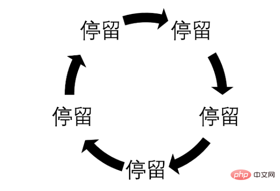
The fade-in and fade-out effect must use opacity. First of all, the fade-in and fade-out of all pictures are the same overall. The animation is just different in time. This must be controlled by animation-delay. The infinite rotation of animation must be controlled by animation-iteration-count: infinite. We have 5 pictures this time. The entire animation is divided into two effects: picture stay and fade-in and fade-out. , represented by the figure below, the arrow indicates the fade-in and fade-out process.

Because there is no attribute in CSS3 that specifies the time interval between two animations, so we must write the effect of the picture when other pictures fade in and out into the animation. Obviously At this time, it is opacity: 0;
For the convenience of writing animation, the animation uses a linear function, that is, animation-timing-function: linear; the whole process takes 20s, and a stay of 3 seconds is used. Fade in and out using 1s, converted into percentages, which are 15% and 5%;
@keyframes fade{
0%{
      opacity:0;
      z-index:2;
}
5%{
      opacity:1;
      z-index: 1;
}
20%{
      opacity:1;
      z-index:1;
}
25%{
      opacity:0;
      z-index:0;
}
100%{
      opacity:0;
      z-index:0;
}
}The next step is to add animation-delay to each picture, because the first picture must be displayed at the front, so the other pictures must be displayed at the front. The neighbor selector uses opacity:0. The first picture does not need to fade in and out. It jumps directly to the stop, which is 5%, so the animation-delay is -1s. The second chapter picture is 20% apart from the first picture, that is 4s, animation-delay is 3s, and so on
.slider-item + .slider-item{
      opacity:0;
}
.slider-item1{
      animation-delay: -1s;
}
.slider-item2{
      animation-delay: 3s;
}
.slider-item3{
      animation-delay: 7s;
}
.slider-item4{
      animation-delay: 11s;
}
.slider-item5{
      animation-delay: 15s;
}At this time our carousel image can be moved
3. Add carousel focus
Adding carousel focus is of course not for clicks, but to tell visitors how many pictures there are and the location of the current picture. At least for me personally, carousel focus is very important, because if I don’t Knowing that there are several pictures in the carousel and I can't click on them, I will be very uneasy and feel that I have not seen the entire page. So let’s add the carousel focus. First of all, it is very clear that the above animation can still be used. In addition, the layout must use position: absolute. In addition, it is obvious that we must write the focus twice, once for the style of the current picture and once for the style of the non-current picture
<div>
<ul>
<li><div></div></li>
<li><div></div></li>
<li><div></div></li>
<li><div></div></li>
<li><div></div></li>
</ul>
</div>
.focus-container{
      position:absolute;
      bottom:2%;
      z-index:7;
      margin:0 auto;
      left:0;
      right:0;
}
.focus-container ul{
      margin-left:46%;
}
.focus-container li{
      width:10px;
      height:10px;
      border-radius:50%;
      float:left;
      margin-right:10px;
      background:#fff;
}
.focus-item{
      width:100%;
      height:100%;
      background:#51B1D9;
      border-radius:inherit;
      animation-duration: 20s;
      animation-timing-function: linear;
      animation-name:fade;
      animation-iteration-count: infinite;
}
.focus-item1{
      animation-delay: -1s;
}
.focus-item2{
      animation-delay: 3s;
}
.focus-item3{
      animation-delay: 7s;
}
.focus-item4{
      animation-delay: 11s;
}
.focus-item5{
      animation-delay: 15s;
}[Recommended tutorial: CSS video tutorial]
4. Combing the code
如果你维护过别人的代码你就会知道,代码梳理对于后期维护的重要性了,没有经过梳理的css代码,随心所欲写到哪里就是哪里,对于后期维护来说简直就是一场灾难,css代码梳理个人认为首先必须添加必要的注释,将css代码分区,另外就是尽量减少后期修改需要修改的地方,这个主要是代码重构的问题,这个问题我已经在编写代码的时候考虑到了,所以主要任务就是添加注释和告诉维护者代码最常修改的地方,我们遵循最常修改的代码放到最后的原则。
我们来分析一下我们的代码如果给别人用可能需要修改的地方,首先肯定是图片路径,所以我们把这个样式放在最后,然后是图片高度,轮播焦点的颜色,动画时间的设置(这里还涉及图片个数),轮播焦点的位置,当然轮播焦点大小也可能修改。重构后代码如下:
<div>
<ul>
<li><div></div></li>
<li><div></div></li>
<li><div></div></li>
<li><div></div></li>
<li><div></div></li>
</ul>
</div>
/*css reset start*/
*{
margin:0;
padding:0;
}
ul,li{
list-style: none;
}
/*css reset end*/

/*css public start*/
.floatfix {
*zoom: 1;
}
.floatfix:after {
content: "";
display: table;
clear: both;
}
/*css public end*/

/*slider start*/
.slider-contaner{
width:100%;
position:relative;
}
.slider-item + .slider-item{
opacity:0;
}
.slider-item{
width:100%;
position:absolute;
animation-timing-function: linear;
animation-name:fade;
animation-iteration-count: infinite;
background-size:100%;
}
.focus-container{
position:absolute;
z-index:7;
margin:0 auto;
left:0;
right:0;
}
.focus-container li{
width:10px;
height:10px;
border-radius:50%;
float:left;
margin-right:10px;
background:#fff;
}
.focus-item{
width:100%;
height:100%;
border-radius:inherit;
animation-timing-function: linear;
animation-name:fade;
animation-iteration-count: infinite;
}
.focus-item2,.focus-item3,.focus-item4,.focus-item5{
opacity:0;
}
.focus-container ul{
margin-left:46%;
}
/*设置轮播焦点的位置*/
.focus-container{
bottom:2%;
}
/*设置当前图片焦点的颜色*/
.focus-item{
background:#51B1D9;
}
/*设置动画,请根据实际需要修改秒数*/
.slider-item,.focus-item{
animation-duration: 20s;
}
.slider-item1,.focus-item1{
animation-delay: -1s;
}
.slider-item2,.focus-item2{
animation-delay: 3s;
}
.slider-item3,.focus-item3{
animation-delay: 7s;
}
.slider-item4,.focus-item4{
animation-delay: 11s;
}
.slider-item5,.focus-item5{
animation-delay: 15s;
}
@keyframes fade{
0%{
opacity:0;
z-index:2;
}
5%{
opacity:1;
z-index: 1;
}
20%{
opacity:1;
z-index:1;
}
25%{
opacity:0;
z-index:0;
}
100%{
opacity:0;
z-index:0;
}
}
/*设置背景,响应式请利用媒体查询根据断点修改路径*/
.slider-item1{
background-image:url(imgs/1.jpg);
}
.slider-item2{
background-image:url(imgs/2.jpg);
}
.slider-item3{
background-image:url(imgs/3.jpg);
}
.slider-item4{
background-image:url(imgs/4.jpg);
}
.slider-item5{
background-image:url(imgs/5.jpg);
}
/*设置图片的高度,请根据具体需要修改百分比,响应式及时修改此值*/
.slider,.slider-item{
padding-bottom:40%;
}五、最后扯两句
这种css3实现的轮播图,缺点也是不言而喻,点击轮换和自动轮换两者只能选其一,不过自动轮换可以用在手机端,这是一个不错的选择,另外,现在的网站大都是通栏设计,网页文字很少,尤其是网站首页更是如此,有时候比的不是网站设计的优劣,反而是谁选的图片好看,谁就有可能受到青睐,这种情况我们其实可以考虑将轮播图变为背景的轮换,这时候轮播焦点也就可以不使用了,相信你的博客首页或者产品首页使用背景轮换,效果会非常不错的
更多编程相关知识,请访问:编程视频!!
The above is the detailed content of How to achieve carousel effect with css. For more information, please follow other related articles on the PHP Chinese website!

Hot AI Tools

Undresser.AI Undress
AI-powered app for creating realistic nude photos

AI Clothes Remover
Online AI tool for removing clothes from photos.

Undress AI Tool
Undress images for free

Clothoff.io
AI clothes remover

Video Face Swap
Swap faces in any video effortlessly with our completely free AI face swap tool!

Hot Article

Hot Tools

Notepad++7.3.1
Easy-to-use and free code editor

SublimeText3 Chinese version
Chinese version, very easy to use

Zend Studio 13.0.1
Powerful PHP integrated development environment

Dreamweaver CS6
Visual web development tools

SublimeText3 Mac version
God-level code editing software (SublimeText3)

Hot Topics
 1389
1389
 52
52
 The Roles of HTML, CSS, and JavaScript: Core Responsibilities
Apr 08, 2025 pm 07:05 PM
HTML defines the web structure, CSS is responsible for style and layout, and JavaScript gives dynamic interaction. The three perform their duties in web development and jointly build a colorful website.
 How to use bootstrap in vue
Apr 07, 2025 pm 11:33 PM
Using Bootstrap in Vue.js is divided into five steps: Install Bootstrap. Import Bootstrap in main.js. Use the Bootstrap component directly in the template. Optional: Custom style. Optional: Use plug-ins.
 How to write split lines on bootstrap
Apr 07, 2025 pm 03:12 PM
There are two ways to create a Bootstrap split line: using the tag, which creates a horizontal split line. Use the CSS border property to create custom style split lines.
 Understanding HTML, CSS, and JavaScript: A Beginner's Guide
Apr 12, 2025 am 12:02 AM
WebdevelopmentreliesonHTML,CSS,andJavaScript:1)HTMLstructurescontent,2)CSSstylesit,and3)JavaScriptaddsinteractivity,formingthebasisofmodernwebexperiences.
 How to use bootstrap button
Apr 07, 2025 pm 03:09 PM
How to use the Bootstrap button? Introduce Bootstrap CSS to create button elements and add Bootstrap button class to add button text
 How to resize bootstrap
Apr 07, 2025 pm 03:18 PM
To adjust the size of elements in Bootstrap, you can use the dimension class, which includes: adjusting width: .col-, .w-, .mw-adjust height: .h-, .min-h-, .max-h-
 How to set up the framework for bootstrap
Apr 07, 2025 pm 03:27 PM
To set up the Bootstrap framework, you need to follow these steps: 1. Reference the Bootstrap file via CDN; 2. Download and host the file on your own server; 3. Include the Bootstrap file in HTML; 4. Compile Sass/Less as needed; 5. Import a custom file (optional). Once setup is complete, you can use Bootstrap's grid systems, components, and styles to create responsive websites and applications.
 How to insert pictures on bootstrap
Apr 07, 2025 pm 03:30 PM
There are several ways to insert images in Bootstrap: insert images directly, using the HTML img tag. With the Bootstrap image component, you can provide responsive images and more styles. Set the image size, use the img-fluid class to make the image adaptable. Set the border, using the img-bordered class. Set the rounded corners and use the img-rounded class. Set the shadow, use the shadow class. Resize and position the image, using CSS style. Using the background image, use the background-image CSS property.


