What are the advantages of HTML5 flexible layout?
HTML5 flexible layout is used to provide maximum flexibility for the box model. The advantage is that it is easy to use and it is easy to achieve a certain layout effect according to flex rules. Any container can be designated as Flex layout.

The operating environment of this tutorial: Windows 7 system, CSS3&&HTML5 version, Dell G3 computer.
Flexible layout (Flexible Box or flexbox) is a layout method that ensures that elements have appropriate behavior when the page needs to adapt to different screen sizes and device types.
The purpose of introducing the flexible box layout model is to provide a more efficient way to arrange, align and allocate empty space to sub-elements in a container.
Advantages and disadvantages of flex layout:
The advantage is that it is easy to use and it is easy to achieve a certain layout effect according to flex rules.
The disadvantage is: the browser compatibility is relatively poor and can only be compatible with ie9 and above.
[Recommended tutorial: CSS video tutorial]
Flexible box content
Flexible box by It is composed of Flex container and Flex item.
A flexible container is defined as a flexible container by setting the value of the display property to flex or inline-flex.
The flexible container contains one or more flexible sub-elements.
Note: The outside of the flexible container and inside the flexible sub-element are rendered normally. The flex box only defines how the flex child elements are laid out within the flex container.
Flexible sub-elements are usually displayed in one line within the flexible box. By default there is only one row per container.
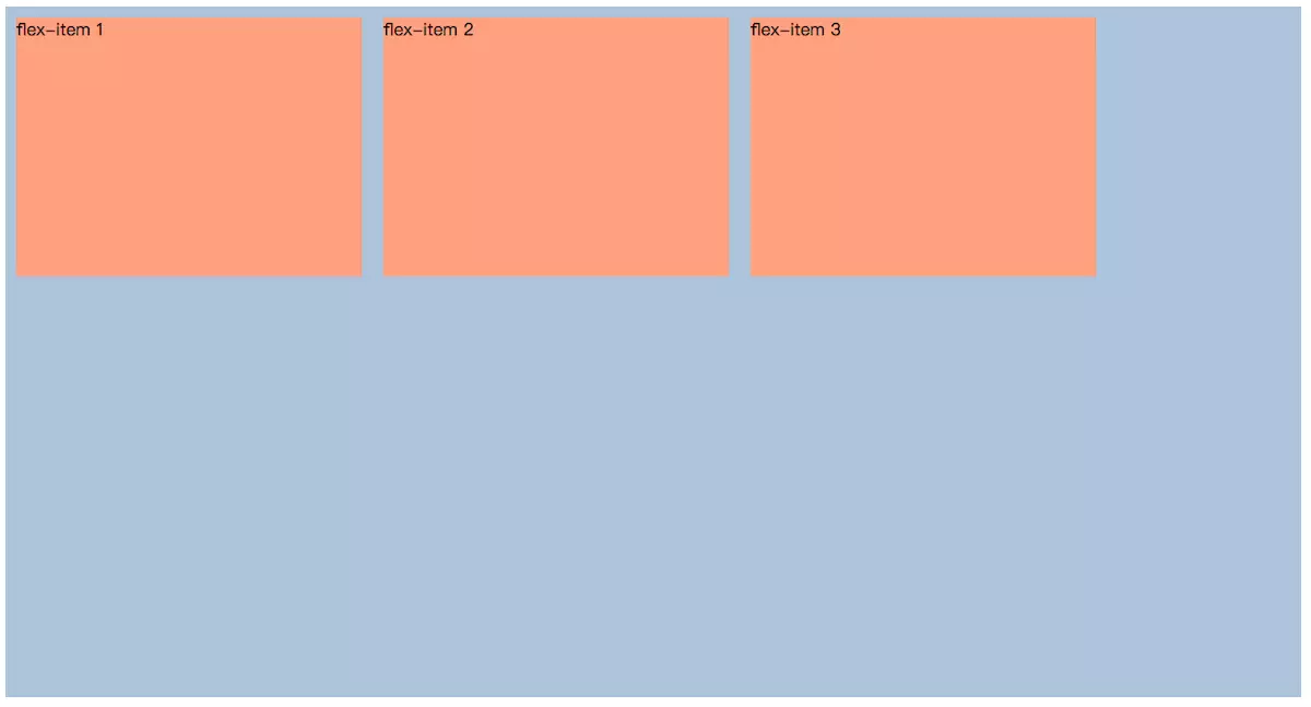
The following elements show the flexible sub-elements displayed in a row, from left to right:
<!DOCTYPE html>
<html>
<head>
    <meta charset="UTF-8">
    <meta name="viewport" content="width=device-width, initial-scale=1.0">
    <meta http-equiv="X-UA-Compatible" content="ie=edge">
    <title>FLEX</title>
    <style>
        .flex-container {
            display: flex;
            flex-direction: row;
            flex-wrap: wrap;
            width: 1200px;
            height: 640px;
            background-color: lightsteelblue;
        }
        .flex-container .flex-item {
            width: 320px;
            height: 240px;
            margin: 10px;
            background-color:lightsalmon;
        }
    </style>
</head>
<body>
    <div>
        <div></div>
        <div></div>
        <div></div>
    </div>
</body>
</html>
Common properties of flexible boxes
| Attribute | Description |
|---|---|
| Specify Arrangement of child elements in a flexible container | |
| Set whether to wrap the child elements of the flexible box when they exceed the parent container | |
| Abbreviation for flex-direction and flex-wrap | |
| Set the flex box element on the side axis (vertical axis) direction | |
| Modify the behavior of the flex-wrap attribute, similar to align-items, but instead of setting the alignment of child elements, Set row alignment | |
| Set the alignment of the flexible box element in the main axis (horizontal axis) direction |
Programming Video! !
The above is the detailed content of What are the advantages of HTML5 flexible layout?. For more information, please follow other related articles on the PHP Chinese website!

Hot AI Tools

Undresser.AI Undress
AI-powered app for creating realistic nude photos

AI Clothes Remover
Online AI tool for removing clothes from photos.

Undress AI Tool
Undress images for free

Clothoff.io
AI clothes remover

Video Face Swap
Swap faces in any video effortlessly with our completely free AI face swap tool!

Hot Article

Hot Tools

Notepad++7.3.1
Easy-to-use and free code editor

SublimeText3 Chinese version
Chinese version, very easy to use

Zend Studio 13.0.1
Powerful PHP integrated development environment

Dreamweaver CS6
Visual web development tools

SublimeText3 Mac version
God-level code editing software (SublimeText3)

Hot Topics
 1386
1386
 52
52
 How to implement flexible layout and responsive design through vue and Element-plus
Jul 18, 2023 am 11:09 AM
How to implement flexible layout and responsive design through vue and Element-plus. In modern web development, flexible layout and responsive design have become a trend. Flexible layout allows page elements to automatically adjust their size and position according to different screen sizes, while responsive design ensures that the page displays well on different devices and provides a good user experience. This article will introduce how to implement flexible layout and responsive design through vue and Element-plus. To begin our work, we
 How to achieve horizontal scrolling effect through CSS Flex layout
Sep 27, 2023 pm 02:05 PM
Summary of how to achieve horizontal scrolling effect through CssFlex elastic layout: In web development, sometimes we need to display a series of items in a container and hope that these items can scroll horizontally. At this time, you can use CSSFlex elastic layout to achieve the horizontal scrolling effect. We can easily achieve this effect by adjusting the properties of the container with simple CSS code. In this article, I will introduce how to use CSSFlex to achieve a horizontal scrolling effect and provide specific code examples. CSSFl
 How to use CSS Flex layout to implement responsive design
Sep 26, 2023 am 08:07 AM
How to use CSSFlex elastic layout to implement responsive design. In today's era of widespread mobile devices, responsive design has become an important task in front-end development. Among them, using CSSFlex elastic layout has become one of the popular choices for implementing responsive design. CSSFlex elastic layout has strong scalability and adaptability, and can quickly implement screen layouts of different sizes. This article will introduce how to use CSSFlex elastic layout to implement responsive design, and give specific code examples.
 How to center a div in html
Apr 05, 2024 am 09:00 AM
There are two ways to center a div in HTML: Use the text-align attribute (text-align: center): For simpler layouts. Use flexible layout (Flexbox): Provide more flexible layout control. The steps include: enabling Flexbox (display: flex) in the parent element. Set the div as a Flex item (flex: 1). Use the align-items and justify-content properties for vertical and horizontal centering.
 Detailed explanation of spacing and white space processing methods in CSS Flex flexible layout
Sep 26, 2023 pm 08:22 PM
Detailed explanation of spacing and white space processing methods in CSSFlex flexible layout Introduction: CSSFlex flexible layout is a very convenient and flexible layout method, which can help us easily create responsive web page layout. When using Flex layout, you often encounter problems with setting spacing and dealing with whitespace. This article will detail how to handle spacing and whitespace in Flex layout and provide specific code examples. 1. Set spacing In Flex layout, we can set spacing in several ways. These are introduced below
 How to use CSS Flex layout to achieve equal-height column layout
Sep 27, 2023 pm 03:17 PM
How to use CSS Flexible Layout to implement equal-height column layout CSS Flexible Box Layout (CSS FlexibleBox Layout), referred to as Flex layout, is a module used for page layout. Flex layout makes it easier for us to implement equal-height column layouts, so that they can be displayed at equal heights regardless of the height of the content. In this article, we will introduce how to use CSSFlex layout to achieve equal height column layout. Below are specific code examples. HTML structure: &
 How to implement two-column layout through CSS Flex layout
Sep 26, 2023 am 10:54 AM
How to implement two-column layout through CSSFlex flexible layout CSSFlex flexible layout is a modern layout technology that can simplify the process of web page layout, allowing designers and developers to easily create layouts that are flexible and adaptable to various screen sizes. Among them, implementing a two-column layout is one of the common requirements in Flex layout. In this article, we will introduce how to use CSSFlex elastic layout to implement a simple two-column layout and provide specific code examples. Using Flex containers and projects
 How to implement irregular grid layout through CSS Flex layout
Sep 28, 2023 pm 09:49 PM
How to implement irregular grid layout through CSSFlex elastic layout. In web design, it is often necessary to use grid layout to achieve page segmentation and layout. Usually grid layout is regular, and each grid is the same size. Sometimes we may need to implement some irregular grid layout. CSSFlex elastic layout is a powerful layout method that can easily implement various grid layouts, including irregular grid layouts. Below we will introduce how to use CSSFlex elastic layout to achieve different


