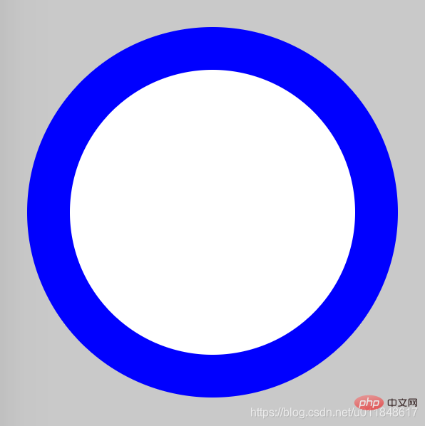
This article introduces how to draw a circle using pure CSS through code examples. It has certain reference value. Friends in need can refer to it. I hope it will be helpful to everyone.

The idea of drawing a circle is very simple: first draw two circles and set different background colors; then make the centers of the two circles coincide.
Difficulty factor
##☆☆HTML
<div class="container">
    <span class="ring-style"></span>
</div>CSS
.container {
    position: relative;
    top: 0;
    left: 0;
    width: 300px;
    height: 300px;
    background-color: lightgrey;
}
.ring-style {
    display: inline-block;
    position: absolute;
    top: 50%;
    left: 50%;
    transform: translate(-50%, -50%);
    background-color: blue;
    width: 260px;
    height: 260px;
    border-radius: 260px;
}
.ring-style::before {
    content: ' ';
    display: inline-block;
    position: absolute;
    top: 50%;
    left: 50%;
    transform: translate(-50%, -50%);
    background-color: white;
    width: 200px;
    height: 200px;
    border-radius: 200px;
}CSS video tutorial]
Rendering

border-radius
The above is the detailed content of Draw a circle using pure CSS (code example). For more information, please follow other related articles on the PHP Chinese website!