Let's talk about the navigation bar in Bootstrap

The navigation bar (navbar) and the navigation (nav) differ by one word, with an additional word "bar". In fact, they are still obviously different in the Bootstrap framework. There is a background color in the navigation bar (navbar), and the navigation bar can be a pure link (similar to navigation), a form, or a combination of form and navigation. This article will introduce the Bootstrap navigation bar in detail.
Basic navigation bar
In the Bootstrap framework, the navigation bar and navigation are not much different in appearance, but in actual use, navigation Bars are much more complex than navigation.
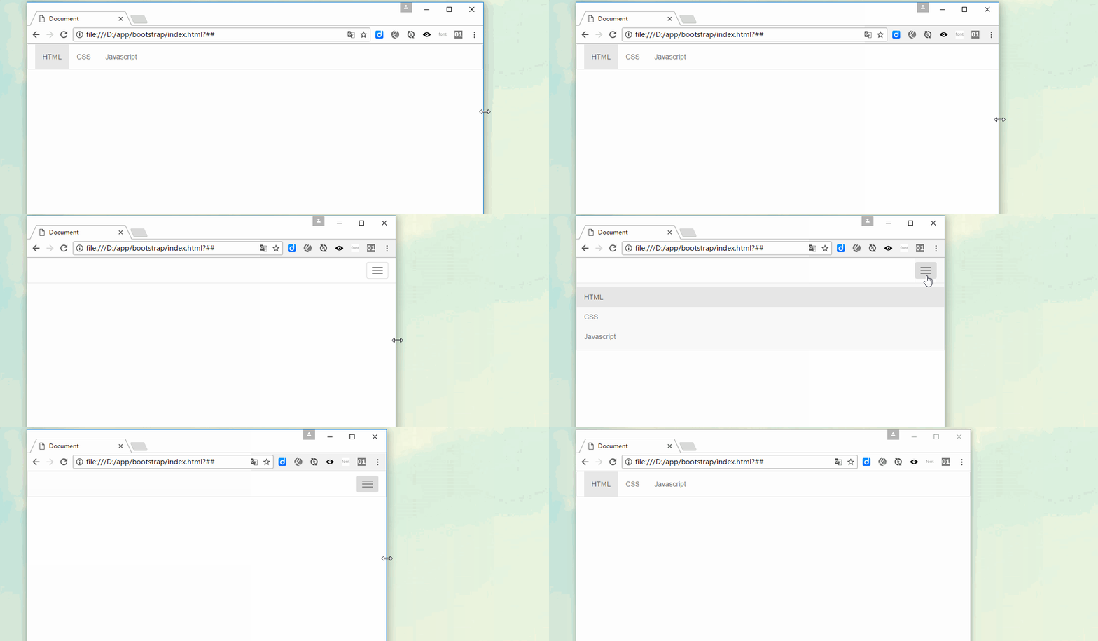
The navigation bar is a responsive basic component used as the navigation header in an application or website. They can be folded (and opened or closed) on mobile devices, and gradually change to horizontal expansion mode when the width of the viewport (viewport) increases
When making a basic navigation bar, there are mainly the following steps: :
1. First, add the class name “navbar-nav” on the basis of making the navigation list (
- )
2. Add a new one outside the list Container (p), and use the class names "navbar" and "navbar-default"
[Principle Analysis]
The main function of the ".navbar" style is to set left and right padding and rounded corners, etc. effect, but its color-related style has not been set in any way
.navbar {
  position: relative;
  min-height: 50px;
  margin-bottom: 20px;
  border: 1px solid transparent;
}The color of the navigation bar is controlled through ".navbar-default"
.navbar-default {
  background-color: #f8f8f8;
  border-color: #e7e7e7;
}The navbar-nav style is in The floating and inner and outer margins of menu items have been re-adjusted based on navigation.nav. It also does not include color and other style settings, and color and other styles are implemented together with the parent container "navbar-default"
[Note] It is best to use the <nav></nav> element , if you are using the generic <p></p> element, be sure to set the role="navigation" attribute for the navigation bar, so that users using assistive devices know clearly that this is A navigation area
<div>
     <ul>
         <li><a>网站首页</a></li>
        <li><a>系列教程</a></li>
        <li><a>名师介绍</a></li>
        <li><a>成功案例</a></li>
        <li><a>关于我们</a></li>
     </ul>
</div>

bootstrap tutorial"
Navigation bar component
[Title]
In Web page production, there is often a title in front of the menu (the text size is slightly larger than other text). In fact, This aspect has also been considered in the Bootstrap framework, which is implemented through "navbar-header" and "navbar-brand"<p></p><div> <div> <a>小火柴的蓝色理想</a> </div> <ul> <li><a>HTML</a></li> <li><a>CSS</a></li> <li><a>Javascript</a></li> <li><a>Bootstrap</a></li> <li><a>jQuery</a></li> </ul> </div>

[Brand Icon]
Replace the place where the brand logo is placed in the navigation bar with the
element to display your own brand icon. Since .navbar-brand has been set with padding and height, you need to add some CSS code according to your own situation to override the default settings
<div>
   <div>
      <a>
        <img  src="/static/imghw/default1.png" data-src="data:image/png;base64,iVBORw0KGgoAAAANSUhEUgAAACgAAAAoCAYAAACM/rhtAAAB+0lEQVR4AcyYg5LkUBhG+1X2PdZGaW3btm3btm3bHttWrPomd1r/2Jn/VJ02TpxcH4CQ/dsuazWgzbIdrm9dZVd4pBz4zx2igTaFHrhvjneVXNHCSqIlFEjiwMyyyOBilRgGSqLNF1jnwNQdIvAt48C3IlBmHCiLQHC2zoHDu6zG1iXn6+y62ScxY9AODO6w0pvAqf23oSE4joOfH6OxfMoRnoGUm+de8wykbFt6wZtA07QwtNOqKh3ZbS3Wzz2F+1c/QJY0UCJ/J3kXWJfv7VhxCRRV1jGw7XI+gcO7rEFFRvdYxydwcPsVsC0bQdKScngt4iUTD4Fy/8p7PoHzRu1DclwmgmiqgUXjD3oTKHbAt869qdJ7l98jNTEblPTkXMwetpvnftA0LLHb4X8kiY9Kx6Q+W7wJtG0HR7fdrtYz+x7iya0vkEtUULIzCjC21wY+W/GYXusRH5kGytWTLxgEEhePPwhKYb7EK3BQuxWwTBuUkd3X8goUn6fMHLyTT+DCsQdAEXNzSMeVPAJHdF2DmH8poCREp3uwm7HsGq9J9q69iuunX6EgrwQVObjpBt8z6rdPfvE8kiiyhsvHnomrQx6BxYUyYiNS8f75H1w4/ISepDZLoDhNJ9cdNUquhRsv+6EP9oNH7Iff2A9g8h8CLt1gH0Qf9NMQAFnO60BJFQe0AAAAAElFTkSuQmCC" class="lazy" alt="Let's talk about the navigation bar in Bootstrap" >
      </a>
    </div>
    <ul>
       <li><a>HTML</a></li>
       <li><a>CSS</a></li>
       <li><a>Javascript</a></li>
       <li><a>Bootstrap</a></li>
       <li><a>jQuery</a></li>
     </ul>
</div>
 [Second-level menu]
<div>
    <ul>
         <li><a>网站首页</a></li>
        <li>
          <a>系列教程<span></span></a>
          <ul>
            <li><a>CSS3</a></li>
            <li><a>JavaScript</a></li>
            <li><a>PHP</a></li>
          </ul>
       </li>
       <li><a>关于我们</a></li>
    </ul>
</div>
【Part Arrangement】
By adding .navbar-left and .navbar-right tool classes, you can create navigation links, forms, buttons or Text alignment. Both classes will set the float style in a specific direction through CSS. For example, to align navigation links, place them in separate- tags with utility classes applied<p></p> These classes are mixin versions of .pull-left and .pull-right , But they are limited to media queries, which makes it easier to handle navigation bar components on various screen sizes<p></p> [Note] Navigation bars currently do not support multiple
. navbar-right class. To allow for proper space between content, the last .navbar-right element uses a negative margin. If there are multiple elements using this class, their margins will not be displayed normally as expected
[Form]
Some navigation bars will have There is a search form. The Bootstrap framework provides a "navbar-form". The method of use is very simple. Just place a form with the navbar-form class name in the navbar container. <p></p> navbar-left implements left floating , navbar-right implements right floating<p></p><div> <ul> <li><a>HTML</a></li> <li><a>CSS</a></li> <li><a>Javascript</a></li> <li><a>Bootstrap</a></li> <li><a>jQuery</a></li> </ul> <form> <div> <input> </div> <button>搜索</button> </form> </div>

【按钮】
对于不包含在 <form></form> 中的 <button></button> 元素,加上 .navbar-btn 后,可以让它在导航条里垂直居中。有一些对于为辅助设备提供可识别标签的方法,例如, aria-label、aria-labelledby 或者 title 属性。如果这些方法都没有,屏幕阅读器将使用 placeholder 属性(如果这个属性存在的话),但是请注意,使用 placeholder 代替其他识别标签的方式是不推荐的
[注意]就像标准的 按钮类 一样,.navbar-btn 可以被用在 <a></a> 和 <input> 元素上。然而,在 .navbar-nav 内,.navbar-btn 和标准的按钮类都不应该被用在 <a></a> 元素上。
<div>
    <ul>
       <li><a>HTML</a></li>
       <li><a>CSS</a></li>
       <li><a>Javascript</a></li>
     </ul>
    <button>Sign in</button>
</div>
 【文本】
【文本】
把文本包裹在 .navbar-text中时,为了有正确的行距和颜色,通常使用 <p></p> 标签
<div>
    <ul>
       <li><a>HTML</a></li>
       <li><a>CSS</a></li>
       <li><a>Javascript</a></li>
     </ul>
    <p>Signed in as huochai</p>
</div>

【非导航链接】
可以在标准的导航组件之外添加标准链接,使用 .navbar-link 类可以让链接有正确的默认颜色和反色设置
<div>
    <ul>
       <li><a>HTML</a></li>
       <li><a>CSS</a></li>
       <li><a>Javascript</a></li>
     </ul>
    <p>Signed in as <a>huochai</a></p>
</div>

导航条位置
很多情况下,设计师希望导航条固定在浏览器顶部或底部,这种固定式导航条的应用在移动端开发中更为常见。Bootstrap框架提供了g两种固定导航条的方式:
☑ .navbar-fixed-top:导航条固定在浏览器窗口顶部
☑ .navbar-fixed-bottom:导航条固定在浏览器窗口底部
使用方法很简单,只需要在制作导航条最外部容器navbar上追加对应的类名即可
这个固定的导航条会遮住页面上的其它内容,除非给 元素底部设置了 padding。提示:导航条的默认高度是 50px
body { padding-top: 70px; }
body { padding-bottom: 70px; }<nav> <ul> <li><a>HTML</a></li> <li><a>CSS</a></li> <li><a>Javascript</a></li> </ul> </nav> <p>测试内容<br><br>测试内容<br><br>测试内容<br><br>测试内容<br><br>测试内容<br><br>测试内容<br><br>测试内容</p> <nav> <ul> <li><a>HTML</a></li> <li><a>CSS</a></li> <li><a>Javascript</a></li> </ul> </nav>
【静止在顶部】
通过添加 .navbar-static-top 类即可创建一个与页面等宽度的导航条,它会随着页面向下滚动而消失
<nav>
    <ul>
       <li><a>HTML</a></li>
       <li><a>CSS</a></li>
       <li><a>Javascript</a></li>
     </ul>
</nav>
<p>测试内容<br><br><br>测试内容<br><br><br>测试内容<br><br><br>测试内容<br><br><br>测试内容<br><br><br>测试内容<br><br><br>测试内容</p>
响应式导航条
Bootstrap的响应式导航条实现如下:
1、保证在窄屏时需要折叠的内容必须包裹在带一个p内,并且为这个p加入collapse、navbar-collapse两个类名。最后为这个p添加一个class类名或者id名
<div>
    <ul>
       <li><a>HTML</a></li>
       <li><a>CSS</a></li>
       <li><a>Javascript</a></li>
     </ul>
</div>
或者
<div>
    <ul>
       <li><a>HTML</a></li>
       <li><a>CSS</a></li>
       <li><a>Javascript</a></li>
     </ul>
</div>
2、保证在窄屏时要显示的图标样式(固定写法):
<button>
  <span>Toggle Navigation</span>
  <span></span>
  <span></span>
  <span></span>
</button>
3、并为button添加data-target=".类名/#id名",究竞是类名还是id名呢?由需要折叠的p来决定。如
<button>
  <span>Toggle Navigation</span>
  <span></span>
  <span></span>
  <span></span>
</button>
或者,对应class="example"
<button>
  <span>Toggle Navigation</span>
  <span></span>
  <span></span>
  <span></span>
</button>
<div>
  <div>
       <button>
         <span>Toggle Navigation</span>
         <span></span>
         <span></span>
         <span></span>
       </button>
  </div>
  <div>
    <ul>
       <li><a>HTML</a></li>
       <li><a>CSS</a></li>
       <li><a>Javascript</a></li>
     </ul>
  </div>
</div>

反色导航条
反色导航条其实是Bootstrap框架提供的第二种风格的导航条,与默认的导航条相比,使用方法并无区别,只是将navbar-deafult类名换成navbar-inverse。其变化只是导航条的背景色和文本做了修改
<div>
    <ul>
       <li><a>HTML</a></li>
       <li><a>CSS</a></li>
       <li><a>Javascript</a></li>
     </ul>
</div>
更多编程相关知识,请访问:编程视频!!
The above is the detailed content of Let's talk about the navigation bar in Bootstrap. For more information, please follow other related articles on the PHP Chinese website!

Hot AI Tools

Undresser.AI Undress
AI-powered app for creating realistic nude photos

AI Clothes Remover
Online AI tool for removing clothes from photos.

Undress AI Tool
Undress images for free

Clothoff.io
AI clothes remover

AI Hentai Generator
Generate AI Hentai for free.

Hot Article

Hot Tools

Notepad++7.3.1
Easy-to-use and free code editor

SublimeText3 Chinese version
Chinese version, very easy to use

Zend Studio 13.0.1
Powerful PHP integrated development environment

Dreamweaver CS6
Visual web development tools

SublimeText3 Mac version
God-level code editing software (SublimeText3)

Hot Topics
 How to introduce bootstrap into Eclipse
Apr 05, 2024 am 02:30 AM
Introduce Bootstrap in Eclipse in five steps: Download the Bootstrap file and unzip it. Import the Bootstrap folder into the project. Add Bootstrap dependency. Load Bootstrap CSS and JS in HTML files. Start using Bootstrap to enhance your user interface.
 750,000 rounds of one-on-one battle between large models, GPT-4 won the championship, and Llama 3 ranked fifth
Apr 23, 2024 pm 03:28 PM
Regarding Llama3, new test results have been released - the large model evaluation community LMSYS released a large model ranking list. Llama3 ranked fifth, and tied for first place with GPT-4 in the English category. The picture is different from other benchmarks. This list is based on one-on-one battles between models, and the evaluators from all over the network make their own propositions and scores. In the end, Llama3 ranked fifth on the list, followed by three different versions of GPT-4 and Claude3 Super Cup Opus. In the English single list, Llama3 overtook Claude and tied with GPT-4. Regarding this result, Meta’s chief scientist LeCun was very happy and forwarded the tweet and
 How to read the bootstrap mediation effect test results in stata
Apr 05, 2024 am 01:48 AM
Interpretation steps of Bootstrap mediation effect test in Stata: Check the sign of the coefficient: Determine the positive or negative direction of the mediation effect. Test p value: less than 0.05 indicates that the mediating effect is significant. Check the confidence interval: not containing zero indicates that the mediation effect is significant. Comparing the median p-value: less than 0.05 further supports the significance of the mediation effect.
 How to introduce idea into bootstrap
Apr 05, 2024 am 02:33 AM
Steps to introduce Bootstrap in IntelliJ IDEA: Create a new project and select "Web Application". Add "Bootstrap" Maven dependency. Create an HTML file and add Bootstrap references. Replace with the actual path to the Bootstrap CSS file. Run the HTML file to use Bootstrap styles. Tip: Use a CDN to import Bootstrap or customize HTML file templates.
 How to use bootstrap to test mediation effects
Apr 05, 2024 am 03:57 AM
The Bootstrap test uses resampling technology to evaluate the reliability of the statistical test and is used to prove the significance of the mediation effect: first, calculate the confidence interval of the direct effect, indirect effect and mediation effect; secondly, calculate the significance of the mediation type according to the Baron and Kenny or Sobel method. significance; and finally estimate the confidence interval for the natural indirect effect.
 How to read the results of bootstrap mediation test
Apr 05, 2024 am 03:30 AM
The Bootstrap mediation test evaluates the mediation effect by resampling the data multiple times: Indirect effect confidence interval: indicates the estimated range of the mediation effect. If the interval does not contain zero, the effect is significant. p-value: Evaluates the probability that the confidence interval does not contain zero, with values less than 0.05 indicating significant. Sample size: The number of data samples used for analysis. Bootstrap subsampling times: the number of repeated samplings (500-2000 times). If the confidence interval does not contain zero and the p-value is less than 0.05, the mediation effect is significant, indicating that the mediating variable explains the relationship between the independent and dependent variables.
 What is the difference between bootstrap and springboot
Apr 05, 2024 am 04:00 AM
The main difference between Bootstrap and Spring Boot is: Bootstrap is a lightweight CSS framework for website styling, while Spring Boot is a powerful, out-of-the-box backend framework for Java web application development. Bootstrap is based on CSS and HTML, while Spring Boot is based on Java and the Spring framework. Bootstrap focuses on creating the look and feel of a website, while Spring Boot focuses on back-end functionality. Spring Boot can be integrated with Bootstrap to create fully functional, beautiful
 How to export the results of bootstrap test mediation effect stata command
Apr 05, 2024 am 03:39 AM
Export the results of the Bootstrap mediation effect test in Stata: Save the results: bootstrap post Create variable list: local vars: coef se ci Export the results (CSV): export delimited results.csv, varlist(`vars') replace comma nolabel


