The warning box can flexibly provide some predefined information to provide users with some feedback content and tips. Today we will introduce the bootstrap warning box, which has certain reference value. Friends in need can refer to it. I hope it will be helpful to everyone.

Warning box
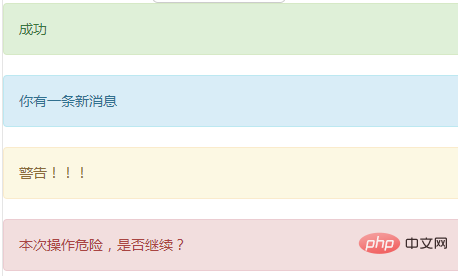
Putting text and an optional button together is a warning box. To use the warning box, you must Set .alert, there are other classes to choose from. Currently provides success, message, warning, or danger.
<div class="alert alert-success" role="alert">成功</div>
    <div class="alert alert-info" role="alert">你有一条新消息</div>
    <div class="alert alert-warning" role="alert">警告!!!</div>
    <div class="alert alert-danger" role="alert">本次操作危险,是否继续?</div>
Can close the warning box
Add .alert-dismissible to the warning box class and a close button, it becomes a warning box that can be closed. In order to ensure that this operation is feasible, you need to add the data-dismiss="alert" attribute to the <button> element.
<div class="alert alert-warning alert-dismissible" role="alert">
<button type="button" class="close" data-dismiss="alert" aria-label="Close"><span aria-hidden="true">×</span></button>
<strong>警告!</strong> 本次操作有风险,是否继续?
</div>
Links in warning
.alert-link Can be set for links with The same color as the current alert box.
 <div class="alert alert-success" role="alert">
        <a href="#" class="alert-link">成功</a>
      </div>
      <div class="alert alert-info" role="alert">
        <a href="#" class="alert-link">你有一条新消息</a>
      </div>
      <div class="alert alert-warning" role="alert">
        <a href="#" class="alert-link">警告!!!</a>
      </div>
      <div class="alert alert-danger" role="alert">
        <a href="#" class="alert-link">本次操作危险,是否继续?</a>
</div> I won’t demonstrate this this time. You can’t see it in the pictures. It’s better to practice it yourself.
Recommended learning: Bootstrap video tutorial
The above is the detailed content of Get the bootstrap warning box in one trick. For more information, please follow other related articles on the PHP Chinese website!