Learn more about the pagination component in Bootstrap
Paging navigation can be seen on almost every website. Good paging can bring a good user experience to users. This article will give you a detailed introduction to Bootstrap pagination. It has certain reference value. Friends in need can refer to it. I hope it will be helpful to everyone.

Overview
There are two types of paging navigation provided in the Bootstrap framework:
☑ Paging navigation with page numbers
☑ Paging navigation with page turning
Paging with page numbers
Paging with page numbers Navigation may be the most common type of paging navigation. Especially when the list page contains a lot of content, users will be provided with a paging navigation method
[Default paging]
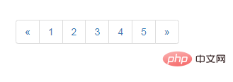
Usually many people like to use the p>a and p>span structures to create paging navigation with page numbers. However, the Bootstrap framework uses a structure like ul>li>a, and adds the pagination method to the ul tag:
<nav aria-label="Page navigation">
  <ul class="pagination">
    <li>
      <a href="#" aria-label="Previous">
        <span aria-hidden="true">«</span>
      </a>
    </li>
    <li><a href="#">1</a></li>
    <li><a href="#">2</a></li>
    <li><a href="#">3</a></li>
    <li><a href="#">4</a></li>
    <li><a href="#">5</a></li>
    <li>
      <a href="#" aria-label="Next">
        <span aria-hidden="true">»</span>
      </a>
    </li>
  </ul>
</nav>
bootstrap Tutorial"
[Status]
Links can be customized under different circumstances. You can add the.disabled class to links that cannot be clicked, and the .active class to the current page.
tag) with the tag, or omit the tag on the forward/backward arrows, so that It maintains the required style and cannot be clicked<nav aria-label="Page navigation">
<ul class="pagination">
<li class="disabled">
<span aria-label="Previous">
<span aria-hidden="true">«</span>
</span>
</li>
<li class="active"><span>1</span></li>
<li><a href="#">2</a></li>
<li><a href="#">3</a></li>
<li><a href="#">4</a></li>
<li><a href="#">5</a></li>
<li>
<a href="#" aria-label="Next">
<span aria-hidden="true">»</span>
</a>
</li>
</ul>
</nav>

[Size]
In the Bootstrap framework, you can pass two different Set its size according to the situation, similar to the button: 1. Use "pagination-lg" to make the paging navigation larger 2. Use "pagination-sm" to make the paging navigation smaller.
<nav aria-label="Page navigation">
<ul class="pagination">
<li>
<a href="#" aria-label="Previous">
<span aria-hidden="true">«</span>
</a>
</li>
<li><a href="#">1</a></li>
<li><a href="#">2</a></li>
<li><a href="#">3</a></li>
<li><a href="#">4</a></li>
<li><a href="#">5</a></li>
<li>
<a href="#" aria-label="Next">
<span aria-hidden="true">»</span>
</a>
</li>
</ul>
</nav>

Page turning
In addition to providing paging navigation with page numbers, the Bootstrap framework also provides Page navigation. This kind of paginated navigation is often seen on some simple websites, such as personal blogs, magazine websites, etc. This kind of paging navigation cannot see the specific page number, but only provides a "previous page" and "next page" button[Default usage]
In actual use, page-turning paging navigation is similar to paging navigation with page numbers. Add thepager class to the ul tag
<ul class="pager"> <li><a href="#">«上一页</a></li> <li><a href="#">下一页»</a></li> </ul>

【 Alignment settings】
By default, the page navigation is displayed in the center, but sometimes we need one to be on the left and the other on the right. The Bootstrap framework provides two styles: ☑ Previous: Let the "Previous" button be on the left☑ Next: Let the "Next" button be on the rightSpecific use At this time, you only need to add the corresponding class name to theli tag
.pager .next > a,
.pager .next > span {
float: right;
}
.pager .previous > a,
.pager .previous > span {
float: left;
}<ul class="pager"> <li class="previous"><a href="#">←上一页</a></li> <li class="next"><a href="#">下一页→</a></li> </ul>

[Status Settings]
Same as paging navigation with page numbers, if the disabled class name is added to the li tag, the paging button is disabled , but its click function cannot be disabled either. It can be processed through js, or replace thetag.pager .disabled > a,
.pager .disabled >a:hover,
.pager .disabled >a:focus,
.pager .disabled > span {
color: #999;
cursor: not-allowed;
background-color: #fff;
}<ul class="pager"> <li class="disabled"><span>«上一页</span></li> <li><a href="#">下一页»</a></li> </ul>
Programming Video! !
The above is the detailed content of Learn more about the pagination component in Bootstrap. For more information, please follow other related articles on the PHP Chinese website!

Hot AI Tools

Undresser.AI Undress
AI-powered app for creating realistic nude photos

AI Clothes Remover
Online AI tool for removing clothes from photos.

Undress AI Tool
Undress images for free

Clothoff.io
AI clothes remover

AI Hentai Generator
Generate AI Hentai for free.

Hot Article

Hot Tools

Notepad++7.3.1
Easy-to-use and free code editor

SublimeText3 Chinese version
Chinese version, very easy to use

Zend Studio 13.0.1
Powerful PHP integrated development environment

Dreamweaver CS6
Visual web development tools

SublimeText3 Mac version
God-level code editing software (SublimeText3)

Hot Topics
 1386
1386
 52
52
 How to get the bootstrap search bar
Apr 07, 2025 pm 03:33 PM
How to use Bootstrap to get the value of the search bar: Determines the ID or name of the search bar. Use JavaScript to get DOM elements. Gets the value of the element. Perform the required actions.
 How to use bootstrap in vue
Apr 07, 2025 pm 11:33 PM
Using Bootstrap in Vue.js is divided into five steps: Install Bootstrap. Import Bootstrap in main.js. Use the Bootstrap component directly in the template. Optional: Custom style. Optional: Use plug-ins.
 How to write split lines on bootstrap
Apr 07, 2025 pm 03:12 PM
There are two ways to create a Bootstrap split line: using the tag, which creates a horizontal split line. Use the CSS border property to create custom style split lines.
 How to do vertical centering of bootstrap
Apr 07, 2025 pm 03:21 PM
Use Bootstrap to implement vertical centering: flexbox method: Use the d-flex, justify-content-center, and align-items-center classes to place elements in the flexbox container. align-items-center class method: For browsers that do not support flexbox, use the align-items-center class, provided that the parent element has a defined height.
 How to resize bootstrap
Apr 07, 2025 pm 03:18 PM
To adjust the size of elements in Bootstrap, you can use the dimension class, which includes: adjusting width: .col-, .w-, .mw-adjust height: .h-, .min-h-, .max-h-
 How to set up the framework for bootstrap
Apr 07, 2025 pm 03:27 PM
To set up the Bootstrap framework, you need to follow these steps: 1. Reference the Bootstrap file via CDN; 2. Download and host the file on your own server; 3. Include the Bootstrap file in HTML; 4. Compile Sass/Less as needed; 5. Import a custom file (optional). Once setup is complete, you can use Bootstrap's grid systems, components, and styles to create responsive websites and applications.
 How to insert pictures on bootstrap
Apr 07, 2025 pm 03:30 PM
There are several ways to insert images in Bootstrap: insert images directly, using the HTML img tag. With the Bootstrap image component, you can provide responsive images and more styles. Set the image size, use the img-fluid class to make the image adaptable. Set the border, using the img-bordered class. Set the rounded corners and use the img-rounded class. Set the shadow, use the shadow class. Resize and position the image, using CSS style. Using the background image, use the background-image CSS property.
 What to do if the Bootstrap Table uses AJAX to get data garbled
Apr 07, 2025 am 11:54 AM
Solutions to the garbled code of Bootstrap Table when using AJAX to obtain data from the server: 1. Set the correct character encoding of the server-side code (such as UTF-8). 2. Set the request header in the AJAX request and specify the accepted character encoding (Accept-Charset). 3. Use the "unescape" converter of the Bootstrap Table to decode the escaped HTML entity into original characters.


