How to set line height in css
In CSS, you can use the line-height attribute to set the line height. You only need to add the "line-height: line height value;" style to the specified element, for example "line-height: 10px;" . The line-height attribute can set the distance between lines (line height), and negative values are not allowed.
The operating environment of this tutorial: Windows 7 system, CSS3&&HTML5 version, Dell G3 computer.
The so-called line height refers to the vertical distance between the baselines of text lines. To understand this sentence, you must first understand a few basic knowledge:
Top line, middle line, baseline, bottom line
<!DOCTYPE html>
<html>
    <head>
        <title>Test</title>
        <style type="text/css" >
            span
            {
                padding:0px;
                line-height:1.5;
            }
        </style>
    </head>
    <body>
        <div class="test">
            <div style="background-color:#ccc;">
                <span style="font-size:3em;background-color:#999;">中文English</span>
                <span style="font-size:3em;background-color:#999;">English中文</span>
            </div>
        </div>
    </body>
<html>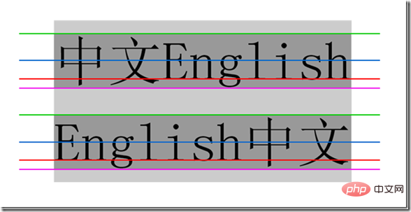
The four lines from top to bottom are the top line, the middle line, the baseline, and the bottom line. They are very similar to the four lines and three spaces when learning English letters. We know that the vertical-align attribute includes top, middle, baseline, and bottom. , which is related to these four lines.
Remember especially that the baseline is not the bottom line, the bottom line is the bottom line.
Line height, line spacing and half-line spacing
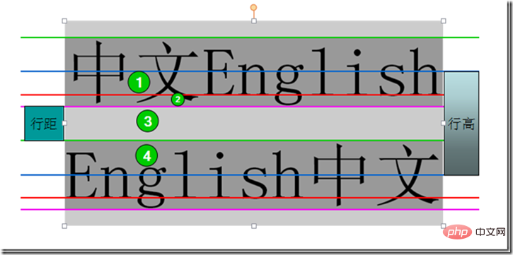
Line height refers to the vertical distance between the baselines of the context line , that is, the vertical distance between the two red lines in the figure.
Line spacing refers to the vertical distance from the bottom line of one row to the top line of the next row, that is, the vertical distance between the pink line of the first row and the green line of the second row.
Half line spacing is half of the line spacing, that is, the vertical distance of area 3/2, the sum of the distances of areas 1, 2, 3, and 4 is the line height, and area 1, 2, 4 The sum of the distances is the font size, so half line spacing can also be calculated like this: (line height - font size)/2
Content area, inline box , Line box
Content area: The area wrapped by the bottom line and the top line, that is, the dark gray background area in the picture below.
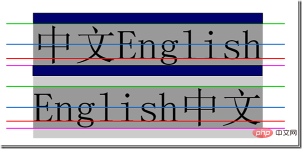
Inline box, each inline element will generate an inline box. The inline box is a concept in the browser rendering model and cannot be displayed. , when there are no other factors (padding, etc.), the inline box is equal to the content area, and when the line height is set, the height of the inline box remains unchanged, and the half line spacing [(line height-font size)/2] increases/decreases to the content respectively. The upper and lower sides of the area (dark blue area)
Line box (line box), the line box refers to a virtual rectangular box of this line, is a concept in the browser rendering mode , and is not actually displayed. The height of the line box is equal to the largest value of the inline box among all elements in this row (the inline box with the largest row height value is used as the benchmark, and other inline boxes are aligned to the benchmark using their own alignment methods, and the height of the line box is finally calculated). When there are multiple lines content, each line will have its own line box.
<div   style="max-width:90%">
                <span style="font-size:1em;background-color:#666;">中文English</span>
                <span style="font-size:3em;background-color:#999;">中文English</span>
                <span style="font-size:3em;background-color:#999;">English中文</span>
                <span style="font-size:1em;background-color:#666;">English中文</span>
            </div>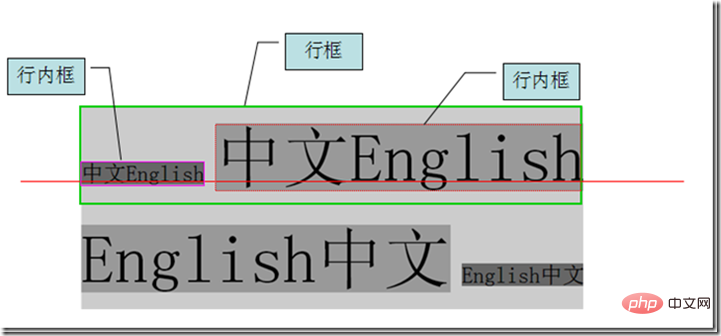
(Learning video sharing: css video tutorial)
line-height
Now that the basic concepts are clear, we can talk about the line-height attribute, the protagonist of this article.
Definition: The line-height attribute sets the distance between lines (line height), and negative values cannot be used. This property affects the layout of the line box. When applied to a block-level element, it defines the minimum distance between baselines in that element rather than the maximum distance. The difference between the calculated values of line-height and font-size (line spacing) is divided into two halves and added to the top and bottom of a line of text content respectively. The smallest box that can contain this content is a line box.
Possible values
| 值 | 说明 |
| normal | 默认,设置合理的行间距。 |
| number | 设置数字,此数字会与当前的字体尺寸相乘来设置行间距。相当于倍数 |
| length | 设置固定的行间距。 |
| % | 基于当前字体尺寸的百分比行间距。 |
| inherit | 规定应该从父元素继承 line-height 属性的值。 |
示例:
<!DOCTYPE html>
<html>

	<head>
		<meta charset="utf-8">
		<style type="text/css">
			p.small {
				line-height: 90%
			}

			p.big {
				line-height: 200%
			}
		</style>
	</head>

	<body>

		<p>
			这是拥有标准行高的段落。 在大多数浏览器中默认行高大约是 110% 到 120%。 这是拥有标准行高的段落。 这是拥有标准行高的段落。 这是拥有标准行高的段落。 这是拥有标准行高的段落。 这是拥有标准行高的段落。
		</p>

		<p class="small">
			这个段落拥有更小的行高。 这个段落拥有更小的行高。 这个段落拥有更小的行高。 这个段落拥有更小的行高。 这个段落拥有更小的行高。 这个段落拥有更小的行高。 这个段落拥有更小的行高。
		</p>

		<p class="big">
			这个段落拥有更大的行高。 这个段落拥有更大的行高。 这个段落拥有更大的行高。 这个段落拥有更大的行高。 这个段落拥有更大的行高。 这个段落拥有更大的行高。 这个段落拥有更大的行高。
		</p>

	</body>

</html>效果图:
更多编程相关知识,请访问:编程视频!!
The above is the detailed content of How to set line height in css. For more information, please follow other related articles on the PHP Chinese website!

Hot AI Tools

Undresser.AI Undress
AI-powered app for creating realistic nude photos

AI Clothes Remover
Online AI tool for removing clothes from photos.

Undress AI Tool
Undress images for free

Clothoff.io
AI clothes remover

AI Hentai Generator
Generate AI Hentai for free.

Hot Article

Hot Tools

Notepad++7.3.1
Easy-to-use and free code editor

SublimeText3 Chinese version
Chinese version, very easy to use

Zend Studio 13.0.1
Powerful PHP integrated development environment

Dreamweaver CS6
Visual web development tools

SublimeText3 Mac version
God-level code editing software (SublimeText3)

Hot Topics
 1378
1378
 52
52
 How to write split lines on bootstrap
Apr 07, 2025 pm 03:12 PM
There are two ways to create a Bootstrap split line: using the tag, which creates a horizontal split line. Use the CSS border property to create custom style split lines.
 How to insert pictures on bootstrap
Apr 07, 2025 pm 03:30 PM
There are several ways to insert images in Bootstrap: insert images directly, using the HTML img tag. With the Bootstrap image component, you can provide responsive images and more styles. Set the image size, use the img-fluid class to make the image adaptable. Set the border, using the img-bordered class. Set the rounded corners and use the img-rounded class. Set the shadow, use the shadow class. Resize and position the image, using CSS style. Using the background image, use the background-image CSS property.
 How to resize bootstrap
Apr 07, 2025 pm 03:18 PM
To adjust the size of elements in Bootstrap, you can use the dimension class, which includes: adjusting width: .col-, .w-, .mw-adjust height: .h-, .min-h-, .max-h-
 The Roles of HTML, CSS, and JavaScript: Core Responsibilities
Apr 08, 2025 pm 07:05 PM
HTML defines the web structure, CSS is responsible for style and layout, and JavaScript gives dynamic interaction. The three perform their duties in web development and jointly build a colorful website.
 How to set up the framework for bootstrap
Apr 07, 2025 pm 03:27 PM
To set up the Bootstrap framework, you need to follow these steps: 1. Reference the Bootstrap file via CDN; 2. Download and host the file on your own server; 3. Include the Bootstrap file in HTML; 4. Compile Sass/Less as needed; 5. Import a custom file (optional). Once setup is complete, you can use Bootstrap's grid systems, components, and styles to create responsive websites and applications.
 How to use bootstrap in vue
Apr 07, 2025 pm 11:33 PM
Using Bootstrap in Vue.js is divided into five steps: Install Bootstrap. Import Bootstrap in main.js. Use the Bootstrap component directly in the template. Optional: Custom style. Optional: Use plug-ins.
 How to use bootstrap button
Apr 07, 2025 pm 03:09 PM
How to use the Bootstrap button? Introduce Bootstrap CSS to create button elements and add Bootstrap button class to add button text
 How to view the date of bootstrap
Apr 07, 2025 pm 03:03 PM
Answer: You can use the date picker component of Bootstrap to view dates in the page. Steps: Introduce the Bootstrap framework. Create a date selector input box in HTML. Bootstrap will automatically add styles to the selector. Use JavaScript to get the selected date.


