

What are the new color modes in css3

css has added 3 new color modes: 1. RGBA mode, which adds Alpha transparency to the RGB mode, such as "rgba(255,0,0,0.5)"; 2. HSL mode, For example, "hsl(360,50%,50%)"; 3. HSLA mode, which adds Alpha transparency to the HSL mode.

The operating environment of this tutorial: Windows 7 system, CSS3 version, Dell G3 computer.
1. CSS1&2 color representation method (W3C standard)
1. Color name color name method (Use color keywords to indicate the corresponding color.)
For example: red (red), blue (blue), pink (pink)
Advantages: Convenient, fast and specific colors More accurate
Disadvantages:
It means the number of colors is limited.
Does not support transparent colors.
2. HEX mode hexadecimal mode (Use hexadecimal to represent color)
Syntax:
#RRGGBB 或 #RGB
Value:
RR: Red value. Hexadecimal positive integer
GG: Green value. Hexadecimal positive integer
BB: Blue value. Hexadecimal positive integer
Value range: 00-FF
For example: #FF0000Red #FFFF00 Yellow.
Advantages: There are many types of colors, and it is more convenient to use.
Disadvantages:
Hexadecimal unit conversion is very problematic.
Transparent colors are not supported.
Specific colors require tool coordination or certain color mixing knowledge
3. RGB three primary color matching method
Syntax:
RGB(R,G,B)
Value:
R: Red value. Positive integer | Percent
G: Green value. Positive integer | Percent
B: Blue value. Positive integer | Percent
Value range: 0~255 or 0%~100%
For example: rgb(255,0,0)Redrgb(255,255,0)Yellow
Advantages: Indicates a wide variety of colors and is more convenient to use
Disadvantages:
Does not support transparent colors
Specific colors require tool coordination or certain color mixing knowledge
2. CSS3 new color expression
1. RGBA mode
This color mode is the same as RGB, except that Alpha transparency is added to the RGB mode.
Syntax:
RGBA(R,G,B,A)
Value:
R: Red value. Positive integer | Percent
G: Green value. Positive integer | Percent
B: Blue value. Positive integer | Percent
A: Alpha transparency. The value is between 0~1.
For example:rgba(255,0,0,0.5)Translucent red
<style type="text/css">
    body{background:rgba(255,0,0,1)}
    div{width:300px;
        height:300px;
        background:rgba(0,0,255,0.4);
        position:absolute;
        top:0;
        left:0;
    }
</style>
<body>
    猜猜我在哪里
    <div></div>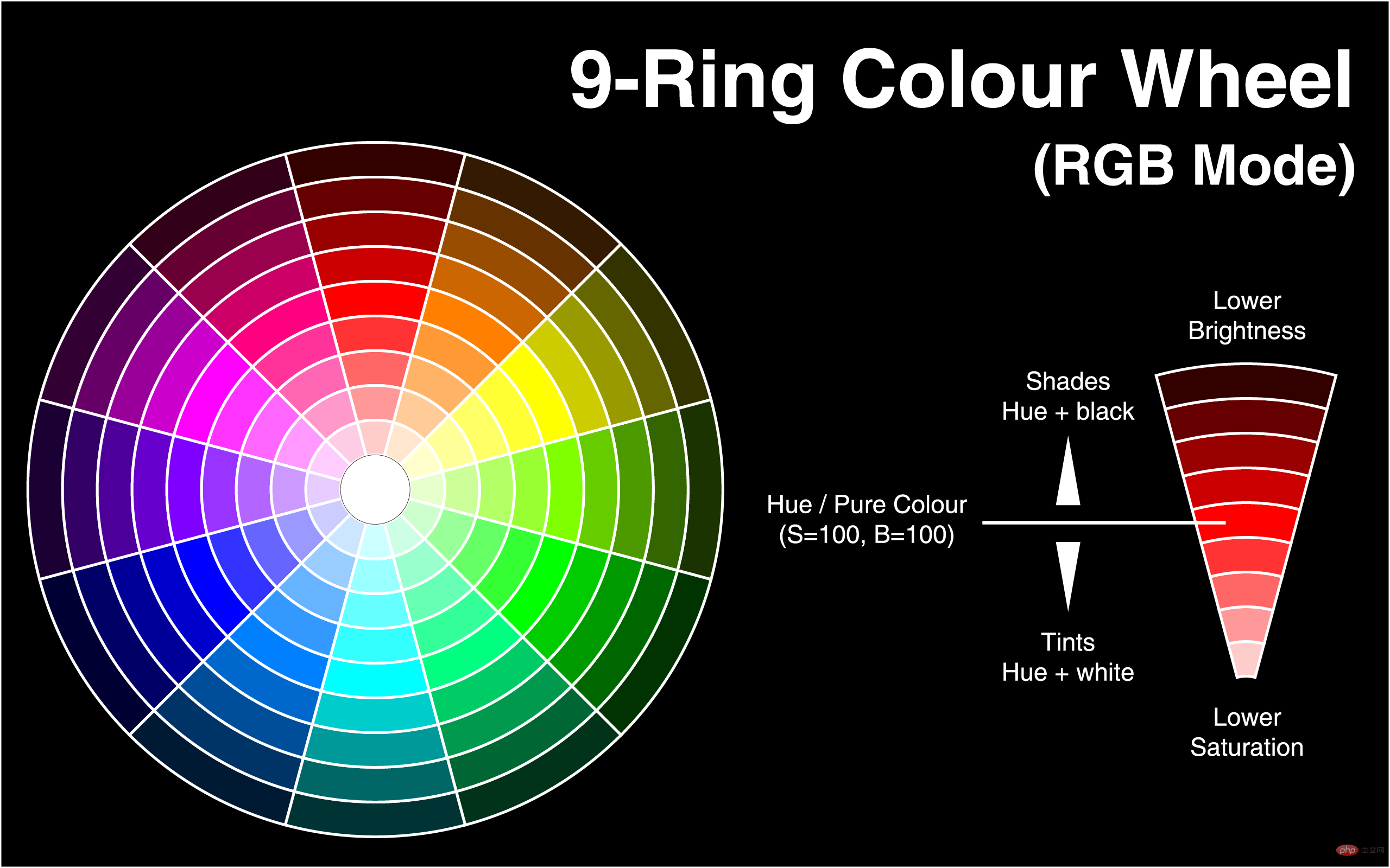
</body>2. HSL mode (Color wheel mode has no transparency)
Syntax:
HSL(H,S,L)
Value:
H: Hue (hue). –0 (or 360) represents red, 120 represents green, 240 represents blue, and other values can also be used to specify colors. The value is: 0 - 360
S: Saturation. The value is: 0.0% - 100.0%
L: Lightness. The value is: 0.0% - 100.0%
For example:hsl(360,50%,50%) Red
 ##
##
<style type="text/css">
    body{background:rgba(0,0,255,0.5);}
    div{width:300px;
        height:300px;
        background:hsl(140,50%,50%);
        position:absolute;
        top:0;
        left:0;
    }
</style>
<body>
    <div></div>
</body>3. HSLA mode(color wheel mode has transparency)
Syntax:HSLA(H,S,L,A)
hsl(360,50%,50%,0.5) red
<style>
        body{background:HSL(0,100%,50%)}
        div{width:300px;
            height:300px;
            background:HSLA(230,100%,50%,0);
            position:absolute;
            top:0;
            left:0;
        }
    </style>
    </head>
    <body>
        猜猜我在哪里
        <div></div>
</body>css video tutorial)
3. Other attributes
1. transparent
<style type="text/css">
    body{background:hsl(270,100%,50%)}
    p{
        font-size:50px;
        font-family:"黑体";
        /*浏览器私有属性*/
        -webkit-text-fill-color:transparent;/*设置文本透明*/
        /*使用rgba(0,0,0,0);也可以实现全透明模式*/
        -webkit-text-stroke:2px yellow;/*将文本设置透明,再设置个边框后就实现镂空字了*/
        /*W3C标准属性*/
        /*text-fill-color:transparent;*/
        /*text-stroke:2px yellow;*/

    }
</style>
<body>
    <p>2012年过去了,最忙的是元芳,你怎么看?</p>
</body>OpacityProperties
Function: Setting The transparency of the element. Value: between 0~1注意:对于尚不支持opacity属性的IE浏览器
滤镜:filter:alpha(opacity=50) 仅限IE
<style>
    body{background:red}
    div{background:blue;
        width:300px;
        height:300px;
        opacity:0.5;
        position:absolute;
        top:0;
        left:0
    }
</style>
</head>
<body>
    看到我你就成功了
    <div></div>
</body>四、CSS3 颜色使用实例
background-image: -ms-linear-gradient(top, #D35644 0%, #31264D 100%) !important;/* Mozilla Firefox */
     background-image: -moz-linear-gradient(top, #D35644 0%, #31264D 100%) !important;/* Opera */
     background-image: -o-linear-gradient(top, #D35644 0%, #31264D 100%) !important;/* Webkit (Safari/Chrome 10) */
     background-image: -webkit-gradient(linear, left bottom, left top, color-stop(0, #D35644), color-stop(1, #31264D)) !important;/* Webkit (Chrome 11+) */
     background-image: -webkit-linear-gradient(top, #D35644 0%, #31264D 100%) !important;/* W3C Markup, IE10 Release Preview */
background-image: linear-gradient(to bottom, #D35644 0%, #31264D 100%) !important; }1、模拟渐变效果
使用透明度来模拟渐变

<style>
    div{height:30px}
    div:nth-child(1){background:HSLA(120,100%,50%,0.1)}
    div:nth-child(2){background:HSLA(120,100%,50%,0.2)}
    div:nth-child(3){background:HSLA(120,100%,50%,0.3)}
    div:nth-child(4){background:HSLA(120,100%,50%,0.4)}
    div:nth-child(5){background:HSLA(120,100%,50%,0.5)}
    div:nth-child(6){background:HSLA(120,100%,50%,0.6)}
    div:nth-child(7){background:HSLA(120,100%,50%,0.7)}
    div:nth-child(8){background:HSLA(120,100%,50%,0.8)}
    div:nth-child(9){background:HSLA(120,100%,50%,0.9)}
    div:nth-child(10){background:HSLA(120,100%,50%,1.0)}
</style>
</head>
<body>
    <div></div>
    <div></div>
    <div></div>
    <div></div>
    <div></div>
    <div></div>
    <div></div>
    <div></div>
    <div></div>
    <div></div>
</body>使用饱和度模拟渐变
<style>
            div{height:30px}
            div:nth-child(1){background:HSLA(120,100%,50%,1)}
            div:nth-child(2){background:HSLA(120,90%,50%,1)}
            div:nth-child(3){background:HSLA(120,80%,50%,1)}
            div:nth-child(4){background:HSLA(120,70%,50%,1)}
            div:nth-child(5){background:HSLA(120,60%,50%,1)}
            div:nth-child(6){background:HSLA(120,50%,50%,1)}
            div:nth-child(7){background:HSLA(120,40%,50%,1)}
            div:nth-child(8){background:HSLA(120,30%,50%,1)}
            div:nth-child(9){background:HSLA(120,20%,50%,1)}
            div:nth-child(10){background:HSLA(120,10%,50%,1)}
        </style>
    </head>
    <body>
        <div></div>
        <div></div>
        <div></div>
        <div></div>
        <div></div>
        <div></div>
        <div></div>
        <div></div>
        <div></div>
        <div></div>
    </body>
</html>使用亮度来实现模拟渐变
<style>
    div{height:30px}
    div:nth-child(1){background:HSLA(120,100%,100%,1)}
    div:nth-child(2){background:HSLA(120,100%,90%,1)}
    div:nth-child(3){background:HSLA(120,100%,80%,1)}
    div:nth-child(4){background:HSLA(120,100%,70%,1)}
    div:nth-child(5){background:HSLA(120,100%,60%,1)}
    div:nth-child(6){background:HSLA(120,100%,50%,1)}
    div:nth-child(7){background:HSLA(120,100%,40%,1)}
    div:nth-child(8){background:HSLA(120,100%,30%,1)}
    div:nth-child(9){background:HSLA(120,100%,20%,1)}
    div:nth-child(10){background:HSLA(120,100%,10%,1)}
</style>
</head>
<body>
    <div></div>
    <div></div>
    <div></div>
    <div></div>
    <div></div>
    <div></div>
    <div></div>
    <div></div>
    <div></div>
    <div></div>
</body>使用背景颜色:
<style>
#div1 { width:200px; height:200px; border:1px solid #333;
background:-moz-linear-gradient(top, red, yellow);
background:-webkit-linear-gradient(top, red, yellow);
background:-ms-linear-gradient(top, red, yellow);
background:linear-gradient(top, red, yellow);
-ms-filter:"progid:DXImageTransform.Microsoft.gradient (GradientType=0, startColorstr=red, endColorstr=yellow)";
+background:#f9f9f9;/*兼容IE9,8,7*/
}
</style>

</head>

<body>

<div id="div1"></div>

</body>更多编程相关知识,请访问:编程视频!!
The above is the detailed content of What are the new color modes in css3. For more information, please follow other related articles on the PHP Chinese website!

Hot AI Tools

Undresser.AI Undress
AI-powered app for creating realistic nude photos

AI Clothes Remover
Online AI tool for removing clothes from photos.

Undress AI Tool
Undress images for free

Clothoff.io
AI clothes remover

AI Hentai Generator
Generate AI Hentai for free.

Hot Article
Hot Tools

Notepad++7.3.1
Easy-to-use and free code editor

SublimeText3 Chinese version
Chinese version, very easy to use

Zend Studio 13.0.1
Powerful PHP integrated development environment

Dreamweaver CS6
Visual web development tools

SublimeText3 Mac version
God-level code editing software (SublimeText3)
Hot Topics
 1377
1377
 52
52

 How to achieve wave effect with pure CSS3? (code example)
Jun 28, 2022 pm 01:39 PM
How to achieve wave effect with pure CSS3? (code example)
Jun 28, 2022 pm 01:39 PM
How to achieve wave effect with pure CSS3? This article will introduce to you how to use SVG and CSS animation to create wave effects. I hope it will be helpful to you!
 Use CSS skillfully to realize various strange-shaped buttons (with code)
Jul 19, 2022 am 11:28 AM
Use CSS skillfully to realize various strange-shaped buttons (with code)
Jul 19, 2022 am 11:28 AM
This article will show you how to use CSS to easily realize various weird-shaped buttons that appear frequently. I hope it will be helpful to you!
 How to hide elements in css without taking up space
Jun 01, 2022 pm 07:15 PM
How to hide elements in css without taking up space
Jun 01, 2022 pm 07:15 PM
Two methods: 1. Using the display attribute, just add the "display:none;" style to the element. 2. Use the position and top attributes to set the absolute positioning of the element to hide the element. Just add the "position:absolute;top:-9999px;" style to the element.
 How to implement lace borders in css3
Sep 16, 2022 pm 07:11 PM
How to implement lace borders in css3
Sep 16, 2022 pm 07:11 PM
In CSS, you can use the border-image attribute to achieve a lace border. The border-image attribute can use images to create borders, that is, add a background image to the border. You only need to specify the background image as a lace style; the syntax "border-image: url (image path) offsets the image border width inward. Whether outset is repeated;".
 What is the RGB color mode?
Feb 28, 2023 pm 04:01 PM
What is the RGB color mode?
Feb 28, 2023 pm 04:01 PM
The RGB color mode is a screen display mode; on the monitor, the RGB color mode produces colors by hitting the red, green, and blue light-emitting electrodes of the screen with an electron gun. Computers can generally display 32-bit colors, with about a More than a million colors. The RGB color mode is a color standardization mode that uses the three basic colors of red, blue and green to produce other colors by superimposing and mixing them in different ways. These three colors are also the three primary colors that produce other colors, and can form all seen color.
 It turns out that text carousel and image carousel can also be realized using pure CSS!
Jun 10, 2022 pm 01:00 PM
It turns out that text carousel and image carousel can also be realized using pure CSS!
Jun 10, 2022 pm 01:00 PM
How to create text carousel and image carousel? The first thing everyone thinks of is whether to use js. In fact, text carousel and image carousel can also be realized using pure CSS. Let’s take a look at the implementation method. I hope it will be helpful to everyone!
 How to enlarge the image by clicking the mouse in css3
Apr 25, 2022 pm 04:52 PM
How to enlarge the image by clicking the mouse in css3
Apr 25, 2022 pm 04:52 PM
Implementation method: 1. Use the ":active" selector to select the state of the mouse click on the picture; 2. Use the transform attribute and scale() function to achieve the picture magnification effect, the syntax "img:active {transform: scale(x-axis magnification, y Axis magnification);}".
 How to set animation rotation speed in css3
Apr 28, 2022 pm 04:32 PM
How to set animation rotation speed in css3
Apr 28, 2022 pm 04:32 PM
In CSS3, you can use the "animation-timing-function" attribute to set the animation rotation speed. This attribute is used to specify how the animation will complete a cycle and set the speed curve of the animation. The syntax is "element {animation-timing-function: speed attribute value;}".
