How to make a triangle in css: first create a div element, set the width and height of the div to 0, fill it with only the border width, and set the border style to solid line "solid"; then set the color of the top border, Just set the color of the remaining three borders to the transparent "transparent" value.

The operating environment of this tutorial: Windows 7 system, CSS3&&HTML5 version, Dell G3 computer.
Use CSS to draw triangles
First step
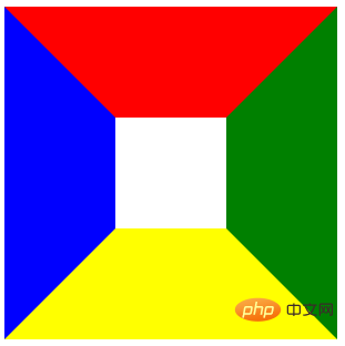
First, let’s create a div. Then add a layer of border to this div, and add different colors to the upper, lower, left and right borders for easy observation. The code and effect are as follows:
.trangle{
  width: 100px;
  height: 100px;
  border: 100px solid #000;
  border-top-color: red;
  border-bottom-color: yellow;
  border-left-color: blue;
  border-right-color: green;
}
<div class="trangle"></div>
Step 2
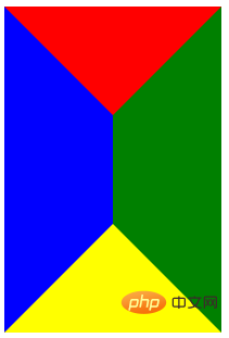
Next, change the width of this div to 0, and let’s take a look at the effect. You can see that since the width of the div has become 0, the borders on the left and right sides are "sucked" together, and the upper and lower borders have become triangles. It seems that it is almost completed. Don't worry, look at the third step.
.trangle{
  width: 0px;
  height: 100px;
  border: 100px solid #000;
  border-top-color: red;
  border-bottom-color: yellow;
  border-left-color: blue;
  border-right-color: green;
}
<div class="trangle"></div>
The third step
Then, change the height of this div to 0, the effect is as follows. We can see that since the height of the div has also become 0, the upper and lower borders have also been "sucked" together, and at the same time the upper and lower borders have also become triangles. So far, four triangles have come out
.trangle{
  width: 0px;
  height: 0px;
  border: 100px solid #000;
  border-top-color: red;
  border-bottom-color: yellow;
  border-left-color: blue;
  border-right-color: green;
}
<div class="trangle"></div>
##Step 4
Finally, it depends on which corner you want. Just set the remaining three borders to transparent. For example, if I want the top triangle, then make the bottom, left, and right transparent. The code and effect are as follows:.trangle{
width: 0px;
height: 0px;
border: 100px solid #000;
border-top-color: red;
border-bottom-color: transparent;
border-left-color: transparent;
border-right-color: transparent;
}
<div class="trangle"></div>
##Simplified codeIn fact, we don’t need to set all four borders. We only need to set the borders of the three sides involved in the triangle you want to draw. Can. Taking the top triangle drawn in the previous step as an example, you only need to set the top, left, and right sides. If you want to top the triangle, set the left and right borders to transparent. The code and effect are as follows:
.trangle{
  width: 0px;
  height: 0px;
  border-top: 100px solid red;
  border-left: 100px solid transparent;
  border-right: 100px solid transparent;
}
<div class="trangle"></div>( Learning video sharing:
css video tutorialCSS realizes drawing various triangles (various angles)
Triangle Up
#triangle-up {
    width: 0;
    height: 0;
    border-left: 50px solid transparent;
    border-right: 50px solid transparent;
    border-bottom: 100px solid red;
}
#triangle-down {
    width: 0;
    height: 0;
    border-left: 50px solid transparent;
    border-right: 50px solid transparent;
    border-top: 100px solid red;
} Triangle Left
#triangle-left {
    width: 0;
    height: 0;
    border-top: 50px solid transparent;
    border-right: 100px solid red;
    border-bottom: 50px solid transparent;
} Triangle Right
#triangle-right {
    width: 0;
    height: 0;
    border-top: 50px solid transparent;
    border-left: 100px solid red;
    border-bottom: 50px solid transparent;
} Triangle Top Left
#triangle-topleft {
    width: 0;
    height: 0;
    border-top: 100px solid red;
    border-right: 100px solid transparent;
} Triangle Top Right
#triangle-topright {
    width: 0;
    height: 0;
    border-top: 100px solid red;
    border-left: 100px solid transparent;

} Triangle Bottom Left
##
#triangle-bottomleft {
    width: 0;
    height: 0;
    border-bottom: 100px solid red;
    border-right: 100px solid transparent;
}Triangle Bottom Right
#triangle-bottomright {
    width: 0;
    height: 0;
    border-bottom: 100px solid red;
    border-left: 100px solid transparent;
}Programming Video ! !
! !
The above is the detailed content of How to make a triangle in css. For more information, please follow other related articles on the PHP Chinese website!