
 Web Front-end
Bootstrap Tutorial
Detailed explanation of how to customize the side navigation bar in bootstrap
Web Front-end
Bootstrap Tutorial
Detailed explanation of how to customize the side navigation bar in bootstrap
Detailed explanation of how to customize the side navigation bar in bootstrap

This article will introduce to you how to bootstrap customize the side navigation bar. It has certain reference value. Friends in need can refer to it. I hope it will be helpful to everyone.

The responsive navigation bar that comes with bootstrap slides downwards. Sometimes it cannot meet the personalized needs. You need to make a side-sliding menu similar to android drawerLayout. This This is the bootstrap custom side-sliding menu I want to implement. I refer to the side-sliding of many official websites. The implementation methods are different, and the advantages and disadvantages are also very obvious. In order to only achieve a side-sliding effect on the homepage of some official websites, owl.carousel is used. The sliding screen plug-in personally feels that it is making a mountain out of a molehill. The more professional name of this bootstrap side sliding menu is called mobile navigation bar. I also compare this name, which is more in line with the characteristics of bootstrap. Therefore, this article introduces an easier method that is easier for novices to accept.
Related recommendations: "bootstrap tutorial"
bootstrap side navigation bar implementation principle
The side sliding bar uses positioning fixed
Use bootstrap responsiveness and use the tool class visible-sm visible-xs hidden-xs hidden-sm, etc. to adapt to different screens
The side-sliding effect of the side-sliding bar does not use the jquery method. It uses the css3 transforms attribute to move p. The side-sliding animation effect uses the css attribute transition
-
Disadvantages: Use two sets of menus, one is the menu displayed on the PC screen, and the other is the mobile phone navigation menu displayed on the mobile terminal. This disadvantage is relatively obvious. It generates irrelevant labels. The advantage is that there is less code and is simple and easy to accept.
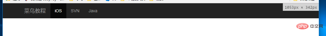
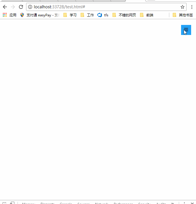
Rendering
##bootstrap navigation Bar layout
    <!--手机导航栏-->
    <div id="mobile-menu" class="mobile-nav visible-xs visible-sm">
        <ul>
            <li><a href="#">首页</a></li>
            <li><a href="#">Java</a></li>
            <li><a href="#">SVN</a></li>
            <li><a href="#">iOS</a></li>
        </ul>
    </div>
    <!--pc导航栏-->
    <nav class="navbar-inverse visible-lg visible-md" role="navigation">
        <div class="container">
            <div class="navbar-header">
                <a class="navbar-brand" href="#">菜鸟教程</a>
            </div>
            <div>
                <ul class="nav navbar-nav">
                    <li class="active"><a href="#">iOS</a></li>
                    <li><a href="#">SVN</a></li>
                    <li><a href="#" class="dropdown-toggle" data-toggle="dropdown">Java</a></li>
                </ul>
            </div>
        </div>
    </nav>
    <!--手机导航栏侧滑-->
    <div class="nav-btn visible-xs visible-sm">
        <a href="#" class="mobile-nav-taggle" id="mobile-nav-taggle">
            <span class="glyphicon glyphicon-align-justify"></span>
        </a>
</div> For details on the bootstrap responsive tool class, please see: https://www.runoob.com/bootstrap/bootstrap-responsive-utilities.html
css to achieve layout and side-sliding effects (side-sliding Key css3 attributes transform, transition)
Not much code, only 10 lines* {margin:0;padding:0;}
#mobile-menu {position:fixed;top:0;left:0;width:220px;height:100%;background-color:#373737;z-index:9999;}
a:hover ,a:focus{text-decoration:none}
.mobile-nav ul li a {color:gray;display:block;padding:1em 5%; border-top:1px solid #4f4f4f;border-bottom:1px solid #292929;transition:all 0.2s ease-out;cursor:pointer;#mobile-menu {position:fixed;top:0;left:0;width:220px;height:100%;background-color:#373737;z-index:9999;transition:all 0.3s ease-in;}}
.mobile-nav ul li a:hover {background-color: #23A1F6;color: #ffffff;}
.show-nav {transform:translateX(0);}
.hide-nav {transform:translateX(-220px);} /*侧滑关键*/
.mobile-nav-taggle {height:35px;line-height:35px;width:35px;background-color:#23A1F6;color:#ffffff;display:inline-block;text-align:center;cursor:pointer}
.nav.avbar-inverse{position:relative;}
.nav-btn {position:absolute;right:20px;top:20px;}transition: property duration timing-function delay;
Click event switches side sliding
        $("#mobile-nav-taggle").click(function () {
            var mobileMenu = $("#mobile-menu");
            if (mobileMenu.hasClass("show-nav")) {
                setTimeout(function () {
                    mobileMenu.addClass("hide-nav").removeClass("show-nav");
                }, 100)
            }
            else {
                setTimeout(function (){
                    mobileMenu.addClass("show-nav").removeClass("hide-nav");
                }, 100)
            }
})It is not recommended to use two menu navigation bars , the shortcomings are obvious, just to achieve the effect, don't mind, in fact, it can also be achieved with a menu navigation bar, try media and it can be achieved.
This article is reproduced from: http://blog.csdn.net/kebi007/article/details/76038251For more programming-related knowledge, please visit:Programming Video
! !The above is the detailed content of Detailed explanation of how to customize the side navigation bar in bootstrap. For more information, please follow other related articles on the PHP Chinese website!

Hot AI Tools

Undresser.AI Undress
AI-powered app for creating realistic nude photos

AI Clothes Remover
Online AI tool for removing clothes from photos.

Undress AI Tool
Undress images for free

Clothoff.io
AI clothes remover

AI Hentai Generator
Generate AI Hentai for free.

Hot Article
Hot Tools

Notepad++7.3.1
Easy-to-use and free code editor

SublimeText3 Chinese version
Chinese version, very easy to use

Zend Studio 13.0.1
Powerful PHP integrated development environment

Dreamweaver CS6
Visual web development tools

SublimeText3 Mac version
God-level code editing software (SublimeText3)
Hot Topics
 1374
1374
 52
52

 How to use bootstrap button
Apr 07, 2025 pm 03:09 PM
How to use bootstrap button
Apr 07, 2025 pm 03:09 PM
How to use the Bootstrap button? Introduce Bootstrap CSS to create button elements and add Bootstrap button class to add button text
 How to do vertical centering of bootstrap
Apr 07, 2025 pm 03:21 PM
How to do vertical centering of bootstrap
Apr 07, 2025 pm 03:21 PM
Use Bootstrap to implement vertical centering: flexbox method: Use the d-flex, justify-content-center, and align-items-center classes to place elements in the flexbox container. align-items-center class method: For browsers that do not support flexbox, use the align-items-center class, provided that the parent element has a defined height.
 How to resize bootstrap
Apr 07, 2025 pm 03:18 PM
How to resize bootstrap
Apr 07, 2025 pm 03:18 PM
To adjust the size of elements in Bootstrap, you can use the dimension class, which includes: adjusting width: .col-, .w-, .mw-adjust height: .h-, .min-h-, .max-h-
 How to insert pictures on bootstrap
Apr 07, 2025 pm 03:30 PM
How to insert pictures on bootstrap
Apr 07, 2025 pm 03:30 PM
There are several ways to insert images in Bootstrap: insert images directly, using the HTML img tag. With the Bootstrap image component, you can provide responsive images and more styles. Set the image size, use the img-fluid class to make the image adaptable. Set the border, using the img-bordered class. Set the rounded corners and use the img-rounded class. Set the shadow, use the shadow class. Resize and position the image, using CSS style. Using the background image, use the background-image CSS property.
 How to upload files on bootstrap
Apr 07, 2025 pm 01:09 PM
How to upload files on bootstrap
Apr 07, 2025 pm 01:09 PM
The file upload function can be implemented through Bootstrap. The steps are as follows: introduce Bootstrap CSS and JavaScript files; create file input fields; create file upload buttons; handle file uploads (using FormData to collect data and then send to the server); custom style (optional).
 How to verify bootstrap date
Apr 07, 2025 pm 03:06 PM
How to verify bootstrap date
Apr 07, 2025 pm 03:06 PM
To verify dates in Bootstrap, follow these steps: Introduce the required scripts and styles; initialize the date selector component; set the data-bv-date attribute to enable verification; configure verification rules (such as date formats, error messages, etc.); integrate the Bootstrap verification framework and automatically verify date input when form is submitted.
 How to get the bootstrap search bar
Apr 07, 2025 pm 03:33 PM
How to get the bootstrap search bar
Apr 07, 2025 pm 03:33 PM
How to use Bootstrap to get the value of the search bar: Determines the ID or name of the search bar. Use JavaScript to get DOM elements. Gets the value of the element. Perform the required actions.
 How to view the date of bootstrap
Apr 07, 2025 pm 03:03 PM
How to view the date of bootstrap
Apr 07, 2025 pm 03:03 PM
Answer: You can use the date picker component of Bootstrap to view dates in the page. Steps: Introduce the Bootstrap framework. Create a date selector input box in HTML. Bootstrap will automatically add styles to the selector. Use JavaScript to get the selected date.
