How to set css style not
How to set css style not: first create a new html file; then use the li tag to create a list, and set the class of the second li tag to mycss; finally, within the css tag, pass the li tag name and The ":not" selector can select li elements whose class is not mycss.

The operating environment of this article: Windows7 system, HTML5&&CSS3 version, Dell G3 computer.
Use the ":not" selector to define styles in css
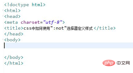
Create a new html file, named test.html, to explain how to use ":not" in css "Selector defines style.
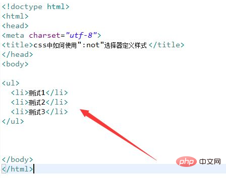
In the test.html file, use the li tag to create a list for testing.
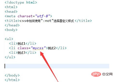
In the test.html file, set the class of the second li tag to mycss.
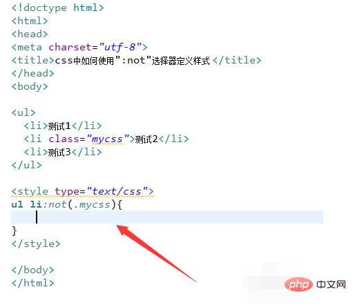
In the css tag, select the li element whose class is not mycss through the li tag name and the ":not" selector.
In the css tag, use the color attribute to set the text color of the li element that meets the selector conditions to red.
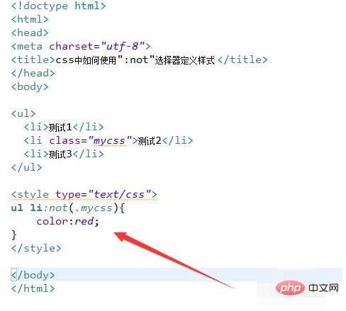
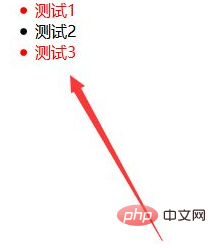
Open the test.html file in the browser to check the effect.
[Recommended learning: css video tutorial]
The above is the detailed content of How to set css style not. For more information, please follow other related articles on the PHP Chinese website!

Hot AI Tools

Undresser.AI Undress
AI-powered app for creating realistic nude photos

AI Clothes Remover
Online AI tool for removing clothes from photos.

Undress AI Tool
Undress images for free

Clothoff.io
AI clothes remover

AI Hentai Generator
Generate AI Hentai for free.

Hot Article

Hot Tools

Notepad++7.3.1
Easy-to-use and free code editor

SublimeText3 Chinese version
Chinese version, very easy to use

Zend Studio 13.0.1
Powerful PHP integrated development environment

Dreamweaver CS6
Visual web development tools

SublimeText3 Mac version
God-level code editing software (SublimeText3)

Hot Topics
 1359
1359
 52
52
 How to solve the h5 compatibility problem
Apr 06, 2025 pm 12:36 PM
Solutions to H5 compatibility issues include: using responsive design that allows web pages to adjust layouts according to screen size. Use cross-browser testing tools to test compatibility before release. Use Polyfill to provide support for new APIs for older browsers. Follow web standards and use effective code and best practices. Use CSS preprocessors to simplify CSS code and improve readability. Optimize images, reduce web page size and speed up loading. Enable HTTPS to ensure the security of the website.
 How to remove the default style in Bootstrap list?
Apr 07, 2025 am 10:18 AM
The default style of the Bootstrap list can be removed with CSS override. Use more specific CSS rules and selectors, follow the "proximity principle" and "weight principle", overriding the Bootstrap default style. To avoid style conflicts, more targeted selectors can be used. If the override is unsuccessful, adjust the weight of the custom CSS. At the same time, pay attention to performance optimization, avoid overuse of !important, and write concise and efficient CSS code.
 How to do PS gradient color picker
Apr 06, 2025 pm 10:09 PM
Gradient color pickers give designers the flexibility to extract and create gradients from images. It simplifies gradient creation, ensures accuracy, inspires, improves efficiency and provides cross-platform support, and covers a wide range of applications including websites, graphic design, UI/UX design and digital art.
 How to build a bootstrap framework
Apr 07, 2025 pm 12:57 PM
To create a Bootstrap framework, follow these steps: Install Bootstrap via CDN or install a local copy. Create an HTML document and link Bootstrap CSS to the <head> section. Add Bootstrap JavaScript file to the <body> section. Use the Bootstrap component and customize the stylesheet to suit your needs.
 Does the image centering support image zooming?
Apr 07, 2025 am 07:42 AM
How to achieve image centering and scaling in Bootstrap: Use d-flex justify-content-center to center images horizontally. Use align-items-center and fixed parent element height vertically center the image. Use the width and height attributes to control the image size, or use max-width and max-height to limit the maximum size. Use the img-fluid class or responsive design mechanism, such as media queries, to achieve responsive scaling. Optimize image size, control scaling using the object-fit attribute, and follow best practices to ensure performance and maintainability.
 How to view Bootstrap's grid system
Apr 07, 2025 am 09:48 AM
Bootstrap's mesh system is a rule for quickly building responsive layouts, consisting of three main classes: container (container), row (row), and col (column). By default, 12-column grids are provided, and the width of each column can be adjusted through auxiliary classes such as col-md-, thereby achieving layout optimization for different screen sizes. By using offset classes and nested meshes, layout flexibility can be extended. When using a grid system, make sure that each element has the correct nesting structure and consider performance optimization to improve page loading speed. Only by in-depth understanding and practice can we master the Bootstrap grid system proficiently.
 How to view the CSS style of Bootstrap
Apr 07, 2025 am 10:24 AM
How to view Bootstrap CSS: Using Browser Developer Tools (F12). Find the "Elements" or "Inspector" tab and find the Bootstrap component. View the CSS styles that the component applies in the Styles panel. Developer tools can be used to filter styles or debug code to gain insight into how it works. Proficient in developer tools and avoid detours.
 How to set the bootstrap navigation bar
Apr 07, 2025 pm 01:51 PM
Bootstrap provides a simple guide to setting up navigation bars: Introducing the Bootstrap library to create navigation bar containers Add brand identity Create navigation links Add other elements (optional) Adjust styles (optional)


