How to hide multi-line text overflow in css
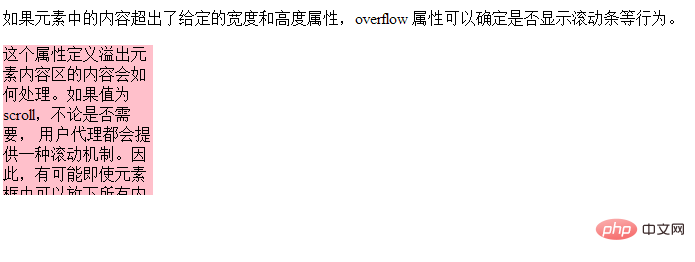
In CSS, you can use the overflow attribute to hide multi-line text overflow. You only need to add the "overflow: hidden;" style to the text element. The overflow attribute specifies what happens when content overflows the element box. When the value is set to "hidden", the overflow part is set to be invisible.

The operating environment of this tutorial: Windows 7 system, CSS3&&HTML5 version, Dell G3 computer.
In CSS, you can use the overflow attribute to hide multi-line text overflow.
The overflow attribute specifies what happens when content overflows the element box.
This attribute defines how content that overflows the element's content area will be handled. Property value:
hidden: The content will be trimmed and the remaining content will be invisible.
scroll: The content is trimmed, but the browser displays scroll bars to view the rest of the content.
auto: If content is trimmed, the browser displays scroll bars to view the remaining content.
If the value is scroll, the user agent will provide a scrolling mechanism whether required or not. Therefore, it is possible that scrollbars will appear even if everything fits inside the element box.
Example:
<!DOCTYPE html>
<html>
	<head>
		<meta charset="utf-8">
		<style type="text/css">
			div {
				background-color: pink;
				width: 150px;
				height: 150px;
				overflow: hidden
			}
		</style>
	</head>

	<body>
	<p>如果元素中的内容超出了给定的宽度和高度属性,overflow 属性可以确定是否显示滚动条等行为。</p>

	<div>
	这个属性定义溢出元素内容区的内容会如何处理。如果值为 scroll,不论是否需要,
	用户代理都会提供一种滚动机制。因此,有可能即使元素框中可以放下所有内容也会出现滚动条。
	默认值是 visible。
	</div>
	</body>

</html>Rendering:

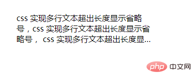
Wouldn’t it look good to directly hide the overflow part? , we can hide the overflow part and display the ellipses:
<!DOCTYPE html>
<html>
	<head>
		<meta charset="UTF-8">
		<title>CSS如何使文本溢出部分显示省略号?多行超出</title>
		<style>
			*{margin: 0px;padding: 0px;}
			.box{
				width: 280px;
				height: 62px;
				margin: 50px auto;
				overflow: hidden;
				text-overflow: ellipsis;
				display: -webkit-box;
				-webkit-line-clamp: 3;
				-webkit-box-orient: vertical;
			}
		</style>
	</head>
	<body>
		<div class="box">
			css 实现多行文本超出长度显示省略号,css 实现多行文本超出长度显示省略号,
			css 实现多行文本超出长度显示省略号
		</div>
	</body>
</html>Rendering:

This method only works with the -webkit kernel, Most mobile browsers are based on WebKit core, so this method is suitable for mobile terminals;
-webkit-line-clamp is used to limit the number of lines of text displayed in a block element. This is Unsupported WebKit property, which does not appear in the CSS draft specification;
display: -webkit-box displays the object as a flexible box model;
-webkit-box -orient sets or retrieves the arrangement of the child elements of the flex box object;
text-overflow: ellipsis is used for multi-line text, using the ellipsis "..." to hide the text that exceeds the range.
(Learning video sharing: css video tutorial)
The above is the detailed content of How to hide multi-line text overflow in css. For more information, please follow other related articles on the PHP Chinese website!

Hot AI Tools

Undresser.AI Undress
AI-powered app for creating realistic nude photos

AI Clothes Remover
Online AI tool for removing clothes from photos.

Undress AI Tool
Undress images for free

Clothoff.io
AI clothes remover

Video Face Swap
Swap faces in any video effortlessly with our completely free AI face swap tool!

Hot Article

Hot Tools

Notepad++7.3.1
Easy-to-use and free code editor

SublimeText3 Chinese version
Chinese version, very easy to use

Zend Studio 13.0.1
Powerful PHP integrated development environment

Dreamweaver CS6
Visual web development tools

SublimeText3 Mac version
God-level code editing software (SublimeText3)

Hot Topics
 1390
1390
 52
52
 How to use bootstrap in vue
Apr 07, 2025 pm 11:33 PM
Using Bootstrap in Vue.js is divided into five steps: Install Bootstrap. Import Bootstrap in main.js. Use the Bootstrap component directly in the template. Optional: Custom style. Optional: Use plug-ins.
 The Roles of HTML, CSS, and JavaScript: Core Responsibilities
Apr 08, 2025 pm 07:05 PM
HTML defines the web structure, CSS is responsible for style and layout, and JavaScript gives dynamic interaction. The three perform their duties in web development and jointly build a colorful website.
 How to write split lines on bootstrap
Apr 07, 2025 pm 03:12 PM
There are two ways to create a Bootstrap split line: using the tag, which creates a horizontal split line. Use the CSS border property to create custom style split lines.
 Understanding HTML, CSS, and JavaScript: A Beginner's Guide
Apr 12, 2025 am 12:02 AM
WebdevelopmentreliesonHTML,CSS,andJavaScript:1)HTMLstructurescontent,2)CSSstylesit,and3)JavaScriptaddsinteractivity,formingthebasisofmodernwebexperiences.
 How to use bootstrap button
Apr 07, 2025 pm 03:09 PM
How to use the Bootstrap button? Introduce Bootstrap CSS to create button elements and add Bootstrap button class to add button text
 How to resize bootstrap
Apr 07, 2025 pm 03:18 PM
To adjust the size of elements in Bootstrap, you can use the dimension class, which includes: adjusting width: .col-, .w-, .mw-adjust height: .h-, .min-h-, .max-h-
 How to set up the framework for bootstrap
Apr 07, 2025 pm 03:27 PM
To set up the Bootstrap framework, you need to follow these steps: 1. Reference the Bootstrap file via CDN; 2. Download and host the file on your own server; 3. Include the Bootstrap file in HTML; 4. Compile Sass/Less as needed; 5. Import a custom file (optional). Once setup is complete, you can use Bootstrap's grid systems, components, and styles to create responsive websites and applications.
 How to insert pictures on bootstrap
Apr 07, 2025 pm 03:30 PM
There are several ways to insert images in Bootstrap: insert images directly, using the HTML img tag. With the Bootstrap image component, you can provide responsive images and more styles. Set the image size, use the img-fluid class to make the image adaptable. Set the border, using the img-bordered class. Set the rounded corners and use the img-rounded class. Set the shadow, use the shadow class. Resize and position the image, using CSS style. Using the background image, use the background-image CSS property.


