

How to achieve wave effect in css

How to achieve the wave effect in css: first create an HTML sample file; then create a square div; then add the "border-radius: 50%" attribute to achieve a circular effect; finally use the animation attribute to make the circle Just roll it up to create a wave effect.
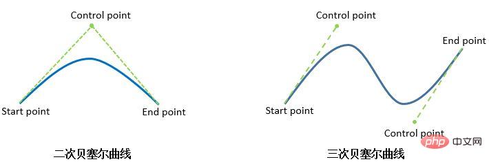
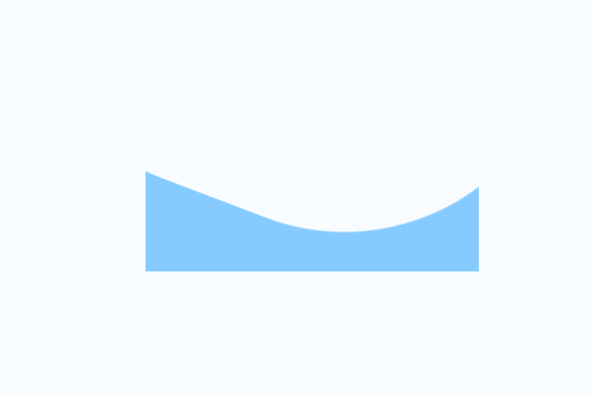
As for using pure CSS to implement Bezier curves, well, there is currently no good method.
Of course, with the help of other forces (SVG, CANVAS), the so-called wave effect can be easily achieved.
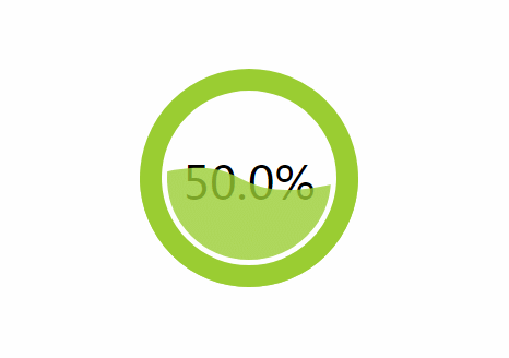
<svg width="200px" height="200px" version="1.1" xmlns="http://www.w3.org/2000/svg">
    <text class="liquidFillGaugeText" text-anchor="middle" font-size="42px" transform="translate(100,120)" style="fill: #000">50.0%</text>
    <!-- Wave -->
    <g id="wave">
    <path id="wave-2" fill="rgba(154, 205, 50, .8)" d="M 0 100 C 133.633 85.12 51.54 116.327 200 100 A 95 95 0 0 1 0 100 Z">
    <animate dur="5s" repeatCount="indefinite" attributeName="d" attributeType="XML" values="M0 100 C90 28, 92 179, 200 100 A95 95 0 0 1 0 100 Z;
    M0 100 C145 100, 41 100, 200 100 A95 95 0 0 1 0 100 Z;
    M0 100 C90 28, 92 179, 200 100 A95 95 0 0 1 0 100 Z"></animate>
    </path>
    </g>
    <circle cx="100" cy="100" r="80" stroke-width="10" stroke="white" fill="transparent"></circle>
    <circle cx="100" cy="100" r="90" stroke-width="20" stroke="yellowgreen" fill="none" class="percentage-pie-svg"></circle>
</svg>. Those who are interested can do their own research.
$(function() {
    let canvas = $("canvas");
    let ctx = canvas[0].getContext('2d');
    let radians = (Math.PI / 180) * 180;
    let startTime = Date.now();
    let time = 2000;
    let clockwise = 1;
    let cp1x, cp1y, cp2x, cp2y;

    // 初始状态
    // ctx.bezierCurveTo(90, 28, 92, 179, 200, 100);
    // 末尾状态
    // ctx.bezierCurveTo(145, 100, 41, 100, 200, 100);

    requestAnimationFrame(function waveDraw() {
        let t = Math.min(1.0, (Date.now() - startTime) / time);

        if(clockwise) {
            cp1x = 90 + (55 * t);
            cp1y = 28 + (72 * t);
            cp2x = 92 - (51 * t);
            cp2y = 179 - (79 * t);
        } else {
            cp1x = 145 - (55 * t);
            cp1y = 100 - (72 * t);
            cp2x = 41 + (51 * t);
            cp2y = 100 + (79 * t);
        }

        ctx.clearRect(0, 0, 200, 200);
        ctx.beginPath();
        ctx.moveTo(0, 100);
        // 绘制三次贝塞尔曲线
        ctx.bezierCurveTo(cp1x, cp1y, cp2x, cp2y, 200, 100);
        // 绘制圆弧
        ctx.arc(100, 100, 100, 0, radians, 0);
        ctx.fillStyle = "rgba(154, 205, 50, .8)";
        ctx.fill();
        ctx.save();

        if( t == 1 ) {
            startTime = Date.now();
            clockwise = !clockwise;
        }

        requestAnimationFrame(waveDraw);
    });
})
web前端开发学习Q-q-u-n: 767273102 ,分享开发工具,零基础,进阶视频教程,希望新手少走弯路css video tutorial]
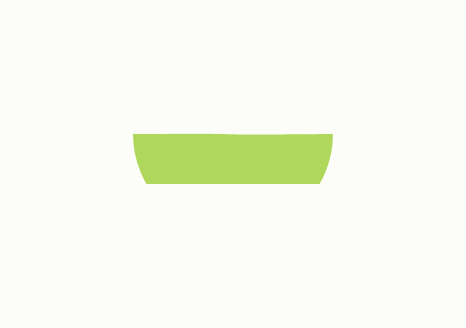
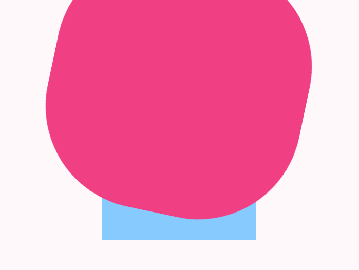
CSS to achieve wave effectDidn’t you say that CSS can’t be achieved at the beginning? Yes, we cannot directly draw a cubic Bezier curve, but we can use some clever methods to simulate the effect of wave motion. Let’s take a look at this method. PrincipleThe principle is very simple. We all know that if you add border-radius: 50% to a square, you will get a circle.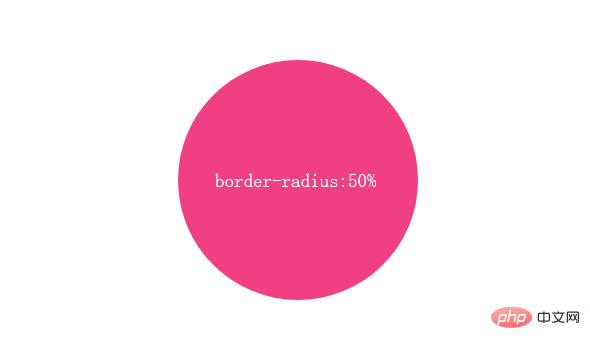
width: 240px;
height: 240px;
background: #f13f84;
border-radius: 50%;
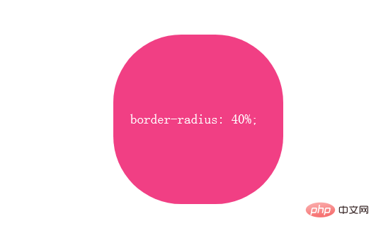
width: 240px;
height: 240px;
background: #f13f84;
border-radius: 40%;
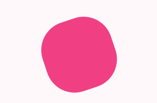
@keyframes rotate{
	from{transform: rotate(0deg)}
	to{transform: rotate(359deg)}
}
.ripple{
	width: 240px;
	height: 240px;
	background: #f13f84;
	border-radius: 40%;
	animation: rotate 3s linear infinite;
}
The above is the detailed content of How to achieve wave effect in css. For more information, please follow other related articles on the PHP Chinese website!

Hot AI Tools

Undresser.AI Undress
AI-powered app for creating realistic nude photos

AI Clothes Remover
Online AI tool for removing clothes from photos.

Undress AI Tool
Undress images for free

Clothoff.io
AI clothes remover

AI Hentai Generator
Generate AI Hentai for free.

Hot Article
Hot Tools

Notepad++7.3.1
Easy-to-use and free code editor

SublimeText3 Chinese version
Chinese version, very easy to use

Zend Studio 13.0.1
Powerful PHP integrated development environment

Dreamweaver CS6
Visual web development tools

SublimeText3 Mac version
God-level code editing software (SublimeText3)
Hot Topics
 1378
1378
 52
52

 How to write split lines on bootstrap
Apr 07, 2025 pm 03:12 PM
How to write split lines on bootstrap
Apr 07, 2025 pm 03:12 PM
There are two ways to create a Bootstrap split line: using the tag, which creates a horizontal split line. Use the CSS border property to create custom style split lines.
 How to insert pictures on bootstrap
Apr 07, 2025 pm 03:30 PM
How to insert pictures on bootstrap
Apr 07, 2025 pm 03:30 PM
There are several ways to insert images in Bootstrap: insert images directly, using the HTML img tag. With the Bootstrap image component, you can provide responsive images and more styles. Set the image size, use the img-fluid class to make the image adaptable. Set the border, using the img-bordered class. Set the rounded corners and use the img-rounded class. Set the shadow, use the shadow class. Resize and position the image, using CSS style. Using the background image, use the background-image CSS property.
 How to resize bootstrap
Apr 07, 2025 pm 03:18 PM
How to resize bootstrap
Apr 07, 2025 pm 03:18 PM
To adjust the size of elements in Bootstrap, you can use the dimension class, which includes: adjusting width: .col-, .w-, .mw-adjust height: .h-, .min-h-, .max-h-
 The Roles of HTML, CSS, and JavaScript: Core Responsibilities
Apr 08, 2025 pm 07:05 PM
The Roles of HTML, CSS, and JavaScript: Core Responsibilities
Apr 08, 2025 pm 07:05 PM
HTML defines the web structure, CSS is responsible for style and layout, and JavaScript gives dynamic interaction. The three perform their duties in web development and jointly build a colorful website.
 How to use bootstrap in vue
Apr 07, 2025 pm 11:33 PM
How to use bootstrap in vue
Apr 07, 2025 pm 11:33 PM
Using Bootstrap in Vue.js is divided into five steps: Install Bootstrap. Import Bootstrap in main.js. Use the Bootstrap component directly in the template. Optional: Custom style. Optional: Use plug-ins.
 How to set up the framework for bootstrap
Apr 07, 2025 pm 03:27 PM
How to set up the framework for bootstrap
Apr 07, 2025 pm 03:27 PM
To set up the Bootstrap framework, you need to follow these steps: 1. Reference the Bootstrap file via CDN; 2. Download and host the file on your own server; 3. Include the Bootstrap file in HTML; 4. Compile Sass/Less as needed; 5. Import a custom file (optional). Once setup is complete, you can use Bootstrap's grid systems, components, and styles to create responsive websites and applications.
 How to use bootstrap button
Apr 07, 2025 pm 03:09 PM
How to use bootstrap button
Apr 07, 2025 pm 03:09 PM
How to use the Bootstrap button? Introduce Bootstrap CSS to create button elements and add Bootstrap button class to add button text
 How to view the date of bootstrap
Apr 07, 2025 pm 03:03 PM
How to view the date of bootstrap
Apr 07, 2025 pm 03:03 PM
Answer: You can use the date picker component of Bootstrap to view dates in the page. Steps: Introduce the Bootstrap framework. Create a date selector input box in HTML. Bootstrap will automatically add styles to the selector. Use JavaScript to get the selected date.
