A detailed introduction to list groups in Bootstrap
 <p>List group is a new component of the Bootstrap framework. It can be used to create lists, vertical navigation and other effects. It can also be used with other components to create more beautiful components. . Related recommendations: "bootstrap Tutorial"
Basic List Group
<p> The basic list group looks like a list item with the list symbol removed and equipped with some specific styles. . The basic list group in the Bootstrap framework mainly consists of two parts: <p> ☑ list-group: List group container, commonly used is the ul element, of course it can also be the ol or p element <p> ☑ list-group-item: list item, commonly used is the li element, of course it can also be the p element <p> For the basic list group, there are not many style settings, mainly setting its spacing, borders and rounded corners. Wait.list-group {
padding-left: 0;
margin-bottom: 20px;
}
.list-group-item {
position: relative;
display: block;
padding: 10px 15px;
margin-bottom: -1px;
background-color: #fff;
border: 1px solid #ddd;
}
.list-group-item:first-child {
border-top-left-radius: 4px;
border-top-right-radius: 4px;
}
.list-group-item:last-child {
margin-bottom: 0;
border-bottom-right-radius: 4px;
border-bottom-left-radius: 4px;
}<ul class="list-group">
<li class="list-group-item">HTML</li>
<li class="list-group-item">CSS</li>
<li class="list-group-item">javascript</li>
<li class="list-group-item">bootstrap</li>
<li class="list-group-item">jquery</li>
</ul>
##Badge
The list group with badge is actually a combination of the badge component in the Bootstrap framework and the basic list group. An effect together. The specific method is very simple. You only need to add the badge component "badge" in "list-group-item" <p> The principle is very simple, that is, setting a right float for the badge. Of course, if there are two badges in one at the same time, When the list items appear, the distance between them is also set <p>.list-group-item > .badge {
float: right;
}
.list-group-item > .badge + .badge {
margin-right: 5px;
}<ul class="list-group">
<li class="list-group-item">
<span class="badge">33</span>HTML
</li>
<li class="list-group-item">
<span class="badge">60</span>CSS
</li>
<li class="list-group-item">
<span class="badge">192</span>javascript
</li>
<li class="list-group-item">
<span class="badge">20</span>bootstrap
</li>
<li class="list-group-item">
<span class="badge">26</span>jquery
</li>
</ul> ##Link
Use
<ul> tags need to be replaced with <p> tag). It is not necessary to add a parent element to each element in the list group<div class="code" style="position:relative; padding:0px; margin:0px;"><pre class='brush:php;toolbar:false;'>a.list-group-item {
color: #555;
}
a.list-group-item .list-group-item-heading {
color: #333;
}
a.list-group-item:hover,
a.list-group-item:focus {
color: #555;
text-decoration: none;
background-color: #f5f5f5;
}</pre><div class="contentsignin">Copy after login</div></div><div class="code" style="position:relative; padding:0px; margin:0px;"><pre class='brush:php;toolbar:false;'><div class="list-group">
<a href="#" class="list-group-item ">HTML</a>
<a href="#" class="list-group-item">CSS</a>
<a href="#" class="list-group-item">javascript</a>
<a href="#" class="list-group-item active">bootstrap</a>
<a href="#" class="list-group-item">jquery</a>
</div></pre><div class="contentsignin">Copy after login</div></div><p> ##Button
The elements in the list group also It can be a button directly (it also means that the parent element must be <p>
instead of <p><ul> ), and there is no need to wrap a separate parent element for each button . Be careful not to use the standard .btn class<div class="code" style="position:relative; padding:0px; margin:0px;"><pre class='brush:php;toolbar:false;'><div class="list-group">
<button type="button" class="list-group-item ">HTML</button>
<button type="button" class="list-group-item">CSS</button>
<button type="button" class="list-group-item">javascript</button>
<button type="button" class="list-group-item">bootstrap</button>
<button type="button" class="list-group-item">jquery</button>
</div></pre><div class="contentsignin">Copy after login</div></div><p> Customized content
The Bootstrap box adds two new styles based on the link list group:
☑ list-group-item-heading: used to define the list item header style<p> ☑ list-group -item-text: used to define the main content of the list item<p> The biggest role of these two styles is to help developers customize the content of the list item<p><div class="list-group">
<a href="##" class="list-group-item">
<h4 id="HTML">HTML</h4>
<p class="list-group-item-text">HTML被认为是前端知识体系里面最简单的知识,几年前,很多人都推荐在W3C上学习个几天就能够基本掌握。但随着HTML5和移动端的强势发展,HTML的技能点也越来越难。世上无难事,好学好总结...</p>
</a>
<a href="##" class="list-group-item">
<h4 id="CSS">CSS</h4>
<p class="list-group-item-text">CSS是前端工程师的基本功,但好多执迷于学习javascript的人的基本功并不扎实。可能一些人从w3school网站匆匆过了一遍,只是对CSS常用概念有一些表面上的理解,就一头扎进javascript的深坑里跳不出来。实际上,javascript中比较复杂的逻辑很有可能使用CSS几行样式就能解决问题,而且性能还好。CSS之所以能成为一门优雅的语言,以及有其对应的重构工程师的岗位,是因为这本语言本身就有很强的存在价值,且真正要理解它并不容易。从CSS禅意花园开始,写CSS成为一种艺术。从CSS2.1到3再到4,CSS所涵盖的内容及可实现的功能得到了极大的丰富,使得CSS的学习成本也越来越高。再多的知识,一个知识点一个知识点去学,总能学明白...</p>
</a>
<a href="##" class="list-group-item">
<h4 id="javascript">javascript</h4>
<p class="list-group-item-text">javascript就如同魔法一样,它是一门充满活力、简单易用的语言,又是一门具有许多复杂微妙技术的语言。即使是经验丰富的javascript开发者,如果没有认真学习的话,也无法真正理解它们,这就是javascript的矛盾之处。由于javascript不必理解就可以使用,因此通常来说很难真正理解语言本身,这就是我们面临的挑战。不满足于只是让代码正常工作,而是想要弄清楚为什么,勇于挑战这条崎岖颠簸的少有人走的路,拥抱整个javascript...</p>
</a>
</div>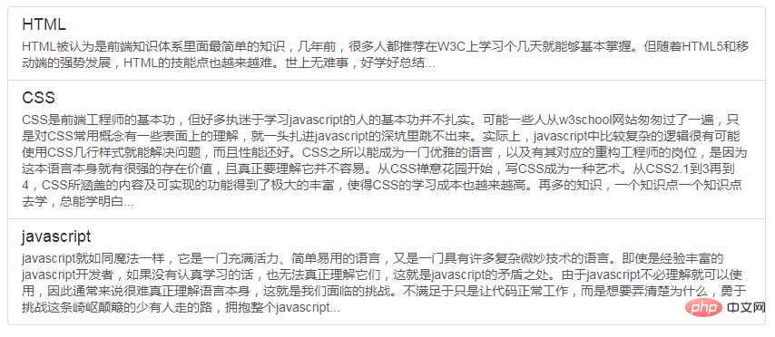 State settings
The Bootstrap framework provides state effects for combined list items, especially linked list groups. Such as common status and disabled status, etc. The implementation method is similar to the previously introduced components. In the list group, you only need to add the class name to the corresponding list item:
☑ active: indicates the current state<p> ☑ disabled: indicates the disabled state<p>.list-group-item.disabled,
.list-group-item.disabled:hover,
.list-group-item.disabled:focus {
color: #777;
background-color: #eee;
}
.list-group-item.active,
.list-group-item.active:hover,
.list-group-item.active:focus {
z-index: 2;
color: #fff;
background-color: #428bca;
border-color: #428bca;
}<div class="list-group"> <a href="#" class="list-group-item ">HTML</a> <a href="#" class="list-group-item">CSS</a> <a href="#" class="list-group-item">javascript</a> <a href="#" class="list-group-item active">bootstrap</a> <a href="#" class="list-group-item disabled">jquery</a> </div>
 Colorful list group
Like the warning component, Bootstrap provides different background colors and Text color, you can use these class names to define list items with different background colors
☑ list-group-item-success: Success, background color is green<p> ☑ list-group-item- info: information, background color is blue<p> ☑ list-group-item-warning: warning, background color is yellow<p> ☑ list-group-item-danger: error, background color is red <p> If you want to add a background color to the list item, you only need to add the corresponding class name based on "list-group-item"<p><div class="list-group">
<a href="##" class="list-group-item">默认</a>
<a href="##" class="list-group-item list-group-item-success">成功</a>
<a href="##" class="list-group-item list-group-item-info">信息</a>
<a href="##" class="list-group-item list-group-item-warning">警告</a>
<a href="##" class="list-group-item list-group-item-danger">错误</a>
</div> programming video! ! <p>
The above is the detailed content of A detailed introduction to list groups in Bootstrap. For more information, please follow other related articles on the PHP Chinese website!

Hot AI Tools

Undresser.AI Undress
AI-powered app for creating realistic nude photos

AI Clothes Remover
Online AI tool for removing clothes from photos.

Undress AI Tool
Undress images for free

Clothoff.io
AI clothes remover

AI Hentai Generator
Generate AI Hentai for free.

Hot Article

Hot Tools

Notepad++7.3.1
Easy-to-use and free code editor

SublimeText3 Chinese version
Chinese version, very easy to use

Zend Studio 13.0.1
Powerful PHP integrated development environment

Dreamweaver CS6
Visual web development tools

SublimeText3 Mac version
God-level code editing software (SublimeText3)

Hot Topics
 How to introduce bootstrap into Eclipse
Apr 05, 2024 am 02:30 AM
Introduce Bootstrap in Eclipse in five steps: Download the Bootstrap file and unzip it. Import the Bootstrap folder into the project. Add Bootstrap dependency. Load Bootstrap CSS and JS in HTML files. Start using Bootstrap to enhance your user interface.
 How to read the bootstrap mediation effect test results in stata
Apr 05, 2024 am 01:48 AM
Interpretation steps of Bootstrap mediation effect test in Stata: Check the sign of the coefficient: Determine the positive or negative direction of the mediation effect. Test p value: less than 0.05 indicates that the mediating effect is significant. Check the confidence interval: not containing zero indicates that the mediation effect is significant. Comparing the median p-value: less than 0.05 further supports the significance of the mediation effect.
 750,000 rounds of one-on-one battle between large models, GPT-4 won the championship, and Llama 3 ranked fifth
Apr 23, 2024 pm 03:28 PM
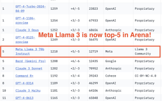
Regarding Llama3, new test results have been released - the large model evaluation community LMSYS released a large model ranking list. Llama3 ranked fifth, and tied for first place with GPT-4 in the English category. The picture is different from other benchmarks. This list is based on one-on-one battles between models, and the evaluators from all over the network make their own propositions and scores. In the end, Llama3 ranked fifth on the list, followed by three different versions of GPT-4 and Claude3 Super Cup Opus. In the English single list, Llama3 overtook Claude and tied with GPT-4. Regarding this result, Meta’s chief scientist LeCun was very happy and forwarded the tweet and
 How to introduce idea into bootstrap
Apr 05, 2024 am 02:33 AM
Steps to introduce Bootstrap in IntelliJ IDEA: Create a new project and select "Web Application". Add "Bootstrap" Maven dependency. Create an HTML file and add Bootstrap references. Replace with the actual path to the Bootstrap CSS file. Run the HTML file to use Bootstrap styles. Tip: Use a CDN to import Bootstrap or customize HTML file templates.
 How to use bootstrap to test mediation effects
Apr 05, 2024 am 03:57 AM
The Bootstrap test uses resampling technology to evaluate the reliability of the statistical test and is used to prove the significance of the mediation effect: first, calculate the confidence interval of the direct effect, indirect effect and mediation effect; secondly, calculate the significance of the mediation type according to the Baron and Kenny or Sobel method. significance; and finally estimate the confidence interval for the natural indirect effect.
 How to read the results of bootstrap mediation test
Apr 05, 2024 am 03:30 AM
The Bootstrap mediation test evaluates the mediation effect by resampling the data multiple times: Indirect effect confidence interval: indicates the estimated range of the mediation effect. If the interval does not contain zero, the effect is significant. p-value: Evaluates the probability that the confidence interval does not contain zero, with values less than 0.05 indicating significant. Sample size: The number of data samples used for analysis. Bootstrap subsampling times: the number of repeated samplings (500-2000 times). If the confidence interval does not contain zero and the p-value is less than 0.05, the mediation effect is significant, indicating that the mediating variable explains the relationship between the independent and dependent variables.
 What is the difference between bootstrap and springboot
Apr 05, 2024 am 04:00 AM
The main difference between Bootstrap and Spring Boot is: Bootstrap is a lightweight CSS framework for website styling, while Spring Boot is a powerful, out-of-the-box backend framework for Java web application development. Bootstrap is based on CSS and HTML, while Spring Boot is based on Java and the Spring framework. Bootstrap focuses on creating the look and feel of a website, while Spring Boot focuses on back-end functionality. Spring Boot can be integrated with Bootstrap to create fully functional, beautiful
 How to export the results of bootstrap test mediation effect stata command
Apr 05, 2024 am 03:39 AM
Export the results of the Bootstrap mediation effect test in Stata: Save the results: bootstrap post Create variable list: local vars: coef se ci Export the results (CSV): export delimited results.csv, varlist(`vars') replace comma nolabel


