

Learn more about popups in Bootstrap

This article will give you a detailed introduction to the pop-up box in Bootstrap. It has certain reference value. Friends in need can refer to it. I hope it will be helpful to everyone.

On the surface, the pop-up box is actually a special prompt box with just an extra title. But in fact, there are differences.
Basic usage
When making a tooltip, you can use the
So the most basic usage is as follows
1. Define the title through the value of the title attribute (you can also use custom attributes src-title to set the title), title has high priority
2. Set the content through the data-content attribute
3. Set data-toggle="popover"
4. Use the following js code to trigger
$('[data-toggle="popover"]').popover();
<button>点我弹出/隐藏弹出框</button>
<script>
$(function(){
$('[data-toggle="popover"]').popover();
});
</script>
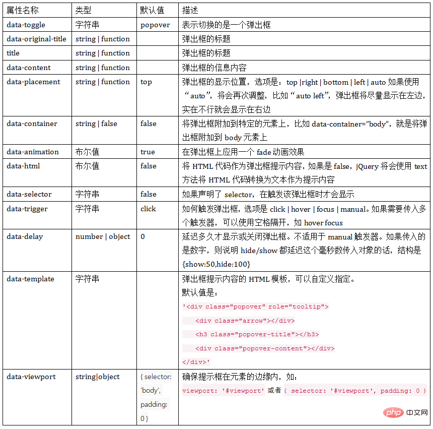
Attribute parameters
When making the pop-up box, you can define it in HTML The custom attributes listed in the table
[Note]data-palcement is displayed on the right by default instead of on the top
<body style="max-width:90%">
<button type="button" class="btn btn-default" data-toggle="popover" data-placement="top" title="标题" data-content="上侧" >上侧</button>
<button type="button" class="btn btn-default" data-toggle="popover" data-placement="bottom" title="标题" data-content="下侧" >下侧</button>
<button type="button" class="btn btn-default" data-toggle="popover" title="标题" data-content="无动画" data-animation="false" >无动画</button>
<button type="button" class="btn btn-default" data-toggle="popover" title="标题" data-content="有动画" >有动画</button>
<button type="button" class="btn btn-default" data-toggle="popover" title="标题" data-content="hover触发" data-trigger="hover">hover触发</button>
<button type="button" class="btn btn-default" data-toggle="popover" title="标题" data-content="click触发" data-trigger="click">click触发</button>
<button type="button" class="btn btn-default" data-toggle="popover" title="标题" data-content="不延迟">不延迟</button>
<button type="button" class="btn btn-default" data-toggle="popover" title="标题" data-content="延迟500ms" data-delay="500">延迟500ms</button>
<script>
$(function(){
$('[data-toggle="popover"]').popover();
});
</script>
JS trigger
The JS usage of popover is the same as that of tooltip. It supports using the options object method to pass parameters to the popover() method
$(element).popover(options);
options The parameters in the object include animation, html, placement, selector, original-title, title, trigger, delay, container, template
DetailsMove here
<body style="max-width:90%">
<button type="button" class="btn btn-default" data-toggle="popover" >按钮</button>
<script>
$(function(){
$('[data-toggle="popover"]').popover({
title:"我是标题",
content:'我是内容'
});
});
</script>
【Keywords】
In addition to using the options object, you can also use keywords, 'show', 'hide', 'toggle', 'destroy '
<body style="max-width:90%">
<button type="button" class="btn btn-default" data-toggle="popover" data-placement="top" title="标题" data-content="内容" id="btn1">按钮1</button>
<button type="button" class="btn btn-default" data-toggle="popover" data-placement="top" title="标题" data-content="内容" id="btn2">按钮2</button>
<button type="button" class="btn btn-default" data-toggle="popover" data-placement="top" title="标题" data-content="内容" id="btn3">按钮3</button>
<button type="button" class="btn btn-default" data-toggle="popover" data-placement="top" title="标题" data-content="内容" id="btn4">按钮4</button>
<script>
$(function(){
$('#btn1').popover('show');//显示弹出框
$('#btn2').popover('hide');//关闭弹出框
$('#btn3').popover('toggle');//反转弹出框
$('#btn4').popover('destroy');//隐藏并销毁弹出框
});
</script>
[Event]
This plug-in supports 5 types of event subscriptions
show.bs.tooltip        show方法调用之后立即触发该事件
shown.bs.tooltip      此事件在tooltip已经显示出来(并且同时在 CSS 过渡效果完成)之后被触发
hide.bs.tooltip        hide方法调用之后立即触发该事件。
hidden.bs.tooltip     此事件在tooltip被隐藏(并且同时在 CSS 过渡效果完成)之后被触发
inserted.bs.tooltip    当tooltip模板加载到DOM中上时,在show.bs.tooltip触发后,触发该事件
<body style="margin-top:50px;">
<button type="button" class="btn btn-default" data-toggle="popover" data-placement="right" title="标题" data-content="内容" id="btn">按钮</button>
<script>
$(function(){
$('#btn').popover();
$("#btn").on("show.bs.popover",function(e){
$(this).html('关闭');
}).on("hide.bs.popover",function(e){
$(this).html('打开');
})
});
</script>
Compare the prompt box
1. The default trigger events of the prompt box tooltip are hover and focus, while the popup box popover is click
2. The tooltip of the prompt box has only one content (title), while the pop-up box can not only set the title (title) but also the content (content)
3. The tooltip of the prompt box is displayed on the top by default, while the pop-up box popover is on the right by default Display
4. Different display templates
Template of prompt box tooltip:
<div class="tooltip" role="tooltip">
    <div class="tooltip-arrow"></div>
    <div class="tooltip-inner"></div>
</div>Template of popup box:
<div class="popover" role="tooltip">
    <div class="arrow"></div>
    <h3 class="popover-title"></h3>
    <div class="popover-content"></div>
</div>More programming related knowledge, Please visit: Programming Teaching! !
The above is the detailed content of Learn more about popups in Bootstrap. For more information, please follow other related articles on the PHP Chinese website!

Hot AI Tools

Undresser.AI Undress
AI-powered app for creating realistic nude photos

AI Clothes Remover
Online AI tool for removing clothes from photos.

Undress AI Tool
Undress images for free

Clothoff.io
AI clothes remover

AI Hentai Generator
Generate AI Hentai for free.

Hot Article
Hot Tools

Notepad++7.3.1
Easy-to-use and free code editor

SublimeText3 Chinese version
Chinese version, very easy to use

Zend Studio 13.0.1
Powerful PHP integrated development environment

Dreamweaver CS6
Visual web development tools

SublimeText3 Mac version
God-level code editing software (SublimeText3)
Hot Topics
 1378
1378
 52
52

 How to get the bootstrap search bar
Apr 07, 2025 pm 03:33 PM
How to get the bootstrap search bar
Apr 07, 2025 pm 03:33 PM
How to use Bootstrap to get the value of the search bar: Determines the ID or name of the search bar. Use JavaScript to get DOM elements. Gets the value of the element. Perform the required actions.
 How to do vertical centering of bootstrap
Apr 07, 2025 pm 03:21 PM
How to do vertical centering of bootstrap
Apr 07, 2025 pm 03:21 PM
Use Bootstrap to implement vertical centering: flexbox method: Use the d-flex, justify-content-center, and align-items-center classes to place elements in the flexbox container. align-items-center class method: For browsers that do not support flexbox, use the align-items-center class, provided that the parent element has a defined height.
 How to use bootstrap in vue
Apr 07, 2025 pm 11:33 PM
How to use bootstrap in vue
Apr 07, 2025 pm 11:33 PM
Using Bootstrap in Vue.js is divided into five steps: Install Bootstrap. Import Bootstrap in main.js. Use the Bootstrap component directly in the template. Optional: Custom style. Optional: Use plug-ins.
 How to write split lines on bootstrap
Apr 07, 2025 pm 03:12 PM
How to write split lines on bootstrap
Apr 07, 2025 pm 03:12 PM
There are two ways to create a Bootstrap split line: using the tag, which creates a horizontal split line. Use the CSS border property to create custom style split lines.
 How to insert pictures on bootstrap
Apr 07, 2025 pm 03:30 PM
How to insert pictures on bootstrap
Apr 07, 2025 pm 03:30 PM
There are several ways to insert images in Bootstrap: insert images directly, using the HTML img tag. With the Bootstrap image component, you can provide responsive images and more styles. Set the image size, use the img-fluid class to make the image adaptable. Set the border, using the img-bordered class. Set the rounded corners and use the img-rounded class. Set the shadow, use the shadow class. Resize and position the image, using CSS style. Using the background image, use the background-image CSS property.
 How to resize bootstrap
Apr 07, 2025 pm 03:18 PM
How to resize bootstrap
Apr 07, 2025 pm 03:18 PM
To adjust the size of elements in Bootstrap, you can use the dimension class, which includes: adjusting width: .col-, .w-, .mw-adjust height: .h-, .min-h-, .max-h-
 How to set up the framework for bootstrap
Apr 07, 2025 pm 03:27 PM
How to set up the framework for bootstrap
Apr 07, 2025 pm 03:27 PM
To set up the Bootstrap framework, you need to follow these steps: 1. Reference the Bootstrap file via CDN; 2. Download and host the file on your own server; 3. Include the Bootstrap file in HTML; 4. Compile Sass/Less as needed; 5. Import a custom file (optional). Once setup is complete, you can use Bootstrap's grid systems, components, and styles to create responsive websites and applications.
 How to use bootstrap button
Apr 07, 2025 pm 03:09 PM
How to use bootstrap button
Apr 07, 2025 pm 03:09 PM
How to use the Bootstrap button? Introduce Bootstrap CSS to create button elements and add Bootstrap button class to add button text
