How to not display elements in css
How to set non-display elements in css: 1. Use the [display: none;] method; 2. Change [display:none;] to [visibility: hidden;]

The operating environment of this tutorial: windows7 system, css3 version, DELL G3 computer.
How to set non-display elements in css:
(1) display: none;
<!DOCTYPE html>
<html>
<head>
    <meta charset="utf-8" />
    <style type="text/css">
    .box {
        width: 160px;
        height: 100px;
        background: #cad5eb;
    }
    .title {
        height: 40px;
        background: #54a962;
    }
    .content {
        height: 60px;
        background: #5650bb;
    }
    </style>
</head>
<body>
    <div class="box">
        <h3 id="标题">标题</h3>
        <p class="content">内容</p>
    </div>
</body>
</html>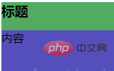
Settings display: none;The effect after display is as follows
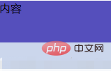
It can be seen that the original title part is missing, and the content part occupies the original title part
( 2) visibility: hidden;
It’s still the above example, but this time change display:none; to visibility: hidden; but the result is quite different
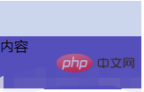
The above is the detailed content of How to not display elements in css. For more information, please follow other related articles on the PHP Chinese website!

Hot AI Tools

Undresser.AI Undress
AI-powered app for creating realistic nude photos

AI Clothes Remover
Online AI tool for removing clothes from photos.

Undress AI Tool
Undress images for free

Clothoff.io
AI clothes remover

AI Hentai Generator
Generate AI Hentai for free.

Hot Article

Hot Tools

Notepad++7.3.1
Easy-to-use and free code editor

SublimeText3 Chinese version
Chinese version, very easy to use

Zend Studio 13.0.1
Powerful PHP integrated development environment

Dreamweaver CS6
Visual web development tools

SublimeText3 Mac version
God-level code editing software (SublimeText3)

Hot Topics
 1371
1371
 52
52
 How to use bootstrap button
Apr 07, 2025 pm 03:09 PM
How to use the Bootstrap button? Introduce Bootstrap CSS to create button elements and add Bootstrap button class to add button text
 How to resize bootstrap
Apr 07, 2025 pm 03:18 PM
To adjust the size of elements in Bootstrap, you can use the dimension class, which includes: adjusting width: .col-, .w-, .mw-adjust height: .h-, .min-h-, .max-h-
 How to upload files on bootstrap
Apr 07, 2025 pm 01:09 PM
The file upload function can be implemented through Bootstrap. The steps are as follows: introduce Bootstrap CSS and JavaScript files; create file input fields; create file upload buttons; handle file uploads (using FormData to collect data and then send to the server); custom style (optional).
 How to insert pictures on bootstrap
Apr 07, 2025 pm 03:30 PM
There are several ways to insert images in Bootstrap: insert images directly, using the HTML img tag. With the Bootstrap image component, you can provide responsive images and more styles. Set the image size, use the img-fluid class to make the image adaptable. Set the border, using the img-bordered class. Set the rounded corners and use the img-rounded class. Set the shadow, use the shadow class. Resize and position the image, using CSS style. Using the background image, use the background-image CSS property.
 How to remove the default style in Bootstrap list?
Apr 07, 2025 am 10:18 AM
The default style of the Bootstrap list can be removed with CSS override. Use more specific CSS rules and selectors, follow the "proximity principle" and "weight principle", overriding the Bootstrap default style. To avoid style conflicts, more targeted selectors can be used. If the override is unsuccessful, adjust the weight of the custom CSS. At the same time, pay attention to performance optimization, avoid overuse of !important, and write concise and efficient CSS code.
 How to view the date of bootstrap
Apr 07, 2025 pm 03:03 PM
Answer: You can use the date picker component of Bootstrap to view dates in the page. Steps: Introduce the Bootstrap framework. Create a date selector input box in HTML. Bootstrap will automatically add styles to the selector. Use JavaScript to get the selected date.
 How to verify bootstrap date
Apr 07, 2025 pm 03:06 PM
To verify dates in Bootstrap, follow these steps: Introduce the required scripts and styles; initialize the date selector component; set the data-bv-date attribute to enable verification; configure verification rules (such as date formats, error messages, etc.); integrate the Bootstrap verification framework and automatically verify date input when form is submitted.
 How to change the size of a Bootstrap list?
Apr 07, 2025 am 10:45 AM
The size of a Bootstrap list depends on the size of the container that contains the list, not the list itself. Using Bootstrap's grid system or Flexbox can control the size of the container, thereby indirectly resizing the list items.


