 Backend Development
 Python Tutorial
 Learn to draw real scatter plots using Python's third-party library openpyxl in one minute
Learn to draw real scatter plots using Python's third-party library openpyxl in one minute
本篇文章给大家详细介绍一下用Python的第三方库openpyxl画真散点图的方法。有一定的参考价值,有需要的朋友可以参考一下,希望对大家有所帮助。

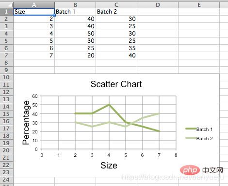
之前在博客上看见不少类似的问题,点进去一看,发现都是完全照抄的官方文档。然而官方文档的demo,画出来并不是我们想要的效果:

说好的散点图,出来却是我们一般定义上的折线图。
直接上代码:
先安装openpyxl第三方库,以Windows为例,在cmd指令窗下发如下命令:
pip install openpyxl
Python代码如下:
"""
__author__ = '伴月雎'
__time__ = '2021/4/21 19:15'
"""
from openpyxl import Workbook
from openpyxl.chart import (
    ScatterChart,
    Reference,
    Series,
)

wb = Workbook()
ws = wb.active
rows = [
    ['Size', 'Batch 1', 'Batch 2'],
    [2, 40, 30],
    [3, 40, 25],
    [4, 50, 30],
    [5, 30, 25],
    [6, 25, 35],
    [7, 20, 40],
]
for row in rows:
    ws.append(row)

chart = ScatterChart()
chart.title = "Scatter Chart"
chart.style = 10
chart.x_axis.title = 'Size'
chart.y_axis.title = 'Percentage'

xvalues = Reference(ws, min_col=1, min_row=2, max_row=7)
for i in range(2, 4):
    values = Reference(ws, min_col=i, min_row=1, max_row=7)
    series = Series(values, xvalues, title_from_data=True)
    chart.series.append(series)
# 第一条散点
s1 = chart.series[0]
# 散点标记类型  'auto', 'dash', 'triangle', 'square', 'picture', 'circle', 'dot', 'plus', 'star', 'diamond', 'x'
s1.marker.symbol = "circle"
s1.marker.graphicalProperties.solidFill = "0000FF"  # Marker filling 设定标记填充的颜色
s1.marker.graphicalProperties.line.solidFill = "0000FF"  # Marker outline 标记轮廓的颜色
s1.graphicalProperties.line.noFill = True  # 关闭连线填充

# 第二条带连线的散点
s2 = chart.series[1]
s2.marker.symbol = "circle"
s2.graphicalProperties.solidFill = "FF0000"
s2.marker.graphicalProperties.line.solidFill = "FF0000"
s2.graphicalProperties.dashStyle = "dash"
s2.graphicalProperties.line.width = 1000  # width in EMUs

ws.add_chart(chart, "A10")
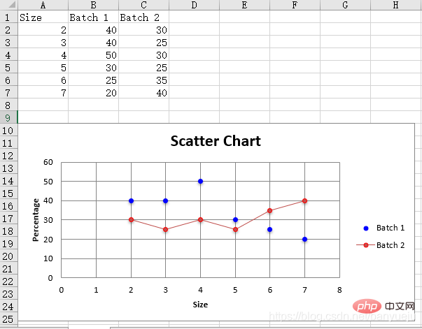
wb.save("scatter.xlsx")效果如下:

大家可以根据自己的需要做相应的扩展:
1.读取自己的Excel表格数据,替换上面代码中手动生成的数据:
        wb = openpyxl.load_workbook('D:\\data.xlsx')  # 填写你的Excel文件路径
ws = workbook['sheet1'] # 填写你的sheet标题再参考上述代码,指定你的xvalues和values(即x轴,y轴)对应的行、列位就OK了。
2.最后修改画图元素的属性值,画出你自己定制化的散点图!
相关免费学习推荐:python视频教程!
The above is the detailed content of Learn to draw real scatter plots using Python's third-party library openpyxl in one minute. For more information, please follow other related articles on the PHP Chinese website!

Hot AI Tools

Undresser.AI Undress
AI-powered app for creating realistic nude photos

AI Clothes Remover
Online AI tool for removing clothes from photos.

Undress AI Tool
Undress images for free

Clothoff.io
AI clothes remover

AI Hentai Generator
Generate AI Hentai for free.

Hot Article

Hot Tools

Notepad++7.3.1
Easy-to-use and free code editor

SublimeText3 Chinese version
Chinese version, very easy to use

Zend Studio 13.0.1
Powerful PHP integrated development environment

Dreamweaver CS6
Visual web development tools

SublimeText3 Mac version
God-level code editing software (SublimeText3)

Hot Topics
 1377
1377
 52
52
 Do mysql need to pay
Apr 08, 2025 pm 05:36 PM
MySQL has a free community version and a paid enterprise version. The community version can be used and modified for free, but the support is limited and is suitable for applications with low stability requirements and strong technical capabilities. The Enterprise Edition provides comprehensive commercial support for applications that require a stable, reliable, high-performance database and willing to pay for support. Factors considered when choosing a version include application criticality, budgeting, and technical skills. There is no perfect option, only the most suitable option, and you need to choose carefully according to the specific situation.
 HadiDB: A lightweight, horizontally scalable database in Python
Apr 08, 2025 pm 06:12 PM
HadiDB: A lightweight, high-level scalable Python database HadiDB (hadidb) is a lightweight database written in Python, with a high level of scalability. Install HadiDB using pip installation: pipinstallhadidb User Management Create user: createuser() method to create a new user. The authentication() method authenticates the user's identity. fromhadidb.operationimportuseruser_obj=user("admin","admin")user_obj.
 Navicat's method to view MongoDB database password
Apr 08, 2025 pm 09:39 PM
It is impossible to view MongoDB password directly through Navicat because it is stored as hash values. How to retrieve lost passwords: 1. Reset passwords; 2. Check configuration files (may contain hash values); 3. Check codes (may hardcode passwords).
 Python: Exploring Its Primary Applications
Apr 10, 2025 am 09:41 AM
Python is widely used in the fields of web development, data science, machine learning, automation and scripting. 1) In web development, Django and Flask frameworks simplify the development process. 2) In the fields of data science and machine learning, NumPy, Pandas, Scikit-learn and TensorFlow libraries provide strong support. 3) In terms of automation and scripting, Python is suitable for tasks such as automated testing and system management.
 How to optimize MySQL performance for high-load applications?
Apr 08, 2025 pm 06:03 PM
MySQL database performance optimization guide In resource-intensive applications, MySQL database plays a crucial role and is responsible for managing massive transactions. However, as the scale of application expands, database performance bottlenecks often become a constraint. This article will explore a series of effective MySQL performance optimization strategies to ensure that your application remains efficient and responsive under high loads. We will combine actual cases to explain in-depth key technologies such as indexing, query optimization, database design and caching. 1. Database architecture design and optimized database architecture is the cornerstone of MySQL performance optimization. Here are some core principles: Selecting the right data type and selecting the smallest data type that meets the needs can not only save storage space, but also improve data processing speed.
 The 2-Hour Python Plan: A Realistic Approach
Apr 11, 2025 am 12:04 AM
You can learn basic programming concepts and skills of Python within 2 hours. 1. Learn variables and data types, 2. Master control flow (conditional statements and loops), 3. Understand the definition and use of functions, 4. Quickly get started with Python programming through simple examples and code snippets.
 How to use AWS Glue crawler with Amazon Athena
Apr 09, 2025 pm 03:09 PM
As a data professional, you need to process large amounts of data from various sources. This can pose challenges to data management and analysis. Fortunately, two AWS services can help: AWS Glue and Amazon Athena.
 Can mysql connect to the sql server
Apr 08, 2025 pm 05:54 PM
No, MySQL cannot connect directly to SQL Server. But you can use the following methods to implement data interaction: Use middleware: Export data from MySQL to intermediate format, and then import it to SQL Server through middleware. Using Database Linker: Business tools provide a more friendly interface and advanced features, essentially still implemented through middleware.


