 Web Front-end
 CSS Tutorial
 Detailed explanation of two ways to achieve text gradient color using pure CSS
Detailed explanation of two ways to achieve text gradient color using pure CSS
This article introduces two ways to use pure CSS to achieve text gradient color. It has certain reference value. Friends in need can refer to it. I hope it will be helpful to everyone.

Explanation
The focus this time is on two attributes,
background attribute
mask attribute
These two attributes are the key to the two implementation methods.
Method 1
Rendering

Code
<!DOCTYPE html>
<html>

<head>
    <meta charset="utf-8">
    <style>

    span {
        background: linear-gradient(to right, red, blue);
        -webkit-background-clip: text;
        color: transparent;
    }
    </style>
</head>

<body>
        <span>前端简单说</span>
</body>
</html>There is not much code, let’s take a look, background: linear-gradient(to right, red, blue); This line It sets the gradient color for the background. Please note here that this is an abbreviation. In fact, it sets the gradient color for background-image, not background-color, but the value of the background image. It is a gradient color. If you don’t know the gradient color, go here to see it.
CSS3 Gradient (Gradients)
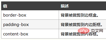
-webkit-background-clip: text; This line will be mentioned , background-clip attribute, let’s take a look at the description on W3Cschool
The background-clip attribute specifies the drawing area of the background
Syntax background -clip: border-box|padding-box|content-box;

There is no mention of the value text above. Seeing the previous prefix, you should It can also be imagined that it has compatibility issues, and it is not currently supported by all browsers.
The value of text means that the text in the block is used as the cropping area to be cropped outward. The background of the text is the background of the block, and the area outside the text will be cropped.
So, we finally write color: transparent; to make the text transparent, which means that the background color behind it will be displayed.
Method 2
Rendering

Code
<!doctype html>
<html>
<head>
<meta charset="UTF-8" />

<style type="text/css">
    h1{
        position: relative;
        color: yellow;
    }
    h1:before{
        content: attr(text);
        position: absolute;
        z-index: 10;
        color:pink;
        -webkit-mask:linear-gradient(to left, red, transparent );
    }
</style>
</style>
</head>

<body>
    <h1 id="前端简单说">前端简单说</h1>
</body>

</html>There is not much code, let’s briefly talk about it,
:before selector inserts content before the selected element.
Use the content attribute to specify the content to be inserted.
content value attr is used to get the attribute value, content:attr(attribute name);
content: attr(text); can get the element text attribute. The text attribute here is a custom attribute. You can also add a tt attribute to the element, like this <h1 id="Front-end-in-brief">Front-end in brief </h1>
Then the content attribute is written like this, content: attr(tt); It will also work.
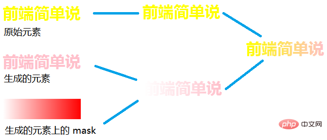
Okay, let’s continue talking about the focus of the second method, the mask attribute, because we have already written an article introducing the mask attribute before.
Let’s briefly talk about the mask in CSS—make good use of mask-image
I won’t introduce it in detail here. Friends who want to know more about it can read the above article, which will definitely be helpful to you.
Simply put, the mask attribute allows a certain part of the element to be displayed or hidden.
We can understand the principle of the second method by looking at the picture

Summary
This time These two methods should be easy to understand. I hope it will be helpful to everyone.
For more programming-related knowledge, please visit: Introduction to Programming! !
The above is the detailed content of Detailed explanation of two ways to achieve text gradient color using pure CSS. For more information, please follow other related articles on the PHP Chinese website!

Hot AI Tools

Undresser.AI Undress
AI-powered app for creating realistic nude photos

AI Clothes Remover
Online AI tool for removing clothes from photos.

Undress AI Tool
Undress images for free

Clothoff.io
AI clothes remover

AI Hentai Generator
Generate AI Hentai for free.

Hot Article

Hot Tools

Notepad++7.3.1
Easy-to-use and free code editor

SublimeText3 Chinese version
Chinese version, very easy to use

Zend Studio 13.0.1
Powerful PHP integrated development environment

Dreamweaver CS6
Visual web development tools

SublimeText3 Mac version
God-level code editing software (SublimeText3)

Hot Topics
 1359
1359
 52
52
 How to remove the default style in Bootstrap list?
Apr 07, 2025 am 10:18 AM
The default style of the Bootstrap list can be removed with CSS override. Use more specific CSS rules and selectors, follow the "proximity principle" and "weight principle", overriding the Bootstrap default style. To avoid style conflicts, more targeted selectors can be used. If the override is unsuccessful, adjust the weight of the custom CSS. At the same time, pay attention to performance optimization, avoid overuse of !important, and write concise and efficient CSS code.
 How to layout bootstrap
Apr 07, 2025 pm 02:24 PM
To use Bootstrap to layout a website, you need to use a grid system to divide the page into containers, rows, and columns. First add the container, then add the rows in it, add the columns within the row, and finally add the content in the column. Bootstrap's responsive layout function automatically adjusts the layout according to breakpoints (xs, sm, md, lg, xl). Different layouts under different screen sizes can be achieved by using responsive classes.
 How to build a bootstrap framework
Apr 07, 2025 pm 12:57 PM
To create a Bootstrap framework, follow these steps: Install Bootstrap via CDN or install a local copy. Create an HTML document and link Bootstrap CSS to the <head> section. Add Bootstrap JavaScript file to the <body> section. Use the Bootstrap component and customize the stylesheet to suit your needs.
 How to use bootstrap button
Apr 07, 2025 pm 03:09 PM
How to use the Bootstrap button? Introduce Bootstrap CSS to create button elements and add Bootstrap button class to add button text
 How to set the bootstrap navigation bar
Apr 07, 2025 pm 01:51 PM
Bootstrap provides a simple guide to setting up navigation bars: Introducing the Bootstrap library to create navigation bar containers Add brand identity Create navigation links Add other elements (optional) Adjust styles (optional)
 How to insert pictures on bootstrap
Apr 07, 2025 pm 03:30 PM
There are several ways to insert images in Bootstrap: insert images directly, using the HTML img tag. With the Bootstrap image component, you can provide responsive images and more styles. Set the image size, use the img-fluid class to make the image adaptable. Set the border, using the img-bordered class. Set the rounded corners and use the img-rounded class. Set the shadow, use the shadow class. Resize and position the image, using CSS style. Using the background image, use the background-image CSS property.
 How to upload files on bootstrap
Apr 07, 2025 pm 01:09 PM
The file upload function can be implemented through Bootstrap. The steps are as follows: introduce Bootstrap CSS and JavaScript files; create file input fields; create file upload buttons; handle file uploads (using FormData to collect data and then send to the server); custom style (optional).
 How to view the date of bootstrap
Apr 07, 2025 pm 03:03 PM
Answer: You can use the date picker component of Bootstrap to view dates in the page. Steps: Introduce the Bootstrap framework. Create a date selector input box in HTML. Bootstrap will automatically add styles to the selector. Use JavaScript to get the selected date.


