
 Web Front-end
Bootstrap Tutorial
An in-depth analysis of automatic positioning buoys in Bootstrap
Web Front-end
Bootstrap Tutorial
An in-depth analysis of automatic positioning buoys in Bootstrap
An in-depth analysis of automatic positioning buoys in Bootstrap

This article will take you to learn more about the automatic positioning buoy in Bootstrap. It has certain reference value. Friends in need can refer to it. I hope it will be helpful to everyone.

The main function of the Affix plug-in is to add or delete position:fixed to an element (an element that needs to be fixed) through the plug-in to achieve a sticky fixation effect of the element in the browser window. [Related recommendations: "bootstrap tutorial"]
Basic usage
First of all, let’s take a look at an Apple official website for automatic Application of positioning buoy
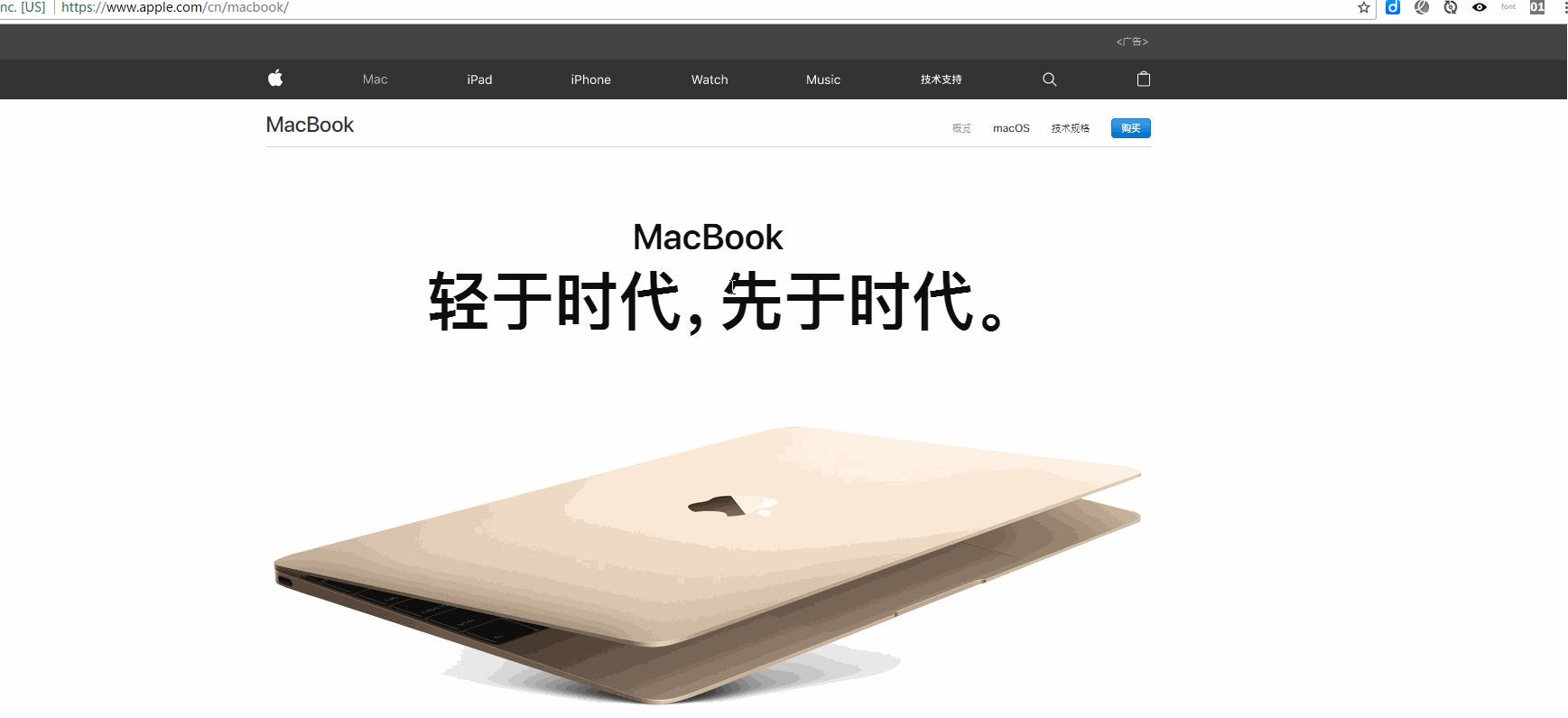
As can be seen from the git diagram above, when the Macbook column is scrolled to a certain height, it is fixed at the top of the window and will no longer move
The Affix plug-in can fix the positioning of any element. The simplest method is to trigger it through the custom attribute data. It mainly includes two parameters:
1. data-spy: value affix, indicating that the element is fixed.
2. data-offset: an integer value, such as 90, indicating that the values of the elements top and bottom are both 90px, which includes two methods: data-offset-top and data-offset-bottom
data-offset-top is used to set the distance of the element from the top. For example, 90 means that the element is 90px from the top. When the user drags the scroll bar down from the top, when the scrolling distance is greater than 90px, the affix element will no longer scroll and will be fixed at the top of the browser window
data- offset-bottom is just the opposite of data-offset-top
1 2 3 |
|
[Setting CSS]
When using the Affix plug-in, content must be positioned through CSS. The Affix plug-in switches between three classes, each class presents a specific state: .affix, .affix-top and .affix-bottom
1. At the beginning, The plugin adds .affix-top to indicate the element's topmost position. No CSS positioning is required at this time
2. When scrolling past the element with Affix added, the actual Affix should be triggered. At this time .affix will replace .affix-top, and set position: fixed (provided by Bootstrap’s CSS code)
At this time , you need to manually set .affix, such as .affix{top:0;} means stopping at the top of the window
3. If the bottom offset is defined, when the scroll reaches this position, .affix should be is replaced with .affix-bottom. Since the offset is optional, setting it requires that the appropriate CSS be set as well. In this case please add position: absolute;
1 2 3 4 5 6 7 8 9 |
|

JS trigger# if necessary
##Sometimes, when using this plugin, the top and bottom heights are not necessarily fixed, so it is not appropriate to use declarative usage during initialization. At this time, using javascript becomes more flexible, because it not only supports passing in numeric offsets, but also supports passing in functions that can dynamically calculate offsets1 2 3 4 5 6 7 8 9 10 |
|
[Event]
The affix component provides 6 types of events, that is, affix and affixed each correspond to events in 3 states (normal, top, bottom)1 2 3 4 5 6 |
|
1 2 3 4 5 6 7 8 9 10 11 12 13 14 15 16 17 18 19 20 21 22 23 24 |
|

programming video! !
The above is the detailed content of An in-depth analysis of automatic positioning buoys in Bootstrap. For more information, please follow other related articles on the PHP Chinese website!

Hot AI Tools

Undresser.AI Undress
AI-powered app for creating realistic nude photos

AI Clothes Remover
Online AI tool for removing clothes from photos.

Undress AI Tool
Undress images for free

Clothoff.io
AI clothes remover

Video Face Swap
Swap faces in any video effortlessly with our completely free AI face swap tool!
Hot Article
Hot Tools

Notepad++7.3.1
Easy-to-use and free code editor

SublimeText3 Chinese version
Chinese version, very easy to use

Zend Studio 13.0.1
Powerful PHP integrated development environment

Dreamweaver CS6
Visual web development tools

SublimeText3 Mac version
God-level code editing software (SublimeText3)
Hot Topics
 1389
1389
 52
52

 How to get the bootstrap search bar
Apr 07, 2025 pm 03:33 PM
How to get the bootstrap search bar
Apr 07, 2025 pm 03:33 PM
How to use Bootstrap to get the value of the search bar: Determines the ID or name of the search bar. Use JavaScript to get DOM elements. Gets the value of the element. Perform the required actions.
 How to use bootstrap in vue
Apr 07, 2025 pm 11:33 PM
How to use bootstrap in vue
Apr 07, 2025 pm 11:33 PM
Using Bootstrap in Vue.js is divided into five steps: Install Bootstrap. Import Bootstrap in main.js. Use the Bootstrap component directly in the template. Optional: Custom style. Optional: Use plug-ins.
 How to do vertical centering of bootstrap
Apr 07, 2025 pm 03:21 PM
How to do vertical centering of bootstrap
Apr 07, 2025 pm 03:21 PM
Use Bootstrap to implement vertical centering: flexbox method: Use the d-flex, justify-content-center, and align-items-center classes to place elements in the flexbox container. align-items-center class method: For browsers that do not support flexbox, use the align-items-center class, provided that the parent element has a defined height.
 How to write split lines on bootstrap
Apr 07, 2025 pm 03:12 PM
How to write split lines on bootstrap
Apr 07, 2025 pm 03:12 PM
There are two ways to create a Bootstrap split line: using the tag, which creates a horizontal split line. Use the CSS border property to create custom style split lines.
 How to use bootstrap button
Apr 07, 2025 pm 03:09 PM
How to use bootstrap button
Apr 07, 2025 pm 03:09 PM
How to use the Bootstrap button? Introduce Bootstrap CSS to create button elements and add Bootstrap button class to add button text
 How to resize bootstrap
Apr 07, 2025 pm 03:18 PM
How to resize bootstrap
Apr 07, 2025 pm 03:18 PM
To adjust the size of elements in Bootstrap, you can use the dimension class, which includes: adjusting width: .col-, .w-, .mw-adjust height: .h-, .min-h-, .max-h-
 How to set up the framework for bootstrap
Apr 07, 2025 pm 03:27 PM
How to set up the framework for bootstrap
Apr 07, 2025 pm 03:27 PM
To set up the Bootstrap framework, you need to follow these steps: 1. Reference the Bootstrap file via CDN; 2. Download and host the file on your own server; 3. Include the Bootstrap file in HTML; 4. Compile Sass/Less as needed; 5. Import a custom file (optional). Once setup is complete, you can use Bootstrap's grid systems, components, and styles to create responsive websites and applications.
 How to insert pictures on bootstrap
Apr 07, 2025 pm 03:30 PM
How to insert pictures on bootstrap
Apr 07, 2025 pm 03:30 PM
There are several ways to insert images in Bootstrap: insert images directly, using the HTML img tag. With the Bootstrap image component, you can provide responsive images and more styles. Set the image size, use the img-fluid class to make the image adaptable. Set the border, using the img-bordered class. Set the rounded corners and use the img-rounded class. Set the shadow, use the shadow class. Resize and position the image, using CSS style. Using the background image, use the background-image CSS property.
