Pure CSS to achieve wonderful and interesting background effects! !

This article will introduce you to some interesting background knowledge. Using some very small units and just a few lines of code, you can produce wonderful and interesting results. Background effect~
The impact of magnitude on background graphics
The protagonist of this article is mainly:
- Multiple radial gradients (repeating-radial -gradient)
- Multiple angular gradient (repeating-conic-gradient)
What is the order of magnitude for the background graphic? Let's take a look at such an interesting phenomenon:
We use repeating-conic-gradient to implement a graphic with multiple angular gradients. The code is very simple, as shown below:
<div></div>
div {
    width: 100vw;
    height: 100vh;
    background: repeating-conic-gradient(#fff, #000, #fff 30deg);
}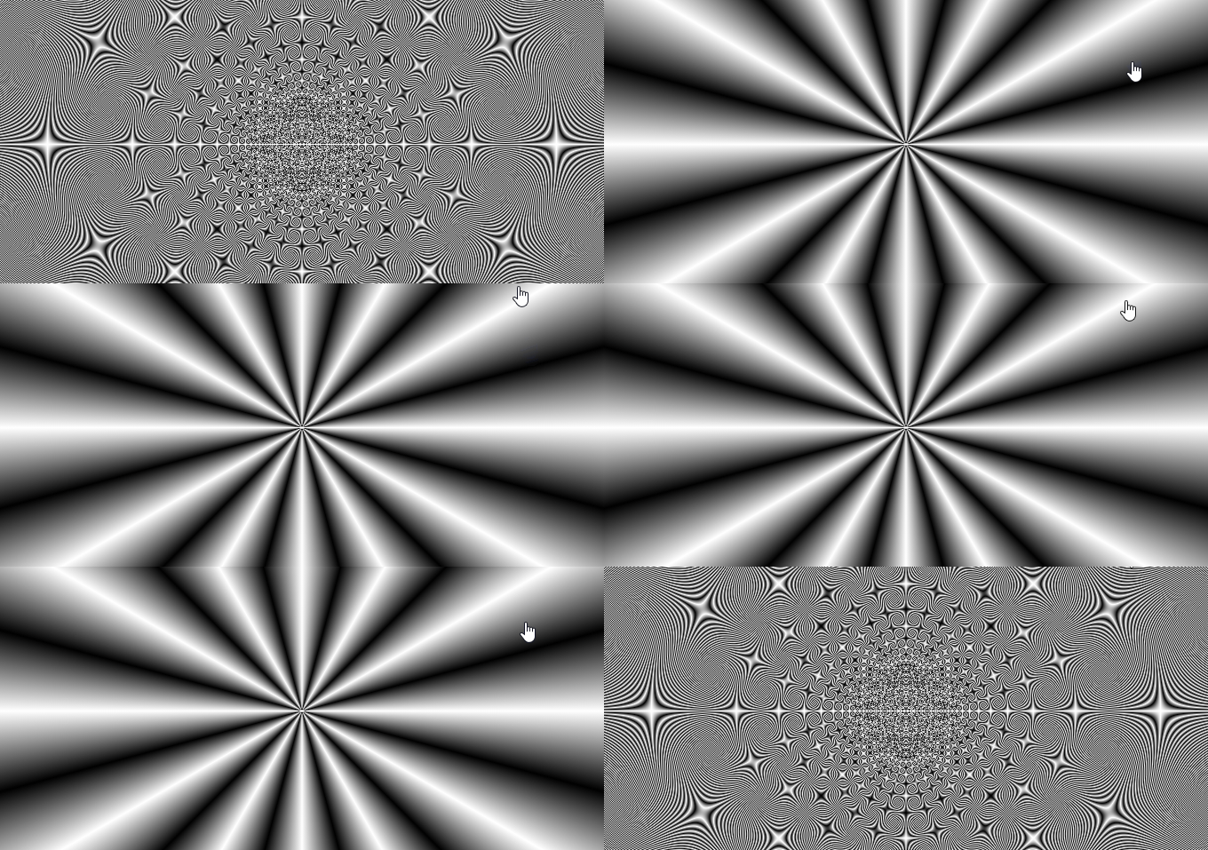
Replace 30deg with 0.1deg
Then, we use a very small value to replace the above code 30deg, similar to this:
{
    background: repeating-conic-gradient(#fff, #000, #fff 0.1deg);
}What is this? Think about it, what will the graphics drawn by this line of code look like?
Look at the effect:

Wow, incredible. 0.1deg is very critical here. The smaller the angle here (preferably less than 1deg), the cooler the graphics will be, which is what we call the impact of the order of magnitude on the background graphics.
CodePen -- One Line CSS Pattern
Observe the change process with the help of CSS @property
Before, if we directly wrote the following transition code , it is impossible to get tween transition animation, only frame-by-frame animation:
div{
    background: repeating-conic-gradient(#fff, #000, #fff 0.1deg);
    transition: background 1s;
}

div:hover {
    background: repeating-conic-gradient(#fff, #000, #fff 30deg);
}can only get this effect, the reason is that CSS does not support direct transition animation for such complex gradients :

OK, next, use it in this article--CSS @property, making the impossible possible Introduction## With the knowledge of #CSS @property, we can use CSS @property to observe the process of their two status changes.
@property --angle {
syntax: '<angle>';
inherits: false;
initial-value: 0.1deg;
}
div{
background: repeating-conic-gradient(#fff, #000, #fff var(--angle));
transition: --angle 2s;
}
html:hover {
--angle: 30deg;
}
CodePen -- repeating-conic-gradient CSS Pattern Transition (Only Chrome 85)
PassedCSS @property realizes the tween transition animation. Seeing the change process from 30deg to 0.1deg, we can roughly see that the small unit 0.1 How deg affects graphics.
Multiple radial gradients & multiple angular gradients with small units to achieve interesting backgrounds
Using some of the above tips, we use multiple radial gradients (repeating- radial-gradient) and multiple angular gradients (repeating-conic-gradient) can generate some very interesting background images. Simply list some:div {
background-image: repeating-radial-gradient(
circle at center center,
rgb(241, 43, 239),
rgb(239, 246, 244) 3px
);
}
div {
    background-image: repeating-radial-gradient(
        circle at 15% 30%,
        rgb(4, 4, 0),
        rgb(52, 72, 197),
        rgb(115, 252, 224),
        rgb(116, 71, 5),
        rgb(223, 46, 169),
        rgb(0, 160, 56),
        rgb(234, 255, 0) 2px
    );
}
div {
    background-image: repeating-radial-gradient(
        circle at center center,
        rgb(81, 9, 72),
        rgb(72, 90, 223),
        rgb(80, 0, 34),
        rgb(34, 134, 255),
        rgb(65, 217, 176),
        rgb(241, 15, 15),
        rgb(148, 213, 118) 0.1px
    );
}
div {
    background-image: repeating-radial-gradient(
        ellipse at center center,
        rgb(75, 154, 242),
        rgb(64, 135, 228),
        rgb(54, 117, 214),
        rgb(43, 98, 200),
        rgb(33, 79, 185),
        rgb(22, 60, 171),
        rgb(12, 42, 157),
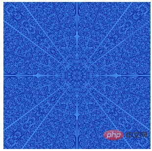
        rgb(1, 23, 143) 0.01px
    );
} 
CodePen Demo -- Magic Gradient Art
How small can it be?repeating-radial-gradient It is similar to radial-gradient() and takes the same arguments, but it repeats the color in all directions, overriding it the entire container.
1px, which is the focus of this article. How small can it be?
:root {
    --length: 1px
}
{
    background-image: repeating-radial-gradient(
        circle at 17% 32%,
        rgb(4, 4, 0),
        rgb(52, 72, 197),
        rgb(115, 252, 224),
        rgb(116, 71, 5),
        rgb(223, 46, 169),
        rgb(0, 160, 56),
        rgb(234, 255, 0) var(--length)
    );
}100px to 0.00001px for comparison:


在 0.001px 到 0.0001px 这个区间段,基本上图形已经退化为粒子图形,见不到径向渐变的轮廓了,而到了 0.00001px 这个级别,居然退化为了一张纯色图片!
CodePen Demo -- 不同级别长度单位对 repeating-radial-gradient 图形的影响
使用 repeating-radial-gradient 实现电视雪花噪声动画
在上述 DEMO 中,我们发现,当在 0.001px 到 0.0001px 这个区间段,repeating-radial-gradient 基本退化为了粒子图形:
{
    background-image: repeating-radial-gradient(
        circle at 17% 32%,
        rgb(4, 4, 0),
        rgb(52, 72, 197),
        rgb(115, 252, 224),
        rgb(116, 71, 5),
        rgb(223, 46, 169),
        rgb(0, 160, 56),
        rgb(234, 255, 0) 0.0008px
    );
}
这不是非常类似电视雪花屏的效果么?微调 0.0008px 这个参数, 利用几帧不同的动画,我们就可以得到电视雪花噪声的动画了。

啊哈,非常的有意思,完整的源码你可以戳这里:
Copepen Demo -- PURE CSS TV NOISE EFFECT (Only Chrome 85+)
更多编程相关知识,请访问:编程视频!!
The above is the detailed content of Pure CSS to achieve wonderful and interesting background effects! !. For more information, please follow other related articles on the PHP Chinese website!

Hot AI Tools

Undresser.AI Undress
AI-powered app for creating realistic nude photos

AI Clothes Remover
Online AI tool for removing clothes from photos.

Undress AI Tool
Undress images for free

Clothoff.io
AI clothes remover

Video Face Swap
Swap faces in any video effortlessly with our completely free AI face swap tool!

Hot Article

Hot Tools

Notepad++7.3.1
Easy-to-use and free code editor

SublimeText3 Chinese version
Chinese version, very easy to use

Zend Studio 13.0.1
Powerful PHP integrated development environment

Dreamweaver CS6
Visual web development tools

SublimeText3 Mac version
God-level code editing software (SublimeText3)

Hot Topics
 1386
1386
 52
52
 How to use bootstrap in vue
Apr 07, 2025 pm 11:33 PM
Using Bootstrap in Vue.js is divided into five steps: Install Bootstrap. Import Bootstrap in main.js. Use the Bootstrap component directly in the template. Optional: Custom style. Optional: Use plug-ins.
 The Roles of HTML, CSS, and JavaScript: Core Responsibilities
Apr 08, 2025 pm 07:05 PM
HTML defines the web structure, CSS is responsible for style and layout, and JavaScript gives dynamic interaction. The three perform their duties in web development and jointly build a colorful website.
 How to write split lines on bootstrap
Apr 07, 2025 pm 03:12 PM
There are two ways to create a Bootstrap split line: using the tag, which creates a horizontal split line. Use the CSS border property to create custom style split lines.
 Understanding HTML, CSS, and JavaScript: A Beginner's Guide
Apr 12, 2025 am 12:02 AM
WebdevelopmentreliesonHTML,CSS,andJavaScript:1)HTMLstructurescontent,2)CSSstylesit,and3)JavaScriptaddsinteractivity,formingthebasisofmodernwebexperiences.
 How to set up the framework for bootstrap
Apr 07, 2025 pm 03:27 PM
To set up the Bootstrap framework, you need to follow these steps: 1. Reference the Bootstrap file via CDN; 2. Download and host the file on your own server; 3. Include the Bootstrap file in HTML; 4. Compile Sass/Less as needed; 5. Import a custom file (optional). Once setup is complete, you can use Bootstrap's grid systems, components, and styles to create responsive websites and applications.
 How to insert pictures on bootstrap
Apr 07, 2025 pm 03:30 PM
There are several ways to insert images in Bootstrap: insert images directly, using the HTML img tag. With the Bootstrap image component, you can provide responsive images and more styles. Set the image size, use the img-fluid class to make the image adaptable. Set the border, using the img-bordered class. Set the rounded corners and use the img-rounded class. Set the shadow, use the shadow class. Resize and position the image, using CSS style. Using the background image, use the background-image CSS property.
 How to resize bootstrap
Apr 07, 2025 pm 03:18 PM
To adjust the size of elements in Bootstrap, you can use the dimension class, which includes: adjusting width: .col-, .w-, .mw-adjust height: .h-, .min-h-, .max-h-
 How to use bootstrap button
Apr 07, 2025 pm 03:09 PM
How to use the Bootstrap button? Introduce Bootstrap CSS to create button elements and add Bootstrap button class to add button text


