
 Web Front-end
CSS Tutorial
Detailed explanation of three CSS3 blur background effects (code examples)
Web Front-end
CSS Tutorial
Detailed explanation of three CSS3 blur background effects (code examples)
Detailed explanation of three CSS3 blur background effects (code examples)

This article will introduce to you three effects of CSS3 to achieve blurred background. It has certain reference value. Friends in need can refer to it. I hope it will be helpful to everyone.

No need to start, let’s go directly to the topic.
Normal background blur effect is as follows:

Use attributes:
filter:(2px)
#Normal background blur
For the sake of beauty, the text in front of the background cannot be blurred, and the filter attribute will make the descendants of the entire p and white edges
appear. In other words, this effect cannot be achieved. How to do it? We can use pseudo elements, which also solves the problem of white edges. Implementation ideas: Set the background in the parent container and use relative positioning to facilitate the overlap of pseudo elements. In :after, you only need to inherit the background, set blur, and absolutely position it to cover the parent element. This way the child elements in the parent container are not affected by the blur. Because the blurriness of a pseudo-element cannot be inherited by the descendants of the parent element. Having said so much, let’s refresh ourselves with some code. Simple html layout:<div class="bg"> <div class="drag">like window</div> </div>
/*背景模糊*/
.bg{
    width:100%;
    height:100%;
    position: relative;
    background: url("../image/banner/banner.jpg") no-repeat fixed;
    padding:1px;
    box-sizing:border-box;
    z-index:1;
}
.bg:after{
    content: "";
    width:100%;
    height:100%;
    position: absolute;
    left:0;
    top:0;
    background: inherit;
    filter: blur(2px);
    z-index: 2;
}
.drag{
    position: absolute;
    left:50%;
    top:50%;
    transform: translate(-50%,-50%);
    width:200px;
    height:200px;
    text-align: center;

    z-index:11;
}So what is the effect of writing code like this?

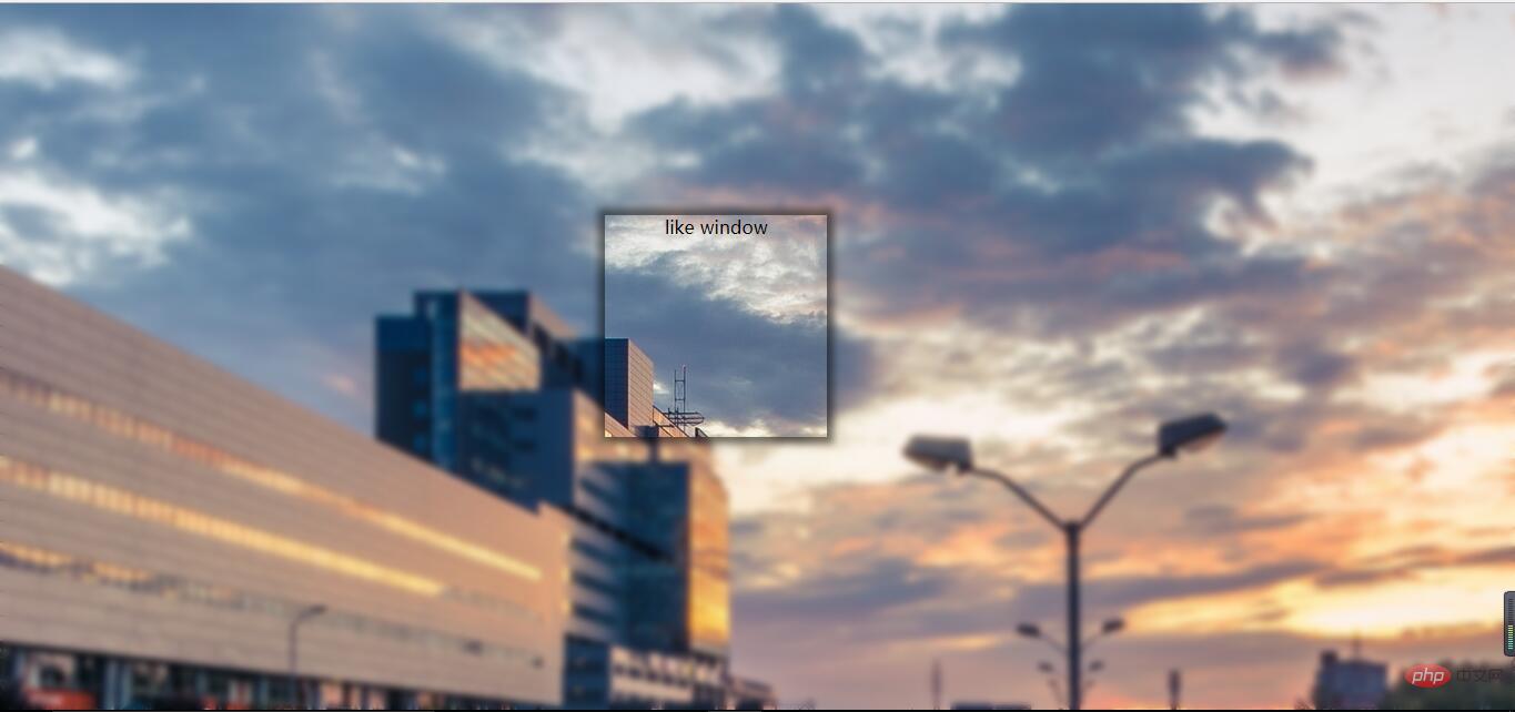
#The background is partially blurred
Compared with the previous effect , it is relatively simple to partially blur the background. At this time, the parent element does not need to set the pseudo element to be blurry at all. Directly analogize the above code to blur the child elements,
but the descendants of the child elements may not be blurred(note this, the solution is as described in the previous effect).
The HTML layout has changed slightly:
<div class="bg">
   <div class="drag">
        <div>like window</div>
   </div>
</div>css code is as follows: (please pay attention to comparison)
/*背景局部模糊*/
.bg{
    width:100%;
    height:100%;
    background: url("../image/banner/banner.jpg") no-repeat fixed;
    padding:1px;
    box-sizing:border-box;
    z-index:1;
}
.drag{
    margin:100px auto;
    width:200px;
    height:200px;

    background: inherit;

    position: relative;
}
.drag >div{
    width:100%;
    height: 100%;
    text-align: center;
    line-height:200px;
    position: absolute;
    left:0;
    top:0;
    z-index: 11;
}
.drag:after{
    content: "";
    width:100%;
    height:100%;
    position: absolute;
    left:0;
    top:0;
    background: inherit;
    filter: blur(15px);/*为了模糊更明显,调高模糊度*/
    z-index: 2;
}The effect is as follows: 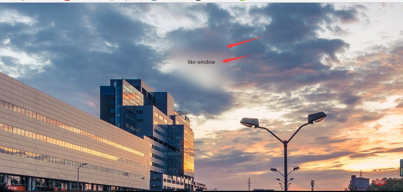
#The background is partially clear
The background is partially clear. This effect is neither simple nor difficult. The key is to apply the background:inherit attribute.
You can’t use transform here to center it vertically
, you should choose flex layout. If the transform attribute is used here, the background will also be offset. In this way, there is no local clear effect. The html layout remains unchanged, pay attention to the changes in css:/*背景局部清晰*/
.bg{
width:100%;
height:100%;
position: relative;
background: url("../image/banner/banner.jpg") no-repeat fixed;
padding:1px;
box-sizing:border-box;
}
.bg:after{
content: "";
width:100%;
height:100%;
position: absolute;
left:0;
top:0;
background: inherit;
filter: blur(3px);
z-index: 1;
}
.drag{
position: absolute;
left:40%;
top:30%;
/*transform: translate(-50%,-50%);*/
width:200px;
height:200px;
text-align: center;
background: inherit;
z-index:11;
box-shadow: 0 0 10px 6px rgba(0,0,0,.5);
} Effect display: For more programming-related knowledge, please visit : ###Introduction to Programming###! ! ###
The above is the detailed content of Detailed explanation of three CSS3 blur background effects (code examples). For more information, please follow other related articles on the PHP Chinese website!

Hot AI Tools

Undresser.AI Undress
AI-powered app for creating realistic nude photos

AI Clothes Remover
Online AI tool for removing clothes from photos.

Undress AI Tool
Undress images for free

Clothoff.io
AI clothes remover

Video Face Swap
Swap faces in any video effortlessly with our completely free AI face swap tool!

Hot Article
Hot Tools

Notepad++7.3.1
Easy-to-use and free code editor

SublimeText3 Chinese version
Chinese version, very easy to use

Zend Studio 13.0.1
Powerful PHP integrated development environment

Dreamweaver CS6
Visual web development tools

SublimeText3 Mac version
God-level code editing software (SublimeText3)
Hot Topics
 1391
1391
 52
52

 How to use bootstrap in vue
Apr 07, 2025 pm 11:33 PM
How to use bootstrap in vue
Apr 07, 2025 pm 11:33 PM
Using Bootstrap in Vue.js is divided into five steps: Install Bootstrap. Import Bootstrap in main.js. Use the Bootstrap component directly in the template. Optional: Custom style. Optional: Use plug-ins.
 The Roles of HTML, CSS, and JavaScript: Core Responsibilities
Apr 08, 2025 pm 07:05 PM
The Roles of HTML, CSS, and JavaScript: Core Responsibilities
Apr 08, 2025 pm 07:05 PM
HTML defines the web structure, CSS is responsible for style and layout, and JavaScript gives dynamic interaction. The three perform their duties in web development and jointly build a colorful website.
 How to write split lines on bootstrap
Apr 07, 2025 pm 03:12 PM
How to write split lines on bootstrap
Apr 07, 2025 pm 03:12 PM
There are two ways to create a Bootstrap split line: using the tag, which creates a horizontal split line. Use the CSS border property to create custom style split lines.
 Understanding HTML, CSS, and JavaScript: A Beginner's Guide
Apr 12, 2025 am 12:02 AM
Understanding HTML, CSS, and JavaScript: A Beginner's Guide
Apr 12, 2025 am 12:02 AM
WebdevelopmentreliesonHTML,CSS,andJavaScript:1)HTMLstructurescontent,2)CSSstylesit,and3)JavaScriptaddsinteractivity,formingthebasisofmodernwebexperiences.
 How to use bootstrap button
Apr 07, 2025 pm 03:09 PM
How to use bootstrap button
Apr 07, 2025 pm 03:09 PM
How to use the Bootstrap button? Introduce Bootstrap CSS to create button elements and add Bootstrap button class to add button text
 How to resize bootstrap
Apr 07, 2025 pm 03:18 PM
How to resize bootstrap
Apr 07, 2025 pm 03:18 PM
To adjust the size of elements in Bootstrap, you can use the dimension class, which includes: adjusting width: .col-, .w-, .mw-adjust height: .h-, .min-h-, .max-h-
 How to set up the framework for bootstrap
Apr 07, 2025 pm 03:27 PM
How to set up the framework for bootstrap
Apr 07, 2025 pm 03:27 PM
To set up the Bootstrap framework, you need to follow these steps: 1. Reference the Bootstrap file via CDN; 2. Download and host the file on your own server; 3. Include the Bootstrap file in HTML; 4. Compile Sass/Less as needed; 5. Import a custom file (optional). Once setup is complete, you can use Bootstrap's grid systems, components, and styles to create responsive websites and applications.
 How to insert pictures on bootstrap
Apr 07, 2025 pm 03:30 PM
How to insert pictures on bootstrap
Apr 07, 2025 pm 03:30 PM
There are several ways to insert images in Bootstrap: insert images directly, using the HTML img tag. With the Bootstrap image component, you can provide responsive images and more styles. Set the image size, use the img-fluid class to make the image adaptable. Set the border, using the img-bordered class. Set the rounded corners and use the img-rounded class. Set the shadow, use the shadow class. Resize and position the image, using CSS style. Using the background image, use the background-image CSS property.
