

How to set image border with css

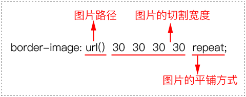
In CSS, you can use the border-image attribute to set the image border. You only need to add the "border-image: image path, cutting width, tiling method;" style to the element. The border-image attribute can add a background image to the border to achieve the picture border effect.
The operating environment of this tutorial: Windows 7 system, CSS3&&HTML5 version, Dell G3 computer.
In the introductory stage of CSS, we learned about the border-style attribute and also knew that borders only have a few simple styles such as solid lines and dotted lines. What if we want to add a beautiful background image to the border?
In CSS3, we can use the border-image attribute to add a background image to the border. The latest versions of all major browsers now support the border-image attribute.
Syntax:
Description:
border-image attribute needs to be defined 3 aspects of content.
(1) Picture path.
(2) Cutting width: the cutting width of the four sides, in order: upper edge, right edge, lower edge, and left edge (clockwise).
(3) Tiling method: There are three values, namely repeat, round and stretch.
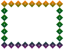
In all the examples in this section, we use the 90px×90px picture shown in the picture as the background picture of the border.

Code example:
<!DOCTYPE html>
<html>
<head>
    <meta charset="utf-8" />
    <title></title>
    <style type="text/css">
        div
        {
            width:210px;
            height:150px;
            border:30px solid gray;
            border-image:url(img/border.png) 30 repeat;
        }
    </style>
</head>
<body>
    <div></div>
</body>
</html>The browser preview is as shown below.
Analysis:
From the preview effect, we can know that the numbers 1, 3, 7, and 9 located at the 4 corners are still Obediently located at the 4 corners. Then the 4 borders 2, 4, 6, and 8 will be continuously tiled.
Regarding the border-image attribute, we summarize it as follows:
(1) When making a border background image, 4 sides should be made, and the middle part needs to be hollowed out.
(2) The width of each side of the border background image should be the same as the corresponding border width (i.e. border-width).
Example: tiling method
<!DOCTYPE html>
<html>
<head>
    <meta charset="utf-8" />
    <title></title>
    <style type="text/css">
        div
        {
            width:170px;
            height:110px;
            line-height:110px;
            text-align: center;
            border:30px solid gray;
            margin-top:20px;
        }
        /*第1个div平铺方式为:repeat*/
        #div1{border-image:url(img/border.png) 30 repeat;}
        /*第2个div平铺方式为:round*/
        #div2{border-image:url(img/border.png) 30 round;}
        /*第3个div平铺方式为:stretch*/
        #div3{border-image:url(img/border.png) 30 stretch;}
    </style>
</head>
<body>
    <div id="div1">repeat</div>
    <div id="div2">round</div>
    <div id="div3">stretch</div>
</body>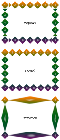
</html>The browser preview effect is as shown below:
Analysis:
There are three tiling methods for the border-image attribute: repeat, round, and stretch.
(1) When the value is repeat, it means that the small square with 4 sides will be repeated continuously, and the part beyond the element will be cut off.
(2) When the value is round, it means that the small squares with 4 sides will be covered. The border image is compressed or stretched to achieve full coverage.
(3) When the value is stretch, it means that the small square with 4 sides will be stretched as long as the sides are.
Derived sub-attributes of border-image
The border-image attribute can be separated and set corresponding background images for the four sides respectively. The attributes of these four sides are as follows shown in the table.
| Sub-property | Description |
|---|---|
| Define the top border background image | |
| Define the bottom border background image | |
| Define left border background image | |
| Define the right border background image |
css video tutorial)
The above is the detailed content of How to set image border with css. For more information, please follow other related articles on the PHP Chinese website!

Hot AI Tools

Undresser.AI Undress
AI-powered app for creating realistic nude photos

AI Clothes Remover
Online AI tool for removing clothes from photos.

Undress AI Tool
Undress images for free

Clothoff.io
AI clothes remover

Video Face Swap
Swap faces in any video effortlessly with our completely free AI face swap tool!

Hot Article
Hot Tools

Notepad++7.3.1
Easy-to-use and free code editor

SublimeText3 Chinese version
Chinese version, very easy to use

Zend Studio 13.0.1
Powerful PHP integrated development environment

Dreamweaver CS6
Visual web development tools

SublimeText3 Mac version
God-level code editing software (SublimeText3)
Hot Topics
 1392
1392
 52
52

 How to use bootstrap in vue
Apr 07, 2025 pm 11:33 PM
How to use bootstrap in vue
Apr 07, 2025 pm 11:33 PM
Using Bootstrap in Vue.js is divided into five steps: Install Bootstrap. Import Bootstrap in main.js. Use the Bootstrap component directly in the template. Optional: Custom style. Optional: Use plug-ins.
 The Roles of HTML, CSS, and JavaScript: Core Responsibilities
Apr 08, 2025 pm 07:05 PM
The Roles of HTML, CSS, and JavaScript: Core Responsibilities
Apr 08, 2025 pm 07:05 PM
HTML defines the web structure, CSS is responsible for style and layout, and JavaScript gives dynamic interaction. The three perform their duties in web development and jointly build a colorful website.
 How to write split lines on bootstrap
Apr 07, 2025 pm 03:12 PM
How to write split lines on bootstrap
Apr 07, 2025 pm 03:12 PM
There are two ways to create a Bootstrap split line: using the tag, which creates a horizontal split line. Use the CSS border property to create custom style split lines.
 Understanding HTML, CSS, and JavaScript: A Beginner's Guide
Apr 12, 2025 am 12:02 AM
Understanding HTML, CSS, and JavaScript: A Beginner's Guide
Apr 12, 2025 am 12:02 AM
WebdevelopmentreliesonHTML,CSS,andJavaScript:1)HTMLstructurescontent,2)CSSstylesit,and3)JavaScriptaddsinteractivity,formingthebasisofmodernwebexperiences.
 How to use bootstrap button
Apr 07, 2025 pm 03:09 PM
How to use bootstrap button
Apr 07, 2025 pm 03:09 PM
How to use the Bootstrap button? Introduce Bootstrap CSS to create button elements and add Bootstrap button class to add button text
 How to resize bootstrap
Apr 07, 2025 pm 03:18 PM
How to resize bootstrap
Apr 07, 2025 pm 03:18 PM
To adjust the size of elements in Bootstrap, you can use the dimension class, which includes: adjusting width: .col-, .w-, .mw-adjust height: .h-, .min-h-, .max-h-
 How to set up the framework for bootstrap
Apr 07, 2025 pm 03:27 PM
How to set up the framework for bootstrap
Apr 07, 2025 pm 03:27 PM
To set up the Bootstrap framework, you need to follow these steps: 1. Reference the Bootstrap file via CDN; 2. Download and host the file on your own server; 3. Include the Bootstrap file in HTML; 4. Compile Sass/Less as needed; 5. Import a custom file (optional). Once setup is complete, you can use Bootstrap's grid systems, components, and styles to create responsive websites and applications.
 How to insert pictures on bootstrap
Apr 07, 2025 pm 03:30 PM
How to insert pictures on bootstrap
Apr 07, 2025 pm 03:30 PM
There are several ways to insert images in Bootstrap: insert images directly, using the HTML img tag. With the Bootstrap image component, you can provide responsive images and more styles. Set the image size, use the img-fluid class to make the image adaptable. Set the border, using the img-bordered class. Set the rounded corners and use the img-rounded class. Set the shadow, use the shadow class. Resize and position the image, using CSS style. Using the background image, use the background-image CSS property.
