

How to position css

Css positioning method: First use the position attribute to specify the positioning type of the element (static positioning, absolute positioning, relative positioning or fixed positioning); then use the left, top, right, bottom attributes to adjust the position of the element. Can.
The operating environment of this tutorial: Windows 7 system, CSS3&&HTML5 version, Dell G3 computer.
What is positioning:
The position attribute in css, position has four values: absolute/relative/fixed/static (absolute/ Relative/Fixed/Static (default)) You can set some irregular layouts through positioning attributes. Use TLBR(top,left,bottom,right) to adjust the position of elements.
Description of each attribute value:
- static (static) No special settings, does not break away from the document flow , Follow the basic positioning regulations and cannot perform hierarchical classification through z-index. In ordinary flows, the default attributes of each element are.
- relative (relative positioning) objects cannot be stacked, do not break away from the document flow, and are positioned through top, bottom, left, and right with reference to their own static position.
- absolute (absolute positioning) Out of the document flow, positioned through top, bottom, left, right. Select its nearest parent object with the most positioning settings for absolute positioning. If the object's parent does not set positioning attributes, the absolute element will be positioned at the origin of the body coordinates.
- fixed (fixed positioning) Out of the document flow, The fixed reference object here is the visual window rather than the body or parent element. Fixed elements will not scroll as the window scrolls. Belongs to a subset of absolute.
The specific function of each attribute value:
A.static: (static, default attribute ) is usually not used, but there are some scenarios where you want to use it when you want to change the value of position from other values to the default.
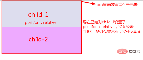
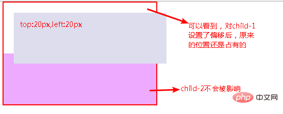
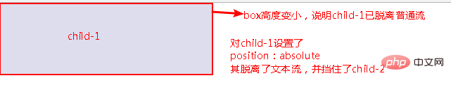
B.relative: (relative positioning) An element is set to position: relative, because it does not break away from the text flow, if TLBR (top, left, bottom, right) is not set , its position will not be changed, and it will not affect the current layout, which is equivalent to nothing happening. If TLBR is set, the element can be offset in the specified direction, but its original position is still occupied. An example is shown in the figure:
Figure 1: Position: relative# is set for child-1
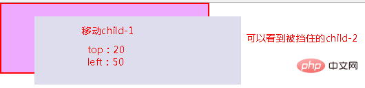
C. Absolute: (absolute positioning), completely separated from the text flow (ordinary flow), the original position is no longer occupied, and TLBR can be set to move at will;
Special note, after setting absolute on the element, None of its parent elements have position: absolute/relative/fixed set and it will have body as its parent. Picture 1: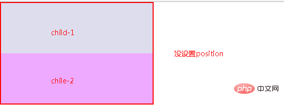
D.fixed: (fixed positioning), it will not scroll as the page scrolls, so there will be no pictures here. The most vivid ones are those small web page advertisements. You Scroll the page, but it keeps following you to the right or left of the page.
Positioning layout skills: position: relative and position: absolute used in combination:
As mentioned above, if absolute is set to an element, its None of the parent elements have position: relative set, and the body will be the parent. In this case, it will be difficult for us to position the element to our target position, and it will be troublesome to measure the pixels. Picture description: Picture 1: Initial state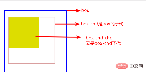
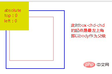
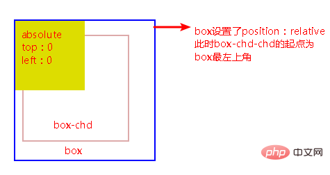
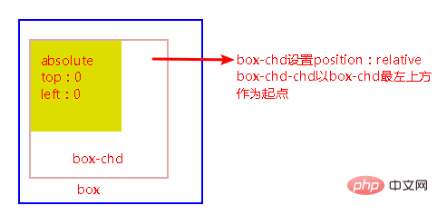
It can be seen that when the child sets position: absolute, and its parent sets position: relative, the child will move from the top left of the parent element as the starting point, and follow the nearest Principle , that is, the children look up for their parents. When they find the first parent with relative set, use the upper leftmost parent as the starting point.
The combination of relative and absolute facilitates positioning and layout, and the distance that needs to be moved is also reduced. There is no need to start from the body to measure the pixels of the entire page. It is also convenient for management and has a clear structure.
(Learning video sharing: css video tutorial)
The above is the detailed content of How to position css. For more information, please follow other related articles on the PHP Chinese website!

Hot AI Tools

Undresser.AI Undress
AI-powered app for creating realistic nude photos

AI Clothes Remover
Online AI tool for removing clothes from photos.

Undress AI Tool
Undress images for free

Clothoff.io
AI clothes remover

AI Hentai Generator
Generate AI Hentai for free.

Hot Article
Hot Tools

Notepad++7.3.1
Easy-to-use and free code editor

SublimeText3 Chinese version
Chinese version, very easy to use

Zend Studio 13.0.1
Powerful PHP integrated development environment

Dreamweaver CS6
Visual web development tools

SublimeText3 Mac version
God-level code editing software (SublimeText3)
Hot Topics
 1359
1359
 52
52

 How to remove the default style in Bootstrap list?
Apr 07, 2025 am 10:18 AM
How to remove the default style in Bootstrap list?
Apr 07, 2025 am 10:18 AM
The default style of the Bootstrap list can be removed with CSS override. Use more specific CSS rules and selectors, follow the "proximity principle" and "weight principle", overriding the Bootstrap default style. To avoid style conflicts, more targeted selectors can be used. If the override is unsuccessful, adjust the weight of the custom CSS. At the same time, pay attention to performance optimization, avoid overuse of !important, and write concise and efficient CSS code.
 How to resize bootstrap
Apr 07, 2025 pm 03:18 PM
How to resize bootstrap
Apr 07, 2025 pm 03:18 PM
To adjust the size of elements in Bootstrap, you can use the dimension class, which includes: adjusting width: .col-, .w-, .mw-adjust height: .h-, .min-h-, .max-h-
 How to use bootstrap button
Apr 07, 2025 pm 03:09 PM
How to use bootstrap button
Apr 07, 2025 pm 03:09 PM
How to use the Bootstrap button? Introduce Bootstrap CSS to create button elements and add Bootstrap button class to add button text
 How to upload files on bootstrap
Apr 07, 2025 pm 01:09 PM
How to upload files on bootstrap
Apr 07, 2025 pm 01:09 PM
The file upload function can be implemented through Bootstrap. The steps are as follows: introduce Bootstrap CSS and JavaScript files; create file input fields; create file upload buttons; handle file uploads (using FormData to collect data and then send to the server); custom style (optional).
 How to change the size of a Bootstrap list?
Apr 07, 2025 am 10:45 AM
How to change the size of a Bootstrap list?
Apr 07, 2025 am 10:45 AM
The size of a Bootstrap list depends on the size of the container that contains the list, not the list itself. Using Bootstrap's grid system or Flexbox can control the size of the container, thereby indirectly resizing the list items.
 How to layout bootstrap
Apr 07, 2025 pm 02:24 PM
How to layout bootstrap
Apr 07, 2025 pm 02:24 PM
To use Bootstrap to layout a website, you need to use a grid system to divide the page into containers, rows, and columns. First add the container, then add the rows in it, add the columns within the row, and finally add the content in the column. Bootstrap's responsive layout function automatically adjusts the layout according to breakpoints (xs, sm, md, lg, xl). Different layouts under different screen sizes can be achieved by using responsive classes.
 How to insert pictures on bootstrap
Apr 07, 2025 pm 03:30 PM
How to insert pictures on bootstrap
Apr 07, 2025 pm 03:30 PM
There are several ways to insert images in Bootstrap: insert images directly, using the HTML img tag. With the Bootstrap image component, you can provide responsive images and more styles. Set the image size, use the img-fluid class to make the image adaptable. Set the border, using the img-bordered class. Set the rounded corners and use the img-rounded class. Set the shadow, use the shadow class. Resize and position the image, using CSS style. Using the background image, use the background-image CSS property.
 How to build a bootstrap framework
Apr 07, 2025 pm 12:57 PM
How to build a bootstrap framework
Apr 07, 2025 pm 12:57 PM
To create a Bootstrap framework, follow these steps: Install Bootstrap via CDN or install a local copy. Create an HTML document and link Bootstrap CSS to the <head> section. Add Bootstrap JavaScript file to the <body> section. Use the Bootstrap component and customize the stylesheet to suit your needs.
